9.1 Introduction to Bivariate Data and Scatterplots
Learning Objectives
By the end of this chapter, the student should be able to:
- Display and describe relationships in bivariate data
- Describe bivariate data numerically
- Understand basic ideas of linear regression
- Predict future value using your regression line
- Understand the impact of influential points and outliers in the context of linear regression
- Apply ideas of inference to linear regression

Professionals often want to know how two (or more) numeric variables are related. For example, is there a relationship between the grade on the second math exam a student takes and the grade on the final exam? If there is a relationship, what is the relationship and how strong is it?
In another example, your income may be determined by your education, your profession, your years of experience, and your ability. The amount you pay a repair person for labor is often determined by an initial amount plus an hourly fee.
The type of data described in these examples is bivariate data — “bi” for two variables. In this chapter, you will be studying the “simple linear regression”. Note that this does not imply that these ideas are “simple” but just that we are working with one independent variable (x) and a linear relationship. This involves data that fits a line in two dimensions.
Bivariate Data
When considering the relationship between two quantitative variables:
- Start with a graph (scatterplot)
- Look for an overall pattern and deviations from the pattern
- Use numerical descriptions of the data and overall pattern (correlation, coefficient of determination)
- Consider a mathematical model (regression)
Scatterplots
Before we take up the discussion of linear regression and correlation, we need to examine a way to display the relation between two variables x and y. The most common and easiest way is a scatter plot. A scatter plot shows a lot about the relationship between the variables. When you look at a scatterplot, you want to notice the overall pattern and any potential deviations from the pattern. You can determine the strength of the relationship by looking at the scatter plot and seeing how close the points are together. When looking at a scatterplot you always want to note:
- Shape
- Trend
- Strength
The following scatterplot examples illustrate these concepts.
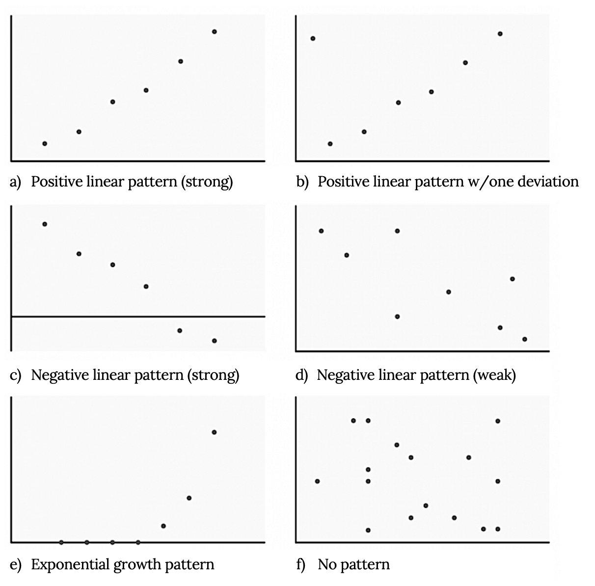
Shape
Although we may see other shapes in a scatter plot, at this point we are only interested in applying these ideas when we see a linear pattern. Linear patterns are quite common. The linear relationship is strong if the points are close to a straight line, except in the case of a horizontal line where there is no relationship. If we think that the points show a linear relationship, we would like to draw a line on the scatter plot. This line can will later be calculated through a process called linear regression. However, we only calculate a regression line if one of the variables helps to explain or predict the other variable.
Trend
If we do see a linear pattern, what sort of relationship is there? A positive trend is seen when increasing x also increases y. On the other hand a negative (inverse) trend is seen when increasing x appears to cause y to decrease. In other words:
- High values of one variable occurring with high values of the other variable or low values of one variable occurring with low values of the other variable.
- High values of one variable occurring with low values of the other variable.
Strength
At this point we can think about the strength of a relationship as how tightly do the points on a scatterplot fit the linear pattern. A stronger relationship has points clustered together closely while in a weaker one, points are more spread out. The strength of a relationship is not always apparent in a scatterplot but we will see numerical measures of this in the future.
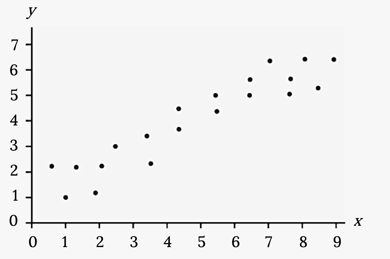
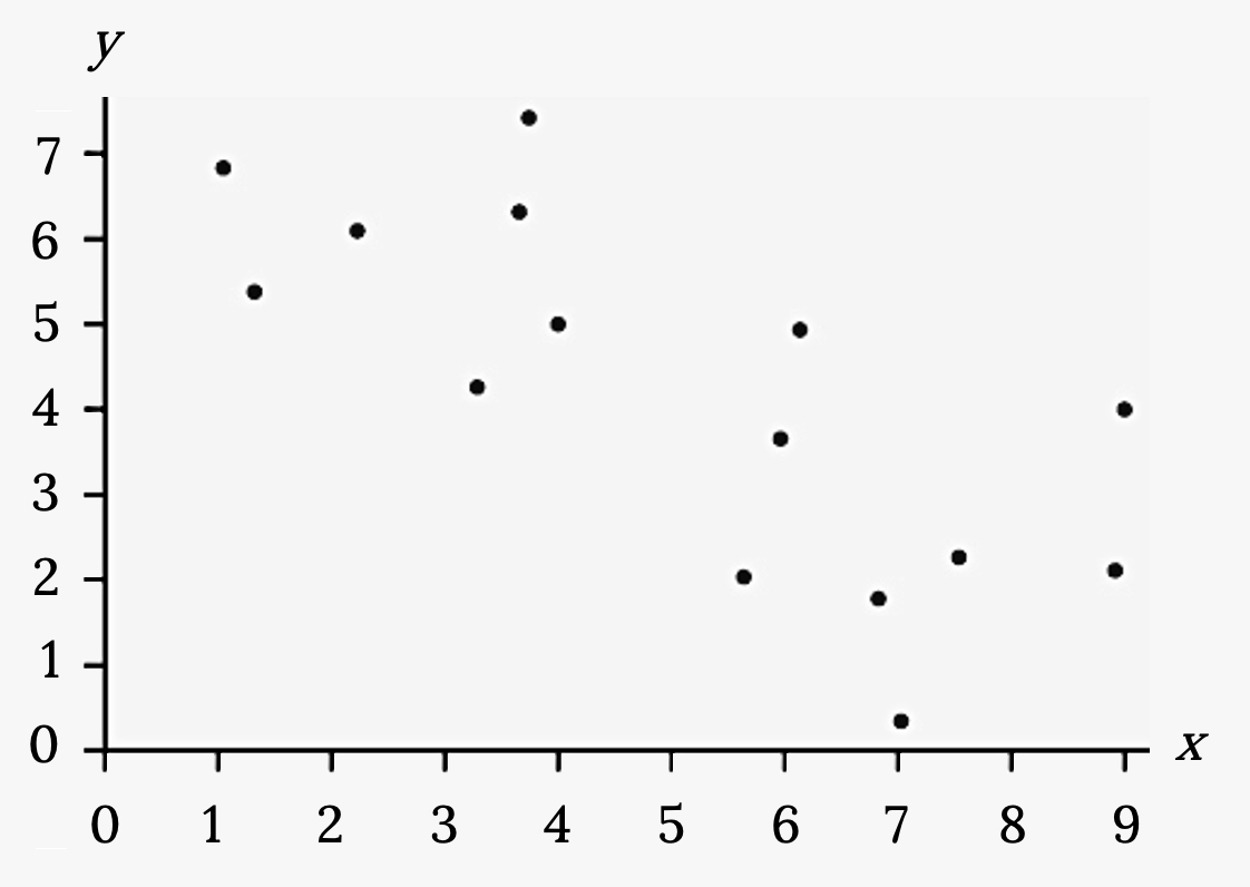
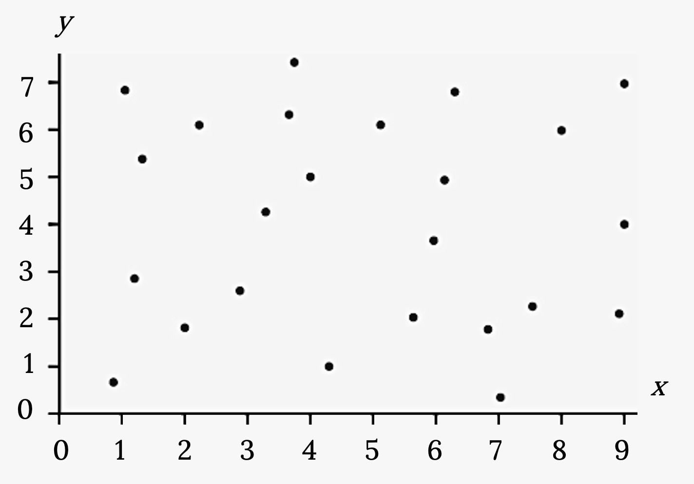
Example
1. Does the scatter plot appear linear? Strong or weak? Positive or negative?
2. Does the scatter plot appear linear? Strong or weak? Positive or negative?
3. Does the scatter plot appear linear? Strong or weak? Positive or negative?
Your turn!
Amelia plays basketball for her high school. She wants to improve to play at the college level. She notices that the number of points she scores in a game goes up in response to the number of hours she practices her jump shot each week. She records the following data:
| X (hours practicing jump shot) | Y (points scored in a game) |
|---|---|
| 5 | 15 |
| 7 | 22 |
| 9 | 28 |
| 10 | 31 |
| 11 | 33 |
| 12 | 36 |
Construct a scatter plot and state if what Amelia thinks appears to be true.
Image References
Figure 9.1: Aaron Huber (2018). “Artist at Work.” Public domain. Retrieved from https://unsplash.com/photos/KxeFuXta4SE
Figure 9.2: Kindred Grey via Virginia Tech (2020). “Figure 9.2” CC BY-SA 4.0. Retrieved from https://commons.wikimedia.org/wiki/File:Figure_9.2.png . Adaptation of Figures 12.6, 12.7, and 12.8 from OpenStax Introductory Statistics (2013) (CC BY 4.0). Retrieved from https://openstax.org/books/introductory-statistics/pages/12-2-scatter-plots
Figure 9.3: Kindred Grey via Virginia Tech (2020). “Figure 9.3” CC BY-SA 4.0. Retrieved from https://commons.wikimedia.org/wiki/File:Figure_9.3.png . Adaptation of Figure 12.26 from OpenStax Introductory Statistics (2013) (CC BY 4.0). Retrieved from https://openstax.org/books/introductory-statistics/pages/12-practice
Figure 9.4: Kindred Grey via Virginia Tech (2020). “Figure 9.4” CC BY-SA 4.0. Retrieved from https://commons.wikimedia.org/wiki/File:Figure_9.4.png . Adaptation of Figure 12.27 from OpenStax Introductory Statistics (2013) (CC BY 4.0). Retrieved from https://openstax.org/books/introductory-statistics/pages/12-practice
Figure 9.5: Kindred Grey via Virginia Tech (2020). “Figure 9.5” CC BY-SA 4.0. Retrieved from https://commons.wikimedia.org/wiki/File:Figure_9.5.png . Adaptation of Figure 12.28 from OpenStax Introductory Statistics (2013) (CC BY 4.0). Retrieved from https://openstax.org/books/introductory-statistics/pages/12-practice
Data consisting of two variables, often in search of an association
The dependent variable in an experiment; the value that is measured for change at the end of an experiment
The independent variable in an experiment; the value controlled by researchers
