Chapter Wrap Up
Concept Check
Section Reviews
9.1 Introduction to Bi-variate Data and Scatterplots
Scatter plots are particularly helpful graphs when we want to see if there is a linear relationship among data points. They indicate both the direction of the relationship between the x variables and the y variables, and the strength of the relationship. We calculate the strength of the relationship between an independent variable and a dependent variable using linear regression.
9.2 Measures of Association
The correlation coefficient r measures the strength of the linear association between x and y. The variable r has to be between –1 and +1. When r is positive, the x and y will tend to increase and decrease together. When r is negative, x will increase and y will decrease, or the opposite, x will decrease and y will increase. The coefficient of determination r2, is equal to the square of the correlation coefficient. When expressed as a percent, r2 represents the percent of variation in the dependent variable y that can be explained by variation in the independent variable x using the regression line.
9.3 Modeling Linear Relationships
A regression line, or a line of best fit, can be drawn on a scatter plot and used to predict outcomes for the x and y variables in a given data set or sample data. There are several ways to find a regression line, but usually the least-squares regression line is used because it creates a uniform line. Residuals, also called “errors,” measure the distance from the actual value of y and the estimated value of y. The Sum of Squared Errors, when set to its minimum, calculates the points on the line of best fit. Regression lines can be used to predict values within the given set of data, but should not be used to make predictions for values outside the set of data.
9.4 Cautions about Regression
To determine if a point is an outlier, do one of the following:
- Must have a linear relationship to use these methods!
- Correlation is not causation
- Be careful with Extrapolation
- Beware of Influential Points
9.5 Inference for Regression
We can apply our inference techniques to regression, especially for the slope.
Key Terms
Try to define the terms below on your own. Scroll over any term to check your response!
9.1 Introduction to Bi-variate Data and Scatterplots
9.2 Measures of Association
9.3 Modeling Linear Relationships
9.4 Cautions about Regression
Extra Practice
9.1 Introduction to Bi-variate Data and Scatterplots
1. The Gross Domestic Product Purchasing Power Parity is an indication of a country’s currency value compared to another country. The figure below shows the GDP PPP of Cuba as compared to US dollars. Construct a scatter plot of the data.
| Year | Cuba’s PPP | Year | Cuba’s PPP |
|---|---|---|---|
| 1999 | 1,700 | 2006 | 4,000 |
| 2000 | 1,700 | 2007 | 11,000 |
| 2002 | 2,300 | 2008 | 9,500 |
| 2003 | 2,900 | 2009 | 9,700 |
| 2004 | 3,000 | 2010 | 9,900 |
| 2005 | 3,500 |
2. The following table shows the poverty rates and cell phone usage in the United States. Construct a scatter plot of the data.
| Year | Poverty Rate | Cellular Usage per Capita |
|---|---|---|
| 2003 | 12.7 | 54.67 |
| 2005 | 12.6 | 74.19 |
| 2007 | 12 | 84.86 |
| 2009 | 12 | 90.82 |
3. Does the higher cost of tuition translate into higher-paying jobs? The table lists the top ten colleges based on mid-career salary and the associated yearly tuition costs. Construct a scatter plot of the data. Note that tuition is the independent variable and salary is the dependent variable.
| School | Mid-Career Salary (in thousands) | Yearly Tuition |
|---|---|---|
| Princeton | 137 | 28,540 |
| Harvey Mudd | 135 | 40,133 |
| CalTech | 127 | 39,900 |
| US Naval Academy | 122 | 0 |
| West Point | 120 | 0 |
| MIT | 118 | 42,050 |
| Lehigh University | 118 | 43,220 |
| NYU-Poly | 117 | 39,565 |
| Babson College | 117 | 40,400 |
| Stanford | 114 | 54,506 |
9.2 Measures of Association
1. Can a coefficient of determination be negative? Why or why not?
2. The Gross Domestic Product Purchasing Power Parity is an indication of a country’s currency value compared to another country. The figure below shows the GDP PPP of Cuba as compared to US dollars. Construct a scatter plot of the data.
| Year | Cuba’s PPP | Year | Cuba’s PPP |
|---|---|---|---|
| 1999 | 1,700 | 2006 | 4,000 |
| 2000 | 1,700 | 2007 | 11,000 |
| 2002 | 2,300 | 2008 | 9,500 |
| 2003 | 2,900 | 2009 | 9,700 |
| 2004 | 3,000 | 2010 | 9,900 |
| 2005 | 3,500 |
Find:
- r
- r2x
3. The following table shows the poverty rates and cell phone usage in the United States. Construct a scatter plot of the data.
| Year | Poverty Rate | Cellular Usage per Capita |
|---|---|---|
| 2003 | 12.7 | 54.67 |
| 2005 | 12.6 | 74.19 |
| 2007 | 12 | 84.86 |
| 2009 | 12 | 90.82 |
Find:
- r
- r2
4. Does the higher cost of tuition translate into higher-paying jobs? The table lists the top ten colleges based on mid-career salary and the associated yearly tuition costs. Construct a scatter plot of the data. Note that tuition is the independent variable and salary is the dependent variable.
| School | Mid-Career Salary (in thousands) | Yearly Tuition |
|---|---|---|
| Princeton | 137 | 28,540 |
| Harvey Mudd | 135 | 40,133 |
| CalTech | 127 | 39,900 |
| US Naval Academy | 122 | 0 |
| West Point | 120 | 0 |
| MIT | 118 | 42,050 |
| Lehigh University | 118 | 43,220 |
| NYU-Poly | 117 | 39,565 |
| Babson College | 117 | 40,400 |
| Stanford | 114 | 54,506 |
Find:
- r
- r2
9.3 Modeling Linear Relationships
1. A random sample of ten professional athletes produced the following data where x is the number of endorsements the player has and y is the amount of money made (in millions of dollars).
| x | y | x | y |
|---|---|---|---|
| 0 | 2 | 5 | 12 |
| 3 | 8 | 4 | 9 |
| 2 | 7 | 3 | 9 |
| 1 | 3 | 0 | 3 |
| 5 | 13 | 4 | 10 |
a. Draw a scatter plot of the data.
b. Use regression to find the equation for the line of best fit.
- ŷ = 2.23 + 1.99x
c. Draw the line of best fit on the scatter plot.
d. What is the slope of the line of best fit? What does it represent?
- The slope is 1.99 (b = 1.99). It means that for every endorsement deal a professional player gets, he gets an average of another $1.99 million in pay each year.
e. What is the y-intercept of the line of best fit? What does it represent?
f. What does an r value of zero mean?
- It means that there is no correlation between the data sets.
g. When n = 2 and r = 1, are the data significant? Explain.
h. When n = 100 and r = -0.89, is there a significant correlation? Explain.
- Yes, there are enough data points and the value of r is strong enough to show that there is a strong negative correlation between the data sets.
2. What is the process through which we can calculate a line that goes through a scatter plot with a linear pattern?
9.4 Cautions about Regression
1. The following table shows economic development measured in per capita income PCINC.
| Year | PCINC | Year | PCINC |
|---|---|---|---|
| 1870 | 340 | 1920 | 1050 |
| 1880 | 499 | 1930 | 1170 |
| 1890 | 592 | 1940 | 1364 |
| 1900 | 757 | 1950 | 1836 |
| 1910 | 927 | 1960 | 2132 |
- What are the independent and dependent variables?
- Draw a scatter plot.
- Use regression to find the line of best fit and the correlation coefficient.
- Interpret the significance of the correlation coefficient.
- Is there a linear relationship between the variables?
- Find the coefficient of determination and interpret it.
- What is the slope of the regression equation? What does it mean?
- Use the line of best fit to estimate PCINC for 1900, for 2000.
- Determine if there are any outliers.
2. The scatter plot shows the relationship between hours spent studying and exam scores. The line shown is the calculated line of best fit. The correlation coefficient is 0.69.
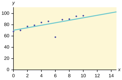
a. Do there appear to be any outliers?
- Yes, there appears to be an outlier at (6, 58).
b. A point is removed, and the line of best fit is recalculated. The new correlation coefficient is 0.98. Does the point appear to have been an outlier? Why?
c. What effect did the potential outlier have on the line of best fit?
- The potential outlier flattened the slope of the line of best fit because it was below the data set. It made the line of best fit less accurate is a predictor for the data.
d. Are you more or less confident in the predictive ability of the new line of best fit?
e. The Sum of Squared Errors for a data set of 18 numbers is 49. What is the standard deviation?
- s = 1.75
f. The Standard Deviation for the Sum of Squared Errors for a data set is 9.8. What is the cutoff for the vertical distance that a point can be from the line of best fit to be considered an outlier?
3. The height (sidewalk to roof) of notable tall buildings in America is compared to the number of stories of the building (beginning at street level).
| Height (in feet) | Stories |
|---|---|
| 1,050 | 57 |
| 428 | 28 |
| 362 | 26 |
| 529 | 40 |
| 790 | 60 |
| 401 | 22 |
| 380 | 38 |
| 1,454 | 110 |
| 1,127 | 100 |
| 700 | 46 |
- Using “stories” as the independent variable and “height” as the dependent variable, make a scatter plot of the data.
- Does it appear from inspection that there is a relationship between the variables?
- Calculate the least squares line. Put the equation in the form of: ŷ = a + bx
- Find the correlation coefficient. Is it significant?
- Find the estimated heights for 32 stories and for 94 stories.
- Based on the data, is there a linear relationship between the number of stories in tall buildings and the height of the buildings?
- Are there any outliers in the data? If so, which point(s)?
- What is the estimated height of a building with six stories? Does the least squares line give an accurate estimate of height? Explain why or why not.
- Based on the least squares line, adding an extra story is predicted to add about how many feet to a building?
- What is the slope of the least squares (best-fit) line? Interpret the slope.
4. Ornithologists, scientists who study birds, tag sparrow hawks in 13 different colonies to study their population. They gather data for the percent of new sparrow hawks in each colony and the percent of those that have returned from migration.
Percent return: 74, 66, 81, 52, 73, 62, 52, 45, 62, 46, 60, 46, 38
Percent new: 5, 6, 8, 11, 12, 15, 16, 17, 18, 18, 19, 20, 20
- Enter the data into your calculator and make a scatter plot.
- Use your calculator’s regression function to find the equation of the least-squares regression line. Add this to your scatter plot from part a.
- Explain in words what the slope and y-intercept of the regression line tell us.
- How well does the regression line fit the data? Explain your response.
- Which point has the largest residual? Explain what the residual means in context. Is this point an outlier? An influential point? Explain.
- An ecologist wants to predict how many birds will join another colony of sparrow hawks to which 70% of the adults from the previous year have returned. What is the prediction?
- Solution to a and b: Check student’s solution.
- Solution to c: The slope of the regression line is -0.3031 with a y-intercept of 31.93. In context, the y-intercept indicates that when there are no returning sparrow hawks, there will be almost 32% new sparrow hawks, which doesn’t make sense since if there are no returning birds, then the new percentage would have to be 100% (this is an example of why we do not extrapolate). The slope tells us that for each percentage increase in returning birds, the percentage of new birds in the colony decreases by 30.3%.
- Solution to d: If we examine r2, we see that only 57.52% of the variation in the percent of new birds is explained by the model and the correlation coefficient, r = –.7584 only indicates a somewhat strong correlation between returning and new percentages.
- Solution to e: The ordered pair (66, 6) generates the largest residual of 6.0. This means that when the observed return percentage is 66%, our observed new percentage, 6%, is almost 6% less than the predicted new value of 11.98%. If we remove this data pair, we see only an adjusted slope of -.2789 and an adjusted intercept of 30.9816. In other words, even though this data generates the largest residual, it is not an outlier, nor is the data pair an influential point.
- Solution to f: If there are 70% returning birds, we would expect to see y = –.2789(70) + 30.9816 = 0.114 or 11.4% new birds in the colony.
5. The following table shows data on average per capita coffee consumption and heart disease rate in a random sample of 10 countries.
| Yearly coffee consumption in liters | 2.5 | 3.9 | 2.9 | 2.4 | 2.9 | 0.8 | 9.1 | 2.7 | 0.8 | 0.7 |
| Death from heart diseases | 221 | 167 | 131 | 191 | 220 | 297 | 71 | 172 | 211 | 300 |
- Enter the data into your calculator and make a scatter plot.
- Use your calculator’s regression function to find the equation of the least-squares regression line. Add this to your scatter plot from part a.
- Explain in words what the slope and y-intercept of the regression line tell us.
- How well does the regression line fit the data? Explain your response.
- Which point has the largest residual? Explain what the residual means in context. Is this point an outlier? An influential point? Explain.
- Do the data provide convincing evidence that there is a linear relationship between the amount of coffee consumed and the heart disease death rate? Carry out an appropriate test at a significance level of 0.05 to help answer this question.
6. The following table consists of one student athlete’s time (in minutes) to swim 2000 yards and the student’s heart rate (beats per minute) after swimming on a random sample of 10 days:
| Swim Time | Heart Rate |
|---|---|
| 34.12 | 144 |
| 35.72 | 152 |
| 34.72 | 124 |
| 34.05 | 140 |
| 34.13 | 152 |
| 35.73 | 146 |
| 36.17 | 128 |
| 35.57 | 136 |
| 35.37 | 144 |
| 35.57 | 148 |
- Enter the data into your calculator and make a scatter plot.
- Use your calculator’s regression function to find the equation of the least-squares regression line. Add this to your scatter plot from part a.
- Explain in words what the slope and y-intercept of the regression line tell us.
- How well does the regression line fit the data? Explain your response.
- Which point has the largest residual? Explain what the residual means in context. Is this point an outlier? An influential point? Explain.
- Check student’s solution.
- Check student’s solution.
- We have a slope of –1.4946 with a y-intercept of 193.88. The slope, in context, indicates that for each additional minute added to the swim time, the heart rate will decrease by 1.5 beats per minute. If the student is not swimming at all, the y-intercept indicates that his heart rate will be 193.88 beats per minute. While the slope has meaning (the longer it takes to swim 2,000 meters, the less effort the heart puts out), the y-intercept does not make sense. If the athlete is not swimming (resting), then his heart rate should be very low.
- Since only 1.5% of the heart rate variation is explained by this regression equation, we must conclude that this association is not explained with a linear relationship.
- The point (34.72, 124) generates the largest residual of –11.82. This means that our observed heart rate is almost 12 beats less than our predicted rate of 136 beats per minute. When this point is removed, the slope becomes –2.953 with the y-intercept changing to 247.1616. While the linear association is still very weak, we see that the removed data pair can be considered an influential point in the sense that the y-intercept becomes more meaningful.
7. A researcher is investigating whether population impacts homicide rate. He uses demographic data from Detroit, MI to compare homicide rates and the number of the population that are white males.
| Population Size | Homicide rate per 100,000 people |
|---|---|
| 558,724 | 8.6 |
| 538,584 | 8.9 |
| 519,171 | 8.52 |
| 500,457 | 8.89 |
| 482,418 | 13.07 |
| 465,029 | 14.57 |
| 448,267 | 21.36 |
| 432,109 | 28.03 |
| 416,533 | 31.49 |
| 401,518 | 37.39 |
| 387,046 | 46.26 |
| 373,095 | 47.24 |
| 359,647 | 52.33 |
- Use your calculator to construct a scatter plot of the data. What should the independent variable be? Why?
- Use your calculator’s regression function to find the equation of the least-squares regression line. Add this to your scatter plot.
- Discuss what the following mean in context.
- The slope of the regression equation
- The y-intercept of the regression equation
- The correlation r
- The coefficient of determination r2.
- Do the data provide convincing evidence that there is a linear relationship between population size and homicide rate? Carry out an appropriate test at a significance level of 0.05 to help answer this question.
8. Use the table below to answer (a) and (b).
| School | Mid-Career Salary (in thousands) | Yearly Tuition |
|---|---|---|
| Princeton | 137 | 28,540 |
| Harvey Mudd | 135 | 40,133 |
| CalTech | 127 | 39,900 |
| US Naval Academy | 122 | 0 |
| West Point | 120 | 0 |
| MIT | 118 | 42,050 |
| Lehigh University | 118 | 43,220 |
| NYU-Poly | 117 | 39,565 |
| Babson College | 117 | 40,400 |
| Stanford | 114 | 54,506 |
a. Using the data to determine the linear-regression line equation with the outliers removed. Is there a linear correlation for the data set with outliers removed? Justify your answer.
b. If we remove the two service academies (the tuition is $0.00), we construct a new regression equation of y = –0.0009x + 160 with a correlation coefficient of 0.71397 and a coefficient of determination of 0.50976. This allows us to say there is a fairly strong linear association between tuition costs and salaries if the service academies are removed from the data set.
9. The average number of people in a family that attended college for various years is given below.
| Year | Number of Family Members Attending College |
|---|---|
| 1969 | 4.0 |
| 1973 | 3.6 |
| 1975 | 3.2 |
| 1979 | 3.0 |
| 1983 | 3.0 |
| 1988 | 3.0 |
| 1991 | 2.9 |
- Using “year” as the independent variable and “Number of Family Members Attending College” as the dependent variable, draw a scatter plot of the data.
- Calculate the least-squares line. Put the equation in the form of: ŷ = a + bx
- Find the correlation coefficient. Is it significant?
- Pick two years between 1969 and 1991 and find the estimated number of family members attending college.
- Based on the data, is there a linear relationship between the year and the average number of family members attending college?
- Using the least-squares line, estimate the number of family members attending college for 1960 and 1995. Does the least-squares line give an accurate estimate for those years? Explain why or why not.
- Are there any outliers in the data?
- What is the estimated average number of family members attending college for 1986? Does the least squares line give an accurate estimate for that year? Explain why or why not.
- What is the slope of the least squares (best-fit) line? Interpret the slope.
10. The percent of female wage and salary workers who are paid hourly rates is given in below for the years 1979 to 1992.
| Year | Percent of workers paid hourly rates |
|---|---|
| 1979 | 61.2 |
| 1980 | 60.7 |
| 1981 | 61.3 |
| 1982 | 61.3 |
| 1983 | 61.8 |
| 1984 | 61.7 |
| 1985 | 61.8 |
| 1986 | 62.0 |
| 1987 | 62.7 |
| 1990 | 62.8 |
| 1992 | 62.9 |
- Using “year” as the independent variable and “percent” as the dependent variable, draw a scatter plot of the data.
- Does it appear from inspection that there is a relationship between the variables? Why or why not?
- Calculate the least-squares line. Put the equation in the form of: ŷ = a + bx
- Find the correlation coefficient. Is it significant?
- Find the estimated percents for 1991 and 1988.
- Based on the data, is there a linear relationship between the year and the percent of female wage and salary earners who are paid hourly rates?
- Are there any outliers in the data?
- What is the estimated percent for the year 2050? Does the least-squares line give an accurate estimate for that year? Explain why or why not.
- What is the slope of the least-squares (best-fit) line? Interpret the slope.
- Check student’s solution.
- yes
- ŷ = −266.8863+0.1656x
- 0.9448; Yes
- 62.8233; 62.3265
- yes
- no; (1987, 62.7)
- 72.5937; no
- slope = 0.1656.
As the year increases by one, the percent of workers paid hourly rates tends to increase by 0.1656.
11. The cost of a leading liquid laundry detergent in different sizes is given below.
| Size (ounces) | Cost ($) | Cost per ounce |
|---|---|---|
| 16 | 3.99 | |
| 32 | 4.99 | |
| 64 | 5.99 | |
| 200 | 10.99 |
- Complete the table for the cost per ounce of the different sizes.
- Using “size” as the independent variable and “cost per ounce” as the dependent variable, draw a scatter plot of the data.
- Does it appear from inspection that there is a relationship between the variables? Why or why not?
- Calculate the least-squares line. Put the equation in the form of: ŷ = a + bx
- Find the correlation coefficient. Is it significant?
- If the laundry detergent were sold in a 40-ounce size, find the estimated cost per ounce.
- If the laundry detergent were sold in a 90-ounce size, find the estimated cost per ounce.
- Does it appear that a line is the best way to fit the data? Why or why not?
- Are there any outliers in the the data?
- Is the least-squares line valid for predicting what a 300-ounce size of the laundry detergent would cost per ounce? Why or why not?
- What is the slope of the least-squares (best-fit) line? Interpret the slope.
-
Figure 9.33 Size (ounces) Cost ($) cents/oz 16 3.99 24.94 32 4.99 15.59 64 5.99 9.36 200 10.99 5.50 - Check student’s solution.
- There is a linear relationship for the sizes 16 through 64, but that linear trend does not continue to the 200-oz size.
- ŷ = 20.2368 – 0.0819x
- r = –0.8086
- 40-oz: 16.96 cents/oz
- 90-oz: 12.87 cents/oz
- The relationship is not linear; the least squares line is not appropriate.
- no outliers
- No, you would be extrapolating. The 300-oz size is outside the range of x.
- slope = –0.08194; for each additional ounce in size, the cost per ounce decreases by 0.082 cents.
12. According to a flyer by a Prudential Insurance Company representative, the costs of approximate probate fees and taxes for selected net taxable estates are as follows:
| Net Taxable Estate ($) | Approximate Probate Fees and Taxes ($) |
|---|---|
| 600,000 | 30,000 |
| 750,000 | 92,500 |
| 1,000,000 | 203,000 |
| 1,500,000 | 438,000 |
| 2,000,000 | 688,000 |
| 2,500,000 | 1,037,000 |
| 3,000,000 | 1,350,000 |
- Decide which variable should be the independent variable and which should be the dependent variable.
- Draw a scatter plot of the data.
- Does it appear from inspection that there is a relationship between the variables? Why or why not?
- Calculate the least-squares line. Put the equation in the form of: ŷ = a + bx.
- Find the correlation coefficient. Is it significant?
- Find the estimated total cost for a next taxable estate of $1,000,000. Find the cost for $2,500,000.
- Does it appear that a line is the best way to fit the data? Why or why not?
- Are there any outliers in the data?
- Based on these results, what would be the probate fees and taxes for an estate that does not have any assets?
- What is the slope of the least-squares (best-fit) line? Interpret the slope.
13. The following are advertised sale prices of color televisions at Anderson’s.
| Size (inches) | Sale Price ($) |
|---|---|
| 9 | 147 |
| 20 | 197 |
| 27 | 297 |
| 31 | 447 |
| 35 | 1177 |
| 40 | 2177 |
| 60 | 2497 |
- Decide which variable should be the independent variable and which should be the dependent variable.
- Draw a scatter plot of the data.
- Does it appear from inspection that there is a relationship between the variables? Why or why not?
- Calculate the least-squares line. Put the equation in the form of: ŷ = a + bx
- Find the correlation coefficient. Is it significant?
- Find the estimated sale price for a 32 inch television. Find the cost for a 50 inch television.
- Does it appear that a line is the best way to fit the data? Why or why not?
- Are there any outliers in the data?
- What is the slope of the least-squares (best-fit) line? Interpret the slope.
- Size is x, the independent variable, price is y, the dependent variable.
- Check student’s solution.
- The relationship does not appear to be linear.
- ŷ = –745.252 + 54.75569x
- r = 0.8944, yes it is significant
- 32-inch: $1006.93, 50-inch: $1992.53
- No, the relationship does not appear to be linear. However, r is significant.
- no, the 60-inch TV
- For each additional inch, the price increases by $54.76
14. The figure below shows the average heights for American boys in 1990.
| Age (years) | Height (cm) |
|---|---|
| birth | 50.8 |
| 2 | 83.8 |
| 3 | 91.4 |
| 5 | 106.6 |
| 7 | 119.3 |
| 10 | 137.1 |
| 14 | 157.5 |
- Decide which variable should be the independent variable and which should be the dependent variable.
- Draw a scatter plot of the data.
- Does it appear from inspection that there is a relationship between the variables? Why or why not?
- Calculate the least-squares line. Put the equation in the form of: ŷ = a + bx
- Find the correlation coefficient. Is it significant?
- Find the estimated average height for a one-year-old. Find the estimated average height for an eleven-year-old.
- Does it appear that a line is the best way to fit the data? Why or why not?
- Are there any outliers in the data?
- Use the least squares line to estimate the average height for a sixty-two-year-old man. Do you think that your answer is reasonable? Why or why not?
- What is the slope of the least-squares (best-fit) line? Interpret the slope.
15. Use the table below to answer (a)-(n).
| State | # letters in name | Year entered the Union | Ranks for entering the Union | Area (square miles) |
|---|---|---|---|---|
| Alabama | 7 | 1819 | 22 | 52,423 |
| Colorado | 8 | 1876 | 38 | 104,100 |
| Hawaii | 6 | 1959 | 50 | 10,932 |
| Iowa | 4 | 1846 | 29 | 56,276 |
| Maryland | 8 | 1788 | 7 | 12,407 |
| Missouri | 8 | 1821 | 24 | 69,709 |
| New Jersey | 9 | 1787 | 3 | 8,722 |
| Ohio | 4 | 1803 | 17 | 44,828 |
| South Carolina | 13 | 1788 | 8 | 32,008 |
| Utah | 4 | 1896 | 45 | 84,904 |
| Wisconsin | 9 | 1848 | 30 | 65,499 |
We are interested in whether there is a relationship between the ranking of a state and the area of the state.
- What are the independent and dependent variables?
- What do you think the scatter plot will look like? Make a scatter plot of the data.
- Does it appear from inspection that there is a relationship between the variables? Why or why not?
- Calculate the least-squares line. Put the equation in the form of: ŷ = a + bx
- Find the correlation coefficient. What does it imply about the significance of the relationship?
- Find the estimated areas for Alabama and for Colorado. Are they close to the actual areas?
- Use the two points in part f to plot the least-squares line on your graph from part b.
- Does it appear that a line is the best way to fit the data? Why or why not?
- Are there any outliers?
- Use the least squares line to estimate the area of a new state that enters the Union. Can the least-squares line be used to predict it? Why or why not?
- Delete “Hawaii” and substitute “Alaska” for it. Alaska is the forty-ninth, state with an area of 656,424 square miles.
- Calculate the new least-squares line.
- Find the estimated area for Alabama. Is it closer to the actual area with this new least-squares line or with the previous one that included Hawaii? Why do you think that’s the case?
- Do you think that, in general, newer states are larger than the original states?
- Let rank be the independent variable and area be the dependent variable.
- Check student’s solution.
- There appears to be a linear relationship, with one outlier.
- ŷ (area) = 24177.06 + 1010.478x
- r = 0.50047, r is not significant so there is no relationship between the variables.
- Alabama: 46407.576 Colorado: 62575.224
- Alabama estimate is closer than Colorado estimate.
- If the outlier is removed, there is a linear relationship.
- There is one outlier (Hawaii).
- rank 51: 75711.4; no
-
Figure 9.38 Alabama 7 1819 22 52,423 Colorado 8 1876 38 104,100 Hawaii 6 1959 50 10,932 Iowa 4 1846 29 56,276 Maryland 8 1788 7 12,407 Missouri 8 1821 24 69,709 New Jersey 9 1787 3 8,722 Ohio 4 1803 17 44,828 South Carolina 13 1788 8 32,008 Utah 4 1896 45 84,904 Wisconsin 9 1848 30 65,499 - ŷ = –87065.3 + 7828.532x
- Alabama: 85,162.404; the prior estimate was closer. Alaska is an outlier.
- yes, with the exception of Hawaii
References
Image References
Figure 9.24: Figure 12.30 from OpenStax Introductory Statistics (2013) (CC BY 4.0). Retrieved from https://openstax.org/books/introductory-statistics/pages/12-practice
Text
Data from the House Ways and Means Committee, the Health and Human Services Department.
Data from Microsoft Bookshelf.
Data from the United States Department of Labor, the Bureau of Labor Statistics.
Data from the Physician’s Handbook, 1990.
Data consisting of two variables, often in search of an association
The dependent variable in an experiment; the value that is measured for change at the end of an experiment
The independent variable in an experiment; the value controlled by researchers
A numerical measure that provides a measure of strength and direction of the linear association between the independent variable x and the dependent variable y
A mathematical model of a linear association
Tells us how the dependent variable (y) changes for every one unit increase in the independent (x) variable, on average
The value of y when x is 0 in your regression equation
A numerical measure of the percentage or proportion of variation in the dependent variable (y) that can be explained by the independent variable (x)
The process of predicting outside of the observed x values
An observation that stands out from the rest of the data significantly
Observed data points that do not follow the trend of the rest of the data and have a large influence on the calculation of the regression line
A residual measures the vertical distance between an observation and the predicted point on a regression line
