9.2 Measures of Association
Besides looking at the scatter plot and seeing that a linear relationship seems reasonable, and identifying a positive or negative trend, how can you tell more about this relationship? While it is always good practice to first examine things visually, you may find that deciphering a scatterplot, especially the strength of a relationship can be tricky. The next step is then to then calculate numerical measures of this association.
The Correlation Coefficient, r
The correlation coefficient, r, developed by Karl Pearson in the early 1900s, is a numerical measure that provides a measure of strength and direction of the linear association between the independent variable x and the dependent variable y.
The correlation coefficient can be calculated using the formula:
![r=\frac{n\Sigma \left(xy\right)-\left(\Sigma x\right)\left(\Sigma y\right)}{\sqrt{\left[n\Sigma {x}^{2}-{\left(\Sigma x\right)}^{2}\right]\left[n\Sigma {y}^{2}-{\left(\Sigma y\right)}^{2}\right]}}](https://pressbooks.lib.vt.edu/app/uploads/quicklatex/quicklatex.com-b690c8e081b40eb45818b7f655dcceec_l3.png "Rendered by QuickLaTeX.com")
where n = the number of data points.
The formula for r is formidable, so I would not recommend doing this by hand, however technology can make quick work of the calculation.
If you suspect a linear relationship between x and y, then r can measure how strong the linear relationship is.
What the VALUE of r tells us:
- The value of r is always between –1 and +1: –1 ≤ r ≤ 1.
- The size of the correlation r indicates the strength of the linear relationship between x and y. Values of r close to –1 or to +1 indicate a stronger linear relationship between x and y.
- If r = 0 there is likely no linear correlation. It is important to view the scatterplot, however, because data that exhibit a curved or horizontal pattern may have a correlation of 0.
- If r = 1, there is perfect positive correlation. If r = –1, there is perfect negative correlation. In both these cases, all of the original data points lie on a straight line. Of course, in the real world, this will not generally happen.
What the SIGN of r tells us
- A positive value of r means that when x increases, y tends to increase and when x decreases, y tends to decrease (positive correlation).
- A negative value of r means that when x increases, y tends to decrease and when x decreases, y tends to increase (negative correlation).
- The sign of r is the same as the sign of the slope, b, of the best-fit line.
Example
A random sample of 11 statistics students produced the following data, where x is the third exam score out of 80, and y is the final exam score out of 200.
| x (third exam score) | y (final exam score) |
|---|---|
| 65 | 175 |
| 67 | 133 |
| 71 | 185 |
| 71 | 163 |
| 66 | 126 |
| 75 | 198 |
| 67 | 153 |
| 70 | 163 |
| 71 | 159 |
| 69 | 151 |
| 69 | 159 |
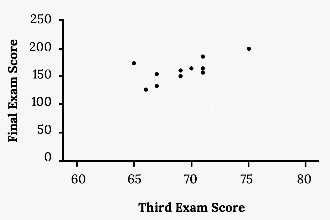
Find the correlation coefficient:
Your turn!
Match the following scatter plots with their description of correlation coefficient
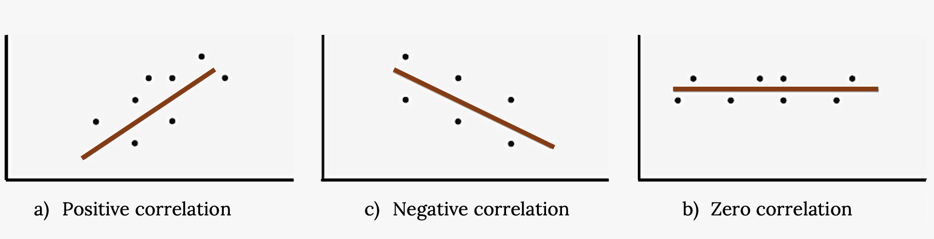
- –1 < r < 0
- r = 0
- 0 < r < 1
The Coefficient of Determination, r2
The coefficient of determination, r2 , is (obviously) the square of the correlation coefficient, but is usually stated as a percent, rather than in decimal form. It has an interpretation in the context of the data:
 , when expressed as a percent, represents the percent of variation in the dependent (predicted) variable y that can be explained by variation in the independent (explanatory) variable x using the regression (best-fit) line.
- 1 – , when expressed as a percentage, represents the percent of variation in y that is NOT explained by variation in x using the regression line. This can be seen as the scattering of the observed data points about the regression line.
Example
Recall our previous example using a student’s third exam scores to predict their final exam scores:
We found the correlation coefficient is r = 0.6631.
Find the coefficient of determination:
Interpret of r2 in the context of this example:
Image References
Figure 9.8: Kindred Grey via Virginia Tech (2020). “Figure 9.8” CC BY-SA 4.0. Retrieved from https://commons.wikimedia.org/wiki/File:Figure_9.8.png . Adaptation of Figure 12.9 from OpenStax Introductory Statistics (2013) (CC BY 4.0). Retrieved from https://openstax.org/books/introductory-statistics/pages/12-3-the-regression-equation
Figure 9.9: Kindred Grey via Virginia Tech (2020). “Figure 9.9” CC BY-SA 4.0. Retrieved from https://commons.wikimedia.org/wiki/File:Figure_9.9.png . Adaptation of Figure 12.13 from OpenStax Introductory Statistics (2013) (CC BY 4.0). Retrieved from https://openstax.org/books/introductory-statistics/pages/12-3-the-regression-equation
A numerical measure that provides a measure of strength and direction of the linear association between the independent variable x and the dependent variable y
