9.4 Cautions about Regression
While regression is a very useful and powerful tool, it is also commonly misused. The main things we need to keep in mind when interpreting our results are:
- Linearity assumption
- Association And/Or correlation do not mean Causation
- Extrapolation
- Outliers and influential points
Linearity
Remember, it is always important to plot a scatter diagram first. If the scatter plot indicates that there is a linear relationship between the variables, then it is reasonable to use the methods we are discussing.
Correlation Does Not Imply Causation
Even when we do have an apparent linear relationship and find a reasonable value of r, there can always be confounding or lurking variables at work. Be wary of spurious correlations and make sure the connection you are making makes sense!
There are also often situations where it may not be clear which variable is causing which. Does lack of sleep lead to higher stress levels or does high stress levels lead to lack of sleep? Which came first, the chicken or the egg? Sometimes these may not be answerable, but at least we are able to show an association there.
Extrapolation
Remember, it is always important to plot a scatter diagram first. If the scatter plot indicates that there is a linear relationship between the variables, then it is reasonable to use a best fit line to make predictions for y given x within the domain of x-values in the sample data, but not necessarily for x-values outside that domain. The process of predicting inside of the observed x values observed in the data is called interpolation. The process of predicting outside of the observed x values observed in the data is called extrapolation.
Recall our example from the previous section. You could use the line to predict the final exam score for a student who earned a grade of 73 on the third exam. You should NOT use the line to predict the final exam score for a student who earned a grade of 50 on the third exam, because 50 is not within the domain of the x-values in the sample data, which are between 65 and 75.
To understand really how unreliable the prediction can be outside of the observed x values observed in the data, make the substitution x = 90 into the equation.

The final-exam score is predicted to be 261.19. The largest a final-exam score could be is 100.
Outliers and Influential Points
In some data sets, there are values (observed data points) that may appear to be outliers x or y. Outliers are points that seem to stick out from the rest of the group in a single variable. Besides outliers, a sample may contain one or a few points that are called influential points. Influential points are observed data points that do not follow the trend of the rest of the data. These points may have a big effect on the calculation of the slope of the regression line. To begin to identify an influential point, you can remove it from the data set and see if the slope of the regression line is changed significantly.
How do we handle these unusual points? Sometimes they should not be included in the analysis of the data. It is possible that an outlier or influential point is a result of erroneous data. Other times it may hold valuable information about the population under study and should remain included in the data. The key is to examine carefully what causes a data point to be an outlier and/or influential point.
Identifying Outliers and/or Influential Points
Computers and many calculators can be used to identify outliers from the data. Computer output for regression analysis will often identify both outliers and influential points so that you can examine them.
We know how to find outliers in a single variable using fence rules and boxplots. However, we would like some guideline as to how far away a point needs to be in order to be considered an influential point. They also have large “errors”, where the “error” or residual is the vertical distance from the line to the point. As a rough rule of thumb, we can flag any point that is located further than two standard deviations above or below the best-fit line as an outlier. The standard deviation used is the standard deviation of the residuals or errors.
We can do this visually in the scatter plot by drawing an extra pair of lines that are two standard deviations above and below the best-fit line. Any data points that are outside this extra pair of lines are flagged as potential outliers. Or we can do this numerically by calculating each residual and comparing it to twice the standard deviation. The graphical procedure is shown in the example below, followed by the numerical calculations in the next example. You would generally need to use only one of these methods.
Example
Continuing with the example from the previous section, you can determine if there is an outlier or not. If there is an outlier, as an exercise, delete it and fit the remaining data to a new line. For this example, the new line ought to fit the remaining data better. This means the SSE should be smaller and the correlation coefficient ought to be closer to 1 or –1.
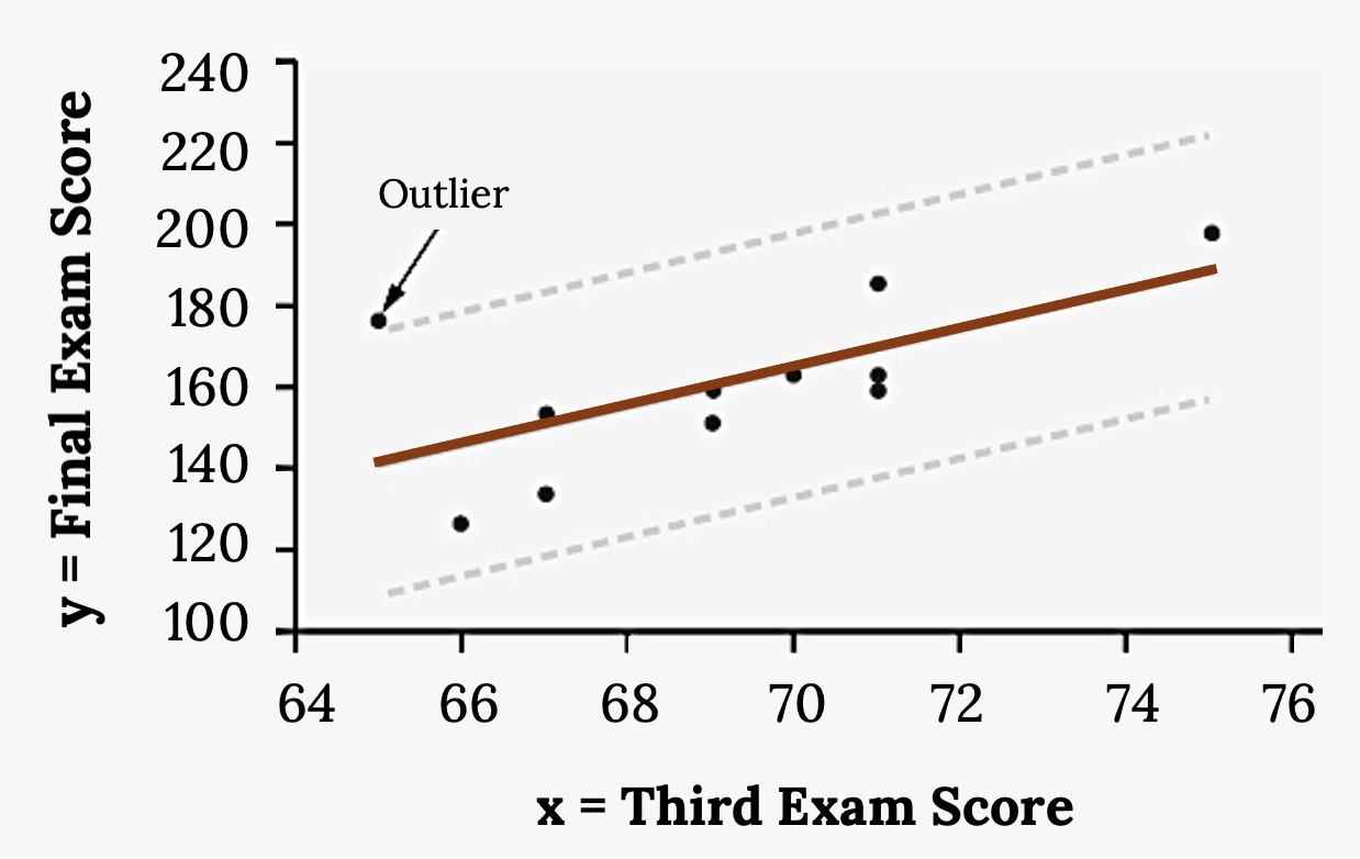
Here it is easy to identify the outliers graphically and visually. If we were to measure the vertical distance from any data point to the corresponding point on the line of best fit and that distance were equal to 2s or more, then we would consider the data point to be “too far” from the line of best fit. We need to find and graph the lines that are two standard deviations below and above the regression line. Any points that are outside these two lines are outliers. We will call these lines Y2 and Y3:
- ŷ = –173.5 + 4.83x is the line of best fit.
- Let Y2 = –173.5 + 4.83x –2(16.4)
- Let Y3 = –173.5 + 4.83x + 2(16.4)
Notice Y2 and Y3 have the same slope as the line of best fit.
If we graph the scatterplot with the best fit line in equation Y1, and the two extra lines as Y2 and Y3, you will find that the only data point that is not between lines Y2 and Y3 is the point x = 65, y = 175. The outlier is the student who had a grade of 65 on the third exam and 175 on the final exam; this point is further than two standard deviations away from the best-fit line.
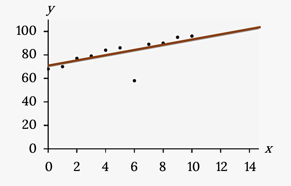
Your turn!
Identify the potential outlier in the scatter plot by drawing two separate lines. Suppose the standard deviation of the residuals or errors (s) is approximately s=8.6.
Residuals
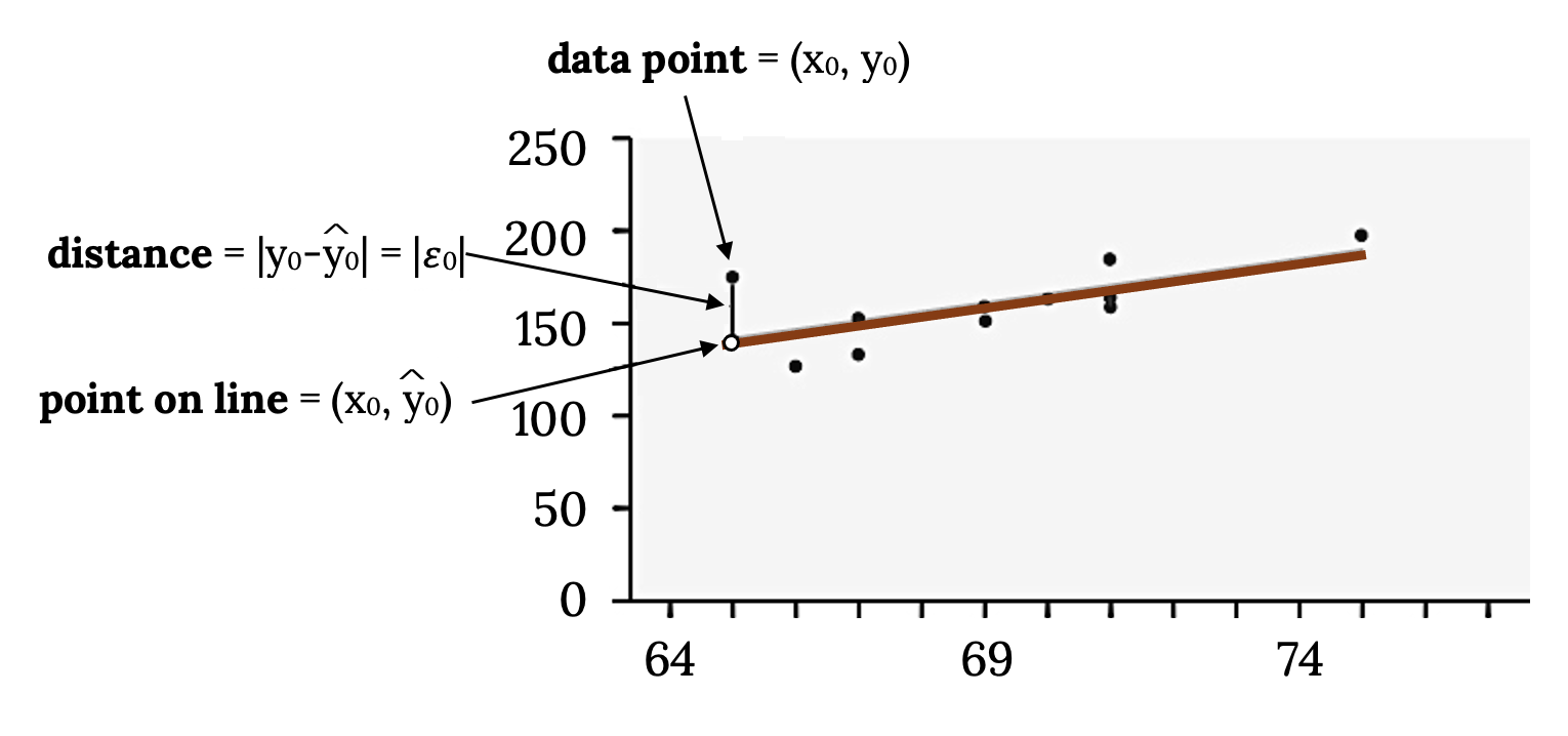
In the process of numerically identifying outliers and influential points, one of the most important tools we have is called the residual. It is found by y0 – ŷ0 = ε0 (ε = the Greek letter epsilon) and is called the “error”. It is not an error in the sense of a mistake. The absolute value of a residual measures the vertical distance between the actual value of y and the estimated value of y. In other words, it measures the vertical distance between the actual data point and the predicted point on the line.
If the observed data point lies above the line, the residual is positive, and the line underestimates the actual data value for y. If the observed data point lies below the line, the residual is negative, and the line overestimates that actual data value for y.
In the diagram below, y0 – ŷ0 = ε0 is the residual for the point shown. Here the point lies above the line and the residual is positive.
Points that fall far from the line are points of high leverage; these points can strongly influence the slope of the least squares line. If one of these high leverage points does appear
to actually invoke its influence on the slope of the line then we call it an influential point. Usually we can say a point is influential if, had we fitted the line without it, the influential point would have been unusually far from the least squares line. Let’s see how to do this mathematically:
Example
For each data point, you can calculate the residuals or errors, yi – ŷi = εi for i = 1, 2, 3, …, 11. Each |ε| is a vertical distance. In the following table, the first two columns are the third-exam and final-exam data. The third column shows the predicted ŷ values calculated from the line of best fit: ŷ = –173.5 + 4.83x. The residuals, or errors, have been calculated in the fourth column of the table: observed y value−predicted y value = y − ŷ.
| x | y | ŷ | y – ŷ |
|---|---|---|---|
| 65 | 175 | 140 | 175 – 140 = 35 |
| 67 | 133 | 150 | 133 – 150= –17 |
| 71 | 185 | 169 | 185 – 169 = 16 |
| 71 | 163 | 169 | 163 – 169 = –6 |
| 66 | 126 | 145 | 126 – 145 = –19 |
| 75 | 198 | 189 | 198 – 189 = 9 |
| 67 | 153 | 150 | 153 – 150 = 3 |
| 70 | 163 | 164 | 163 – 164 = –1 |
| 71 | 159 | 169 | 159 – 169 = –10 |
| 69 | 151 | 160 | 151 – 160 = –9 |
| 69 | 159 | 160 | 159 – 160 = –1 |
For this example, there are 11 ε values. If you square each ε and add, you get:

This is called the Sum of Squared Errors (SSE).
The squares are 352172162621929232121029212
Then, add (sum) all the |y – ŷ| squared terms using the formula
 (Recall that yi – ŷi = εi.)
= 352 + 172 + 162 + 62 + 192 + 92 + 32 + 12 + 102 + 92 + 12
= 2440 = SSE. The result, SSE is the Sum of Squared Errors.
s is the standard deviation of all the y − ŷ = ε values where n = the total number of data points. If each residual is calculated and squared, and the results are added, we get the SSE. The standard deviation of the residuals is calculated from the SSE as:

For our example:
 .
.
Note: Rather than calculate these ourselves, we can find s using the computer or calculator.
More on Influential Points
If we were to measure the vertical distance from any data point to the corresponding point on the line of best fit and that distance is at least 2s, then we would consider the data point to be “too far” from the line of best fit. We call that point a potential influential point.
Back to our example, multiply s by 2:
(2)(16.47) = 32.94
32.94 is 2 standard deviations away from the mean of the y – ŷ values.
So for this example, if any of the |y – ŷ| values are at least 32.94, the corresponding (x, y) data point is a potential outlier.
We are looking for all data points for which the residual is greater than 2s = 2(16.4) = 32.8 or less than –32.8. Compare these values to the residuals in column four of the table. It appears all the |y – ŷ|’s are less than 31.29 except for the first one which is 35.
35 > 31.29 That is, |y – ŷ| ≥ (2)(s)
The only such data point is the student who had a grade of 65 on the third exam and 175 on the final exam; the residual for this student is 35.
How does the outlier affect the best fit line? Numerically and graphically, we have identified the point (65, 175) as an outlier. We should re-examine the data for this point to see if there are any problems with the data. If there is an error, we should fix the error if possible, or delete the data. If the data is correct, we would leave it in the data set. For this problem, we will suppose that we examined the data and found that this outlier data was an error. Therefore we will continue on and delete the outlier, so that we can explore how it affects the results, as a learning experience.
The next step is to compute a new best-fit line using the ten remaining points. The new line of best fit and the correlation coefficient are:
ŷ = –355.19 + 7.39x and r = 0.9121
The new line with r = 0.9121 is a stronger correlation than the original (r = 0.6631) because r = 0.9121 is closer to one. This means that the new line is a better fit to the ten remaining data values. The line can better predict the final exam score given the third exam score. The point we deleted appeared to be an influential point
It is often tempting to remove outliers and influential points. Don’t do this without a very good reason. Models that ignore exceptional (and interesting) cases often perform poorly. For instance, if a financial firm ignored the largest market swings – the “outliers” – they would soon go bankrupt by making poorly thought-out investments.
When outliers are deleted, the researcher should either record that data was deleted, and why, or the researcher should provide results both with and without the deleted data. If data is erroneous and the correct values are known (e.g., student one actually scored a 70 instead of a 65), then this correction can be made to the data.
Using this new line of best fit (based on the remaining ten data points in the “exam example” used in previous sections, what would a student who receives a 73 on the third exam expect to receive on the final exam? Is this the same as the prediction made using the original line?
- Using the new line of best fit, ŷ = –355.19 + 7.39(73) = 184.28. A student who scored 73 points on the third exam would expect to earn 184 points on the final exam.
- The original line predicted ŷ = –173.51 + 4.83(73) = 179.08 so the prediction using the new line with the outlier eliminated differs from the original prediction.
Your turn!
The Consumer Price Index (CPI) measures the average change over time in the prices paid by urban consumers for consumer goods and services. The CPI affects nearly all Americans because of the many ways it is used. One of its biggest uses is as a measure of inflation. By providing information about price changes in the Nation’s economy to government, business, and labor, the CPI helps them to make economic decisions. The President, Congress, and the Federal Reserve Board use the CPI’s trends to formulate monetary and fiscal policies. In the following table, x is the year and y is the CPI.
| x | y | x | y |
|---|---|---|---|
| 1915 | 10.1 | 1969 | 36.7 |
| 1926 | 17.7 | 1975 | 49.3 |
| 1935 | 13.7 | 1979 | 72.6 |
| 1940 | 14.7 | 1980 | 82.4 |
| 1947 | 24.1 | 1986 | 109.6 |
| 1952 | 26.5 | 1991 | 130.7 |
| 1964 | 31.0 | 1999 | 166.6 |
- Draw a scatterplot of the data.
- Calculate the least squares line. Write the equation in the form ŷ = a + bx.
- Draw the line on the scatterplot.
- Find the correlation coefficient.
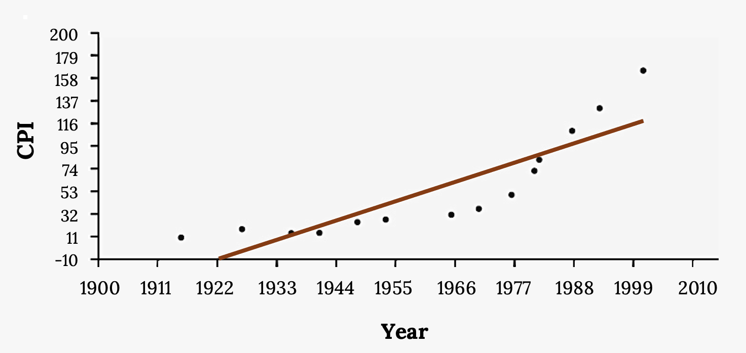
- What is the average CPI for the year 1990?
- Comment on the appropriateness of this linear model. Do there appear to be any outliers or influential points?
Image References
Figure 9.12: Kindred Grey via Virginia Tech (2020). “Figure 9.12” CC BY-SA 4.0. Retrieved from https://commons.wikimedia.org/wiki/File:Figure_9.12.png . Adaptation of Figure 12.18 from OpenStax Introductory Statistics (2013) (CC BY 4.0). Retrieved from https://openstax.org/books/introductory-statistics/pages/12-6-outliers
Figure 9.13: Kindred Grey via Virginia Tech (2020). “Figure 9.13” CC BY-SA 4.0. Retrieved from https://commons.wikimedia.org/wiki/File:Figure_9.13.png . Adaptation of Figure 12.19 from OpenStax Introductory Statistics (2013) (CC BY 4.0). Retrieved from https://openstax.org/books/introductory-statistics/pages/12-6-outliers
Figure 9.14: Kindred Grey via Virginia Tech (2020). “Figure 9.14” CC BY-SA 4.0. Retrieved from https://commons.wikimedia.org/wiki/File:Figure_9.14.png . Adaptation of Figure 12.10 from OpenStax Introductory Statistics (2013) (CC BY 4.0). Retrieved from https://openstax.org/books/introductory-statistics/pages/12-3-the-regression-equation
Figure 9.17: Kindred Grey via Virginia Tech (2020). “Figure 9.17” CC BY-SA 4.0. Retrieved from https://commons.wikimedia.org/wiki/File:Figure_9.17.png . Adaptation of Figure 12.20 from OpenStax Introductory Statistics (2013) (CC BY 4.0). Retrieved from https://openstax.org/books/introductory-statistics/pages/12-6-outliers
The process of predicting outside of the observed x values
An observation that stands out from the rest of the data significantly
Observed data points that do not follow the trend of the rest of the data and have a large influence on the calculation of the regression line
A residual measures the vertical distance between an observation and the predicted point on a regression line
