Chapter 2 Wrap Up
Concept Check
Section Reviews
2.1 Introduction to Descriptive Statistics and Frequency Tables
Descriptive statistics are ways of organizing summarizing and presenting data. There are two main types: visual and numerical. Usually we want to first examine a dataset visually then describe it numerically. Appropriate methods often depend on the type of data you are working with, however frequency tables are a quick easy way to organize any type of data.
2.2 Displaying and Describing Categorical Data
Two basic visual methods we have for displaying categorical statistics are:
- Pie charts
- Bar charts
When describing a categorical distribution we want to note:
- Mode
- Level of variability (diversity)
2.3 Displaying Quantitative Data
The following are common methods of displaying quantitative data
- Stem-and-leaf plots
- Dot plots
- Line graphs
- Histograms
- Frequency polygons
- Time series plots
Some work better to show certain aspects, or for different sample sizes than others.
2.4 Describing Quantitative Distributions
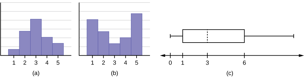
When describing a quantitative distribution we want to at least note 4 things: the shape of the distribution, the presence of outliers, the center, and the spread. A helpful acronym to remember this is SOCS:
- Shape – Can be identified visually, want to note symmetry or lack thereof (skewness) and modality
- Outliers – Extreme outliers can be seen visually
- Center – Central tendency can be estimated visually
- Spread – Dispersion can be estimated visually and roughly quantified with the range
2.5 Measures of Location and Outliers
The values that divide a rank-ordered set of data into 100 equal parts are called percentiles. Percentiles are used to compare and interpret data. For example, an observation at the 50th percentile would be greater than 50 percent of the other observations in the set.

Where:
- i = the ranking or position of a data value,
- k = the kth percentile,
- n = total number of data.
Expression for finding the percentile of a data value:

Where:
- x = the number of values counting from the bottom of the data list up to but not including the data value for which you want to find the percentile,
- y = the number of data values equal to the data value for which you want to find the percentile,
- n = total number of data
Quartiles divide data into quarters. The first quartile (Q1) is the 25th percentile, the second quartile (Q2 or median) is 50th percentile, and the third quartile (Q3) is the the 75th percentile.
The interquartile range, or IQR, is the range of the middle 50 percent of the data values. The IQR is found by subtracting Q1 from Q3, and can help determine outliers by using the following fence rules.
- Upper fence = Q3 + IQR(1.5)
- Upper fence =Q1 – IQR(1.5)
Box plots are a type of graph that can help visually organize data. To graph a box plot the following data points must be calculated: the minimum value, the first quartile, the median, the third quartile, and the maximum value. Once the box plot is graphed, you can display and compare distributions of data.
2.6 Measures of Center
The mean and the median can be calculated to help you find the “center” of a data set. The mean may often be the best representation of the center of a dataset, but the median is often more appropriate when a data set contains several outliers or extreme values. The mode will tell you the most frequently occurring datum (or data) in your data set.
The mean of a dataset can can be approximated from a frequency table by:

Where:
- f = interval frequencies
- m = interval midpoints.
2.7 Measures of Spread
The variance and standard deviation are numerical measures of the spread or dispersion of a dataset. There are different equations to use if you are calculating the standard deviation of a sample or of a population. You find the sample and population standard deviations, respectively:
- s =

- σ =

To find the standard deviation of a frequency table:
 where
where 
Z-scores are a measure of location that puts an observation in units of standard deviations relative to the mean. We can use these to compare things from different distributions.
Key Terms
Try to define the terms below on your own. Scroll over any term to check your response!
2.1 Introduction
- Descriptive statistics
- Graphical descriptive methods
- Numerical descriptive methods
- Distribution
- Frequency
- Relative frequency
- Cumulative relative frequency
- Lower class limit
- Upper class limit
- Class width
- Class midpoint
2.2 Displaying and Describing Categorical Data
2.3 Displaying Quantitative Data
2.4 Describing Quantitative Distributions
2.5 Measures of Location and Outliers
2.6 Measures of Center
2.7 Measures of Spread
- Variation (variability, spread)
- Standard deviation
- Sample
- Population
- Variance
- Population
- Sample
- Z-score
Extra Practice
2.1 Introduction
- The two types of descriptive statistical methods are:
Answer:
- Graphical
- Numerical
2.2 Displaying and Describing Categorical Data
- The two basic options for graphing categorical data are
Answer:
- Graphical
- Numerical
2. When describing categorical data we want to note:
Answer:
- Mode
- Level of variability
2. When describing the level of variability in categorical data we want to think about it as:
Answer:
- Diversity
2.3 Displaying Quantitative Data
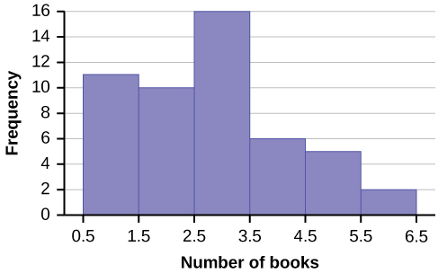
1. Create a histogram for the following data: the number of books bought by 50 part-time college students at ABC College. The number of books is discrete data, since books are counted.
1, 1, 1, 1, 1, 1, 1, 1, 1, 1, 1
2, 2, 2, 2, 2, 2, 2, 2, 2, 2
3, 3, 3, 3, 3, 3, 3, 3, 3, 3, 3, 3, 3, 3, 3, 3
4, 4, 4, 4, 4, 4
5, 5, 5, 5, 5
6, 6
Eleven students buy one book. Ten students buy two books. Sixteen students buy three books. Six students buy four books. Five students buy five books. Two students buy six books.
Because the data are integers, subtract 0.5 from 1, the smallest data value and add 0.5 to 6, the largest data value. Then the starting point is 0.5 and the ending value is 6.5.
Next, calculate the width of each bar or class interval. If the data are discrete and there are not too many different values, a width that places the data values in the middle of the bar or class interval is the most convenient.
Calculate the number of bars as follows:  = 1.
= 1.
where 1 is the width of a bar. Therefore, bars = 6.
The following histogram displays the number of books on the x-axis and the frequency on the y-axis.
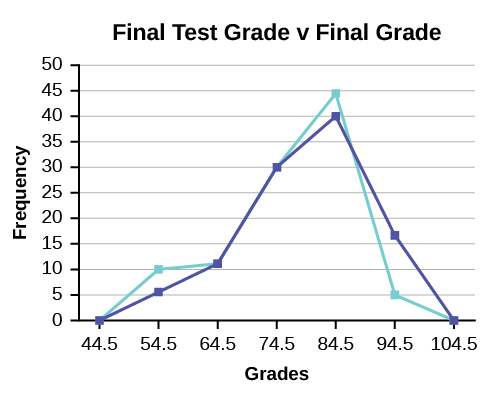
2. We will construct an overlay frequency polygon comparing the scores from the figure below with the students’ final numeric grade.
| Lower Bound | Upper Bound | Frequency | Cumulative Frequency |
|---|---|---|---|
| 49.5 | 59.5 | 5 | 5 |
| 59.5 | 69.5 | 10 | 15 |
| 69.5 | 79.5 | 30 | 45 |
| 79.5 | 89.5 | 40 | 85 |
| 89.5 | 99.5 | 15 | 100 |
| Lower Bound | Upper Bound | Frequency | Cumulative Frequency |
|---|---|---|---|
| 49.5 | 59.5 | 10 | 10 |
| 59.5 | 69.5 | 10 | 20 |
| 69.5 | 79.5 | 30 | 50 |
| 79.5 | 89.5 | 45 | 95 |
| 89.5 | 99.5 | 5 | 100 |
3. Construct a frequency polygon of U.S. Presidents’ ages at inauguration shown in the figure below.[1]
| Age at Inauguration | Frequency |
|---|---|
| 41.5–46.5 | 4 |
| 46.5–51.5 | 11 |
| 51.5–56.5 | 14 |
| 56.5–61.5 | 9 |
| 61.5–66.5 | 4 |
| 66.5–71.5 | 3 |
4. Construct a frequency polygon for the following:
-
Figure 2.60 Pulse Rates for Women Frequency 60–69 12 70–79 14 80–89 11 90–99 1 100–109 1 110–119 0 120–129 1 -
Figure 2.61 Actual Speed in a 30 MPH Zone Frequency 42–45 25 46–49 14 50–53 7 54–57 3 58–61 1 -
Figure 2.62 Tar (mg) in Non-filtered Cigarettes Frequency 10–13 1 14–17 0 18–21 15 22–25 7 26–29 2
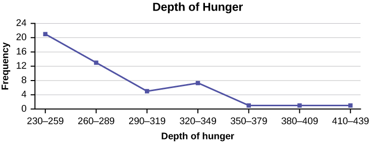
5. Construct a frequency polygon from the frequency distribution for the 50 highest ranked countries for depth of hunger. [2]
| Depth of Hunger | Frequency |
|---|---|
| 230–259 | 21 |
| 260–289 | 13 |
| 290–319 | 5 |
| 320–349 | 7 |
| 350–379 | 1 |
| 380–409 | 1 |
| 410–439 | 1 |
6. Use the two frequency tables to compare the life expectancy of men and women from 20 randomly selected countries. Include an overlaid frequency polygon and discuss the shapes of the distributions, the center, the spread, and any outliers. What can we conclude about the life expectancy of women compared to men?[3]
| Life Expectancy at Birth – Women | Frequency |
|---|---|
| 49–55 | 3 |
| 56–62 | 3 |
| 63–69 | 1 |
| 70–76 | 3 |
| 77–83 | 8 |
| 84–90 | 2 |
| Life Expectancy at Birth – Men | Frequency |
|---|---|
| 49–55 | 3 |
| 56–62 | 3 |
| 63–69 | 1 |
| 70–76 | 1 |
| 77–83 | 7 |
| 84–90 | 5 |
7. The following table is a portion of a data set from www.worldbank.org. Use the table to construct a time series graph for CO2 emissions for the United States.[4]
| Ukraine | United Kingdom | United States | |
|---|---|---|---|
| 2003 | 352,259 | 540,640 | 5,681,664 |
| 2004 | 343,121 | 540,409 | 5,790,761 |
| 2005 | 339,029 | 541,990 | 5,826,394 |
| 2006 | 327,797 | 542,045 | 5,737,615 |
| 2007 | 328,357 | 528,631 | 5,828,697 |
| 2008 | 323,657 | 522,247 | 5,656,839 |
| 2009 | 272,176 | 474,579 | 5,299,563 |
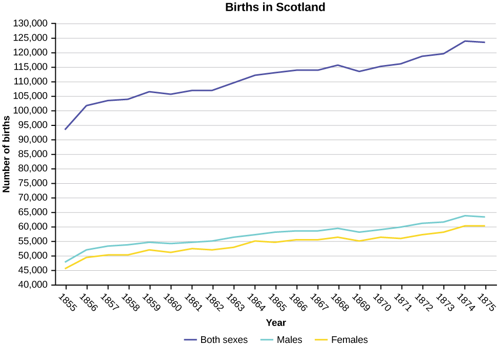
8. Construct a times series graph for (a) the number of male births, (b) the number of female births, and (c) the total number of births.[5]
| Female | Male | Total | |
| 1855 | 45,545 | 47,804 | 93,349 |
| 1856 | 49,582 | 52,239 | 101,821 |
| 1857 | 50,257 | 53,158 | 103,415 |
| 1858 | 50,324 | 53,694 | 104,018 |
| 1859 | 51,915 | 54,628 | 106,543 |
| 1860 | 51,220 | 54,409 | 105,629 |
| 1861 | 52,403 | 54,606 | 107,009 |
| 1862 | 51,812 | 55,257 | 107,069 |
| 1863 | 53,115 | 56,226 | 109,341 |
| 1864 | 54,959 | 57,374 | 112,333 |
| 1865 | 54,850 | 58,220 | 113,070 |
| 1866 | 55,307 | 58,360 | 113,667 |
| 1867 | 55,527 | 58,517 | 114,044 |
| 1868 | 56,292 | 59,222 | 115,514 |
| 1869 | 55,033 | 58,321 | 113,354 |
| 1870 | 56,431 | 58,959 | 115,390 |
| 1871 | 56,099 | 60,029 | 116,128 |
| 1872 | 57,472 | 61,293 | 118,765 |
| 1873 | 58,233 | 61,467 | 119,700 |
| 1874 | 60,109 | 63,602 | 123,711 |
| 1875 | 60,146 | 63,432 | 123,578 |
9. The following data sets list full time police per 100,000 citizens along with homicides per 100,000 citizens for the city of Detroit, Michigan during the period from 1961 to 1973.[6]
| Police | Homicides | |
| 1961 | 260.35 | 8.6 |
| 1962 | 269.8 | 8.9 |
| 1963 | 272.04 | 8.52 |
| 1964 | 272.96 | 8.89 |
| 1965 | 272.51 | 13.07 |
| 1966 | 261.34 | 14.57 |
| 1967 | 268.89 | 21.36 |
| 1968 | 295.99 | 28.03 |
| 1969 | 319.87 | 31.49 |
| 1970 | 341.43 | 37.39 |
| 1971 | 356.59 | 46.26 |
| 1972 | 376.69 | 47.24 |
| 1973 | 390.19 | 52.33 |
- Construct a double time series graph using a common x-axis for both sets of data.
- Which variable increased the fastest? Explain.
- Did Detroit’s increase in police officers have an impact on the murder rate? Explain.
2.4 Describing Quantitative Distributions
2.5 Measures of Location and Outliers
1. Test scores for a college statistics class held during the day are: 99, 56, 78, 55.5, 32, 90, 80, 81, 56, 59, 45, 77, 84.5, 84, 70, 72, 68, 32, 79, 90. Test scores for a college statistics class held during the evening are: 98, 78, 68, 83, 81, 89, 88, 76, 65, 45, 98, 90, 80, 84.5, 85, 79, 78, 98, 90, 79, 81, 25.5. [7]
- Find the smallest and largest values, the median, and the first and third quartile for the day class.
- Find the smallest and largest values, the median, and the first and third quartile for the night class.
- For each data set, what percentage of the data is between the smallest value and the first quartile? the first quartile and the median? the median and the third quartile? the third quartile and the largest value? What percentage of the data is between the first quartile and the largest value?
- Create a box plot for each set of data. Use one number line for both box plots.
- Which box plot has the widest spread for the middle 50% of the data (the data between the first and third quartiles)? What does this mean for that set of data in comparison to the other set of data?
Solutions:
-
- Min = 32
- Q1 = 56
- M = 74.5
- Q3 = 82.5
- Max = 99
- Min = 25.5
- Q1 = 78
- M = 81
- Q3 = 89
- Max = 98
- Day class: There are six data values ranging from 32 to 56: 30%. There are six data values ranging from 56 to 74.5: 30%. There are five data values ranging from 74.5 to 82.5: 25%. There are five data values ranging from 82.5 to 99: 25%. There are 16 data values between the first quartile, 56, and the largest value, 99: 75%. Night class:
-
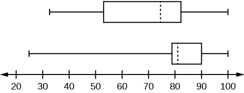
Figure 2.70 - The first data set has the wider spread for the middle 50% of the data. The IQR for the first data set is greater than the IQR for the second set. This means that there is more variability in the middle 50% of the first data set.
2. The following data set shows the heights in inches for the boys in a class of 40 students: 66, 66, 67, 67, 68, 68, 68, 68, 68, 69, 69, 69, 70, 71, 72, 72, 72, 73, 73, 74. The following data set shows the heights in inches for the girls in a class of 40 students: 61, 61, 62, 62, 63, 63, 63, 65, 65, 65, 66, 66, 66, 67, 68, 68, 68, 69, 69, 69. Construct a box plot using a graphing calculator for each data set, and state which box plot has the wider spread for the middle 50% of the data.
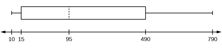
3. Graph a box-and-whisker plot for the data values shown.
10, 10, 10, 15, 35, 75, 90, 95, 100, 175, 420, 490, 515, 515, 790
The five numbers used to create a box-and-whisker plot are:
- Min: 10
- Q1: 15
- Med: 95
- Q3: 490
- Max: 790
Solution: The following graph shows the box-and-whisker plot.
4. Graph a box-and-whisker plot for the data values shown.
0, 5, 5, 15, 30, 30, 45, 50, 50, 60, 75, 110, 140, 240, 330
5. Sixty-five randomly selected car salespersons were asked the number of cars they generally sell in one week. Fourteen people answered that they generally sell three cars, nineteen generally sell four cars, twelve generally sell five cars, nine generally sell six cars, and eleven generally sell seven cars.
a. Construct a box plot below. Use a ruler to measure and scale accurately.
b. Looking at your box plot, does it appear that the data are concentrated together, spread out evenly, or concentrated in some areas, but not in others? How can you tell?
Solution: More than 25% of salespersons sell four cars in a typical week. You can see this concentration in the box plot because the first quartile is equal to the median. The top 25% and the bottom 25% are spread out evenly; the whiskers have the same length.
6. In a survey of 20-year-olds in China, Germany, and the United States, people were asked the number of foreign countries they had visited in their lifetime. The following box plots display the results.
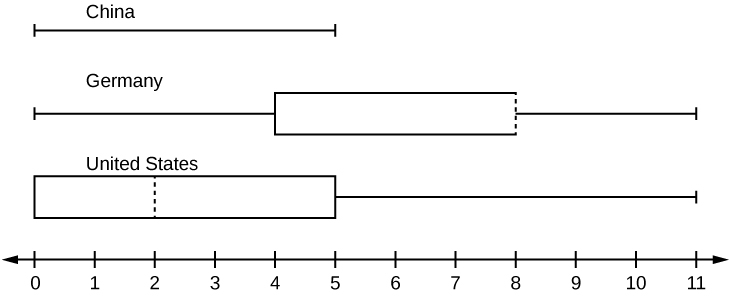
- In complete sentences, describe what the shape of each box plot implies about the distribution of the data collected.
- Have more Americans or more Germans surveyed been to over eight foreign countries?
- Compare the three box plots. What do they imply about the foreign travel of 20-year-old residents of the three countries when compared to each other?
7. Given the following box plot, answer the questions.
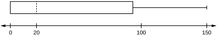
- Think of an example (in words) where the data might fit into the above box plot. In 2–5 sentences, write down the example.
- What does it mean to have the first and second quartiles so close together, while the second to third quartiles are far apart?
- Answers will vary. Possible answer: State University conducted a survey to see how involved its students are in community service. The box plot shows the number of community service hours logged by participants over the past year.
- Because the first and second quartiles are close, the data in this quarter is very similar. There is not much variation in the values. The data in the third quarter is much more variable, or spread out. This is clear because the second quartile is so far away from the third quartile.
8. Given the following box plots, answer the questions.
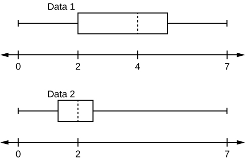
- In complete sentences, explain why each statement is false.
- Data 1 has more data values above two than Data 2 has above two.
- The data sets cannot have the same mode.
- For Data 1, there are more data values below four than there are above four.
- For which group, Data 1 or Data 2, is the value of “7” more likely to be an outlier? Explain why in complete sentences.
9. A survey was conducted of 130 purchasers of new BMW 3 series cars, 130 purchasers of new BMW 5 series cars, and 130 purchasers of new BMW 7 series cars. In it, people were asked the age they were when they purchased their car. The following box plots display the results.
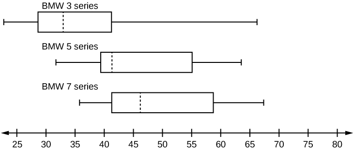
- In complete sentences, describe what the shape of each box plot implies about the distribution of the data collected for that car series.
- Which group is most likely to have an outlier? Explain how you determined that.
- Compare the three box plots. What do they imply about the age of purchasing a BMW from the series when compared to each other?
- Look at the BMW 5 series. Which quarter has the smallest spread of data? What is the spread?
- Look at the BMW 5 series. Which quarter has the largest spread of data? What is the spread?
- Look at the BMW 5 series. Estimate the interquartile range (IQR).
- Look at the BMW 5 series. Are there more data in the interval 31 to 38 or in the interval 45 to 55? How do you know this?
- Look at the BMW 5 series. Which interval has the fewest data in it? How do you know this?
- 31–35
- 38–41
- 41–64
- Each box plot is spread out more in the greater values. Each plot is skewed to the right, so the ages of the top 50% of buyers are more variable than the ages of the lower 50%.
- The BMW 3 series is most likely to have an outlier. It has the longest whisker.
- Comparing the median ages, younger people tend to buy the BMW 3 series, while older people tend to buy the BMW 7 series. However, this is not a rule, because there is so much variability in each data set.
- The second quarter has the smallest spread. There seems to be only a three-year difference between the first quartile and the median.
- The third quarter has the largest spread. There seems to be approximately a 14-year difference between the median and the third quartile.
- IQR ~ 17 years
- There is not enough information to tell. Each interval lies within a quarter, so we cannot tell exactly where the data in that quarter is concentrated.
- The interval from 31 to 35 years has the fewest data values. Twenty-five percent of the values fall in the interval 38 to 41, and 25% fall between 41 and 64. Since 25% of values fall between 31 and 38, we know that fewer than 25% fall between 31 and 35.
10. Twenty-five randomly selected students were asked the number of movies they watched the previous week. The results are as follows:
| # of movies | Frequency |
|---|---|
| 0 | 5 |
| 1 | 9 |
| 2 | 6 |
| 3 | 4 |
| 4 | 1 |
Construct a box plot of the data.
11. Santa Clara County, CA, has approximately 27,873 Japanese-Americans. Their ages are as follows:
| Age Group | Percent of Community |
|---|---|
| 0–17 | 18.9 |
| 18–24 | 8.0 |
| 25–34 | 22.8 |
| 35–44 | 15.0 |
| 45–54 | 13.1 |
| 55–64 | 11.9 |
| 65+ | 10.3 |
- Construct a histogram of the Japanese-American community in Santa Clara County, CA. The bars will not be the same width for this example. Why not? What impact does this have on the reliability of the graph?
- What percentage of the community is under age 35?
- Which box plot most resembles the information above?
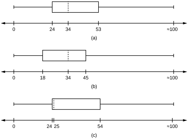
- For graph, check student’s solution.
- 49.7% of the community is under the age of 35.
- Based on the information in the table, graph (a) most closely represents the data
12. For the following 13 real estate prices, calculate the IQR and determine if any prices are potential outliers. Prices are in dollars.
Data: 389,950; 230,500; 158,000; 479,000; 639,000; 114,950; 5,500,000; 387,000; 659,000; 529,000; 575,000; 488,800; 1,095,000.
Solution:
Order the data from smallest to largest.
114,950; 158,000; 230,500; 387,000; 389,950; 479,000; 488,800; 529,000; 575,000; 639,000; 659,000; 1,095,000; 5,500,000
M = 488,800
Q1 =  = 308,750
Q3 =  = 649,000
IQR = 649,000 – 308,750 = 340,250
(1.5)(IQR) = (1.5)(340,250) = 510,375
LF = Q1 – (1.5)(IQR) = 308,750 – 510,375 = –201,625
UF = Q3 + (1.5)(IQR) = 649,000 + 510,375 = 1,159,375
No house price is less than –201,625. However, 5,500,000 is more than 1,159,375. Therefore, 5,500,000 is a potential outlier.
$33,000, $64,500, $28,000, $54,000, $72,000, $68,500, $69,000, $42,000, $54,000, $120,000, $40,500
14. For the two data sets in Example 1 (test scores), find the following:
- The interquartile range. Compare the two interquartile ranges.
- Any outliers in either set.
Solution:
The five number summary for the day and night classes is
| Minimum | Q1 | Median | Q3 | Maximum | |
|---|---|---|---|---|---|
| Day | 32 | 56 | 74.5 | 82.5 | 99 |
| Night | 25.5 | 78 | 81 | 89 | 98 |
- The IQR for the day group is Q3 – Q1 = 82.5 – 56 = 26.5
The IQR for the night group is Q3 – Q1 = 89 – 78 = 11
The interquartile range (the spread or variability) for the day class is larger than the night class IQR. This suggests more variation will be found in the day class’s class test scores.
- Day class outliers are found using the IQR times 1.5 rule. So,
- Q1 – IQR(1.5) = 56 – 26.5(1.5) = 16.25
- Q3 + IQR(1.5) = 82.5 + 26.5(1.5) = 122.25
Since the minimum and maximum values for the day class are greater than 16.25 and less than 122.25, there are no outliers.
Night class outliers are calculated as:
- Q1 – IQR (1.5) = 78 – 11(1.5) = 61.5
- Q3 + IQR(1.5) = 89 + 11(1.5) = 105.5
For this class, any test score less than 61.5 is an outlier. Therefore, the scores of 45 and 25.5 are outliers. Since no test score is greater than 105.5, there is no upper end outlier
15. Find the interquartile range for the following two data sets and compare them.
Test Scores for Class A:
69, 96, 81, 79, 65, 76, 83, 99, 89, 67, 90, 77, 85, 98, 66, 91, 77, 69, 80, 94
Test Scores for Class B:
90, 72, 80, 92, 90, 97, 92, 75, 79, 68, 70, 80, 99, 95, 78, 73, 71, 68, 95, 100
16. Fifty statistics students were asked how much sleep they get per school night (rounded to the nearest hour). The results were:
| AMOUNT OF SLEEP PER SCHOOL NIGHT (HOURS) | FREQUENCY | RELATIVE FREQUENCY | CUMULATIVE RELATIVE FREQUENCY |
|---|---|---|---|
| 4 | 2 | 0.04 | 0.04 |
| 5 | 5 | 0.10 | 0.14 |
| 6 | 7 | 0.14 | 0.28 |
| 7 | 12 | 0.24 | 0.52 |
| 8 | 14 | 0.28 | 0.80 |
| 9 | 7 | 0.14 | 0.94 |
| 10 | 3 | 0.06 | 1.00 |
a. Find the 28th percentile.
b. Find the median.
c. Find the third quartile.
Solution:
a. Notice the 0.28 in the “cumulative relative frequency” column. Twenty-eight percent of 50 data values is 14 values. There are 14 values less than the 28th percentile. They include the two 4s, the five 5s, and the seven 6s. The 28th percentile is between the last six and the first seven. The 28th percentile is 6.5.
b. Look again at the “cumulative relative frequency” column and find 0.52. The median is the 50th percentile or the second quartile. 50% of 50 is 25. There are 25 values less than the median. They include the two 4s, the five 5s, the seven 6s, and eleven of the 7s. The median or 50th percentile is between the 25th, or seven, and 26th, or seven, values. The median is seven.
c. The third quartile is the same as the 75th percentile. You can “eyeball” this answer. If you look at the “cumulative relative frequency” column, you find 0.52 and 0.80. When you have all the fours, fives, sixes and sevens, you have 52% of the data. When you include all the 8s, you have 80% of the data. The 75th percentile, then, must be an eight. Another way to look at the problem is to find 75% of 50, which is 37.5, and round up to 38. The third quartile, Q3, is the 38th value, which is an eight. You can check this answer by counting the values. (There are 37 values below the third quartile and 12 values above.
17. Forty bus drivers were asked how many hours they spend each day running their routes (rounded to the nearest hour). Find the 65th percentile.
| Amount of time spent on route (hours) | Frequency | Relative Frequency | Cumulative Relative Frequency |
|---|---|---|---|
| 2 | 12 | 0.30 | 0.30 |
| 3 | 14 | 0.35 | 0.65 |
| 4 | 10 | 0.25 | 0.90 |
| 5 | 4 | 0.10 | 1.00 |
18. Using the table below:
| AMOUNT OF SLEEP PER SCHOOL NIGHT (HOURS) | FREQUENCY | RELATIVE FREQUENCY | CUMULATIVE RELATIVE FREQUENCY |
|---|---|---|---|
| 4 | 2 | 0.04 | 0.04 |
| 5 | 5 | 0.10 | 0.14 |
| 6 | 7 | 0.14 | 0.28 |
| 7 | 12 | 0.24 | 0.52 |
| 8 | 14 | 0.28 | 0.80 |
| 9 | 7 | 0.14 | 0.94 |
| 10 | 3 | 0.06 | 1.00 |
- Find the 80th percentile.
- Find the 90th percentile.
- Find the first quartile. What is another name for the first quartile?
Solution: Using the data from the frequency table, we have:
- The 80th percentile is between the last eight and the first nine in the table (between the 40th and 41st values). Therefore, we need to take the mean of the 40th an 41st values. The 80th percentile =
 = 8.5
= 8.5 - The 90th percentile will be the 45th data value (location is 0.90(50) = 45) and the 45th data value is nine.
- Q1 is also the 25th percentile. The 25th percentile location calculation: P25 = 0.25(50) = 12.5 ≈ 13 the 13th data value. Thus, the 25th percentile is six
| Amount of time spent on route (hours) | Frequency | Relative Frequency | Cumulative Relative Frequency |
|---|---|---|---|
| 2 | 12 | 0.30 | 0.30 |
| 3 | 14 | 0.35 | 0.65 |
| 4 | 10 | 0.25 | 0.90 |
| 5 | 4 | 0.10 | 1.00 |
20. Listed are 29 ages for Academy Award winning best actors in order from smallest to largest.
18, 21, 22, 25, 26, 27, 29, 30, 31, 33, 36, 37, 41, 42, 47, 52, 55, 57, 58, 62, 64, 67, 69, 71, 72, 73, 74, 76, 77
- Find the 40th percentile.
- Find the 78th percentile.
Solution:
- The 40th percentile is 37 years.
- The 78th percentile is 70 years.
21. Listed are 32 ages for Academy Award winning best actors in order from smallest to largest.
18, 18, 21, 22, 25, 26, 27, 29, 30, 31, 31, 33, 36, 37, 37, 41, 42, 47, 52, 55, 57, 58, 62, 64, 67, 69, 71, 72, 73, 74, 76, 77
- Find the percentile of 37.
- Find the percentile of 72.
22. Jesse was ranked 37th in his graduating class of 180 students. At what percentile is Jesse’s ranking?
Solution: Jesse graduated 37th out of a class of 180 students. There are 180 – 37 = 143 students ranked below Jesse. There is one rank of 37.
x = 143 and y = 1.  (100) =
  (100) = 79.72. Jesse’s rank of 37 puts him at the 80th percentile.
23. For runners in a race, a low time means a faster run. The winners in a race have the shortest running times.
a. Is it more desirable to have a finish time with a high or a low percentile when running a race?
b. The 20th percentile of run times in a particular race is 5.2 minutes. Write a sentence interpreting the 20th percentile in the context of the situation.
c. A bicyclist in the 90th percentile of a bicycle race completed the race in 1 hour and 12 minutes. Is he among the fastest or slowest cyclists in the race? Write a sentence interpreting the 90th percentile in the context of the situation.
24. For runners in a race, a higher speed means a faster run.
a. Is it more desirable to have a speed with a high or a low percentile when running a race?
b. The 40th percentile of speeds in a particular race is 7.5 miles per hour. Write a sentence interpreting the 40th percentile in the context of the situation.
Solution:
a. For runners in a race it is more desirable to have a high percentile for speed. A high percentile means a higher speed which is faster.
b. 40% of runners ran at speeds of 7.5 miles per hour or less (slower). 60% of runners ran at speeds of 7.5 miles per hour or more (faster).
25. On an exam, would it be more desirable to earn a grade with a high or low percentile? Explain.
26. Mina is waiting in line at the Department of Motor Vehicles (DMV). Her wait time of 32 minutes is the 85th percentile of wait times. Is that good or bad? Write a sentence interpreting the 85th percentile in the context of this situation.
Solution: When waiting in line at the DMV, the 85th percentile would be a long wait time compared to the other people waiting. 85% of people had shorter wait times than Mina. In this context, Mina would prefer a wait time corresponding to a lower percentile. 85% of people at the DMV waited 32 minutes or less. 15% of people at the DMV waited 32 minutes or longer.
27. In a survey collecting data about the salaries earned by recent college graduates, Li found that her salary was in the 78th percentile. Should Li be pleased or upset by this result? Explain.
28. In a study collecting data about the repair costs of damage to automobiles in a certain type of crash tests, a certain model of car had $1,700 in damage and was in the 90th percentile. Should the manufacturer and the consumer be pleased or upset by this result? Explain and write a sentence that interprets the 90th percentile in the context of this problem.
Solution: The manufacturer and the consumer would be upset. This is a large repair cost for the damages, compared to the other cars in the sample. Interpretation: 90% of the crash tested cars had damage repair costs of $1700 or less; only 10% had damage repair costs of $1700 or more.
29. The University of California has two criteria used to set admission standards for freshman to be admitted to a college in the UC system:
- Students’ GPAs and scores on standardized tests (SATs and ACTs) are entered into a formula that calculates an “admissions index” score. The admissions index score is used to set eligibility standards intended to meet the goal of admitting the top 12% of high school students in the state. In this context, what percentile does the top 12% represent?
- Students whose GPAs are at or above the 96th percentile of all students at their high school are eligible (called eligible in the local context), even if they are not in the top 12% of all students in the state. What percentage of students from each high school are “eligible in the local context”?
30. Suppose that you are buying a house. You and your realtor have determined that the most expensive house you can afford is the 34th percentile. The 34th percentile of housing prices is $240,000 in the town you want to move to. In this town, can you afford 34% of the houses or 66% of the houses?
Solution: You can afford 34% of houses. 66% of the houses are too expensive for your budget. INTERPRETATION: 34% of houses cost $240,000 or less. 66% of houses cost $240,000 or more.
31. Sixty-five randomly selected car salespersons were asked the number of cars they generally sell in one week. Fourteen people answered that they generally sell three cars, nineteen generally sell four cars, twelve generally sell five cars, nine generally sell six cars, and eleven generally sell seven cars.
a. First quartile = _______
b. Second quartile = median = 50th percentile = _______
c. Third quartile = _______
d. Interquartile range (IQR) = _____ – _____ = _____
e. 10th percentile = _______
f. 70th percentile = _______
Solution:
b. 4
d. 6-4=2
f. 6
32. The median age for U.S. Black citizens currently is 30.9 years; for U.S. White citizens it is 42.3 years.
a. Based upon this information, give two reasons why the Black median age could be lower than the White median age.
b. Does the lower median age for Blacks necessarily mean that Blacks die younger than Whites? Why or why not?
c. How might it be possible for Blacks and Whites to die at approximately the same age, but for the median age for Whites to be higher?
33. Six hundred adult Americans were asked by telephone poll, “What do you think constitutes a middle-class income?” The results are in the figure below. Also, include left endpoint, but not the right endpoint.
| Salary ($) | Relative Frequency |
|---|---|
| < 20,000 | 0.02 |
| 20,000–25,000 | 0.09 |
| 25,000–30,000 | 0.19 |
| 30,000–40,000 | 0.26 |
| 40,000–50,000 | 0.18 |
| 50,000–75,000 | 0.17 |
| 75,000–99,999 | 0.02 |
| 100,000+ | 0.01 |
- What percentage of the survey answered “not sure”?
- What percentage think that middle-class is from $25,000 to $50,000?
- Construct a histogram of the data.
- Should all bars have the same width, based on the data? Why or why not?
- How should the <20,000 and the 100,000+ intervals be handled? Why?
- Find the 40th and 80th percentiles
- Construct a bar graph of the data
Solutions:
- 1 – (0.02+0.09+0.19+0.26+0.18+0.17+0.02+0.01) = 0.06
- 0.19+0.26+0.18 = 0.63
- Check student’s solution.
-
40th percentile will fall between 30,000 and 40,000
80th percentile will fall between 50,000 and 75,000
- Check student’s solution.
34. Given the following box plot:
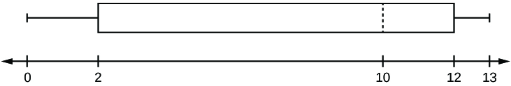
- which quarter has the smallest spread of data? What is that spread?
- which quarter has the largest spread of data? What is that spread?
- find the interquartile range (IQR).
- are there more data in the interval 5–10 or in the interval 10–13? How do you know this?
- which interval has the fewest data in it? How do you know this?
- 0–2
- 2–4
- 10–12
- 12–13
- need more information
35. The following box plot shows the U.S. population for 1990, the latest available year.
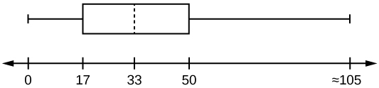
- Are there fewer or more children (age 17 and under) than senior citizens (age 65 and over)? How do you know?
- 12.6% are age 65 and over. Approximately what percentage of the population are working age adults (above age 17 to age 65)?
Solutions:
- more children; the left whisker shows that 25% of the population are children 17 and younger. The right whisker shows that 25% of the population are adults 50 and older, so adults 65 and over represent less than 25%.
- 62.4%
36. On a 20 question math test, the 70th percentile for number of correct answers was 16. Interpret the 70th percentile in the context of this situation.
40. Thirty people spent two weeks around Mardi Gras in New Orleans. Their two-week weight gain is below. (Note: a loss is shown by a negative weight gain.)
| Weight Gain | Frequency |
|---|---|
| –2 | 3 |
| –1 | 5 |
| 0 | 2 |
| 1 | 4 |
| 4 | 13 |
| 6 | 2 |
| 11 | 1 |
a. Calculate the following values:
- the average weight gain for the two weeks
- the standard deviation
- the first, second, and third quartiles
b. Construct a histogram and box plot of the data.
41. The figure below (Table 5) shows the amount, in inches, of annual rainfall in a sample of towns.
| Rainfall (Inches) | Frequency | Relative Frequency | Cumulative Relative Frequency |
|---|---|---|---|
| 2.95–4.97 | 6 |  = 0.12 = 0.12 |
0.12 |
| 4.97–6.99 | 7 |  = 0.14 = 0.14 |
0.12 + 0.14 = 0.26 |
| 6.99–9.01 | 15 |  = 0.30 = 0.30 |
0.26 + 0.30 = 0.56 |
| 9.01–11.03 | 8 |  = 0.16 = 0.16 |
0.56 + 0.16 = 0.72 |
| 11.03–13.05 | 9 |  = 0.18 = 0.18 |
0.72 + 0.18 = 0.90 |
| 13.05–15.07 | 5 |  = 0.10 = 0.10 |
0.90 + 0.10 = 1.00 |
| Total = 50 | Total = 1.00 |
a. From the figure above find the percentage of rainfall that is less than 9.01 inches.
b. Find the percentage of rainfall that is between 6.99 and 13.05 inches.
c. Find the number of towns that have rainfall between 2.95 and 9.01 inches.
42. Nineteen people were asked how many miles, to the nearest mile, they commute to work each day. The data are as follows: 2, 5, 7, 3, 2, 10, 18, 15, 20, 7, 10, 18, 5, 12, 13, 12, 4, 5, 10. The following table was produced:
| DATA | FREQUENCY | RELATIVE FREQUENCY |
CUMULATIVE RELATIVE FREQUENCY |
|---|---|---|---|
| 3 | 3 |  |
0.1579 |
| 4 | 1 |  |
0.2105 |
| 5 | 3 | |
0.1579 |
| 7 | 2 |  |
0.2632 |
| 10 | 3 |  |
0.4737 |
| 12 | 2 | |
0.7895 |
| 13 | 1 | |
0.8421 |
| 15 | 1 | |
0.8948 |
| 18 | 1 | |
0.9474 |
| 20 | 1 | |
1.0000 |
a. Is the table correct? If it is not correct, what is wrong?
b. True or False: Three percent of the people surveyed commute three miles. If the statement is not correct, what should it be? If the table is incorrect, make the corrections.
c. What fraction of the people surveyed commute five or seven miles?
d. What fraction of the people surveyed commute 12 miles or more? Less than 12 miles? Between five and 13 miles (not including five and 13 miles)?
Solution:
43. Sixty adults with gum disease were asked the number of times per week they used to floss before their diagnosis. The (incomplete) results are shown in the figure below:
| # Flossing per Week | Frequency | Relative Frequency | Cumulative Relative Freq. |
|---|---|---|---|
| 0 | 27 | 0.4500 | |
| 1 | 18 | ||
| 3 | 0.9333 | ||
| 6 | 3 | 0.0500 | |
| 7 | 1 | 0.0167 |
a. Fill in the blanks in the figure above
b. What percent of adults flossed six times per week?
c. What percent flossed at most three times per week?
44. Nineteen immigrants to the U.S were asked how many years, to the nearest year, they have lived in the U.S. The data are as follows: 2, 5, 7, 2, 2, 10, 20, 15, 0, 7, 0, 20, 5, 12, 15, 12, 4, 5, 10.
| Data | Frequency | Relative Frequency | Cumulative Relative Frequency |
|---|---|---|---|
| 0 | 2 | |
0.1053 |
| 2 | 3 | |
0.2632 |
| 4 | 1 | |
0.3158 |
| 5 | 3 | |
0.4737 |
| 7 | 2 | |
0.5789 |
| 10 | 2 | |
0.6842 |
| 12 | 2 | |
0.7895 |
| 15 | 1 | |
0.8421 |
| 20 | 1 | |
1.0000 |
- Fix the errors in the figure above. Also, explain how someone might have arrived at the incorrect number(s).
- Explain what is wrong with this statement: “47 percent of the people surveyed have lived in the U.S. for 5 years.”
- Fix the statement in b to make it correct.
- What fraction of the people surveyed have lived in the U.S. five or seven years?
- What fraction of the people surveyed have lived in the U.S. at most 12 years?
- What fraction of the people surveyed have lived in the U.S. fewer than 12 years?
- What fraction of the people surveyed have lived in the U.S. from five to 20 years, inclusive?
45. The population in Park City is made up of children, working-age adults, and retirees. The figure below shows the three age groups, the number of people in the town from each age group, and the proportion (%) of people in each age group. Construct a bar graph showing the proportions.
| Age groups | Number of people | Proportion of population |
|---|---|---|
| Children | 67,059 | 19% |
| Working-age adults | 152,198 | 43% |
| Retirees | 131,662 | 38% |
46. The data are the distances (in kilometers) from a home to local supermarkets.
1.1, 1.5, 2.3, 2.5, 2.7, 3.2, 3.3, 3.3, 3.5, 3.8, 4.0, 4.2, 4.5, 4.5, 4.7, 4.8, 5.5, 5.6, 6.5, 6.7, 12.3
a. Create a stemplot using the data.
b. Do the data seem to have any concentration of values?
Solution:
47. The following data show the distances (in miles) from the homes of off-campus statistics students to the college. Create a stem plot using the data and identify any outliers: 0.5, 0.7, 1.1, 1.2, 1.2, 1.3, 1.3, 1.5, 1.5, 1.7, 1.7, 1.8, 1.9, 2.0, 2.2, 2.5, 2.6, 2.8, 2.8, 2.8, 3.5, 3.8, 4.4, 4.8, 4.9, 5.2, 5.5, 5.7, 5.8, 8.0
48. For the Park City basketball team, scores for the last 30 games were as follows (smallest to largest): 32, 32, 33, 34, 38, 40, 42, 42, 43, 44, 46, 47, 47, 48, 48, 48, 49, 50, 50, 51, 52, 52, 52, 53, 54, 56, 57, 57, 60, 61. Construct a stem plot for the data.
49. The table below shows the number of wins and losses the Atlanta Hawks have had in 42 seasons. Create a side-by-side stem-and-leaf plot of these wins and losses.
| Losses | Wins | Year | Losses | Wins | Year |
|---|---|---|---|---|---|
| 34 | 48 | 1968–1969 | 41 | 41 | 1989–1990 |
| 34 | 48 | 1969–1970 | 39 | 43 | 1990–1991 |
| 46 | 36 | 1970–1971 | 44 | 38 | 1991–1992 |
| 46 | 36 | 1971–1972 | 39 | 43 | 1992–1993 |
| 36 | 46 | 1972–1973 | 25 | 57 | 1993–1994 |
| 47 | 35 | 1973–1974 | 40 | 42 | 1994–1995 |
| 51 | 31 | 1974–1975 | 36 | 46 | 1995–1996 |
| 53 | 29 | 1975–1976 | 26 | 56 | 1996–1997 |
| 51 | 31 | 1976–1977 | 32 | 50 | 1997–1998 |
| 41 | 41 | 1977–1978 | 19 | 31 | 1998–1999 |
| 36 | 46 | 1978–1979 | 54 | 28 | 1999–2000 |
| 32 | 50 | 1979–1980 | 57 | 25 | 2000–2001 |
| 51 | 31 | 1980–1981 | 49 | 33 | 2001–2002 |
| 40 | 42 | 1981–1982 | 47 | 35 | 2002–2003 |
| 39 | 43 | 1982–1983 | 54 | 28 | 2003–2004 |
| 42 | 40 | 1983–1984 | 69 | 13 | 2004–2005 |
| 48 | 34 | 1984–1985 | 56 | 26 | 2005–2006 |
| 32 | 50 | 1985–1986 | 52 | 30 | 2006–2007 |
| 25 | 57 | 1986–1987 | 45 | 37 | 2007–2008 |
| 32 | 50 | 1987–1988 | 35 | 47 | 2008–2009 |
| 30 | 52 | 1988–1989 | 29 | 53 | 2009–2010 |
50. In a survey, 40 people were asked how many times per year they had their car in the shop for repairs. The results are shown in the table below. Construct a line graph.
| Number of times in shop | Frequency |
|---|---|
| 0 | 7 |
| 1 | 10 |
| 2 | 14 |
| 3 | 9 |
51. Using this data set, construct a histogram.
| 9.95 | 10 | 2.25 | 16.75 | 0 |
| 19.5 | 22.5 | 7.5 | 15 | 12.75 |
| 5.5 | 11 | 10 | 20.75 | 17.5 |
| 23 | 21.9 | 24 | 23.75 | 18 |
| 20 | 15 | 22.9 | 18.8 | 20.5 |
52. The following data represent the number of employees at various restaurants in New York City. Using this data, create a histogram.
22, 35, 15, 26, 40, 28, 18, 20, 25, 34, 39, 42, 24, 22, 19, 27, 22, 34, 40, 20, 38, and 28.
Use 10–19 as the first interval.
53. Suppose one hundred eleven people who shopped in a special t-shirt store were asked the number of t-shirts they own costing more than $19 each.
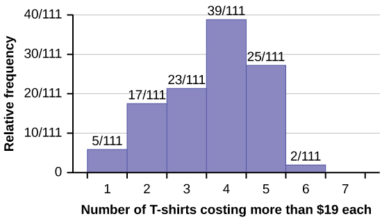
a. The percentage of people who own at most three t-shirts costing more than $19 each is approximately:
- 21
- 59
- 41
- Cannot be determined
b. If the data were collected by asking the first 111 people who entered the store, then the type of sampling is:
- cluster
- simple random
- stratified
- convenience
54. Following are the 2010 obesity rates by U.S. states and Washington, DC.
| State | Percent (%) | State | Percent (%) | State | Percent (%) |
|---|---|---|---|---|---|
| Alabama | 32.2 | Kentucky | 31.3 | North Dakota | 27.2 |
| Alaska | 24.5 | Louisiana | 31.0 | Ohio | 29.2 |
| Arizona | 24.3 | Maine | 26.8 | Oklahoma | 30.4 |
| Arkansas | 30.1 | Maryland | 27.1 | Oregon | 26.8 |
| California | 24.0 | Massachusetts | 23.0 | Pennsylvania | 28.6 |
| Colorado | 21.0 | Michigan | 30.9 | Rhode Island | 25.5 |
| Connecticut | 22.5 | Minnesota | 24.8 | South Carolina | 31.5 |
| Delaware | 28.0 | Mississippi | 34.0 | South Dakota | 27.3 |
| Washington, DC | 22.2 | Missouri | 30.5 | Tennessee | 30.8 |
| Florida | 26.6 | Montana | 23.0 | Texas | 31.0 |
| Georgia | 29.6 | Nebraska | 26.9 | Utah | 22.5 |
| Hawaii | 22.7 | Nevada | 22.4 | Vermont | 23.2 |
| Idaho | 26.5 | New Hampshire | 25.0 | Virginia | 26.0 |
| Illinois | 28.2 | New Jersey | 23.8 | Washington | 25.5 |
| Indiana | 29.6 | New Mexico | 25.1 | West Virginia | 32.5 |
| Iowa | 28.4 | New York | 23.9 | Wisconsin | 26.3 |
| Kansas | 29.4 | North Carolina | 27.8 | Wyoming | 25.1 |
Construct a bar graph of obesity rates of your state and the four states closest to your state. Hint: Label the x-axis with the states. Answers will vary.
55. Student grades on a chemistry exam were: 77, 78, 76, 81, 86, 51, 79, 82, 84, 99.
- Construct a stem-and-leaf plot of the data.
- Are there any potential outliers? If so, which scores are they? Why do you consider them outliers?
56. The table below contains the 2010 obesity rates in U.S. states and Washington, DC.
| State | Percent (%) | State | Percent (%) | State | Percent (%) |
|---|---|---|---|---|---|
| Alabama | 32.2 | Kentucky | 31.3 | North Dakota | 27.2 |
| Alaska | 24.5 | Louisiana | 31.0 | Ohio | 29.2 |
| Arizona | 24.3 | Maine | 26.8 | Oklahoma | 30.4 |
| Arkansas | 30.1 | Maryland | 27.1 | Oregon | 26.8 |
| California | 24.0 | Massachusetts | 23.0 | Pennsylvania | 28.6 |
| Colorado | 21.0 | Michigan | 30.9 | Rhode Island | 25.5 |
| Connecticut | 22.5 | Minnesota | 24.8 | South Carolina | 31.5 |
| Delaware | 28.0 | Mississippi | 34.0 | South Dakota | 27.3 |
| Washington, DC | 22.2 | Missouri | 30.5 | Tennessee | 30.8 |
| Florida | 26.6 | Montana | 23.0 | Texas | 31.0 |
| Georgia | 29.6 | Nebraska | 26.9 | Utah | 22.5 |
| Hawaii | 22.7 | Nevada | 22.4 | Vermont | 23.2 |
| Idaho | 26.5 | New Hampshire | 25.0 | Virginia | 26.0 |
| Illinois | 28.2 | New Jersey | 23.8 | Washington | 25.5 |
| Indiana | 29.6 | New Mexico | 25.1 | West Virginia | 32.5 |
| Iowa | 28.4 | New York | 23.9 | Wisconsin | 26.3 |
| Kansas | 29.4 | North Carolina | 27.8 | Wyoming | 25.1 |
- Use a random number generator to randomly pick eight states. Construct a bar graph of the obesity rates of those eight states.
- Construct a bar graph for all the states beginning with the letter “A.”
- Construct a bar graph for all the states beginning with the letter “M.”
Solution:
-
Eight numbers are generated. The numbers correspond to the numbered states (for this example: {47 21 9 23 51 13 25 4}. If any numbers are repeated, generate a different number. Here, the states (and Washington DC) are {Arkansas, Washington DC, Idaho, Maryland, Michigan, Mississippi, Virginia, Wyoming}.
Corresponding percents are {30.1, 22.2, 26.5, 27.1, 30.9, 34.0, 26.0, 25.1}.
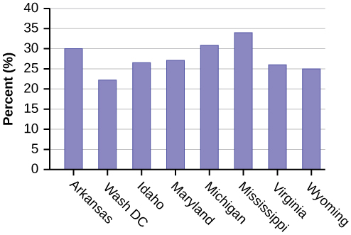
Figure 2.99 .
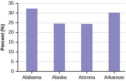
Figure 2.100 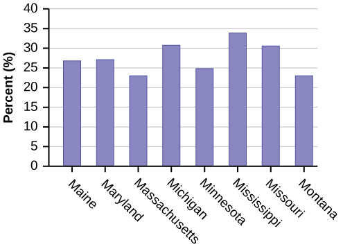
Figure 2.101
57. For each of the following data sets, create a stem plot and identify any outliers.The miles per gallon rating for 30 cars are shown below (lowest to highest).
19, 19, 19, 20, 21, 21, 25, 25, 25, 26, 26, 28, 29, 31, 31, 32, 32, 33, 34, 35, 36, 37, 37, 38, 38, 38, 38, 41, 43, 43
| Stem | Leaf |
|---|---|
| 1 | 9 9 9 |
| 2 | 0 1 1 5 5 5 6 6 8 9 |
| 3 | 1 1 2 2 3 4 5 6 7 7 8 8 8 8 |
| 4 | 1 3 3 |
a. The height in feet of 25 trees is shown below (lowest to highest).
25, 27, 33, 34, 34, 34, 35, 37, 37, 38, 39, 39, 39, 40, 41, 45, 46, 47, 49, 50, 50, 53, 53, 54, 54
b. The data are the prices of different laptops at an electronics store. Round each value to the nearest ten.
249, 249, 260, 265, 265, 280, 299, 299, 309, 319, 325, 326, 350, 350, 350, 365, 369, 389, 409, 459, 489, 559, 569, 570, 610
| Stem | Leaf |
|---|---|
| 2 | 5 5 6 7 7 8 |
| 3 | 0 0 1 2 3 3 5 5 5 7 7 9 |
| 4 | 1 6 9 |
| 5 | 6 7 7 |
| 6 | 1 |
c. The data are daily high temperatures in a town for one month.
61, 61, 62, 64, 66, 67, 67, 67, 68, 69, 70, 70, 70, 71, 71, 72, 74, 74, 74, 75, 75, 75, 76, 76, 77, 78, 78, 79, 79, 95
58. The students in Ms. Ramirez’s math class have birthdays in each of the four seasons. The figure below shows the four seasons, the number of students who have birthdays in each season, and the percentage (%) of students in each group. Construct a bar graph showing the number of students.
| Seasons | Number of students | Proportion of population |
|---|---|---|
| Spring | 8 | 24% |
| Summer | 9 | 26% |
| Autumn | 11 | 32% |
| Winter | 6 | 18% |
Using the data from Mrs. Ramirez’s math class, construct a bar graph showing the percentages.
59. David County has six high schools. Each school sent students to participate in a county-wide science competition. The figure below shows the percentage breakdown of competitors from each school, and the percentage of the entire student population of the county that goes to each school. Construct a bar graph that shows the population percentage of competitors from each school.
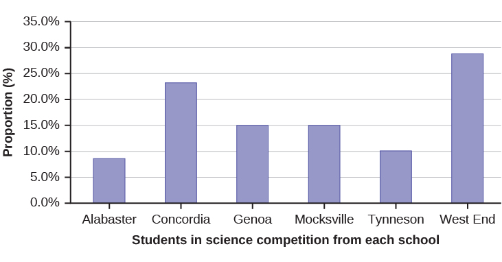
| High School | Science competition population | Overall student population |
|---|---|---|
| Alabaster | 28.9% | 8.6% |
| Concordia | 7.6% | 23.2% |
| Genoa | 12.1% | 15.0% |
| Mocksville | 18.5% | 14.3% |
| Tynneson | 24.2% | 10.1% |
| West End | 8.7% | 28.8% |
Use the data from the David County science competition supplied above. Construct a bar graph that shows the county-wide population percentage of students at each school.
2.6 Measures of Center
1. The following data show the number of months patients typically wait on a transplant list before getting surgery. The data are ordered from smallest to largest. Calculate the mean and median.
3, 4, 5, 7, 7, 7, 7, 8, 8, 9, 9, 10, 10, 10, 10, 10, 11, 12, 12, 13, 14, 14, 15, 15, 17, 17, 18, 19, 19, 19, 21, 21, 22, 22, 23, 24, 24, 24, 24
2. In a sample of 60 households, one house is worth $2,500,000. Half of the rest are worth $280,000, and all the others are worth $315,000. Which is the better measure of the “center”: the mean or the median?
3. The number of books checked out from the library from 25 students are as follows: 0, 0, 0, 1, 2, 3, 3, 4, 4, 5, 5, 7, 7, 7, 7, 8, 8, 8, 9, 10, 10, 11, 11, 12, 12. Find the mode.
4. Find the mean for the following frequency tables.
-
Figure 2.107 Grade Frequency 49.5–59.5 2 59.5–69.5 3 69.5–79.5 8 79.5–89.5 12 89.5–99.5 5 -
Figure 2.108 Daily Low Temperature Frequency 49.5–59.5 53 59.5–69.5 32 69.5–79.5 15 79.5–89.5 1 89.5–99.5 0 -
Figure 2.109 Points per Game Frequency 49.5–59.5 14 59.5–69.5 32 69.5–79.5 15 79.5–89.5 23 89.5–99.5 2
5. The following data show the lengths of boats moored in a marina. The data are ordered from smallest to largest: 16, 17, 19, 20, 20, 21, 23, 24, 25, 25, 25, 26, 26, 27, 27, 27, 28, 29, 30, 32, 33, 33, 34, 35, 37, 39, 40
a. Calculate the mean.
- Mean: 16 + 17 + 19 + 20 + 20 + 21 + 23 + 24 + 25 + 25 + 25 + 26 + 26 + 27 + 27 + 27 + 28 + 29 + 30 + 32 + 33 + 33 + 34 + 35 + 37 + 39 + 40 = 738;

b. Identify the median.
c. Identify the mode.
6. Sixty-five randomly selected car salespersons were asked the number of cars they generally sell in one week. Fourteen people answered that they generally sell three cars, nineteen generally sell four cars, twelve generally sell five cars, nine generally sell six cars, and eleven generally sell seven cars. Calculate the following:
1. sample mean =  = _______
2. median = _______
3. mode = ______
7. The most obese countries in the world have obesity rates that range from 11.4% to 74.6%. This data is summarized in the following table. [11]
| Percent of Population Obese | Number of Countries |
|---|---|
| 11.4–20.45 | 29 |
| 20.45–29.45 | 13 |
| 29.45–38.45 | 4 |
| 38.45–47.45 | 0 |
| 47.45–56.45 | 2 |
| 56.45–65.45 | 1 |
| 65.45–74.45 | 0 |
| 74.45–83.45 | 1 |
- What is the best estimate of the average obesity percentage for these countries?
- The United States has an average obesity rate of 33.9%. Is this rate above average or below?
- How does the United States compare to other countries?
8. The following figure gives the percent of children under five considered to be underweight. What is the best estimate for the mean percentage of underweight children? [12]
| Percent of Underweight Children | Number of Countries |
|---|---|
| 16–21.45 | 23 |
| 21.45–26.9 | 4 |
| 26.9–32.35 | 9 |
| 32.35–37.8 | 7 |
| 37.8–43.25 | 6 |
| 43.25–48.7 | 1 |
The mean percentage, = 
9. Discuss the mean, median, and mode for each of the following problems. Is there a pattern between the shape and measure of the center?
a.
b.
| 4 | 6 9 |
| 5 | 3 6 7 7 7 8 |
| 6 | 0 0 3 3 4 4 5 6 7 7 7 8 |
| 7 | 0 1 1 2 3 4 7 8 8 9 |
| 8 | 0 1 3 5 8 |
| 9 | 0 0 3 3 |
| Key: 8|0 means 80. | |
c.
10. State whether the data are symmetrical, skewed to the left, or skewed to the right.
a. 1, 1, 1, 2, 2, 2, 2, 3, 3, 3, 3, 3, 3, 3, 3, 4, 4, 4, 5, 5
b. 16, 17, 19, 22, 22, 22, 22, 22, 23
c. 87, 87, 87, 87, 87, 88, 89, 89, 90, 91
11. When the data are skewed left, what is the typical relationship between the mean and median?
12. When the data are symmetrical, what is the typical relationship between the mean and median?
Solution: When the data are symmetrical, the mean and median are close or the same.
13. What word describes a distribution that has two modes?
14. Use the following graph to answer a-c.
- Solution: The distribution is skewed right because it looks pulled out to the right.
b. Describe the relationship between the mode and the median of this distribution.
c. Describe the relationship between the mean and the median of this distribution.
- Solution: The mean is 4.1 and is slightly greater than the median, which is four.
15. Data: 11, 11, 12, 12, 12, 12, 13, 15, 17, 22, 22, 22
a. Is the data perfectly symmetrical? Why or why not?
b. Which is the largest, the mean, the mode, or the median of the data set?
- Solution: The mode is 12, the median is 12.5, and the mean is 15.1. The mean is the largest.
16. Data: 56, 56, 56, 58, 59, 60, 62, 64, 64, 65, 67
a. Is the data perfectly symmetrical? Why or why not?
b. Which is the largest, the mean, the mode, or the median of the data set?
17. Of the three measures, which tends to reflect skewing the most, the mean, the mode, or the median? Why?
- Solution: The mean tends to reflect skewing the most because it is affected the most by outliers.
18. In a perfectly symmetrical distribution, when would the mode be different from the mean and median?
19. The median age of the U.S. population in 1980 was 30.0 years. In 1991, the median age was 33.1 years.
- What does it mean for the median age to rise?
- Give two reasons why the median age could rise.
- For the median age to rise, is the actual number of children less in 1991 than it was in 1980? Why or why not?
20. Javier and Ercilia are supervisors at a shopping mall. Each was given the task of estimating the mean distance that shoppers live from the mall. They each randomly surveyed 100 shoppers. The samples yielded the following information.
| Javier | Ercilia | |
|---|---|---|
|
6.0 miles | 6.0 miles |
| s | 4.0 miles | 7.0 miles |
- How can you determine which survey was correct ?
- Explain what the difference in the results of the surveys implies about the data.
- If the two histograms depict the distribution of values for each supervisor, which one depicts Ercilia’s sample? How do you know?
Figure 2.117 - If the two box plots depict the distribution of values for each supervisor, which one depicts Ercilia’s sample? How do you know?
Figure 2.118
21. We are interested in the number of years students in a particular elementary statistics class have lived in California. The information in the following table is from the entire section.
| Number of years | Frequency |
|---|---|
| 22 | 1 |
| 23 | 1 |
| 26 | 1 |
| 40 | 2 |
| 42 | 2 |
| Total = 20 | |
| 7 | 1 |
| 14 | 3 |
| 15 | 1 |
| 18 | 1 |
| 19 | 4 |
| 20 | 3 |
What is the mode?
- 19
- 19.5
- 14 and 20
- 22.65
Is this a sample or the entire population?
- sample
- entire population
- neither
22. How much time does it take to travel to work? The figure below shows the mean commute time by state for workers at least 16 years old who are not working at home. Find the mean travel time, and round off the answer properly.
| 24.0 | 24.3 | 25.9 | 18.9 | 27.5 | 17.9 | 21.8 | 20.9 | 16.7 | 27.3 |
| 18.2 | 24.7 | 20.0 | 22.6 | 23.9 | 18.0 | 31.4 | 22.3 | 24.0 | 25.5 |
| 24.7 | 24.6 | 28.1 | 24.9 | 22.6 | 23.6 | 23.4 | 25.7 | 24.8 | 25.5 |
| 21.2 | 25.7 | 23.1 | 23.0 | 23.9 | 26.0 | 16.3 | 23.1 | 21.4 | 21.5 |
| 27.0 | 27.0 | 18.6 | 31.7 | 23.3 | 30.1 | 22.9 | 23.3 | 21.7 | 18.6 |
23. Find the midpoint for each class. These will be graphed on the x-axis. The frequency values will be graphed on the y-axis values.
2.7 Measures of Spread
1. Use the following data (first exam scores) from Susan Dean’s spring pre-calculus class: 33, 42, 49, 49, 53, 55, 55, 61, 63, 67, 68, 68, 69, 69, 72, 73, 74, 78, 80, 83, 88, 88, 88, 90, 92, 94, 94, 94, 94, 96, 100.
a. Create a chart containing the data, frequencies, relative frequencies, and cumulative relative frequencies to three decimal places.
b. Calculate the following to one decimal place:
-
- The sample mean
- The sample standard deviation
- The median
- The first quartile
- The third quartile
- IQR
c. Construct a box plot and a histogram on the same set of axes. Make comments about the box plot, the histogram, and the chart.
Solutions:
a.
| Data | Frequency | Relative Frequency | Cumulative Relative Frequency |
|---|---|---|---|
| 33 | 1 | 0.032 | 0.032 |
| 42 | 1 | 0.032 | 0.064 |
| 49 | 2 | 0.065 | 0.129 |
| 53 | 1 | 0.032 | 0.161 |
| 55 | 2 | 0.065 | 0.226 |
| 61 | 1 | 0.032 | 0.258 |
| 63 | 1 | 0.032 | 0.29 |
| 67 | 1 | 0.032 | 0.322 |
| 68 | 2 | 0.065 | 0.387 |
| 69 | 2 | 0.065 | 0.452 |
| 72 | 1 | 0.032 | 0.484 |
| 73 | 1 | 0.032 | 0.516 |
| 74 | 1 | 0.032 | 0.548 |
| 78 | 1 | 0.032 | 0.580 |
| 80 | 1 | 0.032 | 0.612 |
| 83 | 1 | 0.032 | 0.644 |
| 88 | 3 | 0.097 | 0.741 |
| 90 | 1 | 0.032 | 0.773 |
| 92 | 1 | 0.032 | 0.805 |
| 94 | 4 | 0.129 | 0.934 |
| 96 | 1 | 0.032 | 0.966 |
| 100 | 1 | 0.032 | 0.998 (Why isn’t this value 1?) |
b.
-
- The sample mean = 73.5
- The sample standard deviation = 17.9
- The median = 73
- The first quartile = 61
- The third quartile = 90
- IQR = 90 – 61 = 29
c. The x-axis goes from 32.5 to 100.5; y-axis goes from –2.4 to 15 for the histogram. The number of intervals is five, so the width of an interval is (100.5 – 32.5) divided by five, is equal to 13.6. Endpoints of the intervals are as follows: the starting point is 32.5, 32.5 + 13.6 = 46.1, 46.1 + 13.6 = 59.7, 59.7 + 13.6 = 73.3, 73.3 + 13.6 = 86.9, 86.9 + 13.6 = 100.5 = the ending value; No data values fall on an interval boundary.
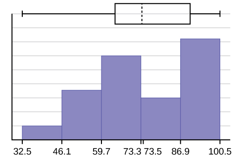
The long left whisker in the box plot is reflected in the left side of the histogram. The spread of the exam scores in the lower 50% is greater (73 – 33 = 40) than the spread in the upper 50% (100 – 73 = 27). The histogram, box plot, and chart all reflect this. There are a substantial number of A and B grades (80s, 90s, and 100). The histogram clearly shows this. The box plot shows us that the middle 50% of the exam scores (IQR = 29) are Ds, Cs, and Bs. The box plot also shows us that the lower 25% of the exam scores are Ds and Fs.
2. The following data show the different types of pet food stores in the area carry: 6, 6, 6, 6, 7, 7, 7, 7, 7, 8, 9, 9, 9, 9, 10, 10, 10, 10, 10, 11, 11, 11, 11, 12, 12, 12, 12, 12, 12. Calculate the sample mean and the sample standard deviation to one decimal place.
3. The following data are the distances between 20 retail stores and a large distribution center. The distances are in miles: 29, 37, 38, 40, 58, 67, 68, 69, 76, 86, 87, 95, 96, 96, 99, 106, 112, 127, 145, 150.
a. Use a graphing calculator or computer to find the standard deviation and round to the nearest tenth.
- Solution: s = 34.5
b. Find the value that is one standard deviation below the mean.
4. Two baseball players, Fredo and Karl, on different teams wanted to find out who had the higher batting average when compared to his team. Which baseball player had the higher batting average when compared to his team?
| Baseball Player | Batting Average | Team Batting Average | Team Standard Deviation |
|---|---|---|---|
| Fredo | 0.158 | 0.166 | 0.012 |
| Karl | 0.177 | 0.189 | 0.015 |
For Fredo: z =  = –0.67
For Karl: z =  = –0.8
Fredo’s z-score of –0.67 is higher than Karl’s z-score of –0.8. For batting average, higher values are better, so Fredo has a better batting average compared to his team.
Use the table above to find the value that is three standard deviations:
- above the mean
- below the mean
5. Find the standard deviation for the following frequency tables using the formula. Check the calculations with the TI 83/84.
| Grade | Frequency |
|---|---|
| 49.5–59.5 | 2 |
| 59.5–69.5 | 3 |
| 69.5–79.5 | 8 |
| 79.5–89.5 | 12 |
| 89.5–99.5 | 5 |
| Daily Low Temperature | Frequency |
|---|---|
| 49.5–59.5 | 53 |
| 59.5–69.5 | 32 |
| 69.5–79.5 | 15 |
| 79.5–89.5 | 1 |
| 89.5–99.5 | 0 |
| Points per Game | Frequency |
|---|---|
| 49.5–59.5 | 14 |
| 59.5–69.5 | 32 |
| 69.5–79.5 | 15 |
| 79.5–89.5 | 23 |
| 89.5–99.5 | 2 |
Solutions:


6. The population parameters below describe the full-time equivalent number of students (FTES) each year at ABC University from 1976–1977 through 2004–2005.
- μ = 1000 FTES
- median = 1,014 FTES
- σ = 474 FTES
- first quartile = 528.5 FTES
- third quartile = 1,447.5 FTES
- n = 29 years
a. A sample of 11 years is taken. About how many are expected to have a FTES of 1014 or above? Explain how you determined your answer.
- The median value is the middle value in the ordered list of data values. The median value of a set of 11 will be the 6th number in order. Six years will have totals at or below the median.
b. 75% of all years have an FTES:
- at or below: _____
- at or above: _____
c. The population standard deviation = _____
- 474 FTES
d. What percent of the FTES were from 528.5 to 1447.5? How do you know?
e. What is the IQR? What does the IQR represent?
- 919
f. How many standard deviations away from the mean is the median?
Additional Information: The population FTES for 2005–2006 through 2010–2011 was given in an updated report. The data are reported here.
| Year | 2005–06 | 2006–07 | 2007–08 | 2008–09 | 2009–10 | 2010–11 |
| Total FTES | 1,585 | 1,690 | 1,735 | 1,935 | 2,021 | 1,890 |
g. Calculate the mean, median, standard deviation, the first quartile, the third quartile and the IQR. Round to one decimal place.
- mean = 1,809.3
- median = 1,812.5
- standard deviation = 151.2
- first quartile = 1,690
- third quartile = 1,935
- IQR = 245
h. What additional information is needed to construct a box plot for the FTES for 2005-2006 through 2010-2011 and a box plot for the FTES for 1976-1977 through 2004-2005?
i. Compare the IQR for the FTES for 1976–77 through 2004–2005 with the IQR for the FTES for 2005-2006 through 2010–2011. Why do you suppose the IQRs are so different? Hint: Think about the number of years covered by each time period and what happened to higher education during those periods.
7. Three students were applying to the same graduate school. They came from schools with different grading systems. Which student had the best GPA when compared to other students at his school? Explain how you determined your answer.
| Student | GPA | School Average GPA | School Standard Deviation |
|---|---|---|---|
| Thuy | 2.7 | 3.2 | 0.8 |
| Vichet | 87 | 75 | 20 |
| Kamala | 8.6 | 8 | 0.4 |
8. A music school has budgeted to purchase three musical instruments. They plan to purchase a piano costing $3,000, a guitar costing $550, and a drum set costing $600. The mean cost for a piano is $4,000 with a standard deviation of $2,500. The mean cost for a guitar is $500 with a standard deviation of $200. The mean cost for drums is $700 with a standard deviation of $100. Which cost is the lowest, when compared to other instruments of the same type? Which cost is the highest when compared to other instruments of the same type. Justify your answer.
- Solution: For pianos, the cost of the piano is 0.4 standard deviations BELOW the mean. For guitars, the cost of the guitar is 0.25 standard deviations ABOVE the mean. For drums, the cost of the drum set is 1.0 standard deviations BELOW the mean. Of the three, the drums cost the lowest in comparison to the cost of other instruments of the same type. The guitar costs the most in comparison to the cost of other instruments of the same type.
9. An elementary school class ran one mile with a mean of 11 minutes and a standard deviation of three minutes. Rachel, a student in the class, ran one mile in eight minutes. A junior high school class ran one mile with a mean of nine minutes and a standard deviation of two minutes. Kenji, a student in the class, ran 1 mile in 8.5 minutes. A high school class ran one mile with a mean of seven minutes and a standard deviation of four minutes. Nedda, a student in the class, ran one mile in eight minutes.
- Why is Kenji considered a better runner than Nedda, even though Nedda ran faster than he?
- Who is the fastest runner with respect to his or her class? Explain why.
10. The most obese countries in the world have obesity rates that range from 11.4% to 74.6%. This data is summarized in the table below: [14]
| Percent of Population Obese | Number of Countries |
|---|---|
| 11.4–20.45 | 29 |
| 20.45–29.45 | 13 |
| 29.45–38.45 | 4 |
| 38.45–47.45 | 0 |
| 47.45–56.45 | 2 |
| 56.45–65.45 | 1 |
| 65.45–74.45 | 0 |
| 74.45–83.45 | 1 |
What is the best estimate of the average obesity percentage for these countries? What is the standard deviation for the listed obesity rates? The United States has an average obesity rate of 33.9%. Is this rate above average or below? How “unusual” is the United States’ obesity rate compared to the average rate? Explain.
Solutions:

- Using the TI 83/84, we obtain a standard deviation of:

- The obesity rate of the United States is 10.58% higher than the average obesity rate.
- Since the standard deviation is 12.95, we see that 23.32 + 12.95 = 36.27 is the obesity percentage that is one standard deviation from the mean. The United States obesity rate is slightly less than one standard deviation from the mean. Therefore, we can assume that the United States, while 34% obese, does not have an unusually high percentage of obese people.
11. The figure below gives the percent of children under five considered to be underweight. [15]
| Percent of Underweight Children | Number of Countries |
|---|---|
| 16–21.45 | 23 |
| 21.45–26.9 | 4 |
| 26.9–32.35 | 9 |
| 32.35–37.8 | 7 |
| 37.8–43.25 | 6 |
| 43.25–48.7 | 1 |
What is the best estimate for the mean percentage of underweight children? What is the standard deviation? Which interval(s) could be considered unusual? Explain.
12. Twenty-five randomly selected students were asked the number of movies they watched the previous week. The results are as follows:
| # of movies | Frequency |
|---|---|
| 0 | 5 |
| 1 | 9 |
| 2 | 6 |
| 3 | 4 |
| 4 | 1 |
a. Find the sample mean .
b. Find the approximate sample standard deviation, s.
Solutions:
a. 1.48
b. 1.12
13. Forty randomly selected students were asked the number of pairs of sneakers they owned. Let X = the number of pairs of sneakers owned. The results are as follows:
| X | Frequency |
|---|---|
| 1 | 2 |
| 2 | 5 |
| 3 | 8 |
| 4 | 12 |
| 5 | 12 |
| 6 | 0 |
| 7 | 1 |
- Find the sample mean
- Find the sample standard deviation, s
- Construct a histogram of the data.
- Complete the columns of the chart.
- Find the first quartile.
- Find the median.
- Find the third quartile.
- Construct a box plot of the data.
- What percent of the students owned at least five pairs?
- Find the 40th percentile.
- Find the 90th percentile.
- Construct a line graph of the data
- Construct a stemplot of the data
14. Following are the published weights (in pounds) of all of the team members of the San Francisco 49ers from a previous year.
177, 205, 210, 210, 232, 205, 185, 185, 178, 210, 206, 212, 184, 174, 185, 242, 188, 212, 215, 247, 241, 223, 220, 260, 245, 259, 278, 270, 280, 295, 275, 285, 290, 272, 273, 280, 285, 286, 200, 215, 185, 230, 250, 241, 190, 260, 250, 302, 265, 290, 276, 228, 265
- Organize the data from smallest to largest value.
- Find the median.
- Find the first quartile.
- Find the third quartile.
- Construct a box plot of the data.
- The middle 50% of the weights are from _______ to _______.
- If our population were all professional football players, would the above data be a sample of weights or the population of weights? Why?
- If our population included every team member who ever played for the San Francisco 49ers, would the above data be a sample of weights or the population of weights? Why?
- Assume the population was the San Francisco 49ers. Find:
- the population mean, μ.
- the population standard deviation, σ.
- the weight that is two standard deviations below the mean.
- When Steve Young, quarterback, played football, he weighed 205 pounds. How many standard deviations above or below the mean was he?
- That same year, the mean weight for the Dallas Cowboys was 240.08 pounds with a standard deviation of 44.38 pounds. Emmit Smith weighed in at 209 pounds. With respect to his team, who was lighter, Smith or Young? How did you determine your answer?
Solutions:
- 174, 177, 178, 184, 185, 185, 185, 185, 188, 190, 200, 205, 205, 206, 210, 210, 210, 212, 212, 215, 215, 220, 223, 228, 230, 232, 241, 241, 242, 245, 247, 250, 250, 259, 260, 260, 265, 265, 270, 272, 273, 275, 276, 278, 280, 280, 285, 285, 286, 290, 290, 295, 302
- 241
- 205.5
- 272.5
-
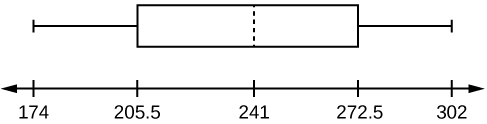
Figure 2.134 - 205.5, 272.5
- sample
- population
- 236.34
- 37.50
- 161.34
- 0.84 std. dev. below the mean
- Young
15. One hundred teachers attended a seminar on mathematical problem solving. The attitudes of a representative sample of 12 of the teachers were measured before and after the seminar. A positive number for change in attitude indicates that a teacher’s attitude toward math became more positive. The 12 change scores are as follows:
3 8–12 05–31–16 5–2
- What is the mean change score?
- What is the standard deviation for this population?
- What is the median change score?
- Find the change score that is 2.2 standard deviations below the mean.
16. Refer to the figures below and determine which of the following (a-d) are true and which are false. Explain your solution to each part in complete sentences.
- The medians for all three graphs are the same.
- We cannot determine if any of the means for the three graphs is different.
- The standard deviation for graph b is larger than the standard deviation for graph a.
- We cannot determine if any of the third quartiles for the three graphs is different.
Solutions:
- True
- True
- True
- False
17. In a recent issue of the IEEE Spectrum, 84 engineering conferences were announced. Four conferences lasted two days. Thirty-six lasted three days. Eighteen lasted four days. Nineteen lasted five days. Four lasted six days. One lasted seven days. One lasted eight days. One lasted nine days. Let X = the length (in days) of an engineering conference.
- Organize the data in a chart.
- Find the median, the first quartile, and the third quartile.
- Find the 65th percentile.
- Find the 10th percentile.
- Construct a box plot of the data.
- The middle 50% of the conferences last from _______ days to _______ days.
- Calculate the sample mean of days of engineering conferences.
- Calculate the sample standard deviation of days of engineering conferences.
- Find the mode.
- If you were planning an engineering conference, which would you choose as the length of the conference: mean, median, or mode? Explain why you made that choice.
- Give two reasons why you think that three to five days seem to be popular lengths of engineering conferences.
18. A survey of enrollment at 35 community colleges across the United States yielded the following figures:
6414, 1550, 2109, 9350, 21828, 4300, 5944, 5722, 2825, 2044, 5481, 5200, 5853, 2750, 10012, 6357, 27000, 9414, 7681, 3200, 17500, 9200, 7380, 18314, 6557, 13713, 17768, 7493, 2771, 2861, 1263, 7285, 28165, 5080, 11622
- Organize the data into a chart with five intervals of equal width. Label the two columns “Enrollment” and “Frequency.”
- Construct a histogram of the data.
- If you were to build a new community college, which piece of information would be more valuable: the mode or the mean?
- Calculate the sample mean.
- Calculate the sample standard deviation.
- A school with an enrollment of 8000 would be how many standard deviations away from the mean?
Solutions:
-
Figure 2.136 Enrollment Frequency 1000-5000 10 5000-10000 16 10000-15000 3 15000-20000 3 20000-25000 1 25000-30000 2 - Check student’s solution.
- mode
- 8628.74
- 6943.88
- –0.09
19. X = the number of days per week that 100 clients use a particular exercise facility.
| x | Frequency |
|---|---|
| 0 | 3 |
| 1 | 12 |
| 2 | 33 |
| 3 | 28 |
| 4 | 11 |
| 5 | 9 |
| 6 | 4 |
- 5
- 80
- 3
- 4
Solution: a
b. The number that is 1.5 standard deviations BELOW the mean is approximately _____
- 0.7
- 4.8
- –2.8
- Cannot be determined
20. Suppose that a publisher conducted a survey asking adult consumers the number of fiction paperback books they had purchased in the previous month. The results are summarized in the figure below.
| # of books | Freq. | Rel. Freq. |
|---|---|---|
| 0 | 18 | |
| 1 | 24 | |
| 2 | 24 | |
| 3 | 22 | |
| 4 | 15 | |
| 5 | 10 | |
| 7 | 5 | |
| 9 | 1 |
- Are there any outliers in the data? Use an appropriate numerical test involving the IQR to identify outliers, if any, and clearly state your conclusion.
- If a data value is identified as an outlier, what should be done about it?
- Are any data values further than two standard deviations away from the mean? In some situations, statisticians may use this criteria to identify data values that are unusual, compared to the other data values. (Note that this criteria is most appropriate to use for data that is mound-shaped and symmetric, rather than for skewed data.)
- Do parts a and c of this problem give the same answer?
- Examine the shape of the data. Which part, a or c, of this question gives a more appropriate result for this data?
- Based on the shape of the data which is the most appropriate measure of center for this data: mean, median or mode
21. This figure contains the total number of deaths worldwide as a result of earthquakes for the period from 2000 to 2012.
| Year | Total Number of Deaths |
|---|---|
| 2000 | 231 |
| 2001 | 21,357 |
| 2002 | 11,685 |
| 2003 | 33,819 |
| 2004 | 228,802 |
| 2005 | 88,003 |
| 2006 | 6,605 |
| 2007 | 712 |
| 2008 | 88,011 |
| 2009 | 1,790 |
| 2010 | 320,120 |
| 2011 | 21,953 |
| 2012 | 768 |
| Total | 823,856 |
Answer each of the following questions and check your answers below.
a. What is the frequency of deaths measured from 2006 through 2009?
b. What percentage of deaths occurred after 2009?
c. What is the relative frequency of deaths that occurred in 2003 or earlier?
d. What is the percentage of deaths that occurred in 2004?
e. What kind of data are the numbers of deaths?
f. The Richter scale is used to quantify the energy produced by an earthquake. Examples of Richter scale numbers are 2.3, 4.0, 6.1, and 7.0. What kind of data are these numbers?
Solution:
22. The following figure contains the total number of fatal motor vehicle traffic crashes in the United States for the period from 1994 to 2011.
| Year | Total Number of Crashes | Year | Total Number of Crashes |
|---|---|---|---|
| 1994 | 36,254 | 2004 | 38,444 |
| 1995 | 37,241 | 2005 | 39,252 |
| 1996 | 37,494 | 2006 | 38,648 |
| 1997 | 37,324 | 2007 | 37,435 |
| 1998 | 37,107 | 2008 | 34,172 |
| 1999 | 37,140 | 2009 | 30,862 |
| 2000 | 37,526 | 2010 | 30,296 |
| 2001 | 37,862 | 2011 | 29,757 |
| 2002 | 38,491 | Total | 653,782 |
| 2003 | 38,477 |
Answer the following questions.
- What is the frequency of deaths measured from 2000 through 2004?
- What percentage of deaths occurred after 2006?
- What is the relative frequency of deaths that occurred in 2000 or before?
- What is the percentage of deaths that occurred in 2011?
- What is the cumulative relative frequency for 2006? Explain what this number tells you about the data.
23. Fifty part-time students were asked how many courses they were taking this term. The (incomplete) results are shown below:
| # of Courses | Frequency | Relative Frequency | Cumulative Relative Frequency |
|---|---|---|---|
| 1 | 30 | 0.6 | |
| 2 | 15 | ||
| 3 |
Fill in the blanks in the figure above.
- What percent of students take exactly two courses?
- What percent of students take one or two courses?
24. Forbes magazine published data on the best small firms in 2012. These were firms which had been publicly traded for at least a year, have a stock price of at least $5 per share, and have reported annual revenue between $5 million and $1 billion. The figure below shows the ages of the chief executive officers for the first 60 ranked firms.
| Age | Frequency | Relative Frequency | Cumulative Relative Frequency |
|---|---|---|---|
| 40–44 | 3 | ||
| 45–49 | 11 | ||
| 50–54 | 13 | ||
| 55–59 | 16 | ||
| 60–64 | 10 | ||
| 65–69 | 6 | ||
| 70–74 | 1 |
- What is the frequency for CEO ages between 54 and 65?
- What percentage of CEOs are 65 years or older?
- What is the relative frequency of ages under 50?
- What is the cumulative relative frequency for CEOs younger than 55?
- Which graph shows the relative frequency and which shows the cumulative relative frequency?
25. The figure below contains data on hurricanes that have made direct hits on the U.S. Between 1851 and 2004. A hurricane is given a strength category rating based on the minimum wind speed generated by the storm.
| Category | Number of Direct Hits | Relative Frequency | Cumulative Frequency |
|---|---|---|---|
| Total = 273 | |||
| 1 | 109 | 0.3993 | 0.3993 |
| 2 | 72 | 0.2637 | 0.6630 |
| 3 | 71 | 0.2601 | |
| 4 | 18 | 0.9890 | |
| 5 | 3 | 0.0110 | 1.0000 |
a. What is the relative frequency of direct hits that were category 4 hurricanes?
- 0.0768
- 0.0659
- 0.2601
- Not enough information to calculate
b. What is the relative frequency of direct hits that were AT MOST a category 3 storm?
- 0.3480
- 0.9231
- 0.2601
- 0.3370
26. The following data are the shoe sizes of 50 male students. The sizes are discrete data since shoe size is measured in whole and half units only. Construct a histogram and calculate the width of each bar or class interval. Suppose you choose six bars.
9, 9, 9.5, 9.5, 10, 10, 10, 10, 10, 10, 10.5, 10.5, 10.5, 10.5, 10.5, 10.5, 10.5, 10.5
11, 11, 11, 11, 11, 11, 11, 11, 11, 11, 11, 11, 11, 11.5, 11.5, 11.5, 11.5, 11.5, 11.5, 11.5
12, 12, 12, 12, 12, 12, 12, 12.5, 12.5, 12.5, 12.5, 14
27. The following data are the number of sports played by 50 student athletes. The number of sports is discrete data since sports are counted.
1, 1, 1, 1, 1, 1, 1, 1, 1, 1, 1, 1, 1, 1, 1, 1, 1, 1, 1, 1
2, 2, 2, 2, 2, 2, 2, 2, 2, 2, 2, 2, 2, 2, 2, 2, 2, 2, 2, 2, 2, 2
3, 3, 3, 3, 3, 3, 3, 3
20 student athletes play one sport. 22 student athletes play two sports. Eight student athletes play three sports.
Fill in the blanks for the following sentence. Since the data consist of the numbers 1, 2, 3, and the starting point is 0.5, a width of one places the 1 in the middle of the interval 0.5 to _____, the 2 in the middle of the interval from _____ to _____, and the 3 in the middle of the interval from _____ to _____.
28. Sixty-five randomly selected car salespersons were asked the number of cars they generally sell in one week. Fourteen people answered that they generally sell three cars, nineteen generally sell four cars, twelve generally sell five cars, nine generally sell six cars, and eleven generally sell seven cars. Complete the table.
| Data Value (# cars) | Frequency | Relative Frequency | Cumulative Relative Frequency |
|---|---|---|---|
What does the frequency column sum to? Why?
What does the relative frequency column sum to? Why?
What is the difference between relative frequency and frequency for each data value?
The relative frequency shows the proportion of data points that have each value. The frequency tells the number of data points that have each value.
What is the difference between cumulative relative frequency and relative frequency for each data value?
To construct the histogram for the data, determine appropriate minimum and maximum x and y values and the scaling. Sketch the histogram. Label the horizontal and vertical axes with words. Include numerical scaling.
29. Suppose that three book publishers were interested in the number of fiction paperbacks adult consumers purchase per month. Each publisher conducted a survey. In the survey, adult consumers were asked the number of fiction paperbacks they had purchased the previous month. The results are as follows:
| # of books | Freq. | Rel. Freq. |
|---|---|---|
| 0 | 10 | |
| 1 | 12 | |
| 2 | 16 | |
| 3 | 12 | |
| 4 | 8 | |
| 5 | 6 | |
| 6 | 2 | |
| 8 | 2 |
| # of books | Freq. | Rel. Freq. |
|---|---|---|
| 0 | 18 | |
| 1 | 24 | |
| 2 | 24 | |
| 3 | 22 | |
| 4 | 15 | |
| 5 | 10 | |
| 7 | 5 | |
| 9 | 1 |
| # of books | Freq. | Rel. Freq. |
|---|---|---|
| 0–1 | 20 | |
| 2–3 | 35 | |
| 4–5 | 12 | |
| 6–7 | 2 | |
| 8–9 | 1 |
- Find the relative frequencies for each survey. Write them in the charts.
- Using either a graphing calculator, computer, or by hand, use the frequency column to construct a histogram for each publisher’s survey. For Publishers A and B, make bar widths of one. For Publisher C, make bar widths of two.
- In complete sentences, give two reasons why the graphs for Publishers A and B are not identical.
- Would you have expected the graph for Publisher C to look like the other two graphs? Why or why not?
- Make new histograms for Publisher A and Publisher B. This time, make bar widths of two.
- Now, compare the graph for Publisher C to the new graphs for Publishers A and B. Are the graphs more similar or more different? Explain your answer.
30. Often, cruise ships conduct all on-board transactions, with the exception of gambling, on a cashless basis. At the end of the cruise, guests pay one bill that covers all onboard transactions. Suppose that 60 single travelers and 70 couples were surveyed as to their on-board bills for a seven-day cruise from Los Angeles to the Mexican Riviera. Following is a summary of the bills for each group.
| Amount($) | Frequency | Rel. Frequency |
|---|---|---|
| 51–100 | 5 | |
| 101–150 | 10 | |
| 151–200 | 15 | |
| 201–250 | 15 | |
| 251–300 | 10 | |
| 301–350 | 5 |
| Amount($) | Frequency | Rel. Frequency |
|---|---|---|
| 100–150 | 5 | |
| 201–250 | 5 | |
| 251–300 | 5 | |
| 301–350 | 5 | |
| 351–400 | 10 | |
| 401–450 | 10 | |
| 451–500 | 10 | |
| 501–550 | 10 | |
| 551–600 | 5 | |
| 601–650 | 5 |
- Fill in the relative frequency for each group.
- Construct a histogram for the singles group. Scale the x-axis by $50 widths. Use relative frequency on the y-axis.
- Construct a histogram for the couples group. Scale the x-axis by $50 widths. Use relative frequency on the y-axis.
- Compare the two graphs:
- List two similarities between the graphs.
- List two differences between the graphs.
- Overall, are the graphs more similar or different?
- Construct a new graph for the couples by hand. Since each couple is paying for two individuals, instead of scaling the x-axis by $50, scale it by $100. Use relative frequency on the y-axis.
- Compare the graph for the singles with the new graph for the couples:
- List two similarities between the graphs.
- Overall, are the graphs more similar or different?
- How did scaling the couples graph differently change the way you compared it to the singles graph?
- Based on the graphs, do you think that individuals spend the same amount, more or less, as singles as they do person by person as a couple? Explain why in one or two complete sentences.
| Amount($) | Frequency | Relative Frequency |
|---|---|---|
| 51–100 | 5 | 0.08 |
| 101–150 | 10 | 0.17 |
| 151–200 | 15 | 0.25 |
| 201–250 | 15 | 0.25 |
| 251–300 | 10 | 0.17 |
| 301–350 | 5 | 0.08 |
| Amount($) | Frequency | Relative Frequency |
|---|---|---|
| 100–150 | 5 | 0.07 |
| 201–250 | 5 | 0.07 |
| 251–300 | 5 | 0.07 |
| 301–350 | 5 | 0.07 |
| 351–400 | 10 | 0.14 |
| 401–450 | 10 | 0.14 |
| 451–500 | 10 | 0.14 |
| 501–550 | 10 | 0.14 |
| 551–600 | 5 | 0.07 |
| 601–650 | 5 | 0.07 |
- See the figures above.
- In the following histogram data values that fall on the right boundary are counted in the class interval, while values that fall on the left boundary are not counted (with the exception of the first interval where both boundary values are included).
Figure 2.153 - In the following histogram, the data values that fall on the right boundary are counted in the class interval, while values that fall on the left boundary are not counted (with the exception of the first interval where values on both boundaries are included).
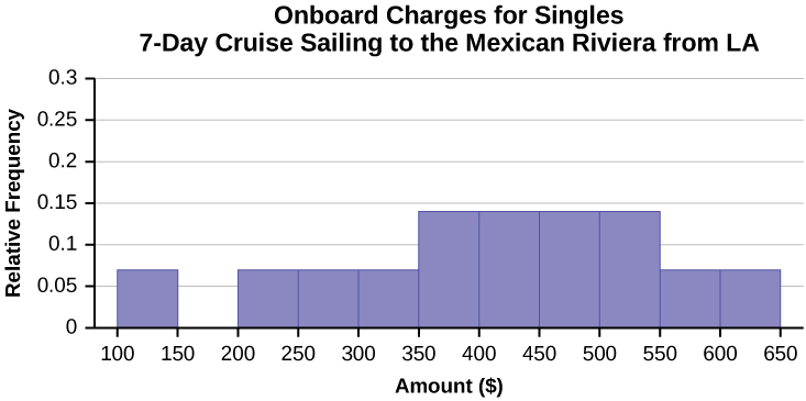
Figure 2.154 - Compare the two graphs:
- Answers may vary. Possible answers include:
- Both graphs have a single peak.
- Both graphs use class intervals with width equal to $50.
- Answers may vary. Possible answers include:
- The couples graph has a class interval with no values.
- It takes almost twice as many class intervals to display the data for couples.
- Answers may vary. Possible answers include: The graphs are more similar than different because the overall patterns for the graphs are the same.
- Answers may vary. Possible answers include:
- Check student’s solution.
- Compare the graph for the Singles with the new graph for the Couples:
-
- Both graphs have a single peak.
- Both graphs display 6 class intervals.
- Both graphs show the same general pattern.
- Answers may vary. Possible answers include: Although the width of the class intervals for couples is double that of the class intervals for singles, the graphs are more similar than they are different.
-
- Answers may vary. Possible answers include: You are able to compare the graphs interval by interval. It is easier to compare the overall patterns with the new scale on the Couples graph. Because a couple represents two individuals, the new scale leads to a more accurate comparison.
- Answers may vary. Possible answers include: Based on the histograms, it seems that spending does not vary much from singles to individuals who are part of a couple. The overall patterns are the same. The range of spending for couples is approximately double the range for individuals.
31. Twenty-five randomly selected students were asked the number of movies they watched the previous week. The results are as follows.
| # of movies | Frequency | Relative Frequency | Cumulative Relative Frequency |
|---|---|---|---|
| 0 | 5 | ||
| 1 | 9 | ||
| 2 | 6 | ||
| 3 | 4 | ||
| 4 | 1 |
- Construct a histogram of the data.
- Complete the columns of the chart.
32. Use the data to construct a line graph.
a. In a survey, 40 people were asked how many times they visited a store before making a major purchase. The results are shown below.
| Number of times in store | Frequency |
|---|---|
| 1 | 4 |
| 2 | 10 |
| 3 | 16 |
| 4 | 6 |
| 5 | 4 |
Solution:
b. In a survey, several people were asked how many years it has been since they purchased a mattress. The results are shown below.
| Years since last purchase | Frequency |
|---|---|
| 0 | 2 |
| 1 | 8 |
| 2 | 13 |
| 3 | 22 |
| 4 | 16 |
| 5 | 9 |
c. Several children were asked how many TV shows they watch each day. The results of the survey are shown below.
| Number of TV Shows | Frequency |
|---|---|
| 0 | 12 |
| 1 | 18 |
| 2 | 36 |
| 3 | 7 |
| 4 | 2 |
Solution:
References
Image References
Figure 2.55: Figure 2.6 from OpenStax Introductory Statistics (2013) (CC BY 4.0). Retrieved from https://openstax.org/books/introductory-statistics/pages/2-2-histograms-frequency-polygons-and-time-series-graphs
Figure 2.58: Figure 2.9 from OpenStax Introductory Statistics (2013) (CC BY 4.0). Retrieved from https://openstax.org/books/statistics/pages/2-2-histograms-frequency-polygons-and-time-series-graphs
Figure 2.68: Figure 2.8 from OpenIntro Introductory Statistics (2019) (CC BY-SA 3.0). Retrieved from https://cnx.org/contents/pJuo4h-U@4.478:UMM7d-Hy/Display-Data
Figure 2.70: Figure 2.14 from OpenStax Introductory Statistics (2013) (CC BY 4.0). Retrieved from https://openstax.org/books/introductory-statistics/pages/2-4-box-plots
Figure 2.71: Figure 2.17 from OpenStax Introductory Statistics (2013) (CC BY 4.0). Retrieved from https://openstax.org/books/statistics/pages/2-4-box-plots
Figure 2.72: Figure 2.45 from OpenStax Introductory Statistics (2013) (CC BY 4.0). Retrieved from https://openstax.org/books/statistics/pages/2-homework
Figure 2.73: Figure 2.46 from OpenStax Introductory Statistics (2013) (CC BY 4.0). Retrieved from https://openstax.org/books/statistics/pages/2-homework
Figure 2.74: Figure 2.47 from OpenStax Introductory Statistics (2013) (CC BY 4.0). Retrieved from https://openstax.org/books/statistics/pages/2-homework
Figure 2.75: Figure 2.46 from OpenStax Introductory Statistics (2013) (CC BY 4.0). Retrieved from https://openstax.org/books/introductory-statistics/pages/2-homework
Figure 2.78: Figure 2.47 from OpenStax Introductory Statistics (2013) (CC BY 4.0). Retrieved from https://openstax.org/books/introductory-statistics/pages/2-bringing-it-together-homework
Figure 2.85: Figure 2.43 from OpenStax Introductory Statistics (2013) (CC BY 4.0). Retrieved from https://openstax.org/books/statistics/pages/2-homework
Figure 2.86: Figure 2.44 from OpenStax Introductory Statistics (2013) (CC BY 4.0). Retrieved from https://openstax.org/books/statistics/pages/2-homework
Figure 2.96: Figure from OpenStax Introductory Business Statistics (2012) (CC BY 4.0). Retrieved from https://openstax.org/books/introductory-business-statistics/pages/2-homework
Figure 2.99: Figure 2.58 from OpenStax Introductory Statistics (2013) (CC BY 4.0). Retrieved from https://openstax.org/books/introductory-statistics/pages/2-solutions
Figure 2.100: Figure 2.59 from OpenStax Introductory Statistics (2013) (CC BY 4.0). Retrieved from https://openstax.org/books/introductory-statistics/pages/2-solutions
Figure 2.101: Figure 2.60 from OpenStax Introductory Statistics (2013) (CC BY 4.0). Retrieved from https://openstax.org/books/introductory-statistics/pages/2-solutions
Figure 2.106: Figure 2.54 from OpenStax Introductory Statistics (2013) (CC BY 4.0). Retrieved from https://openstax.org/books/introductory-statistics/pages/2-solutions
Figure 2.112: Figure 2.24 from OpenStax Introductory Statistics (2013) (CC BY 4.0). Retrieved from https://openstax.org/books/statistics/pages/2-6-skewness-and-the-mean-median-and-mode
Figure 2.114: Figure 2.25 from OpenStax Introductory Statistics (2013) (CC BY 4.0). Retrieved from https://openstax.org/books/statistics/pages/2-6-skewness-and-the-mean-median-and-mode
Figure 2.115: Figure 2.7.9 from LibreTexts Introductory Statistics (2020) (CC BY 4.0). Retrieved from https://stats.libretexts.org/Bookshelves/Introductory_Statistics/Book%3A_Introductory_Statistics_(OpenStax)/02%3A_Descriptive_Statistics/2.07%3A_Skewness_and_the_Mean_Median_and_Mode
Figure 2.117: Figure 2.9.1 from LibreTexts Introductory Business Statistics (2020) (CC BY 4.0). Retrieved from https://biz.libretexts.org/Courses/Gettysburg_College/MGT_235%3A_Introductory_Business_Statistics/02%3A_Descriptive_Statistics/2.09%3A_Homework
Figure 2.118: Figure 2.51 from OpenStax Introductory Statistics (2013) (CC BY 4.0). Retrieved from https://openstax.org/books/statistics/pages/2-bringing-it-together-homework
Figure 2.121: Figure 2.58 from OpenStax Introductory Statistics (2013) (CC BY 4.0). Retrieved from https://openstax.org/books/statistics/pages/2-solutions
Figure 2.123: Figure 2.8.2 from LibreTexts Introductory Statistics (2020) (CC BY 4.0). Retrieved from https://stats.libretexts.org/Bookshelves/Introductory_Statistics/Book%3A_Introductory_Statistics_(OpenStax)/02%3A_Descriptive_Statistics/2.08%3A_Measures_of_the_Spread_of_the_Data
Figure 2.134: Figure from OpenStax Introductory Statistics (2013) (CC BY 4.0). Retrieved from https://openstax.org/books/statistics/pages/2-solutions#element-324s-solution
Figure 2.135: Figure 2.52 from OpenStax Introductory Statistics (2013) (CC BY 4.0). Retrieved from https://openstax.org/books/statistics/pages/2-bringing-it-together-homework
Figure 2.143: Figure 1.11 from OpenStax Introductory Business Statistics (2012) (CC BY 4.0). Retrieved from https://openstax.org/books/introductory-business-statistics/pages/1-homework
Figure 2.153: Figure 2.36 from OpenStax Introductory Business Statistics (2012) (CC BY 4.0). Retrieved from https://openstax.org/books/introductory-business-statistics/pages/2-solutions#eip-457-solution
Figure 2.154: Figure 2.37 from OpenStax Introductory Business Statistics (2012) (CC BY 4.0). Retrieved from https://openstax.org/books/introductory-business-statistics/pages/2-solutions#eip-457-solution
Figure 2.157: Figure 2.51 from OpenStax Introductory Statistics (2013) (CC BY 4.0). Retrieved from https://openstax.org/books/introductory-statistics/pages/2-solutions#fs-idp113295424-solution
Figure 2.160: Figure 2.52 from OpenStax Introductory Statistics (2013) (CC BY 4.0). Retrieved from https://openstax.org/books/introductory-statistics/pages/2-solutions#fs-idp113295424-solution
Text
“State & County QuickFacts: Quick, easy access to facts about people, business, and geography,” U.S. Census Bureau. http://quickfacts.census.gov/qfd/index.html (accessed May 1, 2013).
“Table 5: Direct hits by mainland United States Hurricanes (1851-2004),” National Hurricane Center, http://www.nhc.noaa.gov/gifs/table5.gif (accessed May 1, 2013).
“Levels of Measurement,” http://infinity.cos.edu/faculty/woodbury/stats/tutorial/Data_Levels.htm (accessed May 1, 2013).
David Lane. “Levels of Measurement,” Connexions, http://cnx.org/content/m10809/latest (accessed May 1, 2013).
Dekker, Marcel. Data on annual homicides in Detroit, 1961–73 in Gunst & Mason, Regression Analysis and its Application.
“Timeline: Guide to the U.S. Presidents: Information on every president’s birthplace, political party, term of office, and more.” Scholastic, 2013. Available online at http://www.scholastic.com/teachers/article/timeline-guide-us-presidents (accessed April 3, 2013).
“Presidents.” Fact Monster. Pearson Education, 2007. Available online at http://www.factmonster.com/ipka/A0194030.html (accessed April 3, 2013).
“Food Security Statistics.” Food and Agriculture Organization of the United Nations. Available online at http://www.fao.org/economic/ess/ess-fs/en/ (accessed April 3, 2013).
“Consumer Price Index.” United States Department of Labor: Bureau of Labor Statistics. Available online at http://data.bls.gov/pdq/SurveyOutputServlet (accessed April 3, 2013).
“CO2 emissions (kt).” The World Bank, 2013. Available online at http://databank.worldbank.org/data/home.aspx (accessed April 3, 2013).
“Births Time Series Data.” General Register Office For Scotland, 2013. Available online at http://www.gro-scotland.gov.uk/statistics/theme/vital-events/births/time-series.html (accessed April 3, 2013).
“Demographics: Children under the age of 5 years underweight.” Indexmundi. Available online at http://www.indexmundi.com/g/r.aspx?t=50&v=2224&aml=en (accessed April 3, 2013).
Gunst, Richard, Robert Mason. Regression Analysis and Its Application: A Data-Oriented Approach. CRC Press: 1980.
“Overweight and Obesity: Adult Obesity Facts.” Centers for Disease Control and Prevention. Available online at https://web.archive.org/web/20130917120224/https://www.cdc.gov/obesity/data/adult.html (accessed September 13, 2013).
Burbary, Ken. Facebook Demographics Revisited – 2001 Statistics, 2011. Available online at http://www.kenburbary.com/2011/03/facebook-demographics-revisited-2011-statistics-2/ (accessed August 21, 2013).
“9th Annual AP Report to the Nation.” CollegeBoard, 2013. Available online at http://apreport.collegeboard.org/goals-and-findings/promoting-equity (accessed September 13, 2013).
Data from West Magazine.
Cauchon, Dennis, Paul Overberg. “Census data shows minorities now a majority of U.S. births.” USA Today, 2012. Available online at http://usatoday30.usatoday.com/news/nation/story/2012-05-17/minority-birthscensus/55029100/1 (accessed April 3, 2013).
Data from the United States Department of Commerce: United States Census Bureau. Available online at http://www.census.gov/ (accessed April 3, 2013).
“1990 Census.” United States Department of Commerce: United States Census Bureau. Available online at http://www.census.gov/main/www/cen1990.html (accessed April 3, 2013).
Data from San Jose Mercury News.
Data from Time Magazine; survey by Yankelovich Partners, Inc.
Data from The World Bank, available online at http://www.worldbank.org (accessed April 3, 2013).
“Demographics: Obesity – adult prevalence rate.” Indexmundi. Available online at http://www.indexmundi.com/g/r.aspx?t=50&v=2228&l=en (accessed April 3, 2013).
Data from Microsoft Bookshelf.
King, Bill.“Graphically Speaking.” Institutional Research, Lake Tahoe Community College. Available online at http://www.ltcc.edu/web/about/institutional-research (accessed April 3, 2013).
- “Presidents.” Fact Monster. Pearson Education, 2007. Available online at http://www.factmonster.com/ipka/A0194030.html (accessed April 3, 2013). ↵
- “Food Security Statistics.” Food and Agriculture Organization of the United Nations. Available online at http://www.fao.org/economic/ess/ess-fs/en/ (accessed April 3, 2013). ↵
- Data from West Magazine. ↵
- “CO2 emissions (kt).” The World Bank, 2013. Available online at http://databank.worldbank.org/data/home.aspx (accessed April 3, 2013). ↵
- “Births Time Series Data.” General Register Office For Scotland, 2013. Available online at http://www.gro-scotland.gov.uk/ statistics/theme/vital-events/births/time-series.html (accessed April 3, 2013). ↵
- Data on annual homicides in Detroit, 1961–73, from Gunst & Mason’s book ‘Regression Analysis and its Application’, Marcel Dekker ↵
- Data from West Magazine ↵
- Data from West Magazine ↵
- “Overweight and Obesity: Adult Obesity Facts.” Centers for Disease Control and Prevention. Available online at http://www.cdc.gov/obesity/data/adult.html (accessed September 13, 2013). (archive) ↵
- “Overweight and Obesity: Adult Obesity Facts.” Centers for Disease Control and Prevention. Available online at http://www.cdc.gov/obesity/data/adult.html (accessed September 13, 2013) (archive). ↵
- “Demographics: Obesity – adult prevalence rate.” Indexmundi. Available online at http://www.indexmundi.com/g/ r.aspx?t=50&v=2228&l=en (accessed April 3, 2013). ↵
- “Demographics: Children under the age of 5 years underweight.” Indexmundi. Available online at http://www.indexmundi.com/g/r.aspx?t=50&v=2224&aml=en (accessed April 3, 2013). ↵
- “Presidents.” Fact Monster. Pearson Education, 2007. Available online at http://www.factmonster.com/ipka/A0194030.html (accessed April 3, 2013). ↵
- “Demographics: Obesity – adult prevalence rate.” Indexmundi. Available online at http://www.indexmundi.com/g/ r.aspx?t=50&v=2228&l=en (accessed April 3, 2013). ↵
- “Demographics: Children under the age of 5 years underweight.” Indexmundi. Available online at http://www.indexmundi.com/g/r.aspx?t=50&v=2224&aml=en (accessed April 3, 2013). ↵
Methods of organizing, summarizing, and presenting data
Organizing, summarizing, or presenting data visually in graphs, figures, or charts
Numbers that summarize some aspect of a dataset, often calculated
The possible values a variable can take on, and how often it does so
The number of times a value of the data occurs
The percentage, proportion, or ratio of the frequency of a value of the data to the total number of outcomes
The sum of the relative frequencies for all values that are less than or equal to the given value
The lower end of a bin or class in a frequency table or histogram
The upper end of a bin or class in a frequency table or histogram
The difference in consecutive lower class limits
Found by adding the lower limit and upper limit, then dividing by 2
Data that describes qualities, or puts individuals into categories
The most frequently occurring value
The level of variability or dispersion of a dataset; also commonly known as variation/variability
Numerical data with a mathematical context
A random variable that produces discrete data
Categorical data where the the categories have a natural or intuitive order
What a dataset looks like visually
An observation that stands out from the rest of the data significantly
The central tendency or most typical value of a dataset
How many peaks or clusters there appear to be in a quantitative distribution
A number that measures the central tendency of the data
The middle number in a sorted list
The arithmetic mean, or average of a dataset
The arithmetic mean, or average of a population
Not affected by violations of assumptions such as outliers
The average distance (deviation) of each observation from the mean
A subset of the population studied
The whole group of individuals who can be studied to answer a research question
The square of the standard deviation; a computational step along the way to calculating the standard deviation
A measure of location that tells us how many standard deviations a value is above or below the mean
