2.3 Displaying Quantitative Data
Descriptive Statistics for Quantitative Data
Descriptive options for quantitative data are much more robust than for categorical. Recall descriptive statistics consists of visual and numerical methods. We usually start with visual methods and then move into numerical.
This section will expand on graphical methods while the next few sections will focus on numerical summaries of quantitative data.
Graphical Methods for Quantitative Data
The first thing we may do, especially for quantitative data, is to examine it in a frequency table. We have many more graphical options beyond that for quantitative data. Some of them we will discuss here are:
- Stem-and-leaf plots
- Dot plots
- Line graphs
- Histograms
- Frequency polygons
- Time series plots
Each of these methods comes with it’s own pros and cons.
Stem-And-Leaf Plots
One simple graph, the stem-and-leaf graph or stemplot, comes from the field of exploratory data analysis. It is a good choice when the data sets are small. To create the plot, divide each observation of data into a “stem” and a “leaf”. The leaf consists of a final significant digit. For example you could divide the number 23 into a stem two and a leaf of three. The number 432 could have a stem of 43 and leaf of two. The decimal 9.3 could have a stem of nine and leaf of three. Write the stems in a vertical line from smallest to largest. Draw a vertical line to the right of the stems. Then write the leaves in increasing order next to their corresponding stem.
Example
For Susan Dean’s spring pre-calculus class, scores for the first exam were as follows (smallest to largest):
33, 42, 49, 49, 53, 55, 55, 61, 63, 67, 68, 68, 69, 69, 72, 73, 74, 78, 80, 83, 88, 88, 88, 90, 92, 94, 94, 94, 94, 96, 100
| Stem | Leaf |
|---|---|
| 3 | 3 |
| 4 | 2 9 9 |
| 5 | 3 5 5 |
| 6 | 1 3 7 8 8 9 9 |
| 7 | 2 3 4 8 |
| 8 | 0 3 8 8 8 |
| 9 | 0 2 4 4 4 4 6 |
| 10 | 0 |
The stemplot shows that most scores fell in the 60s, 70s, 80s, and 90s. Eight out of the 31 scores or approximately 26%  were in the 90s or 100, a fairly high number of As.
Comparisons with Stem-and-Leaf Plots
Back-to-back or side-by-side stem-and-leaf plot allows a comparison of the two data sets in two columns. In a side-by-side stem-and-leaf plot, two sets of leaves share the same stem. The leaves are to the left and the right of the stems.
Your turn!
The following two tables show the ages of U.S. presidents at their inauguration and at their death. Construct a side-by-side stem-and-leaf plot using this data.
| President | Age | President | Age | President | Age | President | Age |
|---|---|---|---|---|---|---|---|
| Washington | 57 | Fillmore | 50 | McKinley | 54 | Nixon | 56 |
| J. Adams | 61 | Pierce | 48 | T. Roosevelt | 42 | Ford | 61 |
| Jefferson | 57 | Buchanan | 65 | Taft | 51 | Carter | 52 |
| Madison | 57 | Lincoln | 52 | Wilson | 56 | Reagan | 69 |
| Monroe | 58 | A. Johnson | 56 | Harding | 55 | G.H.W. Bush | 64 |
| J. Q. Adams | 57 | Grant | 46 | Coolidge | 51 | Clinton | 47 |
| Jackson | 61 | Hayes | 54 | Hoover | 54 | G. W. Bush | 54 |
| Van Buren | 54 | Garfield | 49 | F. Roosevelt | 51 | Obama | 47 |
| W. H. Harrison | 68 | Arthur | 51 | Truman | 60 | Trump | 70 |
| Tyler | 51 | Cleveland | 47 | Eisenhower | 62 | Biden | 78 |
| Polk | 49 | B. Harrison | 55 | Kennedy | 43 | ||
| Taylor | 64 | Cleveland | 55 | L. Johnson | 55 |
| President | Age | President | Age | President | Age |
|---|---|---|---|---|---|
| Washington | 67 | Lincoln | 56 | Hoover | 90 |
| J. Adams | 90 | A. Johnson | 66 | F. Roosevelt | 63 |
| Jefferson | 83 | Grant | 63 | Truman | 88 |
| Madison | 85 | Hayes | 70 | Eisenhower | 78 |
| Monroe | 73 | Garfield | 49 | Kennedy | 46 |
| J. Q. Adams | 80 | Arthur | 56 | L. Johnson | 64 |
| Jackson | 78 | Cleveland | 71 | Nixon | 81 |
| Van Buren | 79 | B. Harrison | 67 | Ford | 93 |
| W. H. Harrison | 68 | Cleveland | 71 | Reagan | 93 |
| Tyler | 71 | McKinley | 58 | G.H.W. Bush | 94 |
| Polk | 53 | T. Roosevelt | 60 | ||
| Taylor | 65 | Taft | 72 | ||
| Fillmore | 74 | Wilson | 67 | ||
| Pierce | 64 | Harding | 57 | ||
| Buchanan | 77 | Coolidge | 60 |
Line Graphs
Another type of graph that is useful for showing trends in specific data values (discrete data) is a line graph. In the particular line graph shown below, the x-axis (horizontal axis) consists of data values and the y-axis (vertical axis) consists of frequency points. The frequency points are connected using line segments.
Side Note: Line graphs could also be used with some ordinal categorical data.
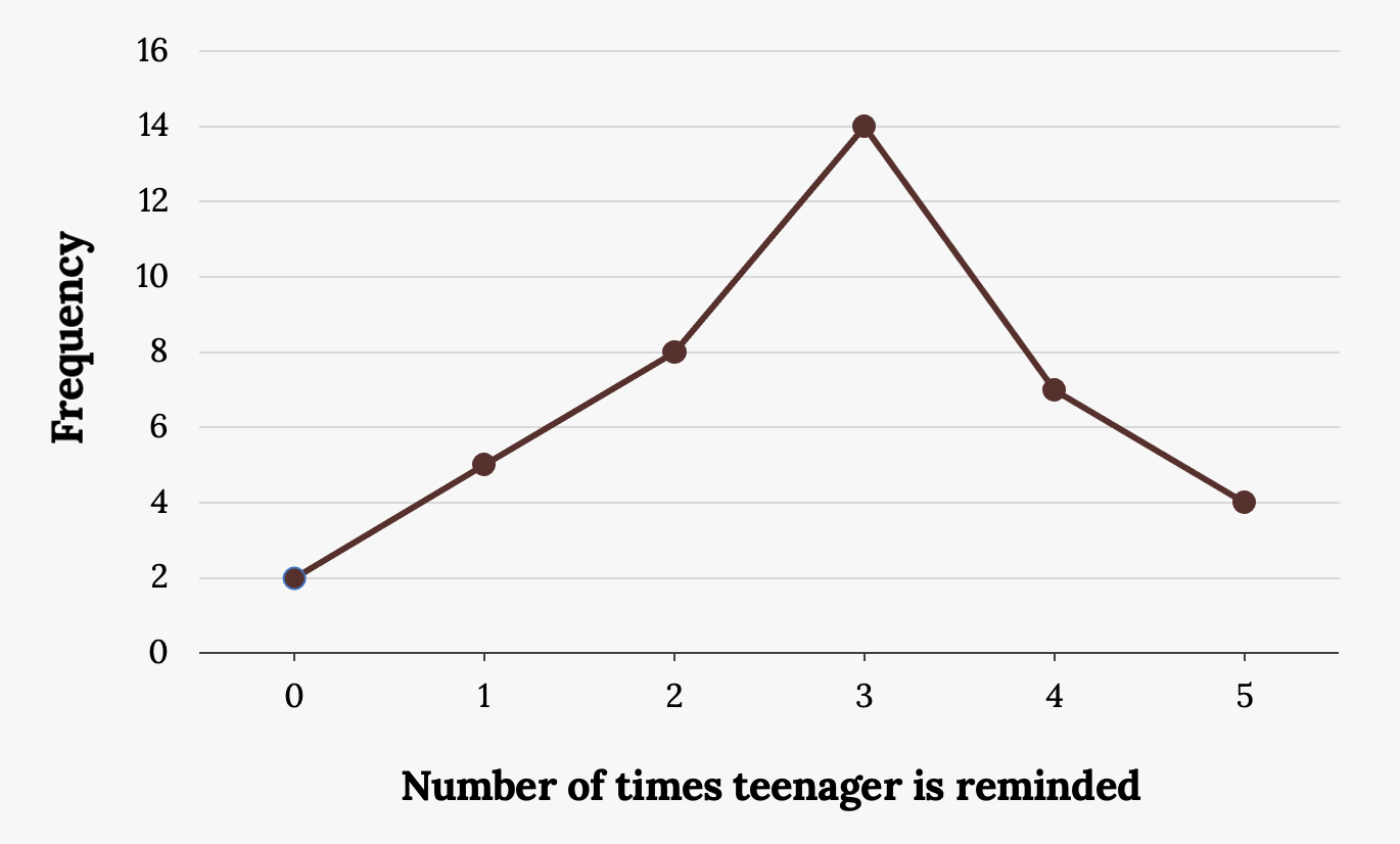
Example
In a survey, 40 mothers were asked how many times per week a teenager must be reminded to complete chores. The results are shown in the table and chart below.
| Number of times teenager is reminded | Frequency |
|---|---|
| 0 | 2 |
| 1 | 5 |
| 2 | 8 |
| 3 | 14 |
| 4 | 7 |
| 5 | 4 |
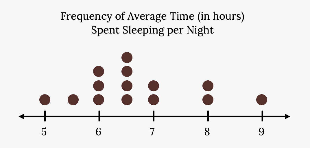
Dot Plots
A dot plot consists of a number line and dots (or points) positioned above the number line.
Dot plots are very similar in functionality to stem-leaf-plots, but look a little bit cleaner. Look for an overall pattern and any outliers or extreme values. An outlier is an observation of data that does not fit the rest of the data. When graphed, an outlier will appear not to fit the pattern of the graph. Some outliers are due to mistakes (for example, writing down 50 instead of 500) while others may indicate that something unusual is happening. It takes some background information to fully explain outliers; we will cover them in more detail later.
Example
Consider the following data dealing with the hours of sleep students get per night: 5, 5.5, 6, 6, 6, 6.5, 6.5, 6.5, 6.5, 7, 7, 8, 8, 9
The dot plot for this data would be as follows:
Histograms
For most of the work in this book, histograms will display the data. One advantage of a histogram is that it can readily display large continuous data sets. A rule of thumb is to use a histogram when the data set consists of 100 values or more.
A histogram consists of contiguous (adjoining) boxes. It has both a horizontal axis and a vertical axis. The horizontal axis is labeled with what the data represents (for instance, distance from your home to school). The vertical axis is labeled either frequency or relative frequency (or percent frequency or probability). The graph will have the same shape with either label. The histogram can give you a really good look at the overall shape of the data, the center, and the spread. However, you do lose individual data points.
A Histogram is essentially a 2-D Frequency table. To construct a histogram, you must first decide the size and number of bars, intervals, or classes, similarly to how you would with a frequency table.
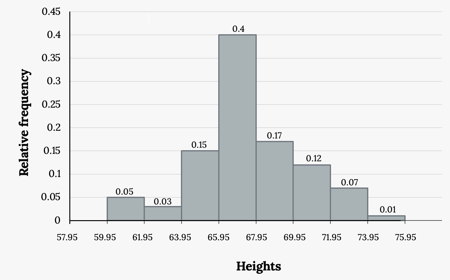
Example
The following data are the heights (in inches to the nearest half inch) of 100 male semiprofessional soccer players. The heights are continuous data, since height is measured.
60, 60.5, 61, 61, 61.5, 63.5, 63.5, 63.5, 64, 64, 64, 64, 64, 64, 64, 64.5, 64.5, 64.5, 64.5, 64.5, 64.5, 64.5, 64.5, 66, 66, 66, 66, 66, 66, 66, 66, 66, 66, 66.5, 66.5, 66.5, 66.5, 66.5, 66.5, 66.5, 66.5, 66.5, 66.5, 66.5, 67, 67, 67, 67, 67, 67, 67, 67, 67, 67, 67, 67, 67.5, 67.5, 67.5, 67.5, 67.5, 67.5, 67.5, 68, 68, 69, 69, 69, 69, 69, 69, 69, 69, 69, 69, 69.5, 69.5, 69.5, 69.5, 69.5, 70, 70, 70, 70, 70, 70, 70.5, 70.5, 70.5, 71, 71, 71, 72, 72, 72, 72.5, 72.5, 73, 73.5, 74
The smallest data value is 60. Since the data with the most decimal places has one decimal (for instance, 61.5), we want our starting point to have two decimal places. Since the numbers 0.5, 0.05, 0.005, etc. are convenient numbers, use 0.05 and subtract it from 60, the smallest value, for the convenient starting point.
60 – 0.05 = 59.95 which is more precise than, say, 61.5 by one decimal place. The starting point is, then, 59.95.
The largest value is 74, so 74 + 0.05 = 74.05 is the ending value.
Next, calculate the width of each bar or class interval. To calculate this width, subtract the starting point from the ending value and divide by the number of bars (you must choose the number of bars you desire). Suppose you choose eight bars.
 = 1.76.
We will round up to two and make each bar or class interval two units wide. Rounding up to two is one way to prevent a value from falling on a boundary. Rounding to the next number is often necessary even if it goes against the standard rules of rounding. For this example, using 1.76 as the width would also work. A guideline that is followed by some for the number of bars or class intervals is to take the square root of the number of data values and then round to the nearest whole number, if necessary. For example, if there are 150 values of data, take the square root of 150 and round to 12 bars or intervals.
Some values in data sets might fall on boundaries for different intervals. Different researchers may set up histograms for the same data in different ways. There is more than one correct way to set up a histogram.
The boundaries are:
- 59.95
- 59.95 + 2 = 61.95
- 61.95 + 2 = 63.95
- 63.95 + 2 = 65.95
- 65.95 + 2 = 67.95
- 67.95 + 2 = 69.95
- 69.95 + 2 = 71.95
- 71.95 + 2 = 73.95
- 73.95 + 2 = 75.95
The heights 60 through 61.5 inches are in the interval 59.95–61.95. The heights that are 63.5 are in the interval 61.95–63.95. The heights that are 64 through 64.5 are in the interval 63.95–65.95. The heights 66 through 67.5 are in the interval 65.95–67.95. The heights 68 through 69.5 are in the interval 67.95–69.95. The heights 70 through 71 are in the interval 69.95–71.95. The heights 72 through 73.5 are in the interval 71.95–73.95. The height 74 is in the interval 73.95–75.95.
The following histogram displays the heights on the x-axis and relative frequency on the y-axis.
Frequency Polygons
Frequency polygons are analogous to line graphs, but instead utilize binning techniques to make continuous data visually easy to interpret. It is essentially a combination of a histogram and line graph.
To construct a frequency polygon, first examine the data and decide on the number of intervals, or class intervals, to use on the x-axis and y-axis. After choosing the appropriate ranges, begin plotting the data points. After all the points are plotted, draw line segments to connect them.
Frequency polygons are sometimes more useful for comparing continuous distributions than histograms. This is achieved by overlaying the frequency polygons drawn for different data sets.
Example
A frequency polygon was constructed from the frequency table below.
| Lower Bound | Upper Bound | Frequency | Cumulative Frequency |
|---|---|---|---|
| 49.5 | 59.5 | 5 | 5 |
| 59.5 | 69.5 | 10 | 15 |
| 69.5 | 79.5 | 30 | 45 |
| 79.5 | 89.5 | 40 | 85 |
| 89.5 | 99.5 | 15 | 100 |
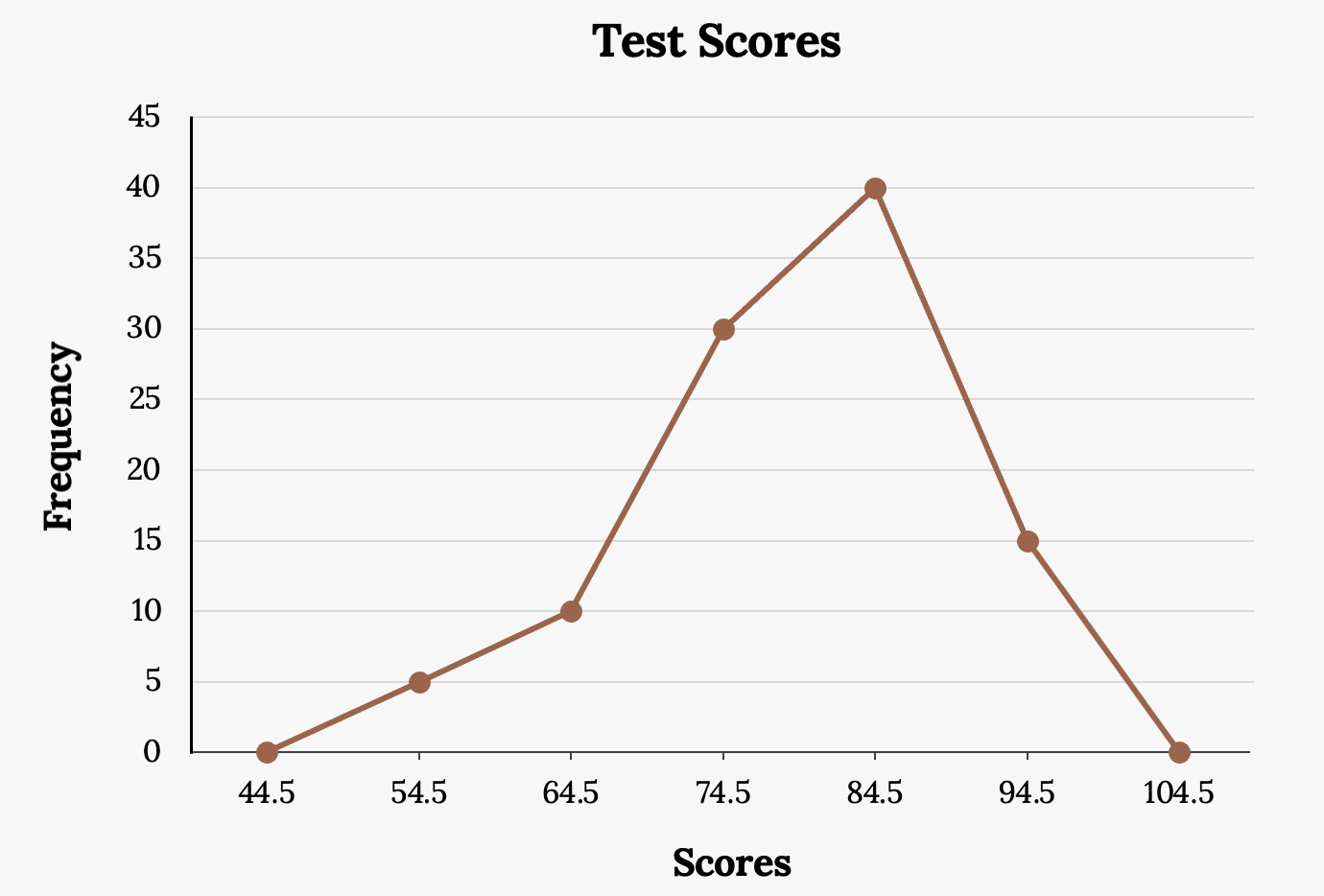
The first label on the x-axis is 44.5. This represents an interval extending from 39.5 to 49.5. Since the lowest test score is 54.5, this interval is used only to allow the graph to touch the x-axis. The point labeled 54.5 represents the next interval, or the first “real” interval from the table, and contains five scores. This reasoning is followed for each of the remaining intervals with the point 104.5 representing the interval from 99.5 to 109.5. Again, this interval contains no data and is only used so that the graph will touch the x-axis. Looking at the graph, we say that this distribution is skewed because one side of the graph does not mirror the other side.
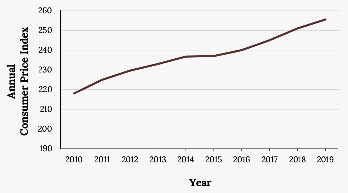
Time Series Plots
Suppose that we want to study the temperature range of a region for an entire month. Every day at noon we note the temperature and write this down in a log. A variety of statistical studies could be done with this data. We could find the mean or the median temperature for the month. We could construct a histogram displaying the number of days that temperatures reach a certain range of values. However, all of these methods ignore a portion of the data that we have collected.
One feature of the data that we may want to consider is that of time. Since each date is paired with the temperature reading for the day, we don‘t have to think of the data as being random. We can instead use the times given to impose a chronological order on the data. A graph that recognizes this ordering and displays the changing temperature as the month progresses is called a time series graph.
Time series graphs are important tools in various applications of statistics. When recording values of the same variable over an extended period of time, sometimes it is difficult to discern any trend or pattern. However, once the same data points are displayed graphically, some features jump out. Time series graphs make trends easy to spot.
To construct a time series graph, we must look at both pieces of our paired data set. We start with a standard Cartesian coordinate system. The horizontal axis is used to plot the date or time increments, and the vertical axis is used to plot the values of the variable that we are measuring. By doing this, we make each point on the graph correspond to a date and a measured quantity. The points on the graph are typically connected by straight lines in the order in which they occur.
Example
The following data shows the Annual Consumer Price Index, each month, for ten years. Construct a time series graph for the Annual Consumer Price Index data only.
| Year | Jan | Feb | Mar | Apr | May | Jun | Jul |
|---|---|---|---|---|---|---|---|
| 2009 | 211.143 | 212.193 | 212.709 | 213.240 | 213.856 | 215.693 | 215.351 |
| 2010 | 216.687 | 216.741 | 217.631 | 218.009 | 218.178 | 217.965 | 218.011 |
| 2011 | 220.223 | 221.309 | 223.467 | 224.906 | 225.964 | 225.722 | 225.922 |
| 2012 | 226.655 | 227.663 | 229.392 | 230.085 | 229.815 | 229.478 | 229.104 |
| 2013 | 230.280 | 232.166 | 232.773 | 232.531 | 232.945 | 233.504 | 233.596 |
| 2014 | 233.916 | 234.781 | 236.293 | 237.072 | 237.900 | 238.343 | 238.250 |
| 2015 | 233.707 | 234.722 | 236.119 | 236.599 | 237.805 | 238.638 | 238.654 |
| 2016 | 236.916 | 237.111 | 238.132 | 239.261 | 240.236 | 241.038 | 240.647 |
| 2017 | 242.839 | 243.603 | 243.801 | 244.524 | 244.733 | 244.955 | 244.786 |
| 2018 | 247.867 | 248.991 | 249.554 | 250.546 | 251.588 | 251.989 | 252.006 |
| 2019 | 251.712 | 252.776 | 254.202 | 255.548 | 256.092 | 256.143 | 256.571 |
| Year | Aug | Sep | Oct | Nov | Dec | Annual |
|---|---|---|---|---|---|---|
| 2009 | 215.834 | 215.969 | 216.177 | 216.330 | 215.949 | 214.537 |
| 2010 | 218.312 | 218.439 | 218.711 | 218.803 | 219.179 | 218.056 |
| 2011 | 226.545 | 226.889 | 226.421 | 226.230 | 225.672 | 224.939 |
| 2012 | 230.379 | 231.407 | 231.317 | 230.221 | 229.601 | 229.594 |
| 2013 | 233.877 | 234.149 | 233.546 | 233.069 | 233.049 | 232.957 |
| 2014 | 237.852 | 238.031 | 237.433 | 236.151 | 234.812 | 236.736 |
| 2015 | 238.316 | 237.945 | 237.838 | 237.336 | 236.525 | 237.017 |
| 2016 | 240.853 | 241.428 | 241.729 | 241.353 | 241.432 | 240.007 |
| 2017 | 245.519 | 246.819 | 246.663 | 246.669 | 246.524 | 245.120 |
| 2018 | 252.146 | 252.439 | 252.885 | 252.038 | 251.233 | 251.107 |
| 2019 | 256.558 | 256.759 | 257.346 | 257.208 | 256.974 | 255.657 |
Numerical data with a mathematical context
A random variable that produces discrete data
Categorical data where the the categories have a natural or intuitive order
