2.5 Measures of Location and Outliers
Let’s keep working through our acronym, SOCS, to describe the key aspects of our data.
- Shape
- Outliers
- Center
- Spread
Measures of location are a tool used to quantify where an observation stands in relation to the rest of the distribution. They also provide the building blocks to formally identify outliers. Common measures of location are quartiles and percentiles. Quartiles divide ordered data into quarters while percentiles divide ordered data into hundredths
Percentiles
Percentiles are useful for comparing values. For this reason, universities and colleges use percentiles extensively. One instance in which colleges and universities use percentiles is when SAT results are used to determine a minimum testing score that will be used as an acceptance factor. For example, suppose Duke accepts SAT scores at or above the 75th percentile. That translates into a score of at least 1220.
To score in the 90th percentile of an exam does not mean, necessarily, that you received 90% on a test. It means that 90% of test scores are the same or less than your score and 10% of the test scores are the same or greater than your test score.
Percentiles are mostly used with very large populations. Therefore, if you were to say that 90% of the test scores are less (and not the same or less) than your score, it would be acceptable because removing one particular data value is not significant.
There are two inverse ways you may work with percentiles; Finding the kth Percentile of a distribution, or finding the percentile of a given observation.
Finding the kth Percentile of a Distribution
Sometimes we may want to find the “kth” percentile of a distribution. For instance what would you have to score on the SAT to be in the 90th percentile?
If you were to do a little research, you would find several formulas for calculating the kth percentile. Here is one of them.
k = the kth percentile. It may or may not be part of the data.
i = the index (ranking or position of a data value)
n = the total number of data
- Order the data from smallest to largest.
- Calculate i =
 (n+1)
(n+1) - If i is an integer, then the kth percentile is the data value in the ith position in the ordered set of data.
- If i is not an integer, then round i up and round i down to the nearest integers. Average the two data values in these two positions in the ordered data set. This is easier to understand in an example.
NOTE: You can calculate percentiles using calculators and computers. There are a variety of online calculators.
Example
Listed are 29 ages for Academy Award winning best actors in order from smallest to largest.
18, 21, 22, 25, 26, 27, 29, 30, 31, 33, 36, 37, 41, 42, 47, 52, 55, 57, 58, 62, 64, 67, 69, 71, 72, 73, 74, 76, 77
- Find the 70th percentile.
- Find the 83rd percentile.
Your turn!
Listed are 29 ages for Academy Award winning best actors in order from smallest to largest.
18, 21, 22, 25, 26, 27, 29, 30, 31, 33, 36, 37, 41, 42, 47, 52, 55, 57, 58, 62, 64, 67, 69, 71, 72, 73, 74, 76, 77
Calculate the 20th percentile and the 55th percentile.
Finding the Percentile of a Value in a Data Set
To find the corresponding percentile of a given observation the process is as follows:
- Order the data from smallest to largest.
- x = the number of data values counting from the bottom of the data list up to but not including the data value for which you want to find the percentile.
- y = the number of data values equal to the data value for which you want to find the percentile.
- n = the total number of data.
- Calculate
 (100). Then round to the nearest integer.
Example
Listed are 29 ages for Academy Award winning best actors in order from smallest to largest.
18, 21, 22, 25, 26, 27, 29, 30, 31, 33, 36, 37, 41, 42, 47, 52, 55, 57, 58, 62, 64, 67, 69, 71, 72, 73, 74, 76, 77
- Find the percentile for 58.
- Find the percentile for 25.
Your turn!
Listed are 30 ages for Academy Award winning best actors in order from smallest to largest.
18, 21, 22, 25, 26, 27, 29, 30, 31, 33, 36, 37, 41, 42, 47, 52, 55, 57, 58, 62, 64, 67, 69, 71, 72, 73, 74, 76, 77
Find the percentiles for 47 and 31.
Quartiles
Quartiles again deal with an ordered dataset and are really just special percentiles. The first quartile, Q1, is the same as the 25th percentile. The second quartile, Q2, is the same as the 50th percentile, and is also called the Median. and the third quartile, Q3, is the same as the 75th percentile.
The Median
The median is a number that measures the “halfway point” of the data. You can think of the median as the “middle value,” but it does not actually have to be one of the observed values. It is a number that separates ordered data into halves. Half the values are the same number or smaller than the median, and half the values are the same number or larger. For example, consider the following data: 1, 11.5, 6, 7.2, 4, 8, 9, 10, 6.8, 8.3, 2, 2, 10, 1
Ordered from smallest to largest: 1, 1, 2, 2, 4, 6, 6.8, 7.2, 8, 8.3, 9, 10, 10, 11.5
Since there are 14 observations, the median is between the seventh value, 6.8, and the eighth value, 7.2. To find the median, add the two values together and divide by two.

Finding Quartiles
The median or second quartile is seven. The lower half of the data are 1, 1, 2, 2, 4, 6, 6.8. The middle value of the lower half is two. 1, 1, 2, 2, 4, 6, 6.8
The number two, which is part of the data, is the first quartile. One-fourth of the entire sets of values are the same as or less than two and three-fourths of the values are more than two.
The upper half of the data is 7.2, 8, 8.3, 9, 10, 10, 11.5. The middle value of the upper half is nine.
The third quartile, Q3, is nine. Three-fourths (75%) of the ordered data set are less than nine. One-fourth (25%) of the ordered data set are greater than nine. The third quartile is part of the data set in this example.
Interpreting Percentiles, Quartiles, and Median
A percentile indicates the relative standing of a data value when data are sorted into numerical order from smallest to largest. Percentages of data values are less than or equal to the pth percentile. For example, 15% of data values are less than or equal to the 15th percentile.
- Low percentiles always correspond to lower data values.
- High percentiles always correspond to higher data values.
A percentile may or may not correspond to a value judgment about whether it is “good” or “bad.” The interpretation of whether a certain percentile is “good” or “bad” depends on the context of the situation to which the data applies. In some situations, a low percentile would be considered “good;” in other contexts a high percentile might be considered “good”. In many situations, there is no value judgment that applies.
Understanding how to interpret percentiles properly is important not only when describing data, but also when calculating probabilities in later chapters of this text.
- information about the context of the situation being considered
- the data value (value of the variable) that represents the percentile
- the percent of individuals or items with data values below the percentile
- the percent of individuals or items with data values above the percentile
Example
On a timed math test, the first quartile for time it took to finish the exam was 35 minutes. Interpret the first quartile in the context of this situation.
- Twenty-five percent of students finished the exam in 35 minutes or less.
- Seventy-five percent of students finished the exam in 35 minutes or more.
- A low percentile could be considered good, as finishing more quickly on a timed exam is desirable. (If you take too long, you might not be able to finish.)
Your turn!
For the 100-meter dash, the third quartile for times for finishing the race was 11.5 seconds. Interpret the third quartile in the context of the situation.
Five Number Summary
The Five Number summary is a simple, easy way to quickly summarize a data set. It consists of:
- Minimum
- Q1
- Median
- Q3
- Maximum
Example
Sharpe Middle School is applying for a grant that will be used to add fitness equipment to the gym. The principal surveyed 15 anonymous students to determine how many minutes a day the students spend exercising. The results from the 15 anonymous students are shown.
0 minutes, 40 minutes, 60 minutes, 30 minutes, 60 minutes, 10 minutes, 45 minutes, 30 minutes, 300 minutes, 90 minutes, 30 minutes, 120 minutes, 60 minutes, 0 minutes, 20 minutes
Determine the following five values.
- Min = 0
- Q1 = 20
- Med = 40
- Q3 = 60
- Max = 300
If you were the principal, would you be justified in purchasing new fitness equipment? Since 75% of the students exercise for 60 minutes or less daily, and since the IQR is 40 minutes (60 – 20 = 40), we know that half of the students surveyed exercise between 20 minutes and 60 minutes daily. This seems a reasonable amount of time spent exercising, so the principal would be justified in purchasing the new equipment.
However, the principal needs to be careful. The value 300 appears to be a potential outlier.
Q3 + 1.5(IQR) = 60 + (1.5)(40) = 120
Interquartile Range
The interquartile range it is the difference between the third quartile (Q3) and the first quartile (Q1).
IQR = Q3 – Q1
The IQR is also helpful to determine potential outliers. It can also be used as a measure of spread and will be discussed further.
Fence Rule
Although points may often look like outliers on a graph, we establish the upper and lower fences to numerically decide if a value is an outlier. The lower fence is 1.5 times the IQR below the first quartile (LF = Q1 – 1.5*IQR) while the upper fence is 1.5 times the IQR above the third quartile (UF = Q3 + 1.5*IQR). If a value falls outside of these fences, i.e. less than the lower fence or greater than the upper fence, we will flag it as an outlier.
Example
[Continued from Sharpe Middle School example above]
The value 300 is greater than 120 so it is a potential outlier. If we delete it and calculate the five values, we get the following values:
- Min = 0
- Q1 = 20
- Q3 = 60
- Max = 120
We still have 75% of the students exercising for 60 minutes or less daily and half of the students exercising between 20 and 60 minutes a day. However, 15 students is a small sample and the principal should survey more students to be sure of his survey results.
Box Plots
Box plots (also called box-and-whisker plots or box-whisker plots) give a good graphical image of the concentration of the data. They also show how far the extreme values are from most of the data. A box plot is constructed from the five number summary. We use these values to compare how close other data values are to them.
To construct a box plot, use a horizontal or vertical number line and a rectangular box. The smallest and largest data values label the endpoints of the axis. The first quartile marks one end of the box and the third quartile marks the other end of the box. Approximately the middle 50 percent of the data fall inside the box. The “whiskers” extend from the ends of the box to the smallest and largest data values. The median or second quartile can be between the first and third quartiles, or it can be one, or the other, or both. The box plot gives a good, quick picture of the data.
Example
Consider, again, this dataset.
1, 1, 2, 2, 4, 6, 6.8, 7.2, 8, 8.3, 9, 10, 10, 11.5
The first quartile is two, the median is seven, and the third quartile is nine. The smallest value is one, and the largest value is 11.5. The following image shows the constructed box plot.
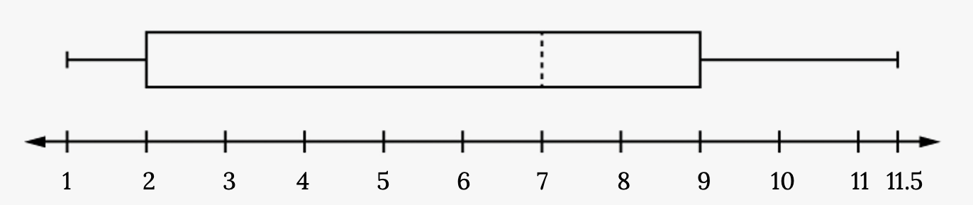
The two whiskers extend from the first quartile to the smallest value and from the third quartile to the largest value. The median is shown with a dashed line.
NOTE: It is important to start a box plot with a scaled number line. Otherwise the box plot may not be useful
Example
The following data are the heights of 40 students in a statistics class.
59, 60, 61, 62, 62, 63, 63, 64, 64, 64, 65, 65, 65, 65, 65, 65, 65, 65, 65, 66, 66, 67, 67, 68, 68, 69, 70, 70, 70, 70, 70, 71, 71, 72, 72, 73, 74, 74, 75, 77
Construct a box plot with the following properties.
- Minimum value = 59
- Maximum value = 77
- Q1: First quartile = 64.5
- Q2: Second quartile or median= 66
- Q3: Third quartile = 70
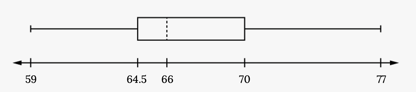
- Each quarter has approximately 25% of the data.
- The spreads of the four quarters are 64.5 – 59 = 5.5 (first quarter), 66 – 64.5 = 1.5 (second quarter), 70 – 66 = 4 (third quarter), and 77 – 70 = 7 (fourth quarter). So, the second quarter has the smallest spread and the fourth quarter has the largest spread.
- Range = maximum value – the minimum value = 77 – 59 = 18
- Interquartile Range: IQR = Q3 – Q1 = 70 – 64.5 = 5.5.
- The interval 59–65 has more than 25% of the data so it has more data in it than the interval 66 through 70 which has 25% of the data.
- The middle 50% (middle half) of the data has a range of 5.5 inches.
Your turn!
136, 140, 178, 190, 205, 215, 217, 218, 232, 234, 240, 255, 270, 275, 290, 301, 303, 315, 317, 318, 326, 333, 343, 349, 360, 369, 377, 388, 391, 392, 398, 400, 402, 405, 408, 422, 429, 450, 475, 512
For some sets of data, some of the largest value, smallest value, first quartile, median, and third quartile may be the same. For instance, you might have a data set in which the median and the third quartile are the same. In this case, the diagram would not have a dotted line inside the box displaying the median. The right side of the box would display both the third quartile and the median. For example, if the smallest value and the first quartile were both one, the median and the third quartile were both five, and the largest value was seven, the box plot would look like:
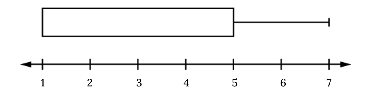
In this case, at least 25% of the values are equal to one. Twenty-five percent of the values are between one and five, inclusive. At least 25% of the values are equal to five. The top 25% of the values fall between five and seven, inclusive.
Image References
Figure 2.39: Kindred Grey via Virginia Tech (2020). “Figure 2.39” CC BY-SA 4.0. Retrieved from https://commons.wikimedia.org/wiki/File:Figure_2.39.png . Adaptation of Figure 2.11 from OpenStax Introductory Statistics (2013) (CC BY 4.0). Retrieved from https://openstax.org/books/introductory-statistics/pages/2-4-box-plots
Figure 2.40: Kindred Grey via Virginia Tech (2020). “Figure 2.40” CC BY-SA 4.0. Retrieved from https://commons.wikimedia.org/wiki/File:Figure_2.40.png . Adaptation of Figure 2.12 from OpenStax Introductory Statistics (2013) (CC BY 4.0). Retrieved from https://openstax.org/books/introductory-statistics/pages/2-4-box-plots
Figure 2.41: Kindred Grey via Virginia Tech (2020). “Figure 2.41” CC BY-SA 4.0. Retrieved from https://commons.wikimedia.org/wiki/File:Figure_2.41.png . Adaptation of Figure 2.13 from OpenStax Introductory Statistics (2013) (CC BY 4.0). Retrieved from https://openstax.org/books/introductory-statistics/pages/2-4-box-plots
