7 Chapter 7: Displaying Data
Introduction
With the power of GIS and remote sensing, you can change how data is displayed in the map document. This capability allows the display of multiple layers, all simultaneously, such as multiple layers using the same data. For example, layers of many different data types—such as points, lines, and polygons—and multiple copies of the same data can be displayed with each visually distinguished by its symbology.
Datums and Coordinate Systems
We begin with a discussion of coordinate systems because, as GIS data is created, it must be referenced to the surface of the Earth. So, as the database developer generates the data, the data is assigned a datum and coordinate system. How and why a specific system is chosen is beyond the scope of this chapter and book and usually involves a choice by the data developer or the data owner. Additionally, datums and coordinate systems can vary based on the location—country, state, or even a local municipal government—and spatial scale, such as large-scale vs. small-scale maps. This chapter provides a brief example of how the choice of coordinate system changes the data, analysis, and map display1.
Open an ArcGIS® Pro project as directed by your instructor—either the project saved from the previous chapter, or you may be directed to start a new project. We begin with the project from the last chapter.
First, check the assigned coordinate system. Right-click Map in the Contents pane and choose Properties as shown in Figure 7.1.
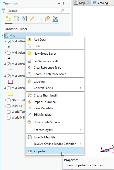
Figure 7.1. Properties
In the Map Properties: Map dialog box, choose Coordinate Systems (Figure 7.2).
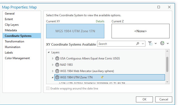
Figure 7.2. Map properties: Coordinate Systems
Here we find the coordinate system and projection associated with each layer and the map display. In Figure 7.3, the coordinate system shown in the right pane is for the Landsat 9 image: WGS 1984 UTM Zone 17N.
By default, ArcGIS® Pro assigns the projection and coordinate system to the map project from the first data, whether shapefile or in this case raster, that is added to the project. But the default assignment can be changed using this Map Properties:Map dialog box.
To change the coordinate system, highlight the one desired. In this case, we will change it to the USA Contiguous Albers Equal Area Conic USGS. Choose this coordinate system from the XY Coordinate Systems list, which then populates in the Current XY box (Figure 7.3).
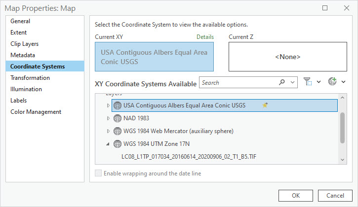
Figure 7.3. Changing coordinate systems
Click OK to accept the change, and the map display changes to reflect the selection of the new coordinate system (Figure 7.4).
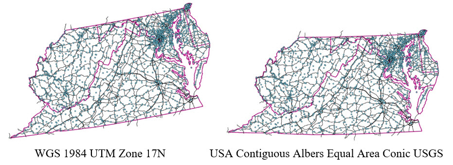
Figure 7.4. Comparing coordinate systems
We end our discussion here but also need to provide a word of caution. Completing analyses using data with different geographic and projected coordinate systems can introduce errors into the results. It is important to understand the different coordinate systems available and used. Using an inappropriate projection can introduce errors.
Data Display and Default Settings
When adding vector or raster datasets to a map project, ArcGIS® Pro selects symbology to display the data. Points are always displayed as colored dots, lines as colored lines, and polygons as solid colors outlined with a different color. Most raster data are displayed as stretched grayscale. An exception is aerial photos, such as those shown using the NAIP GIS Server connection—the default display is red–green–blue (RGB) format (see Chapter 4 Connecting to a folder or an online GIS server for examples of NAIP). Symbology can be modified from the default.
Figures 7.5 and 7.6 provide some examples of default symbology.
Figure 7.5 shows our map, zoomed in to show Landsat 8 Band 5 (raster) displayed in stretched grayscale. The map includes points, lines, and polygons above the raster satellite image in Contents. The default solid polygon for the Mid-Atlantic Counties obscures the raster beneath it—you can see a small corner of it indicated by the green arrow.
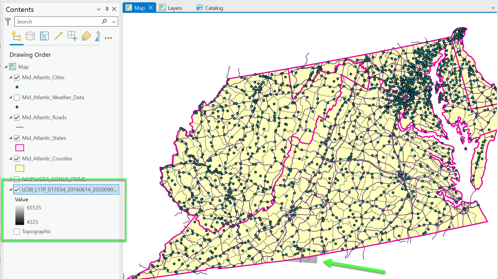
Figure 7.5 Points, lines, and polygons displayed in random colors by GIS
In Figure 7.6, the raster is now visible. The Mid-Atlantic Counties polygon layer has been changed to hollow to allow the Landsat 8 image to show through from underneath all the vector layers above it.
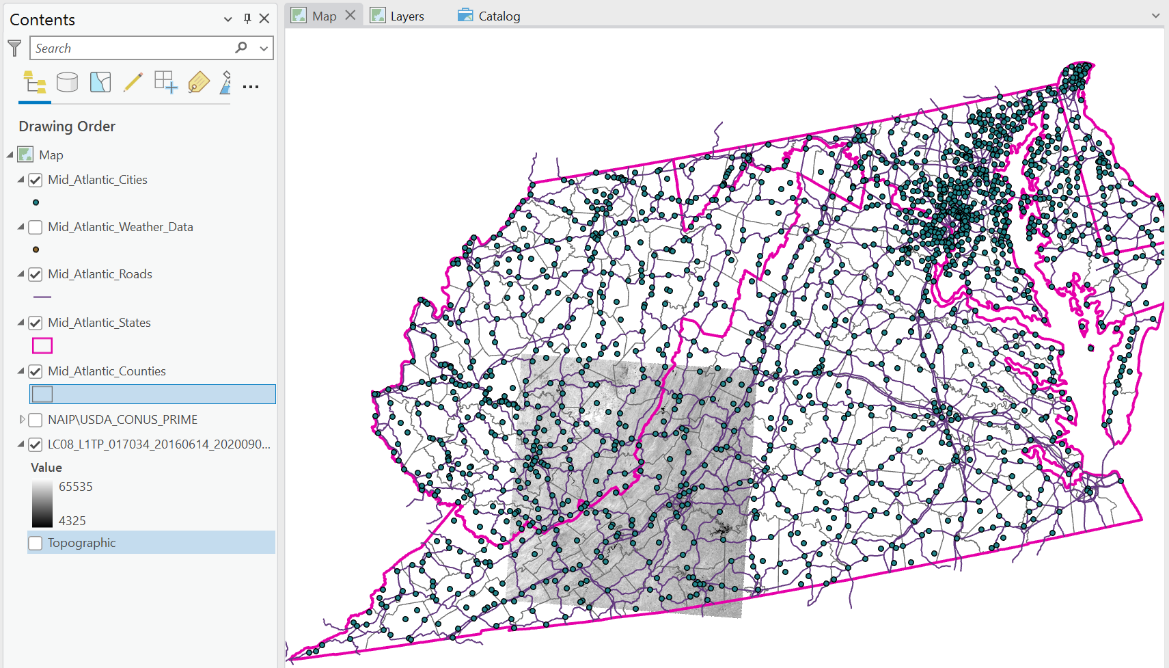
Figure 7.6 Grayscale default setting for Landsat 8 Band 5
In Figure 7.7, the NAIP aerial image, displayed in RGB (Red-Green-Blue), is checked to activate it in the Contents. Because it is at a higher level in Contents, it overlays the satellite image, but it is below the vector layers, so those are still visible.
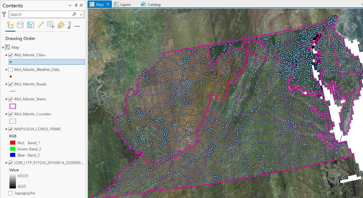
Figure 7.7 NAIP Aerial photos displayed in RGB via the USDA online server connection and overlaid on Landsat 8 Band 5
Changing Symbology of Vector Layers
We will first address how to change the symbology associated with one of the point layers. In Figure 7.8, all the layers are turned off except the two point layers.
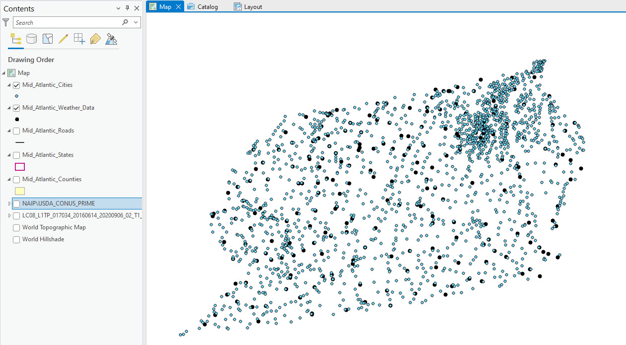
Figure 7.8. Turning off layers
To change the symbology of a point data layer, select one of the point layers in the Contents pane. In Figure 7.9, the Mid-Atlantic Cities layer has been chosen. Once a layer is selected, three new tabs associated with vector data— Feature Layer, Labeling, and Data—appear on the ribbon as indicated by the black box in Figure 7.9.
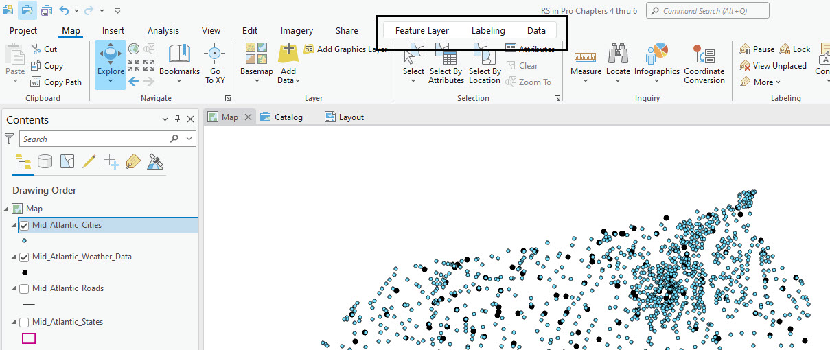
Figure 7.9 Changing symbology
Select Feature Layer, then click on the down arrow under Symbology to expand the Symbology options, as shown in Figure 7.10.
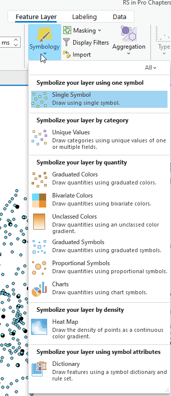
Figure 7.10. Changing symbology
We will only discuss the first two options – Single Symbol and Unique Values.
Click on Single Symbol, and the Symbology – Mid_Atlantic_Cities dialog box opens (Figure 7.11).
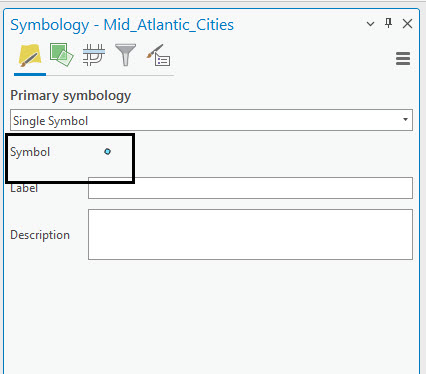
Figure 7.11. Selecting single symbol symbology
Click on the point symbol (shown in the black box in Figure 7.11), and the Format Point Symbol options appear (Figure 7.12).
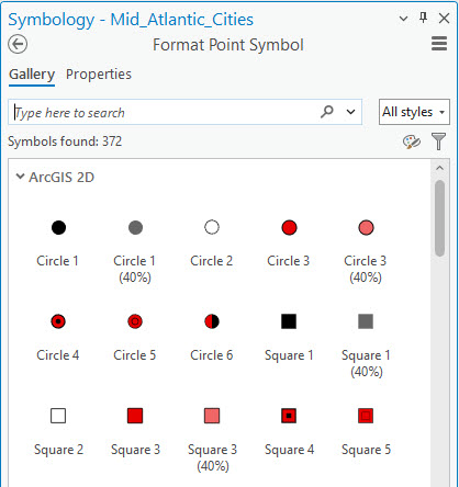
Figure 7.12. Selecting single symbol symbology
Point to any symbol to obtain more information about it (Figure 7.13).
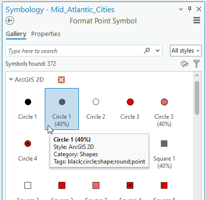
Figure 7.13. Selecting single symbol symbology
Scroll down to reveal additional symbols (Figure 7.14).
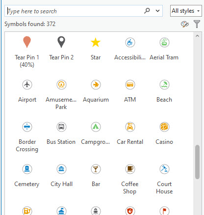
Figure 7.14. Selecting single symbol symbology
You can also search for a specific symbol. In Figure 7.15, we searched for symbols associated with “hospital.” Fourteen options were presented. Again, scroll down to explore all potential symbols.
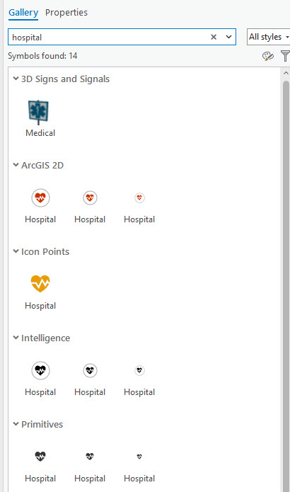
Figure 7.15. Selecting single symbol symbology
In this chapter’s project, we are using Mid-Atlantic Cities and Mid-Atlantic Weather Data. Both are point layers, and both were initially symbolized as colored dots. In Figure 7.16, symbols for both layers were changed. Can you find the symbols and change yours? The symbols used are called Radio Tower (for weather data) and City Hall (for cities).
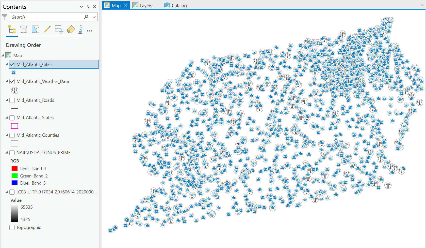
Figure 7.16. Map display with changed symbology
The reason for these choices was to demonstrate the value of choosing wisely when doing symbology. These symbols, while pertinent, make the map difficult to read.
We will change the symbols again but demonstrate a different technique. In the Contents pane, right-click the radio tower symbol, and the Color Properties box opens (Figure 7.17). This allows you to change the color of the symbol selected. Change it to green.
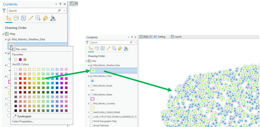
Figure 7.17. Changing symbology
You can also click on the symbol to open the Symbology pane (as in Figure 7.11).
To change the size and color of symbols, click on the Properties heading (next to Gallery in Figure 7.18).
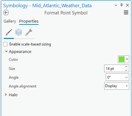
Figure 7.18. Changing symbology.
Sometimes, with many data points in a layer, a symbol is too large and overwhelms the map display. In Figure 7.19, we reduced the radio tower symbol Size to 7 and changed the color to Poinsettia Red. Click on Apply to apply the settings to the symbol.
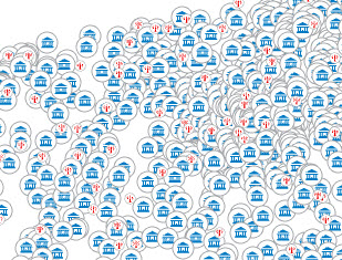
Figure 7.19. Changing symbology
Now, let’s go back and explore Unique Values for the cities layer. Select the Mid_Atlantic_Cities layer, then select the Feature Layer tab on the ribbon, click the down arrow on the Symbology button and choose Unique Values from the options. The Symbology-Mid_Atlantic_Cities pane opens, this time for Unique Values, as you can see under Primary Symbology in Figure 7.20.
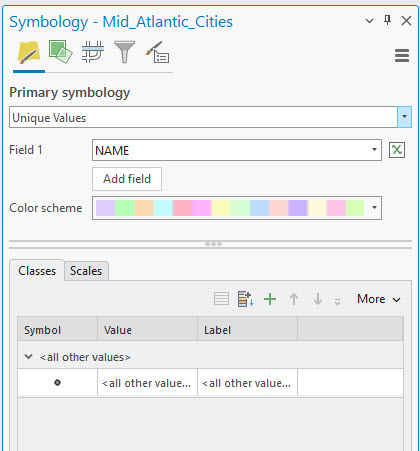
Figure 7.20. Changing symbology: Unique values
This procedure is used when symbolizing features based on field values from the attribute table—a table of the attributes of each feature in a shapefile or feature class. Attributes are characteristics the data’s creator assigns for the layer’s features. How do you find them?
Right-click on the layer’s name and choose Attribute Table (Figure 7.21)
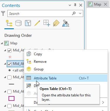
Figure 7.21. Opening the attribute table
The Attribute Table opens the under the map document (Figure 7.22).
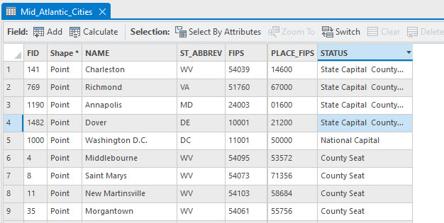
Figure 7.22. Opening the attribute table
Let’s take a closer look. Most columns (aka attributes or fields) can be used to display a feature class or shapefile characteristic. We will demonstrate two—cities located within a specific state and for the second example, the status of each city.
Go back to Symbology, Unique Values, and by Field 1, click on the down arrow and choose ST_ABBREV (State Abbreviation), and for the Color Scheme, choose Basic Random. Each point is now colored by the state where it is located (Figure 7.23)
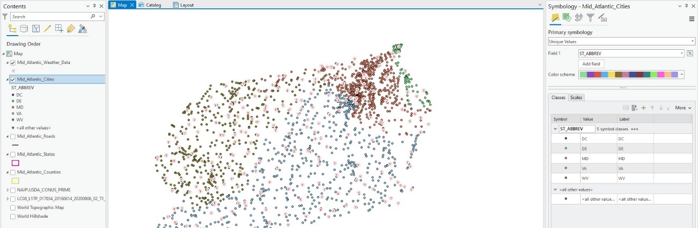
Figure 7.23. Basic random color scheme
Now change the Value Field to STATUS and Color Scheme to Dark 2 (4 classes) (Figure 7.24)
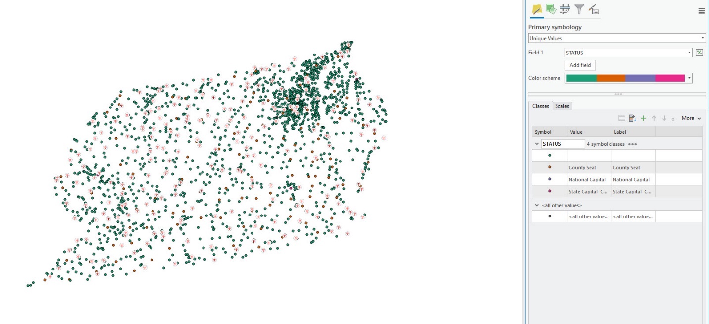
Figure 7.24. Changing symbology
In each instance, the symbology icons in Contents under the layer name have expanded to explain the color coding, as shown in Figure 7.25. Note that one symbol (the top one) has no text next to it—the attribute table was blank under Status for these cities; they had no governmental status other than a city.
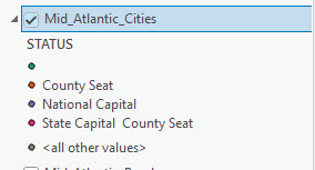
Figure 7.25. Symbology in Contents
At the bottom of the list is <all other values>. This is automatically added each time symbology is chosen, and this can be eliminated. Click on the down arrow next to More and uncheck Show all other values, as shown in Figure 7.26.
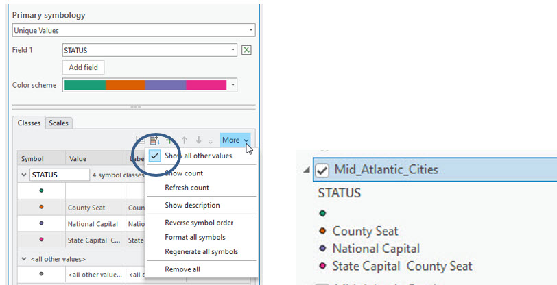
Figure 7.26. Showing all other values
An individual symbol’s color can be changed by right-clicking on the symbol itself in the Symbol column and next to the value description, as in Figure 7.17.
Or, to change the order of the features’ status from the default (alphabetical), select a row and use the up and down arrows to move it (see left in Figure 7.27). We ordered them by importance (right in Figure 7.27).
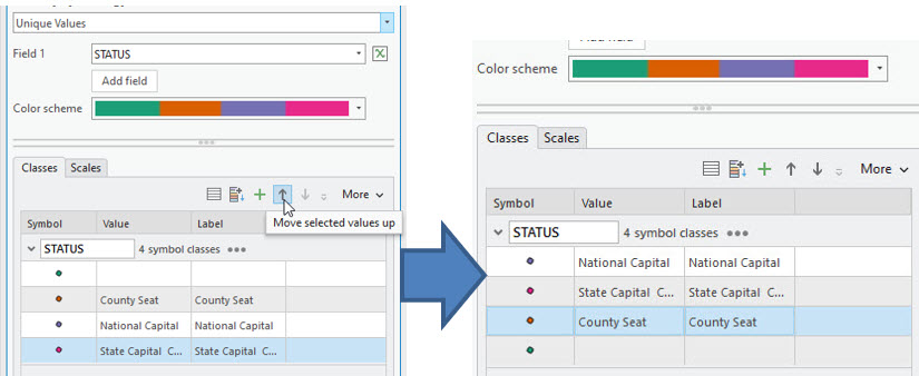
Figure 7.27. Ordered classes
The two symbology options demonstrated here reflect a tiny portion of the available options. Please practice and explore all the different options within the buttons indicated by the black arrows in Figure 7.28. Don’t worry; changing symbology does not alter the original data.
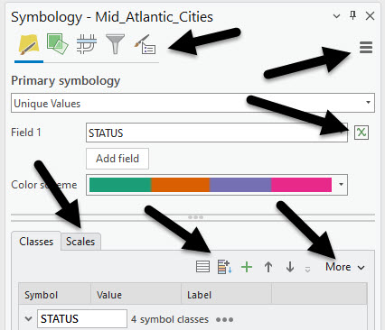
Figure 7.28. Various symbology options.
Let’s move on to a line layer—Roads. It might be helpful to turn off the point layers. Symbology for lines is changed using the same techniques as for points and illustrated below.
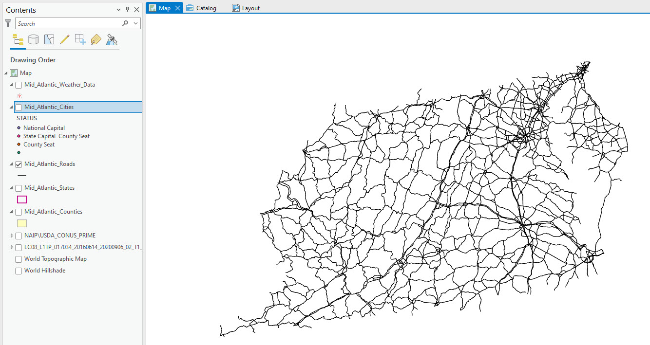
Figure 7.29 Single Symbol example for lines
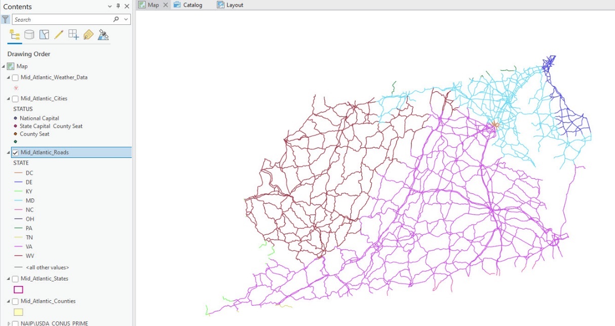
Figure 7.30 Unique Values example for lines, symbolized by State name
Again, as symbology is changed, it is reflected under the layer’s name in the Contents pane.
Changing the symbology of polygon data is similar to point and line data; the main difference is that polygons have area. Turn off and collapse the symbology for all layers except the states and counties. Polygons have similar options as points and lines; however, since they represent area options include, as seen in Figure 7.31, changing the fill color (Color) and the Outline Color and Outline Width. As before, we can symbolize using either Single Symbol or Unique Values.
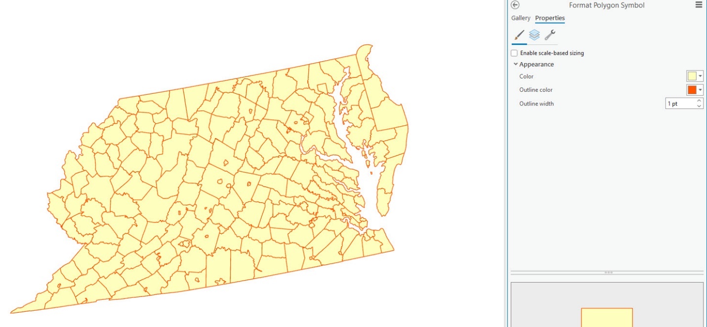
Figure 7.31. Changing polygon symbology
Study the map in Figure 7.32 and re-create it. We have used Unique Values by state name. Did you notice that the outline colors are just a darker version of the fill color?
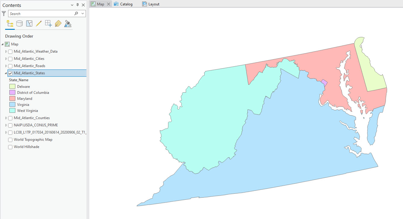
Figure 7.32. Changing polygon symbology
Now, try to recreate Figure 7.33. We varied the symbol type using Unique Values and Single Symbol, varying the colors and sizes.
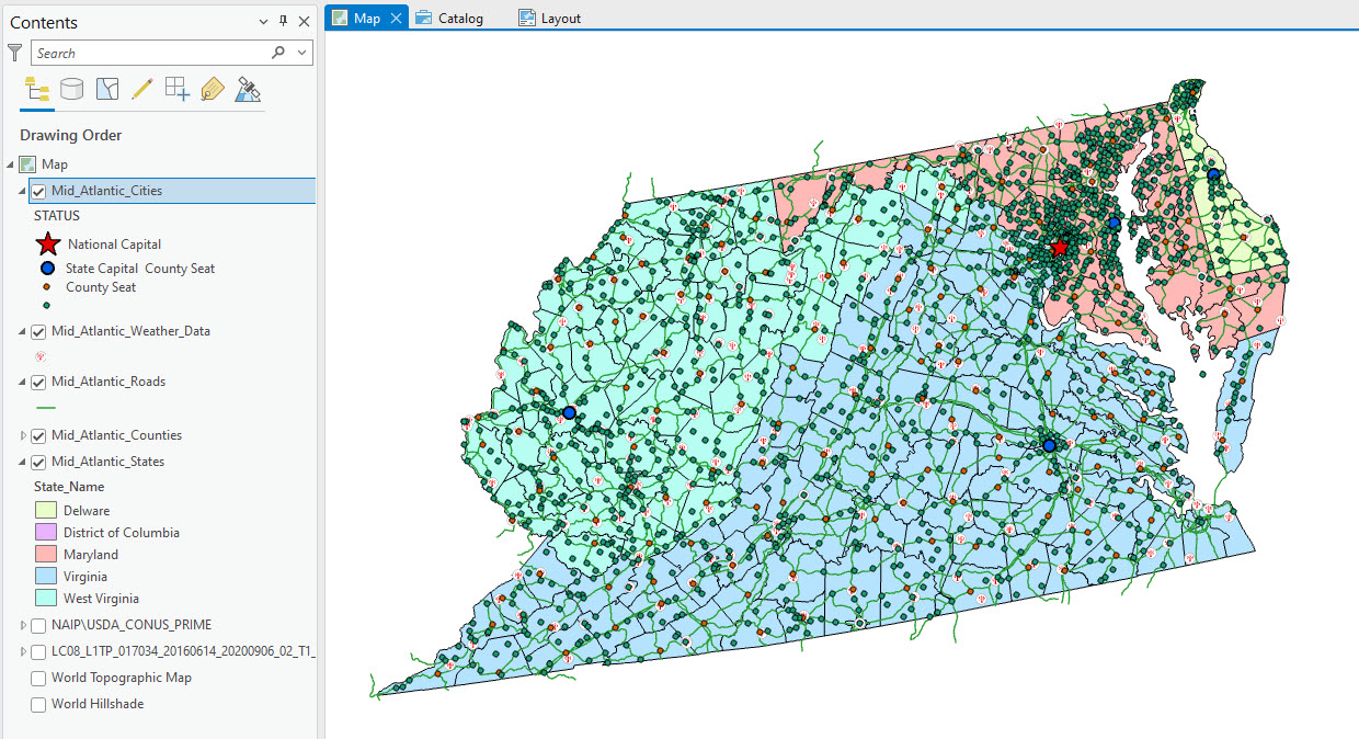
Figure 7.33. Changing polygon symbology
The ultimate display in the map document needs to address multiple layers, their visual representation in the map, and the needs of the audience or customer.
Changing Symbology on Raster Datasets
Changing the symbology on a raster dataset, such as a digital elevation model or a single Landsat image, is accomplished in a comparable manner to vector datasets. Select the layer’s name in the Contents pane, and the Raster Layer and Data tabs display in the ribbon. Figure 7.34 shows a Landsat 8 Band 5 image with all other layers collapsed, and visibility toggled off. Recall the default symbology for most raster files is grayscale.
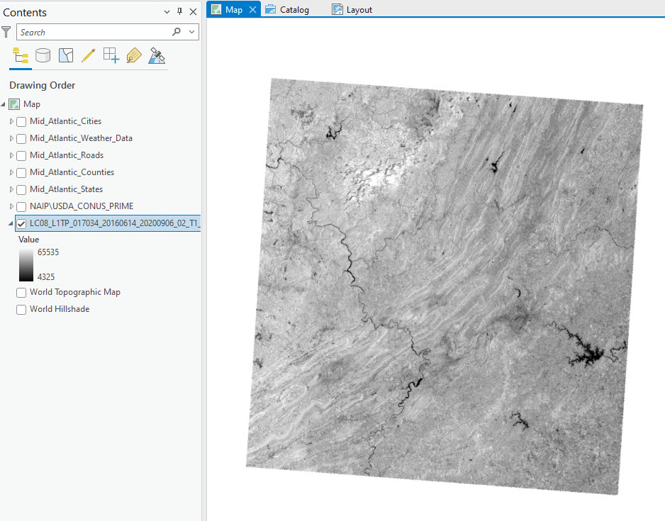
Figure 7.34. Raster image shown in grayscale
Click on the Raster Layer tab to view its options, including Symbology (Figure 7.35)
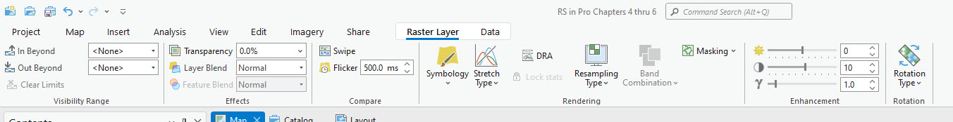
Figure 7.35. Raster layer tab
Please note that we are only going to discuss symbology in this chapter. Many of these other options are related to enhancing the image display and are discussed in later chapters of this book.
Click on the first option—Stretch—in the Symbology drop-down list (Figure 7.36).
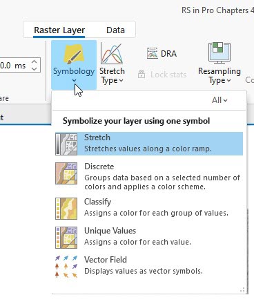
Figure 7.36. The symbology drop-down list
The Symbology pane opens. Point to the grayscale bar to the right of the Color scheme, and it informs us that this is a Continuous Color Scheme, also the name of the color scheme (Figure 7.37).
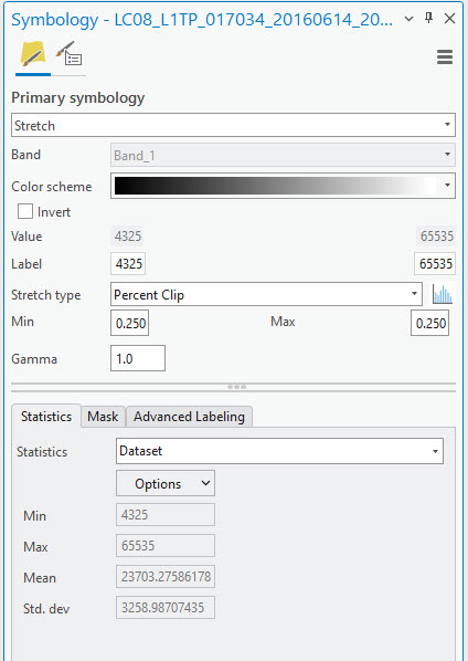
Figure 7.37. The symbology pane
The down arrow at the end of the Color scheme bar gives many options for color (Figure 7.38).
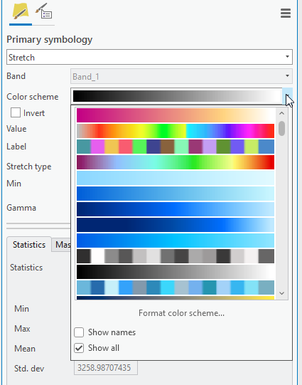
Figure 7.38. Raster color schemes
Pointing to each color provides a verbal description of the scheme (Figure 7.39). Why is this important? Some rasters are elevation data, so using an elevation color scheme is most appropriate.
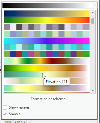
Figure 7.39. The elevation color scheme
Figure 7.40 shows the Landsat 8 Band 5 image with a stretched symbology named Magma. Please note that this color was chosen for demonstration purposes only.
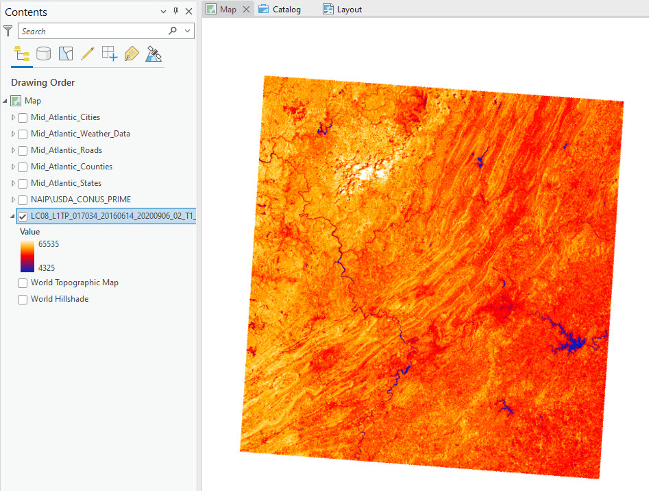
Figure 7.40. Image displayed with the magma color scheme
Discrete symbology is a symbology scheme chosen by GIS, which includes the GIS automatically grouping the raster values (Figure 7.42).
Figure 7.42. Discrete symbology
The results of using a Discrete symbology are in Figure 7.42. This is not an appropriate scheme for Landsat 8 imagery.
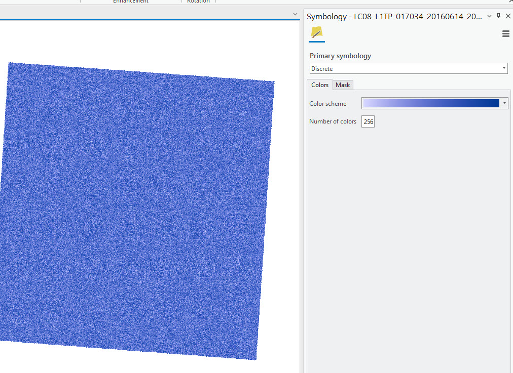
Figure 7.43. Discrete symbology
With Classify, several other options are chosen for symbolization. We will demonstrate Natural Breaks with 5 Classes (Figure 7.44). Please note that this is not the process called Classification which is covered in Chapters 21 – 24 of this book. This step is simply symbolizing a raster dataset.
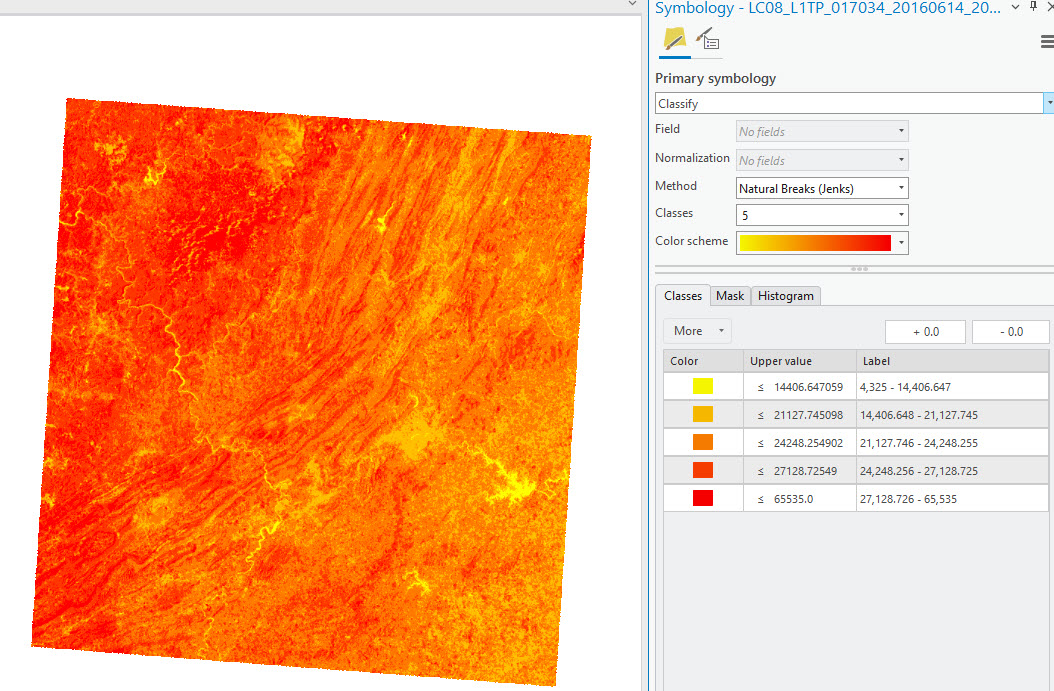
Figure 7.44. Exploring symbology with a raster image
There are many other methods of classification for symbology. (Figure 7.45).
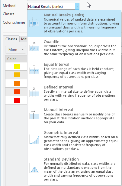
Figure 7.45. Other symbology options
For specifics on the Method for the classification – please see http://pro.arcgis.com/en/pro-app/help/mapping/layer-properties/data-classification-methods.htm.
Caution! As we have demonstrated, using different classification techniques with the same datasets can produce vastly different-looking maps. Ensure you understand what you are trying to communicate to the audience, and integrate an appropriate classification accordingly.
Be especially careful when changing symbology on raster datasets. Know what you want to communicate to the audience. Do you want the display to show distinct differences in colors because of distinct breaks in the data? Or is it more appropriate to display the raster as stretched because there are no distinct borders between values (i.e., on the actual surface of the Earth, elevation changes gradually, not with distinct boundaries)? For more information on symbology in raster datasets, please utilize the Help Button in ArcGIS® Pro.
With these first seven chapters, we have demonstrated how to open ArcGIS® Pro, create a map project, open an existing map project, import a map, connect to external data, add data, and symbolize data.
In Chapter 8, we will discuss metadata within ArcGIS® Pro, and Chapter 9 will demonstrate how to create a map usable in a non-GIS-based program, concluding our introduction to ArcGIS® Pro basics. Chapter 10 introduces remotely sensed images.