18 Chapter 18: Spatial Enhancement of Landsat Imagery
Introduction
As a reminder from Chapter 17: Radiometric Enhancement of Landsat 9 Imagery — image enhancement denotes the processing of remotely sensed imagery to adjust brightness values represented by digital numbers (DN). This improves the image’s visual qualities for a specific purpose. Brightness values of individual pixels are changed to improve color balance, brightness, contrast between pixels, or other elements associated with image display.
While radiometric (Chapter 17) and spectral enhancement (Chapter 19) operate on each pixel individually, spatial enhancement deals primarily with spatial frequency and modifies the pixel’s brightness values based on the values of neighboring pixels.
This chapter focuses on spatial enhancement and demonstrates two processes for spatial enhancement. The first process is dynamic—it changes the image within the viewer itself but does not change the original file. The second process uses tools in the ArcGIS® Pro toolbox and creates new permanent image data with brightness values modified by the specific enhancement method.
This chapter provides an introductory discussion of image enhancement techniques. There is an array of information associated with image enhancement available online that can give a more thorough discussion of these techniques, including:
- Faust (date unknown) Georgia Institute of Technology: http://knightlab.org/rscc/legacy/RSCC_Spatial_Enhancement.pdf
- Natural Resources Canada. Image Enhancement: https://www.nrcan.gc.ca/earth-sciences/geomatics/satellite-imagery-air-photos/satellite-imagery-products/educational-resources/9389
Dynamic Spatial Enhancement
Open a new map project, save it, and add the image we created in the chapter on subsetting a Landsat 9 image. The image, which included bands 2 through 7 of the Landsat 9 scene, was clipped to the spatial extent of the map viewer and showed Roanoke, Blacksburg, and Smith Mountain Lake. Set the band combination to color infrared (Figure 18.1). Set the workspaces to the appropriate project folder.
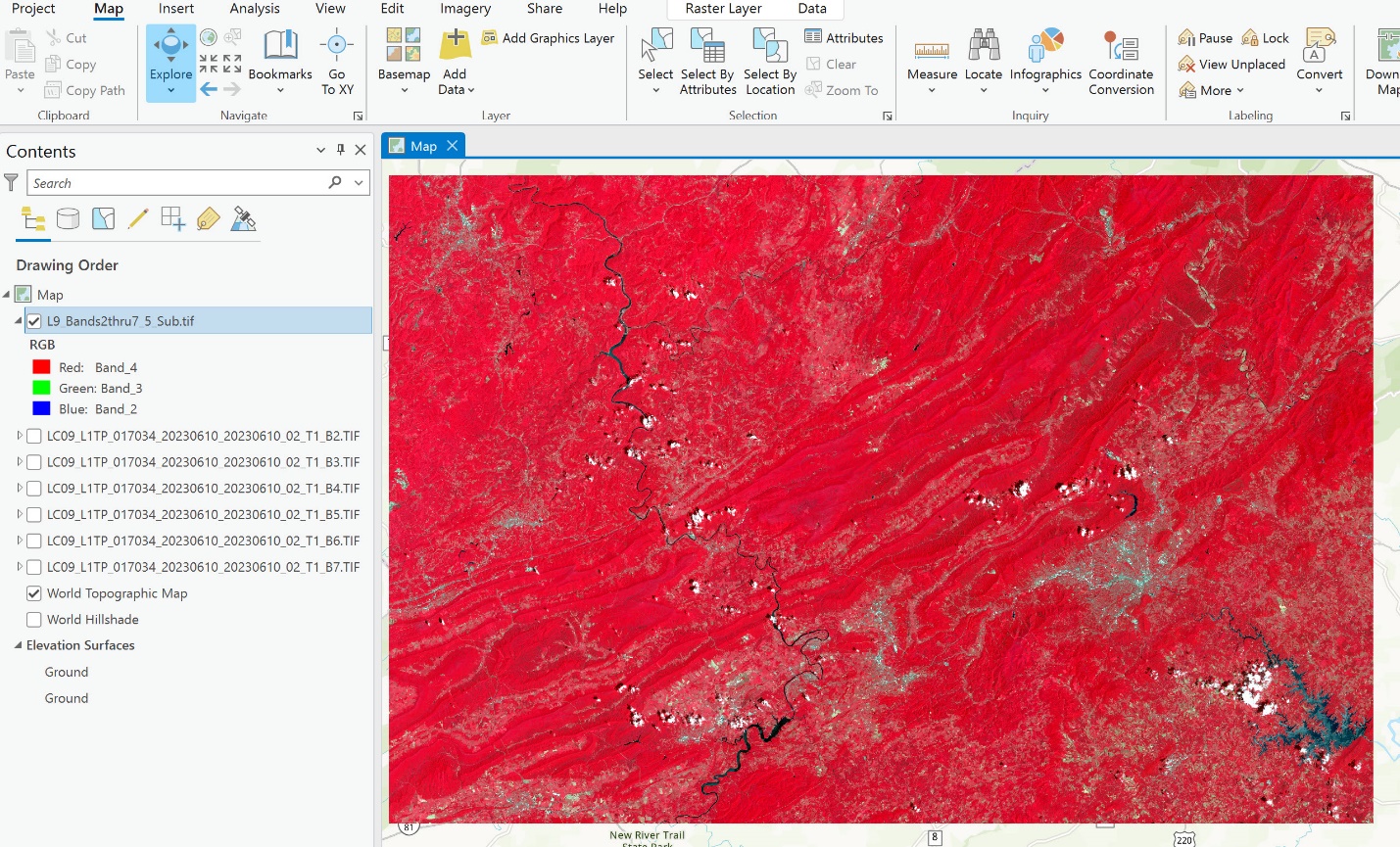 Figure 18.1. Setting the band combinations to view NIR
Go to the Raster Layer tab (underlined in blue in Figure 18.2).
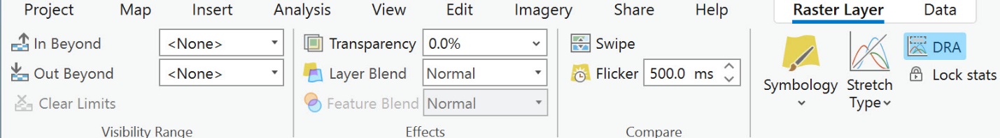
Figure 18.2. Raster Layer tab
- With spatial enhancement, individual pixel values are changed using various tools based on neighboring pixel values. How do these values change? The changes are contingent on the method you select. When using any of these techniques, keep in mind that the change in the image display may not be apparent when zoomed out.
- Select Resampling Type to view the options for resampling.
- For an example of resampling, zoom into the City of Roanoke, specifically to the airport area (Figure 18.3).
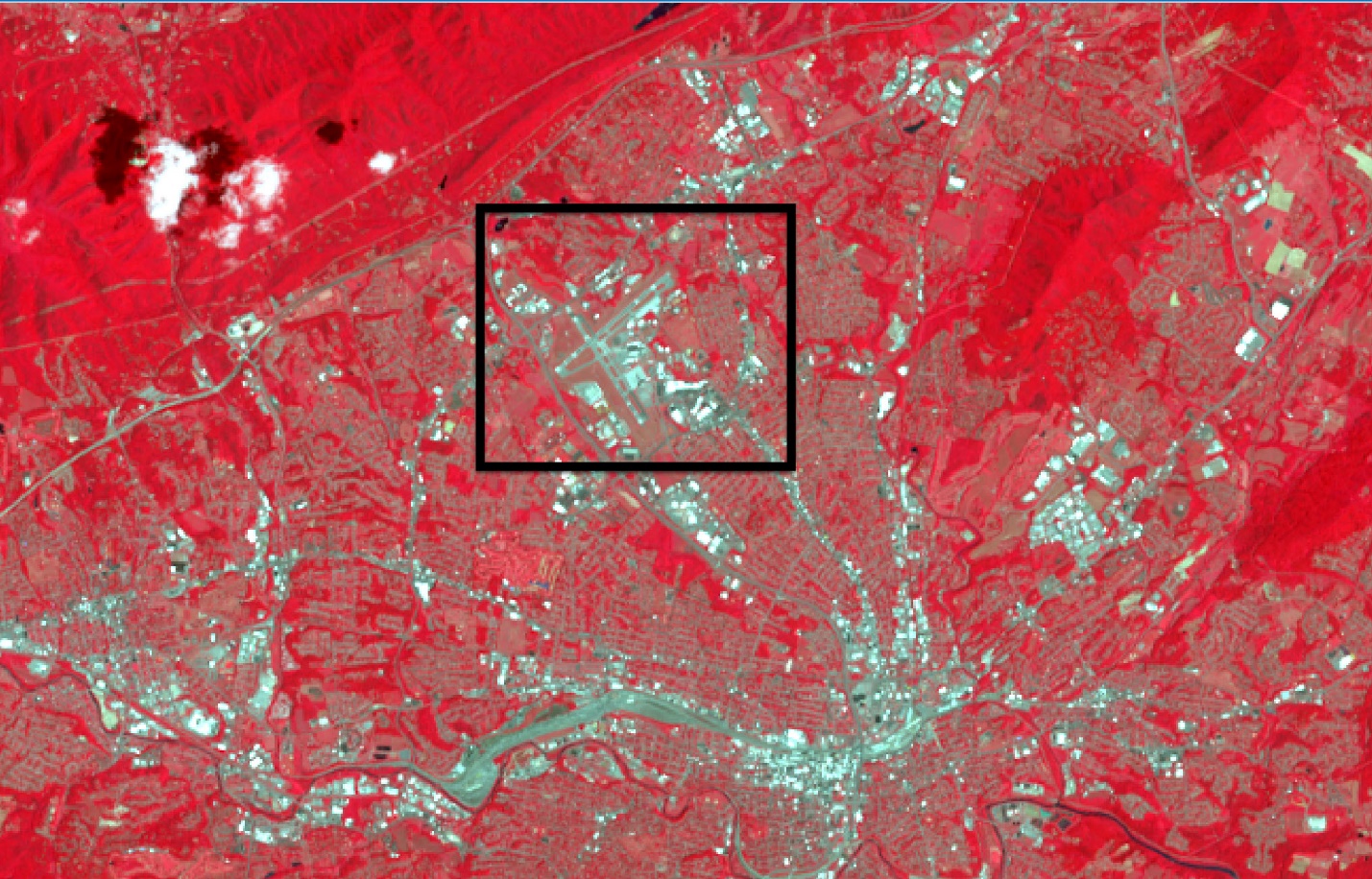
Figure 18.3. City of Roanoke
We will apply some resampling tools, including nearest neighbor, bilinear, and cubic (Figure 18.4).
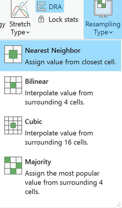
Figure 18.4. Resampling tools
Nearest Neighbor
- In Nearest neighbor, the pixel is assigned the value of the cell closest to it. Looking at the drop-down list, Nearest Neighbor is highlighted because Nearest Neighbor is already used within the image. To verify, check the layer’s properties—go to Properties > Source > Raster Information. In the Pyramids row, we see the method is resampling: Nearest Neighbor (Figure 18.5).
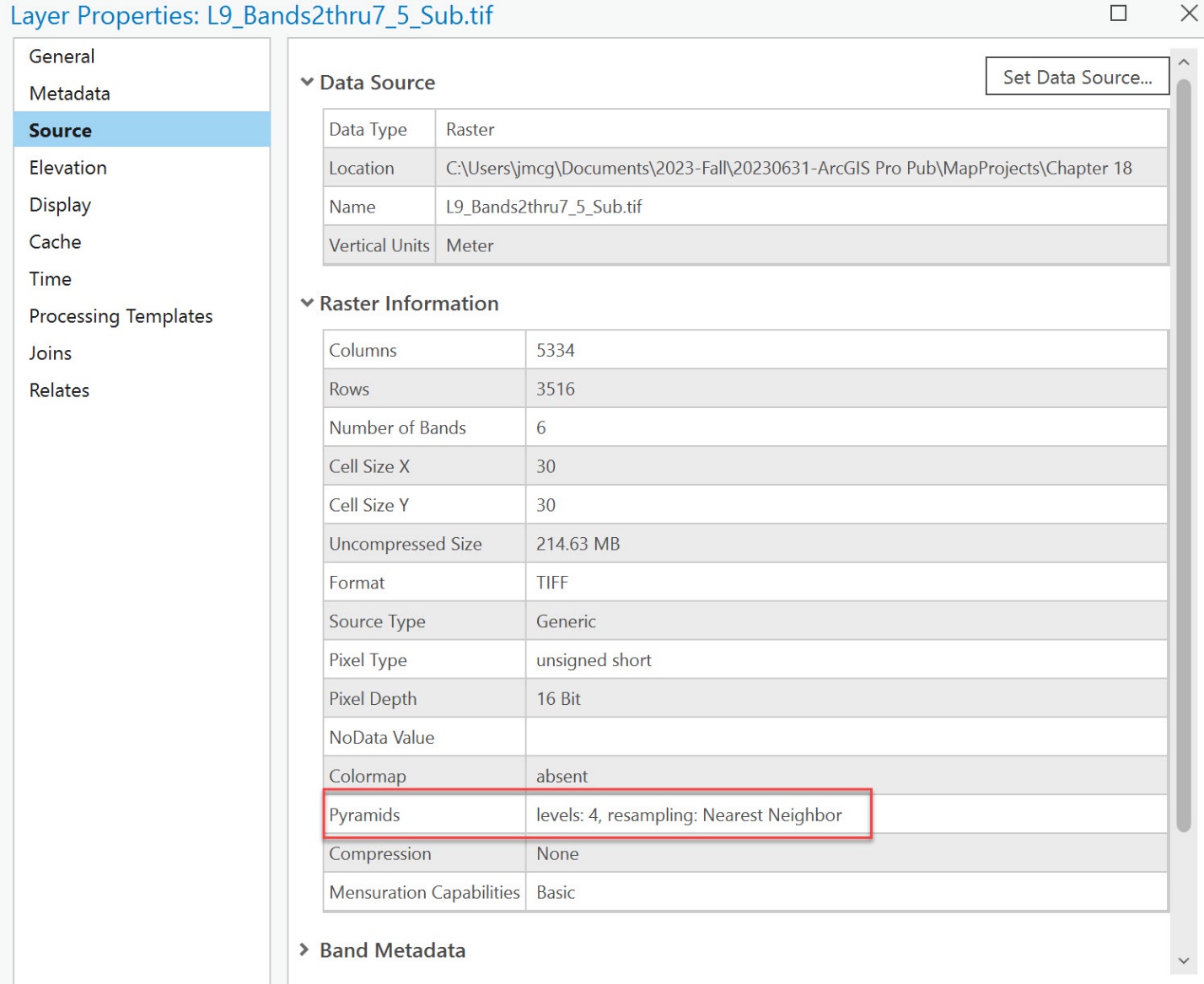
Figure 18.5. Layer Properties
Bilinear
Zoom back out to the full extent of the image. Then go back to the Raster Layer tab, select Resampling Type, and click on Bilinear. This technique creates a smooth-looking result because it averages the brightness values of the four neighboring cells surrounding each pixel. This dynamic method changes the display in the viewer, not the original data (Figure 18.6).
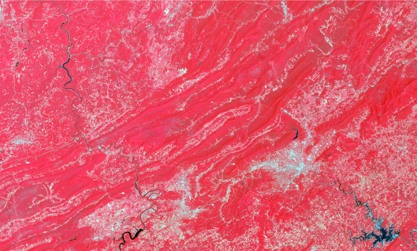 Figure 18.6. Using Bilinear
The dynamic method changes the display in the viewer, not the original data.
Can you see a difference? Zoom into the airport area in the City of Roanoke (Figure 18.7).
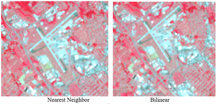
Figure 18.7. Comparing the airport region in Roanoke
Notice in the Nearest Neighbor image that the outlines of the individual cells are visible as a jagged edge—the corners of the pixels are distinct. But in the Bilinear image, the runways and nearby highways now appear to have straight edges—the Bilinear algorithm has blended the pixel corners into a straight edge.
These dynamic enhancement techniques only change the image as displayed in the viewer, not the pixel values or the underlying properties. Check the Properties > Source > Raster Information dialog box again; it still shows Nearest Neighbor (Figure 18.8).
Figure 18.8. The Layer Properties box
Cubic
Now, go back to Raster Layer > Appearance and select Cubic, which, according to the information displayed in Figure 18.4, interpolates from the surrounding sixteen cells.
It creates a sharper-looking airport area (Figure 18.9).
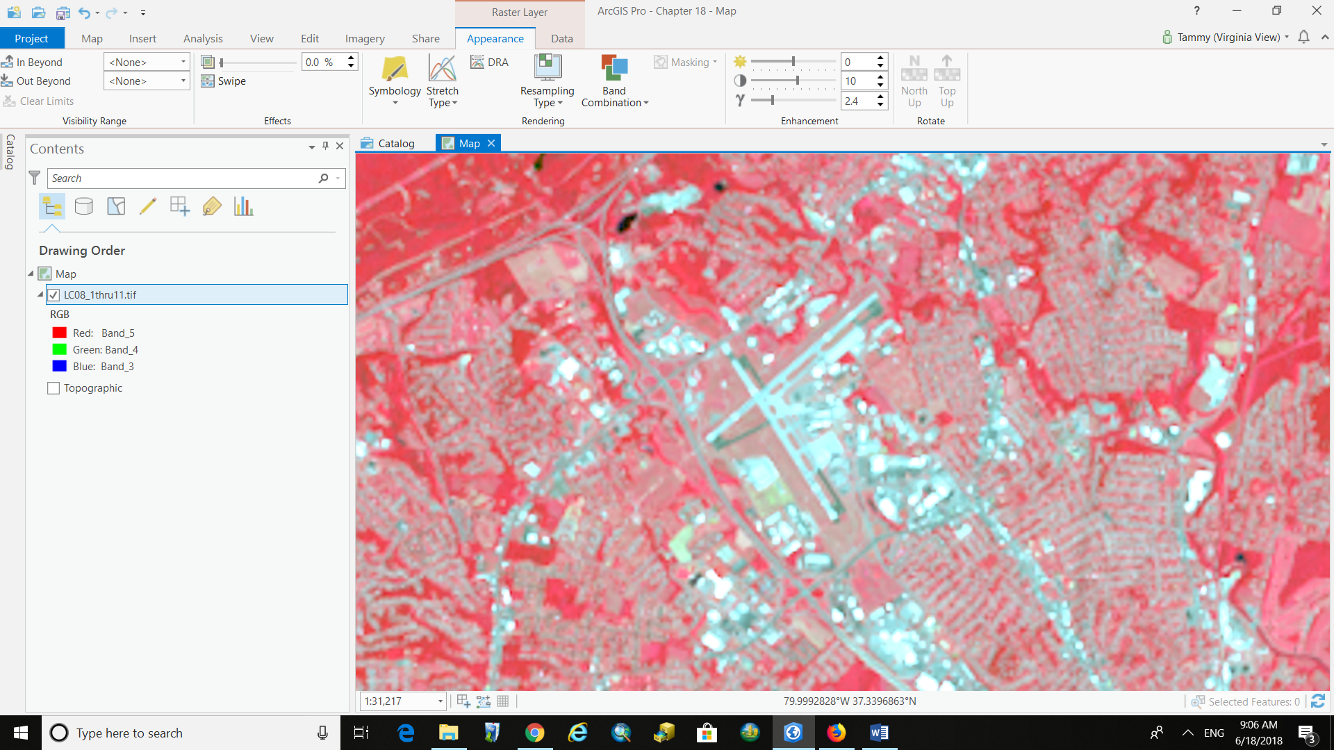
Figure 18.9. The Roanoke Airport region
If you are unsure that you see changes, switch back and forth between the Resampling Types several times, observing the differences.
Now, select Majority. This is not a good resampling method for the airport area because this option assigns the most popular value from the surrounding four cells. So, if definitive boundaries are needed for the analysis, this is not the one to use (Figure 18.10).
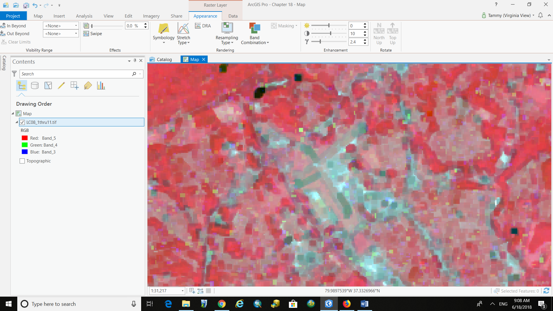
Figure 18.10. The majority resampling method
- If more specific definitions for the methods are required, see ArcGIS help.
- Reset the image to the default, Nearest Neighbor. We will now demonstrate how to use the resampling tools in the Toolbox.
Spatial Enhancement Using Spatial Analyst Tools
Convolution filtering is a process that averages small sets of neighboring pixels across an image. This filtering changes the spatial frequency characteristics of an image. A convolution kernel is a matrix of numbers that assigns a weight to each cell within the matrix. Choosing the kernel defines the neighborhood size. As the kernel moves across the image, the values in each neighborhood are multiplied by the weights, then averaged. The resulting value is assigned to the center pixel, and the kernel moves on to the next neighborhood.
The Filter Tool
The filtering options in this section create new data; after the tool runs, a new dataset is created and saved with the new properties.
Click on the Analysis tab, then Tools, to open the Geoprocessing pane (Figure 18.11).
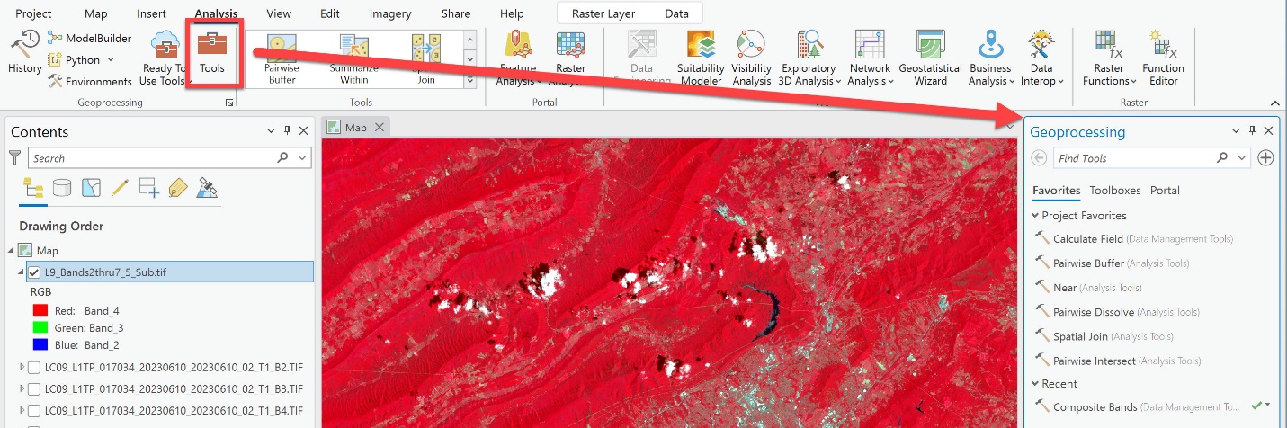 Figure 18.11. The Geoprocessing pane
Search for Filter in the Find Tools box. From the list, locate the Filter (Spatial Analyst Tools) entry and select it. (Figure 18.12). Spatial analyst tools are used to perform geoprocessing on rasters.
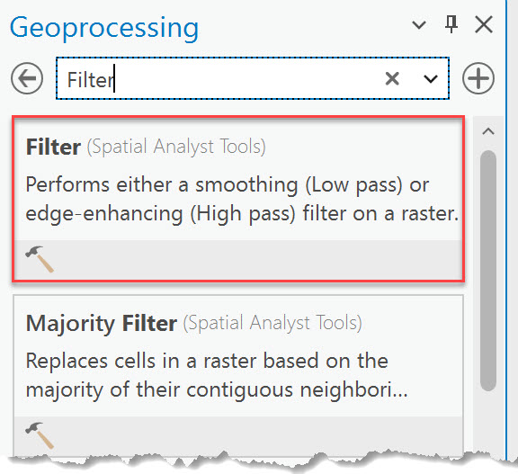
Figure 18.12. The Filter option
In the Filter geoprocessing tool, we will discuss options under Filter type (Figure 18.13).
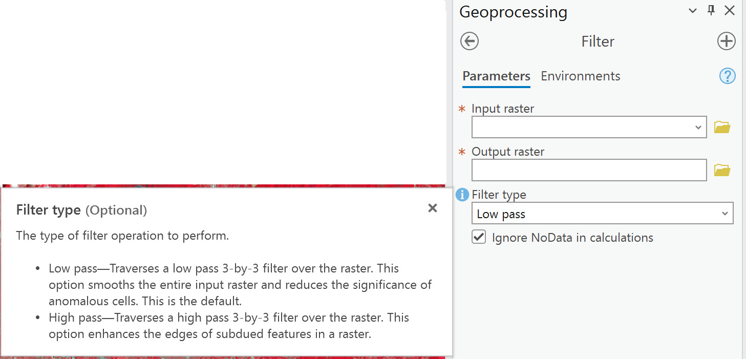
Figure 18.13. The Filter type option
A Low pass filter smooths edges, and a High pass filter enhances edges. Both use a three-by-three filter. We will explore both methods and then compare them.
For the Parameters in the tool, Input raster is the composite image—select it from the drop-down list. Name the Output Raster, giving it a meaningful name to reflect the process used to create the new raster dataset, and check the path to ensure it is stored in your project’s geodatabase. In this example, we named the output raster Filter_low (Figure 18.14).
Click Run.
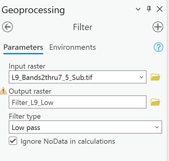
Figure 18.14. Running a low-pass filter
Then do the same for High pass (Figure 18.15), changing the Filter type and the name of the new raster. Additional parameters can be changed by clicking on the Environments tab, but that is beyond the scope of this book.
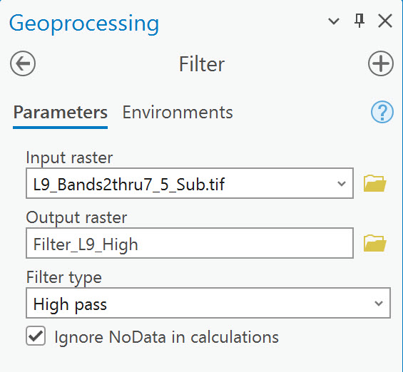
Figure 18.15 Running a high-pass filter
Two new rasters are listed in the Contents window, and two new images appear in the map viewer.
Note: If your new layers in Contents are in RGB symbology, change them to Stretched (Symbology > Primary Symbology > Stretched).
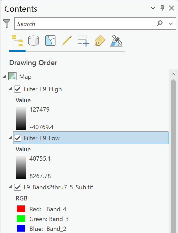
Figure 18.16. Changing the symbology
If you have not already, zoom out to the full extent. In the viewer window, uncheck the High pass image to see the Low pass (Figure 18.17). Low pass results are smoothing of the image. Within the low pass image, what is clearly visible?
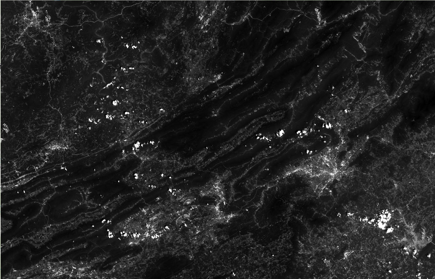
Figure 18.17 Low Pass Enhancement
On the High pass image, only clusters of certain features are enhanced in the image (yellow circles in Figure 18.18). Zoom in to these areas.
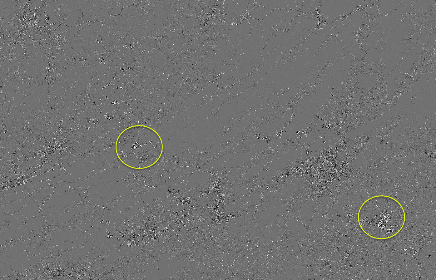
Figure 18.19 High Pass Enhancement
High pass enhances edges. What edges are now visible?
Buildings are visible in the City of Roanoke, along with roads and the airport runways (Figure 18.20).
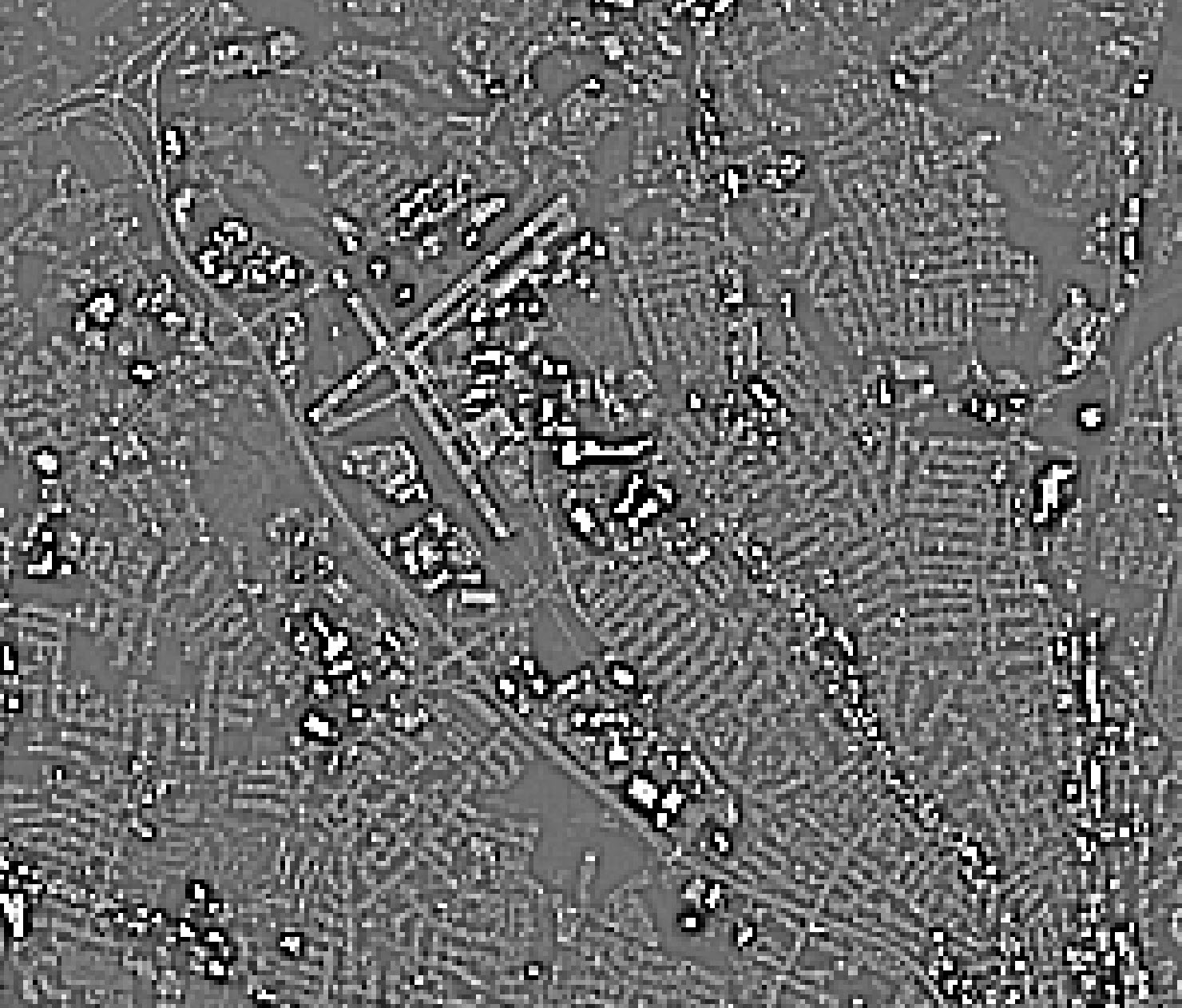
Figure 18.20 – High Pass filter zoomed into Roanoke
Compare this to the low pass results in Roanoke (Figure 18.21).
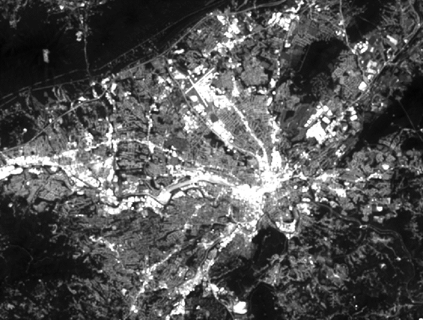
Figure 18.21 Low pass results
From a broader view of the City of Roanoke, we can discern populated areas—the town of Blacksburg in the upper right, the town of Christiansburg in the middle, the city of Radford in the west, and the New River on the left side. Figure 18.22 uses the swipe tool to show the differences between low pass and high pass. Can you identify which is which?
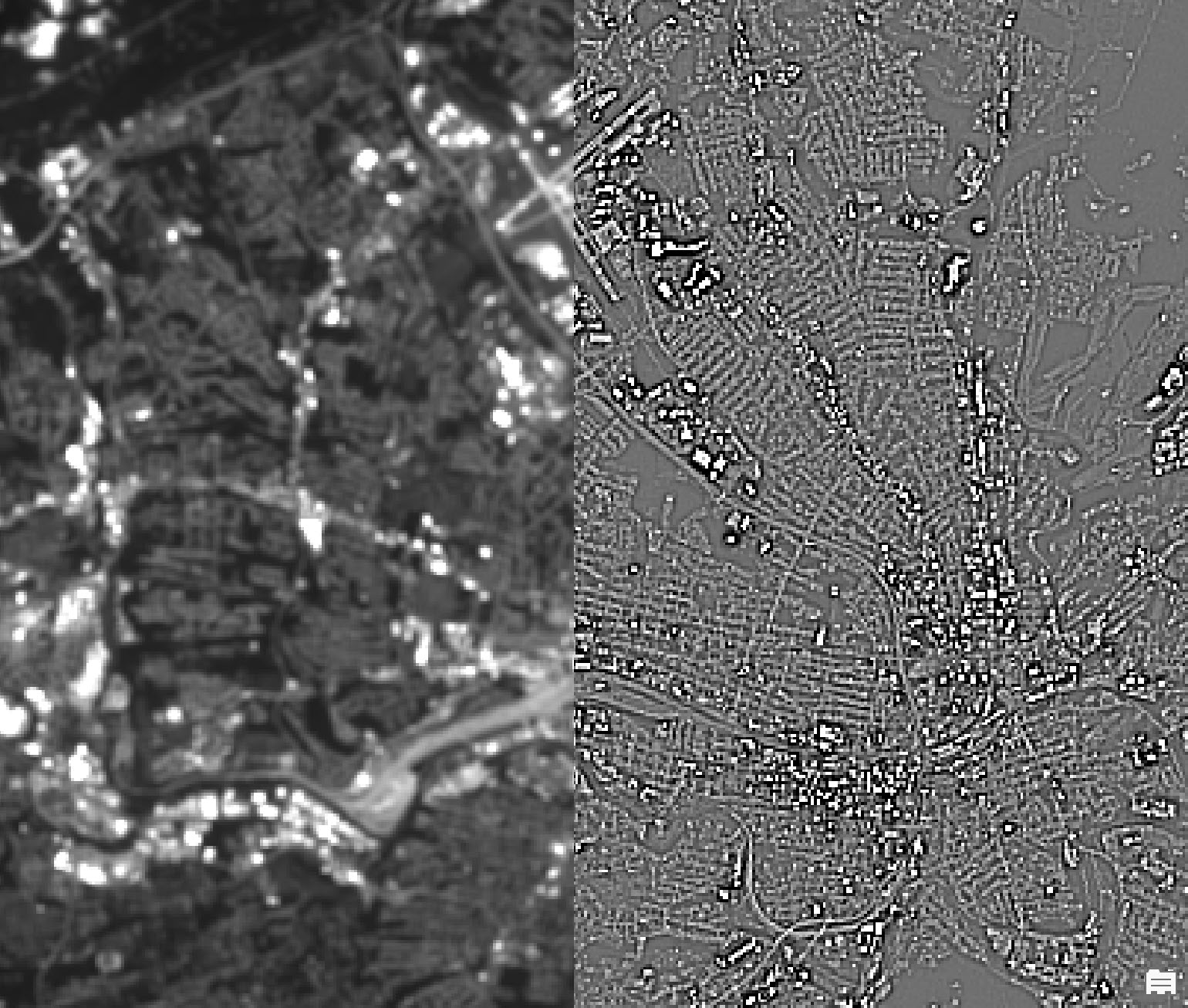
Figure 18.22 Using the swipe tool to compare results
The Filter tool has only these two options for spatial enhancement. Which filter is appropriate for the project depends on the purpose of the project.
Focal Statistics
Now, we will use a second tool. In the Geoprocessing pane, search for and locate the Focal Statistics (Image Analyst Tools) tool and select it to open it (Figure 18.23).
Figure 18.23. The Focal Statistics tool
Two Parameters are the same as Filter in this tool—the Input raster and the Output raster fields. But with this tool, more decisions must be made (Figure 18.24).
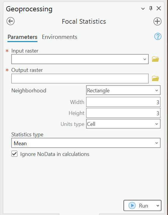
Figure 18.24. The Focal Statistics tool
The first two decisions regard the neighborhood—those cells that will affect the new value of each cell in the new raster image.
The first decision is the shape of the neighborhood. The shape does not have to be a rectangle! Figure 18.25
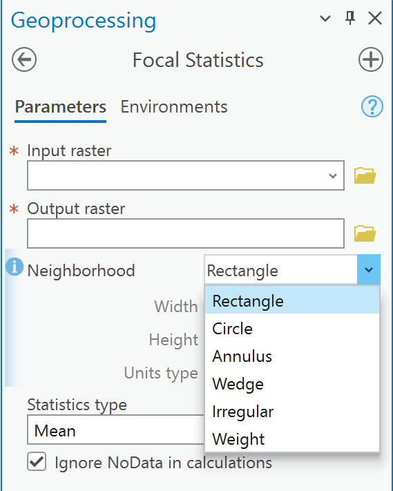
Figure 18.25. The Focal Statistics tool
We will run examples of these; let’s discuss other decisions first.
The second decision is how large to make the neighborhood. The neighborhood is the number of pixels surrounding the individual pixel whose new value will be recalculated using the neighborhood pixels. Figure 18.26 shows that the number of pixels used to generate the Focal Statistics is three pixels wide and three pixels high.
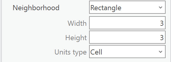
Figure 18.26. Focal Statistics – defining a 3×3 rectangle
The third decision is which statistic to use. Figure 18.27 shows the options for the Statistics type.
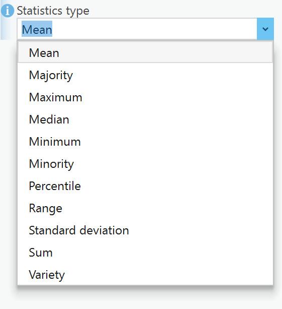
Figure 18.27. The statistics-type options
The information icon explains each statistic in the list (Figure 18.28). Mean (average) or any of these statistic types can be used. The choice is based on the project’s purpose.
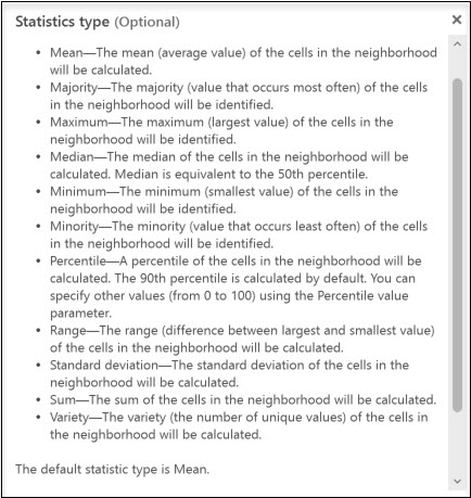
Figure 18.28. Information about the statistics type
Now let’s run a few examples. We will compare the images once we have run the tool a few times. Start with Rectangle for the Neighborhood, Width, and Height of 3 (we will call this 3×3) and Mean for the Statistics Type. We have named the Output raster again so that we know which method was used (Figure 18.29). Click Run. The results are shown in Figure 18.30.
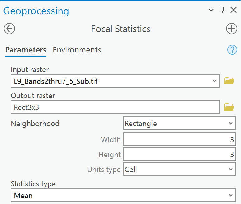
Figure 18.29. Running the Focal statistics tool
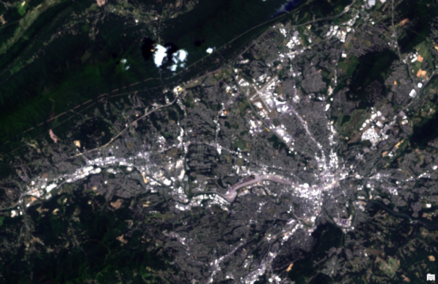
Figure 18.30. Focal Statistics: 3×3 results
Next try – Rectangle, 5×5, Mean; we will not show the tool, but the results are in Figure 18.31.
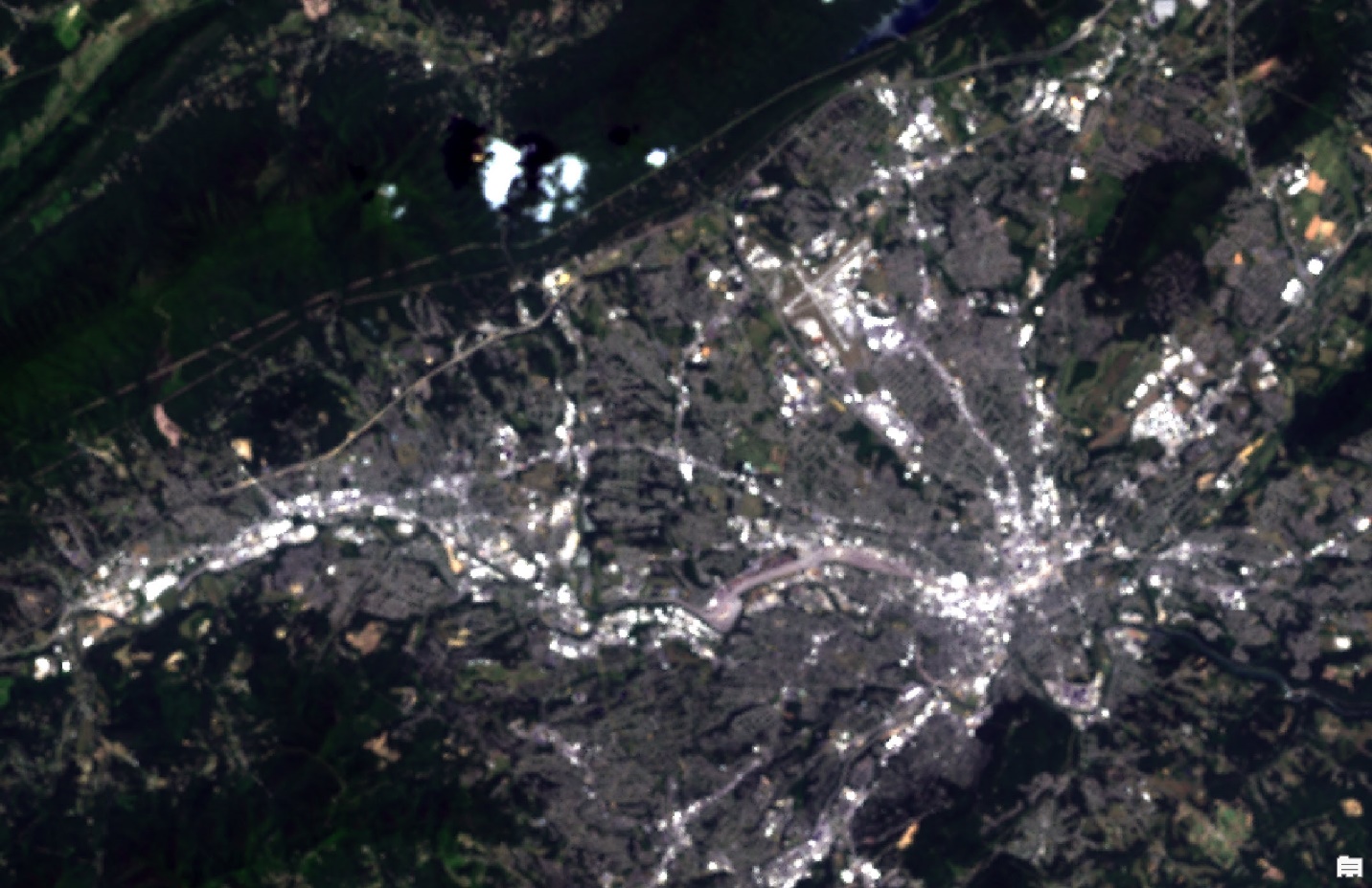
Figure 18.31. Focal Statistics: 5×5 results
After that, try Rectangle, 9×9, Median. The larger the neighborhood, the longer the tool takes to process. The results (Figure 18.32) show more smoothing—remember, a nine-by-nine neighborhood to calculate the new value means each value is more like the other values.

Figure 18.32. Focal Statistics: 9×9 results
Now try Circle with the Parameters: Circle, 6, Median. Results are shown in Figure 18.33. We are not generating a subset as a circle from our clipped image. The filtering neighborhood is circular—a set radius from the center pixel, the pixel for which the new value is calculated. As a reminder, the neighborhood moves across the image, changing the values of each pixel based on the neighborhood parameters.
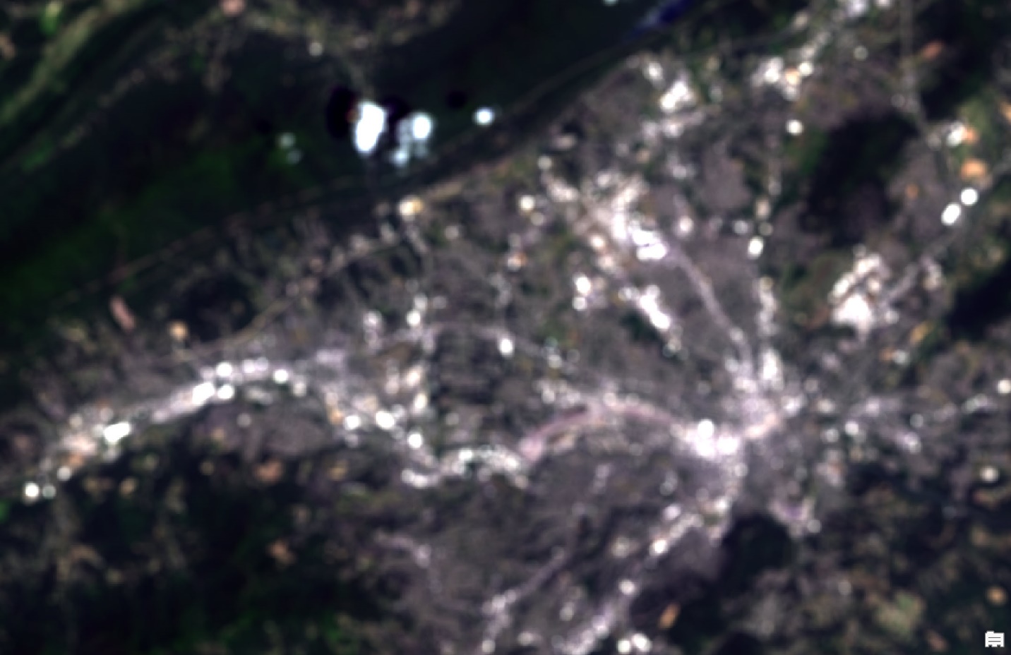
Figure 18.33. Focal statistics: circle 6 results
This completes a few examples; continue to explore on your own.
A note on using two other methods: Weight and Irregular, which provides the convolution kernel option. Convolution was briefly discussed above under dynamic processing. As seen in Figure 18.34, an error message was generated when Irregular was chosen because a .txt file, with weights assigned, is required to use this function. Using this tool for convolution provides options beyond dynamic enhancement and generates a new image.
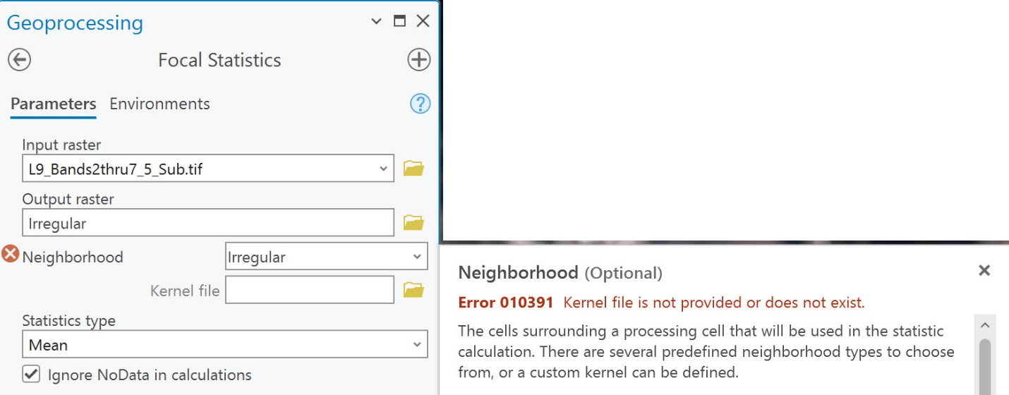
Figure 18.34. Focal statistics: Irregular option
Now that the tool has been run using several parameters, do you see any differences between the images? Why is the image sharper for the 5×5 rectangular neighborhood than for the others? If a 3×3 neighborhood were used, would the image be sharper than the 5×5? Why would the rectangular neighborhood produce sharper images compared to using a circular neighborhood?
Compare the images both in a grayscale stretch (under symbology) and using true color (for this subsetted image, the sequence will be 3,2,1).
Review the new images in Contents (Figure 18.35). The range of digital numbers is different for each result. Why? Recall that the values are being changed, and the greater the number of pixels used as the neighborhood, the smaller the range of values.
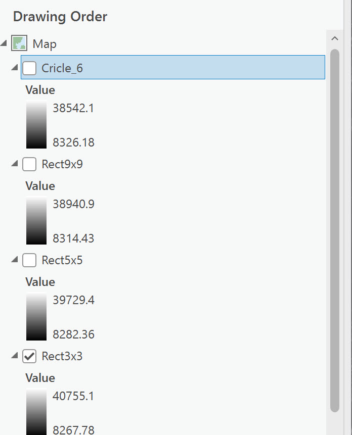
Figure 18.35. Comparing value rages in Contents
To visually examine the differences in the viewer, use the Swipe tool under the Raster Layer tab Compare group (Figure 18.36).
 Figure 18.36. Accessing the Swipe tool
Circle_6 is unchecked in the following image, so the image on display is Rect9×9. For Swipe, select Rect9x9, zoom in to the city of Roanoke, then click the Swipe tool. Click and drag anywhere on the image in the viewer to drag the top image, revealing the one underneath (Rec5x5 in this example). The yellow dotted line in Figure 18.37 identifies the swipe line. The 9×9 smoothed too much and appears blurry. The 5×5 image is much clearer, and the different features are more distinct.
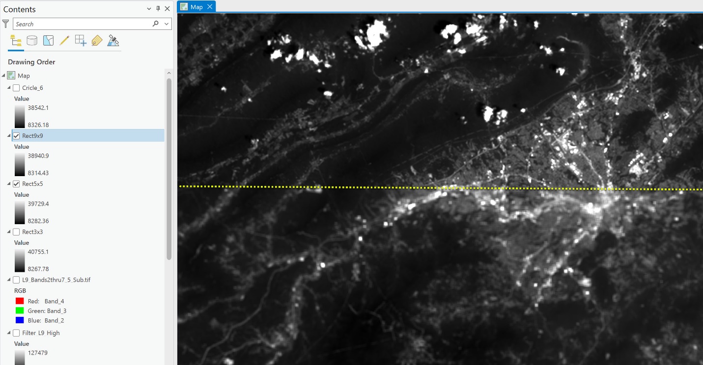
Figure 18.37. Comparing images using the Swipe tool
Continue experimenting with different methods, comparing the new images using Swipe and the digital numbers in the Contents pane.
We completed the spatial enhancement with a composite image, but single bands can also be used. These can be explored on your own. Ultimately, the choice of methods depends upon which is best for the specific project.
For a complete list of Spatial Analyst tools, see http://pro.arcgis.com/en/pro-app/tool-reference/spatial-analyst/complete-listing-of-spatial-analyst-tools.htm
Let’s proceed to the final image enhancement chapter—Chapter 19, Spectral Enhancement of Landsat 9 Imagery.