23 Chapter 23: Evaluating Training Samples in Supervised Classification of a Landsat 9 Image
Introduction
In the prior chapter, we introduced the various classification methods available within ArcGIS® Pro and provided step-by-step instructions on creating training samples for each informational class.
Once training samples are created, the effectiveness of the training samples must be evaluated. This evaluation occurs for many reasons. Spectral values for each class should:
- be independent of each other, with no overlap.
- represent the full range of spectral values for a specific informational class.
- not be over-trained—too many similar training samples will replicate information rather than depict variability within the class.
- represent a normal distribution of values, as best as may be feasible.
- not have pixels selected at the edges of land cover boundaries/tracts—to reduce the likelihood of mixed pixels, which can occur with mixed land uses.
Objective
The objective of this chapter is to use histograms, scatterplots, and statistics to evaluate normality, separability, and partitioning of training data.
This chapter uses the 6-band composite Landsat 9 image of Roanoke, Virginia, subset to the extent of the map viewer created in Chapter 15 and the training sample shapefile created in Chapter 22. We will also create an additional training sample shapefile and additional subset images for each training sample informational class. We will be using the same informational classes as in previous chapters:
|
Class Number |
Information Class |
Color designation |
|
1 |
Urban/built-up/transportation |
Red |
|
2 |
Mixed agriculture |
Yellow |
|
3 |
Forest & Wetland |
Green |
|
4 |
Open water |
Blue |
We recommend that you begin with the project from Chapter 22 and save the project with a new name.
Getting Started
You will need to complete several preparation steps before getting started. These steps are discussed below.
Setting the Background Data Display
Please also ensure you have unchecked Display background data. This was checked in Chapter 15 when subsetting the image in the Options for the Project (Figure 23.1). Figure 23.2 shows the location of this checkbox under Symbology>Mask. Be sure that both areas are unchecked. Leaving these checked affects scatterplots and histograms.
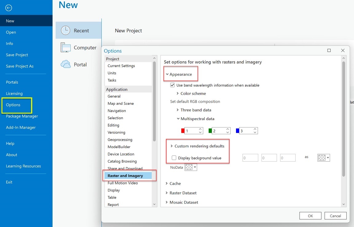
Figure 23.1. Dialog box for changing options on multi-band images
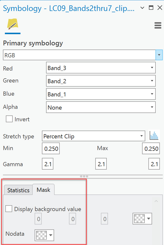
Figure 23.2 Mask tab under primary symbology dialog box
Evaluating Training Samples
You will need to load your training sample shapefile and schema. Keep in mind that evaluating training samples is a long process. If you need to close your map project and continue it later, you may need to reload your training sample shapefile and the schema into the Image Classification Training Samples Manager (the dialog box on the right in Figure 23.24). Follow the steps in the next section to load the schema (for the first time) or reload it later.
Loading the Schema
Open Classification Tools (from the Imagery tab on the ribbon) and select Training Samples Manager. If your schema from the last chapter is not showing in the top half of the Training Samples Manager, you must load the Chapter 22 schema (.ecs file) and the Chapter 22 training samples shapefile. Evaluating training samples is a long process. When you close your map project and continue it later, you may need to reload your schema and training sample shapefile into the Image Classification: Training Samples Manager.
Use the Classification Schema folder at the top of the Image Classification: Training Samples Manager (Figure 23.3) to locate your saved schema, a .ecs file, as shown in Figure 23.4.
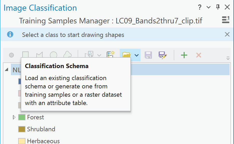
Figure 23.3 Training samples manager classification schema
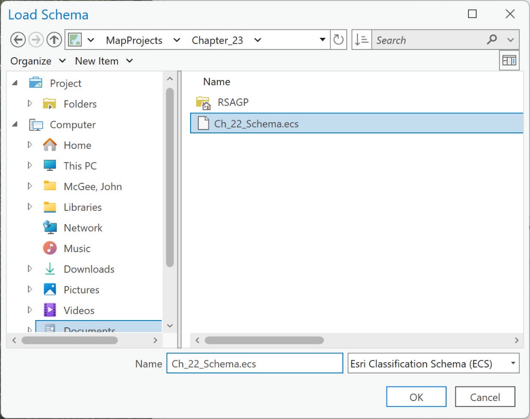
Figure 23.4 Loading a schema file (.ecs) for classification
Loading Training Samples
Use the Load Training Samples folder in the lower half of the pane to load the training samples shapefile. Your Image Classification Training Samples Manager should have the schema and training samples loaded, as shown in Figures 23. 5, and 23.6.
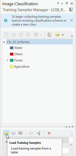
Figure 23.5 Image classification training manager
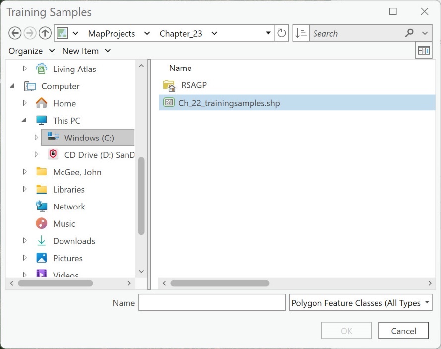
Figure 23.6 Dialog box associated with the training samples shapefile
Again, saving your project and the training samples shapefile frequently is essential.
Next, add the training samples shapefile created in Chapter 22 to the current project in Contents as a map layer. The samples may appear in the map viewer (from the Training Samples Manager), but the actual shapefile is needed in Contents. Adjust the symbology to match the informational classes of the schema (Figure 23.7). If you don’t remember how to symbolize Unique values, refer to Chapter 7.
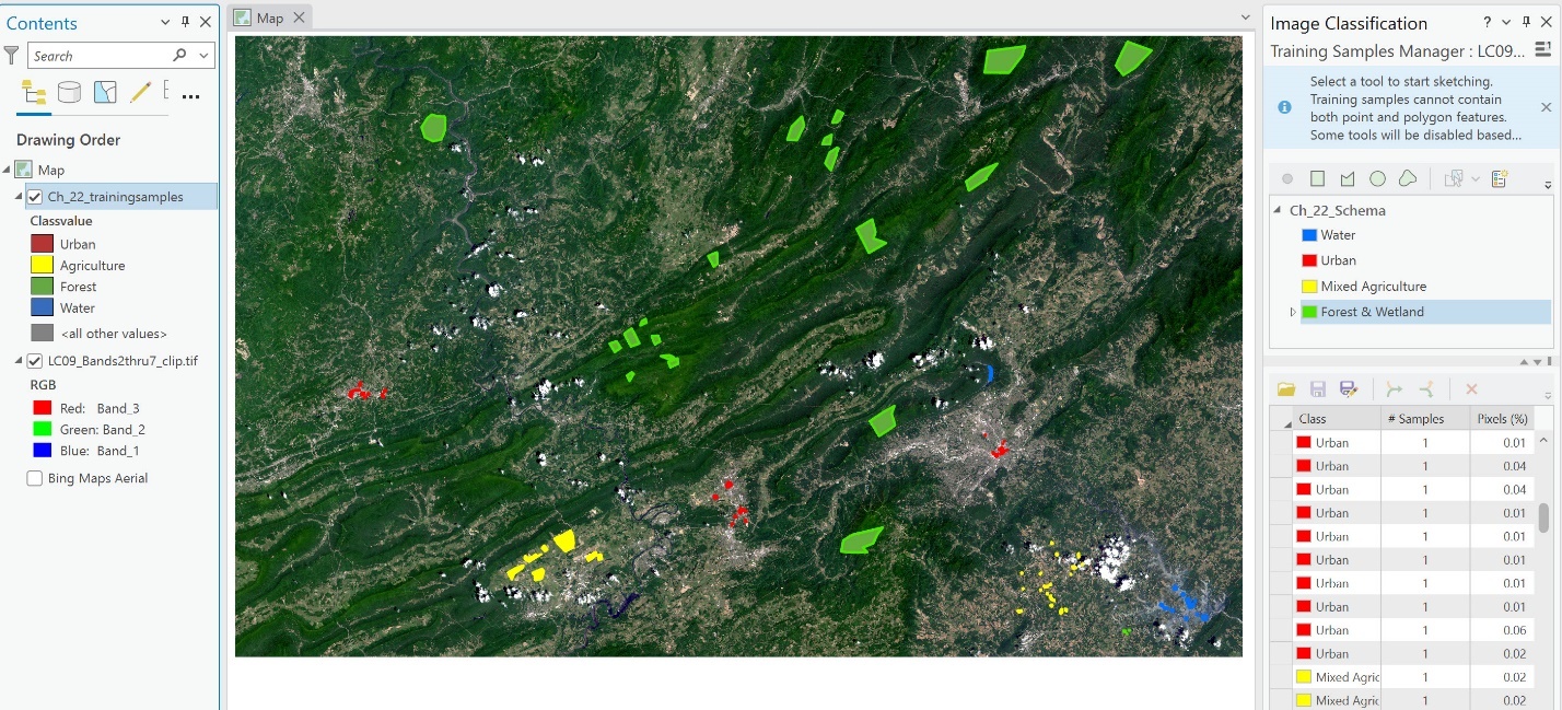
Figure 23.7 Map display showing the symbolization of samples
To begin evaluating the training samples, select the composite image in Contents. Then go to the Data tab on the ribbon and select the Create Chart1 drop-down. We see three options—Histogram, Scatter Plot, and Spectral Profile (Figure 23.8).
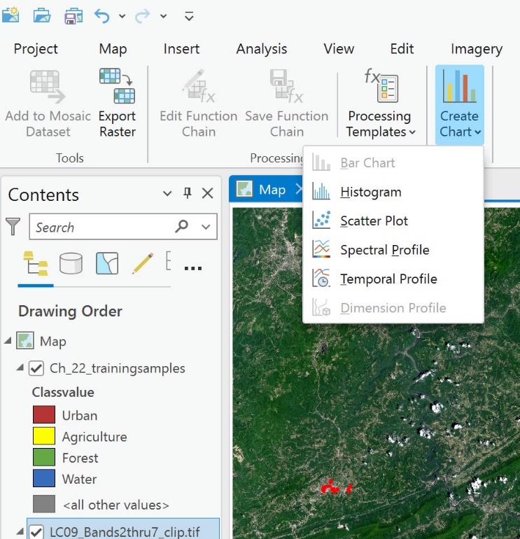
Figure 23.8 The Create Chart tool
We start with Spectral Profile (Figure 23.9).
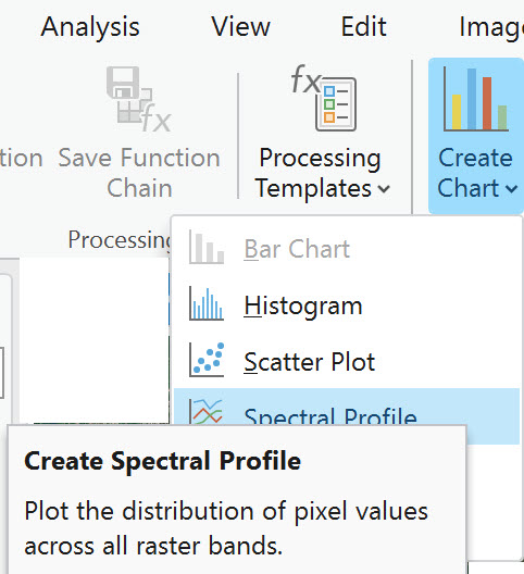
Figure 23.9 Charting a spectral profile
Spectral Profile graphs the spectral values of the pixels captured in the training samples (on the y-axis) for each band (on the x-axis). Graphing the spectral values provides information on whether multiple training samples for a specific informational class cover the same spectral values or a range of spectral values. If more than one training sample covers the same spectral values, we can eliminate one by deleting it or merging it with another training sample. We will evaluate each informational class separately.
Select Spectral Profile. The Chart Properties pane opens with a spectral profile chart tab at the bottom of the map viewer. A new Charts category appears in Contents (Figure 23.10).
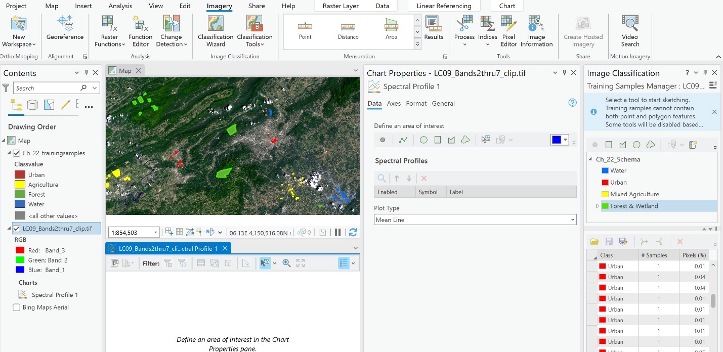
Figure 23.10 A typical spectral plot chart layout in ArcGIS Pro
Please pay close attention to the following instructions and the figures below, as you will need to go back and forth between the Image Classification: Training Samples Manager pane and the Chart Properties pane. It will become apparent why the training sample shapefile must be in Contents. We recommend that both panes be pinned to be visible and easily accessible (as in Figure 23.10).
We will start by evaluating the Urban informational class. In the previous chapter, we created 14 training samples for the urban class—your number of samples may differ (Figure 23.11).
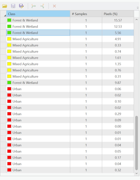
Figure 23.11 A list of training samples
In Chart Properties, choose Feature Selector (Figure 23.12)
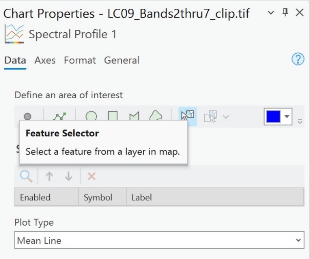
Figure 23.12 The chart properties dialog box and the feature selector option
When you point the cursor into the map viewer, it will have a floating selection icon (Figure 23.13).
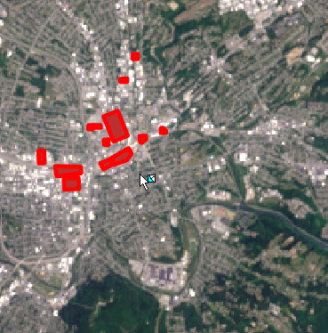
Figure 23.13 Map displaying showing select features
This tool selects pixel values of all bands within the boundaries of a training sample and then graphs them. Do not select anything yet. We need to be careful that we know which sample is being selected in the Training Samples Manager. It may be necessary to zoom in to each sample to select it.
Please select the first Urban sample in the Training Samples Manager; it should be highlighted in the map viewer (Figure 23.14). Since your training samples are likely different from these, your first one can be in a different location.
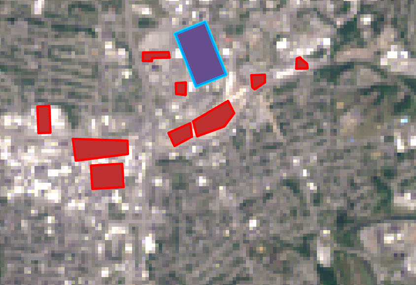
Figure 23.14 Map display showing a single selected feature
Then, with the Feature Selector enabled, click the selected Urban training sample in the map viewer, and its pixel values will be graphed in the Spectral Profile (Figure 23.15).
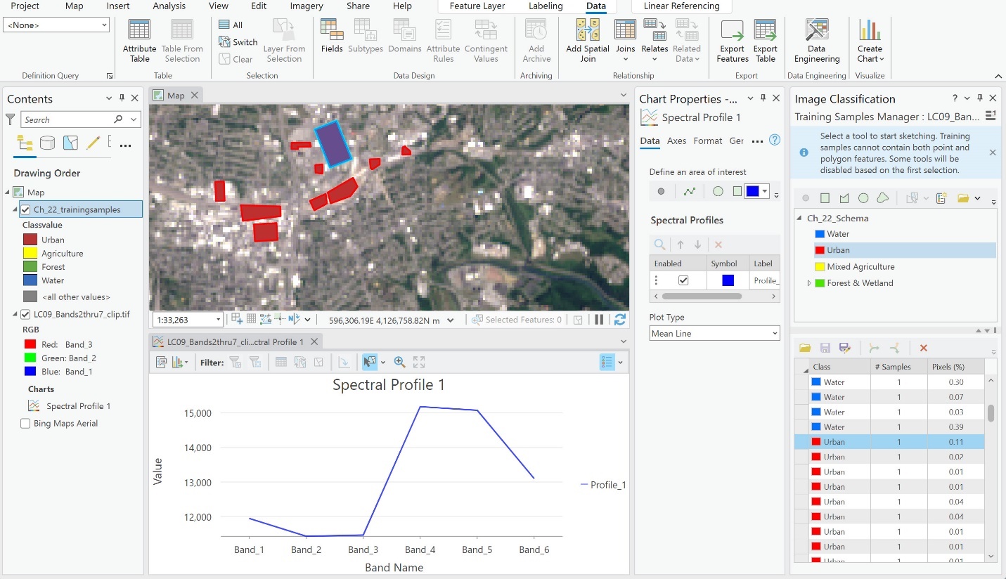
Figure 23.15 A spectral profile chart for the selected feature
We can see the range of spectral values for each band for this one training sample. We need to add a second Urban training sample to conduct a comparison. In Image Classification: Training Samples Manager, select the next training sample in the list—again, it will be highlighted in the map viewer. Ensure the Feature Selector icon is still enabled in Chart Properties and select the highlighted sample to add it to the Spectral Profile graph (Figure 23.16).
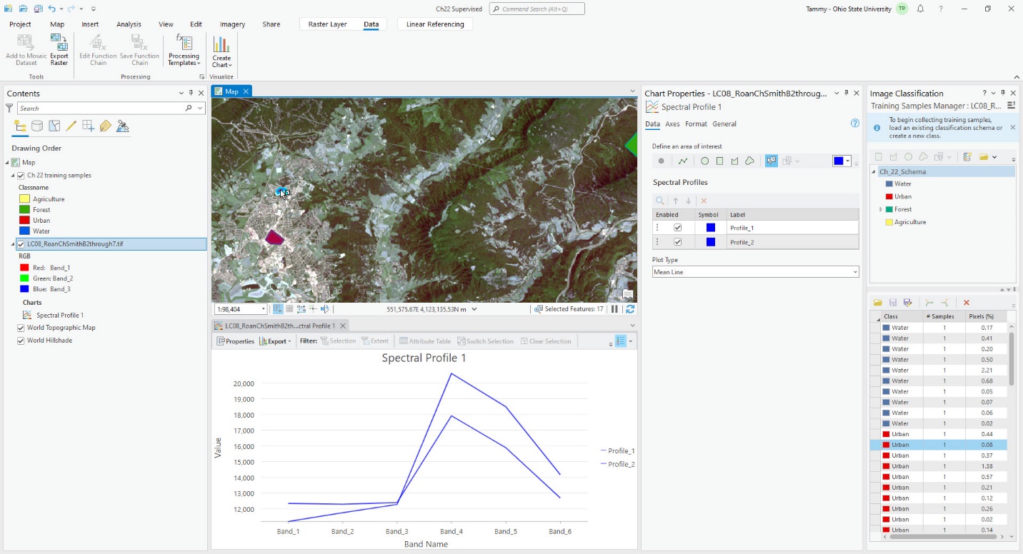
Figure 23.16 A spectral profile chart for 2 selected features
The profiles for these two training samples are similar, but the second one added a more extensive range of values. Now, let’s add a third Urban training sample. This one is slightly different from the first two. It may be necessary to expand the width of the graph to see differences (Figure 23.17).
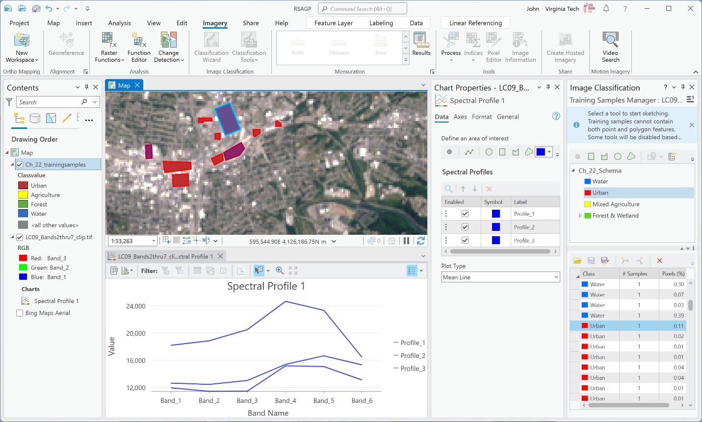
Figure 23.17 A spectral profile chart for 3 selected features
It becomes difficult to see which one is which, so let’s change some colors for the profiles. Under Chart Properties, change the Symbol color in the Spectral Profiles section for each Spectral Profile (Profile_1, Profile_2, Profile_3) so they are three different colors (Figure 23.18).
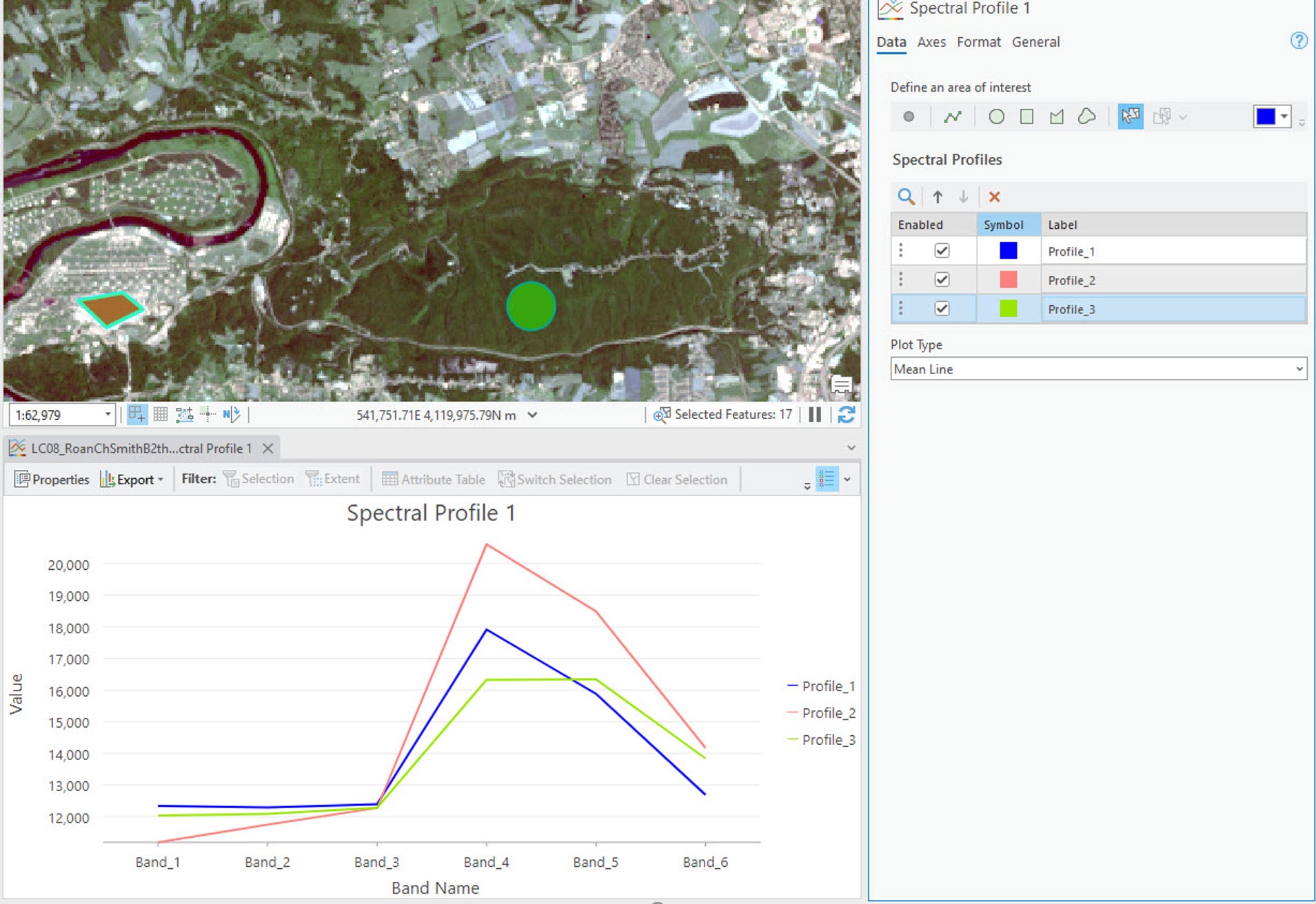
Figure 23.18 A colored spectral profile chart
Continue to add more Urban training samples and evaluate each Spectral Profile. Two notes of caution before you proceed: select each Urban training sample and change the spectral profile symbol color before selecting it in the map viewer (Figure 23.19). This way, you know which profiles belong to which training sample in the Image Classification: Training Samples Manager pane (since the spectral profiles and training samples will be in the same sequence). This will become important for the next step. Be sure you have profiled all the Urban training samples before proceeding.
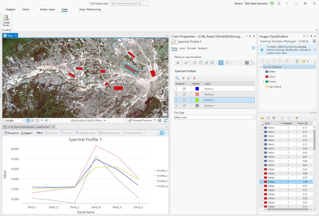
Figure 23.19 A spectral profile chart with 4 selected features
If any two profiles are the same, those two profiles should be combined. Be careful about combining dissimilar values into one sample. When merging training samples, some spectral values could be lost. Merging creates a new median, so values at the extreme may be lost. In Figure 23.20, we have added all 16 samples for urban. We added them in the order listed in the Image Classification: Training Samples Manager, so the profile number in the graph will correspond to that order.
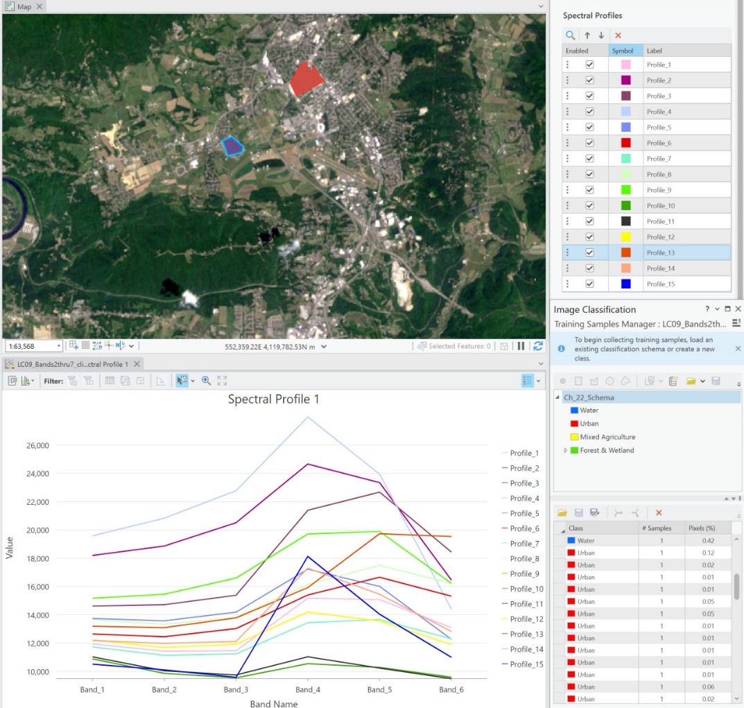
Figure 23.20 A spectral profile chart with all urban training samples
A note of caution. When evaluating spectral values of the samples, do not look at the shape of the line; look at the range of values for the individual bands (x-axis). Keep in mind that each band is useful for evaluating different features. In many instances, the values in a specific band may not be useful for urban environments, so they may have a small range. Let’s examine the graph a bit closer (Figure 23.21).
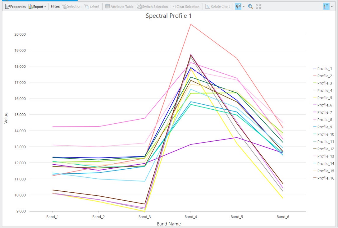
Figure 23.21 The urban spectral profile chart (enlarged)
Profile 2 has the highest peak of all the training samples (for Bands 4, 5, and 6). It is similar to Profiles 1–3, but we will leave this training sample as is because of its high numbers in bands 4–6. Review the next three profiles that peak under Band 4; following their profile lines, they are very close together across all bands. If you are unsure which profile on the graph is which profile number, you can change the colors to verify which ones you see. We are looking at Profiles 4, 6, and 16. In Figure 23.22, we change all three to black.
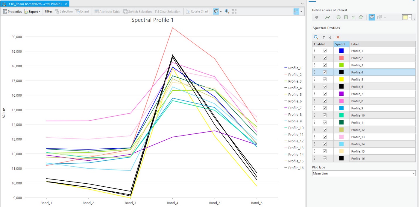
Figure 23.22 Urban spectral profiles, with some colors displayed as black
These three training samples should be merged. Note that, depending on which areas you trained, the graph may have a different look, and you may need to make different decisions.
To complete the merge, highlight the three training samples in the Image Classification: Training Samples Manager. To select multiple rows, hold the ctrl button on the keyboard when you select them. The Collapse button enables once you select two or more rows (Figure 23.23).
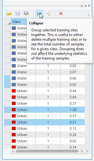
Figure 23.23 Merging (collapsing) training samples
Click Collapse, and those three training samples have been merged into one (Figure 23.24).
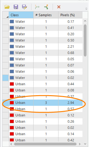
Figure 23.24 Training sample manager showing 3 collapsed samples
You should now remove those three profiles from Chart Properties by selecting the row and clicking on Delete the selected row (Figure 23.25). If you are wary of deleting them, uncheck them instead.
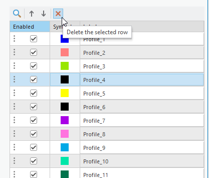
Figure 23.25 Deleting a sample
A note of caution—do not delete the training samples you are not merging! Once you have completed your analysis, you must add those back into the profile to re-evaluate the spectral profiles. If, when deleting or unchecking, your graph does not update, check and uncheck one of the rows. Remember, check the range of values for each band.
Once you have accomplished this task for the urban training samples, remove all the profiles from the Chart Properties and re-create them with your newly merged training samples (Figure 23.26). How did you do? Do you need to merge any others? This evaluation process takes time and must be continually evaluated.
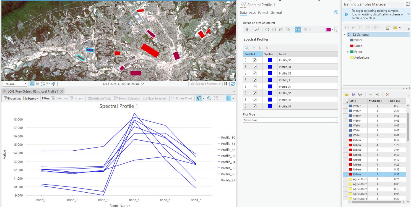
Figure 23.26 Urban spectral profiles after the evaluation process
In Contents, change the name of your chart to Spectral Profile Urban (Figure 23.27), then close the tab. Do not delete the graph from Contents.
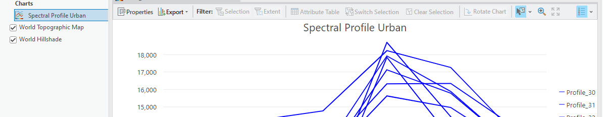
Figure 23.27 Changing the name of the urban spectral profile
The new training sample must now be saved. Be sure to save this merged sample as a new file with a new name. We recommend that the original training sample shapefile be maintained as a separate file.
You will continue the same process, evaluating water, agriculture, and forest training samples. Please create and name a new spectral profile graph for the informational class each time.
The spectral profile in the graph for water is very different from the urban spectral profiles (Figure 23.28).
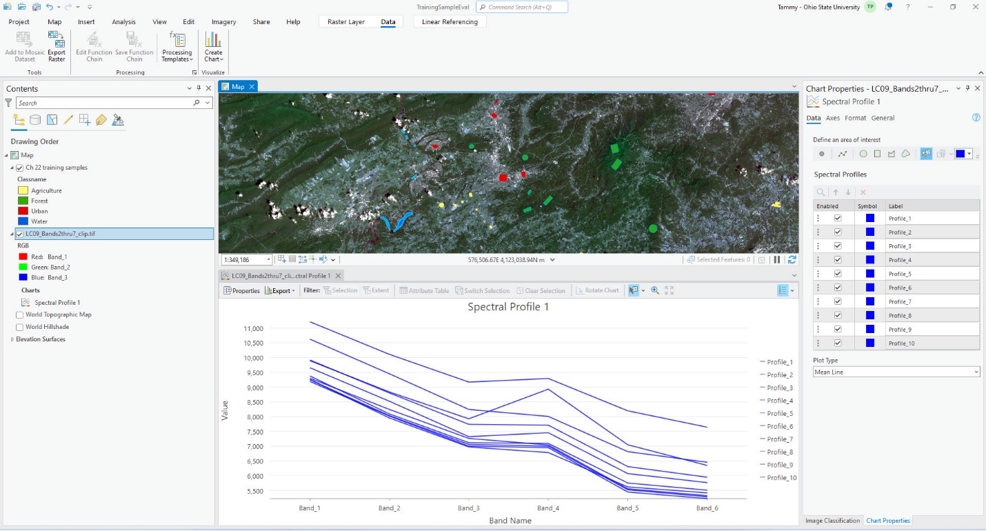
Figure 23.28 Charting spectral profiles of the water training samples
This is expected! Recall from prior chapters that spectral signatures should vary for different features—reference the Landsat 9 band sensitivities table at the end of this chapter. The water profiles are all within a few hundred values in most of the bands. We will merge them into one sample to increase processing efficiency (Figure 23.29).
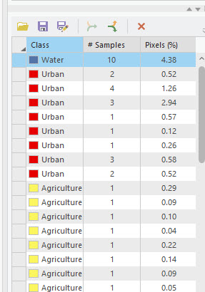
Figure 23.29 Merged water training samples
Again, save the training sample shapefile with a new name. It is important to save it multiple times when completing other training sample evaluation methods—you don’t have to recreate the entire process. Also, save your map project!
Now, continue evaluating training samples for the Forest and Agriculture classes. We will not go step by step; refer to the above instructions.
All Forest spectral values are graphed in Figure 23.30.
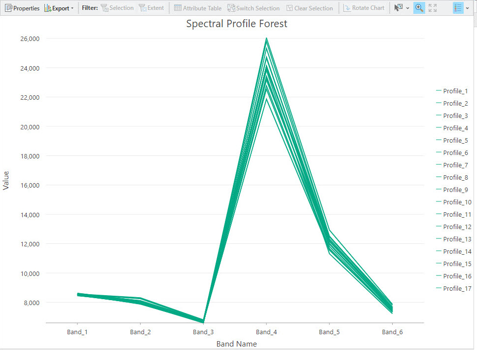 Figure 23.30 Charting forest spectral profiles
Why is there a wider range of spectral values for forest in Band 4? In ArcGIS® Pro, Band 4 is the Landsat 9 near-infrared band, and, recalling previous chapters, vegetation has a greater range of spectral signatures in the near-infrared. Which of these training samples should be merged? Please note that although we do not show the process, we merged some samples. Be sure you are not merging them all into one. Zoom in and out on the spectral profile graph to see how wide the range of values is between each training sample.
Don’t forget to save frequently!
Figure 23.31 is our Spectral Profile Forest after merging samples. We have zoomed in so you can see that the profiles have varied values. Save your training samples and project!
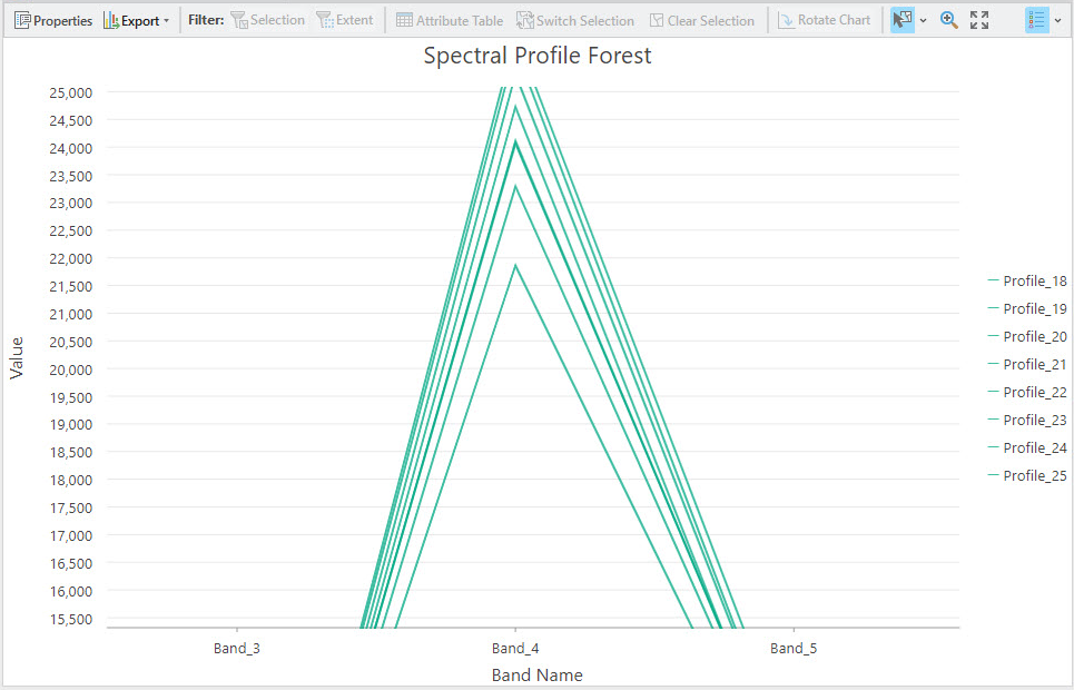
Figure 23.31 Forest spectral profiles after merging
Now evaluate the training samples for Agriculture—complete each sample, graphing them individually. Figure 23.32 is the profile of all agriculture training samples. These show the most variation of all the spectral profiles. Agriculture spectral values vary much more over many difference bands relative to the samples from other informational classes. Can you speculate some reasons for this? For your reference, we have included the Landsat 9 band sensitivities table at the end of this chapter. When evaluating the spectral values of the samples, evaluate all bands and all spectral values.
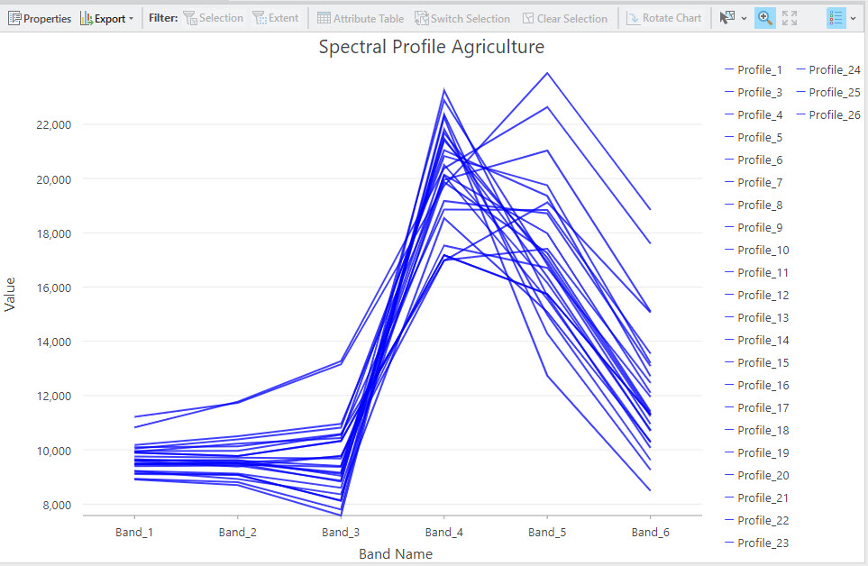
Figure 23.32 Charting agriculture spectral profiles
Figure 23.33 shows the agriculture spectral profiles after merging various training samples. We went from 25 training samples to 12. Some additional merging should occur but remember, for agriculture, the spectral profiles vary across many different bands, so when values are similar in one band, those profiles have a much broader variation in another. SAVE!
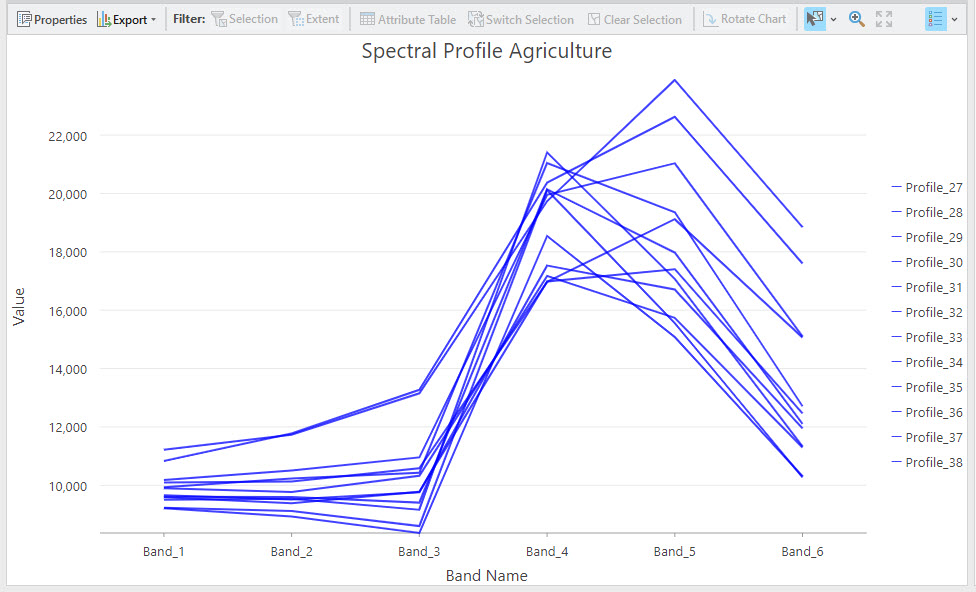
Figure 23.33 Agriculture spectral profiles after merging samples
ArcGIS® Pro maintains a history of your steps and processes, so starting over is unnecessary if you accidentally merge training samples that you ultimately decide should not be merged. If you do not save, you can expand previously collapsed samples. If needed, highlight the merged sample in the list, which enables the Expand tool. This tool is only enabled if you have highlighted a merged sample. We will not demonstrate this capability; we show this as an option (Figure 23.34).
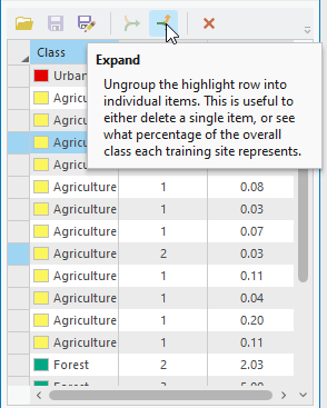
Figure 23.34 The Expand tool
At this juncture, we have demonstrated how to evaluate the training samples to eliminate any significant overlap in spectral values. Leaving overlap within a class will not affect the results. However, it does slow down the classification process. As an analyst becomes more knowledgeable and expert in classification, the number of training samples with overlapping spectral values will decrease.
Close the Spectral Profile Chart and Chart Properties pane. You are not deleting the charts—they are still in Contents and can be opened from there.
Please now add the new training sample shapefile to Contents and symbolize with Unique Values. If you compare the shapefile of the initial training samples to the final one, you will see that the number of features has decreased. The individual samples remain, but the new shapefile has multi-part polygons.
Extracting Training Data Brightness Values
Before we proceed into the next two sections, Scatterplots and Histograms, we will extract the brightness values for each pixel of the training data into a point feature class.
Under the Analysis tab, choose Tools, and search for Extract by Mask (Figure 23.35).
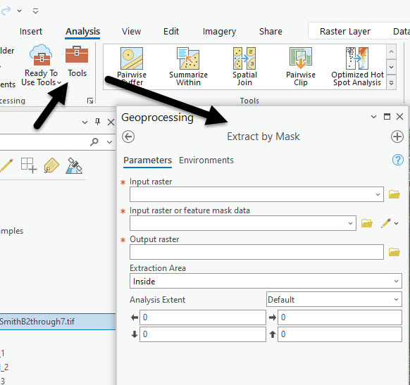
Figure 23.35 The Extract by Mask tool
The Input raster is your subsetted composite image, and the Input raster or feature mask data is the final training samples shapefile (Figure 23.36). For Extraction Area, be sure it says Inside—we want the pixels inside the features of the shapefile. Click Run.
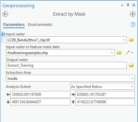
Figure 23.36 The Extract by Mask tool
The results are in Figure 23.37. If you cannot see the image, turn off the original subsetted composite image and the training sample shapefile. If you zoom in, you will see that these portions of the image are within your training data shapefile features.
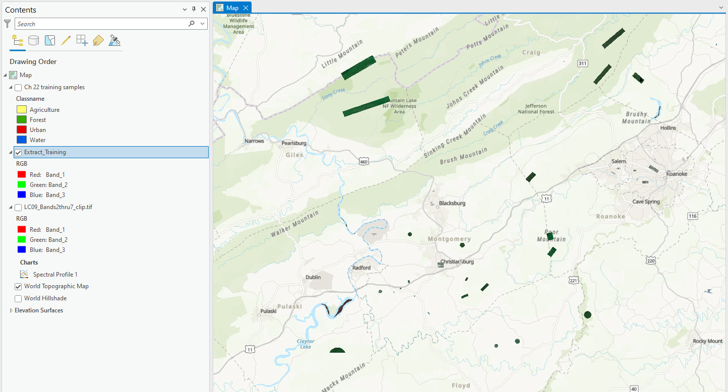
Figure 23.37 Extracted data
Go back to the Geoprocessing pane and search for Raster to Point. The Input Raster is the new raster created in the last step. Field is Value and name the Output point features so you understand what this feature class represents (Figure 23.38). Click Run.
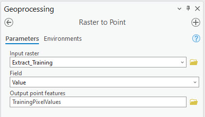
Figure 23.38 The Raster to Point tool
Figure 23.39 is the result, zoomed in to one of the training samples. A new file has been created with a point representing the center of each pixel of your training sample data. For our training data there are 80,868 points—yours will be different because you selected different training samples.
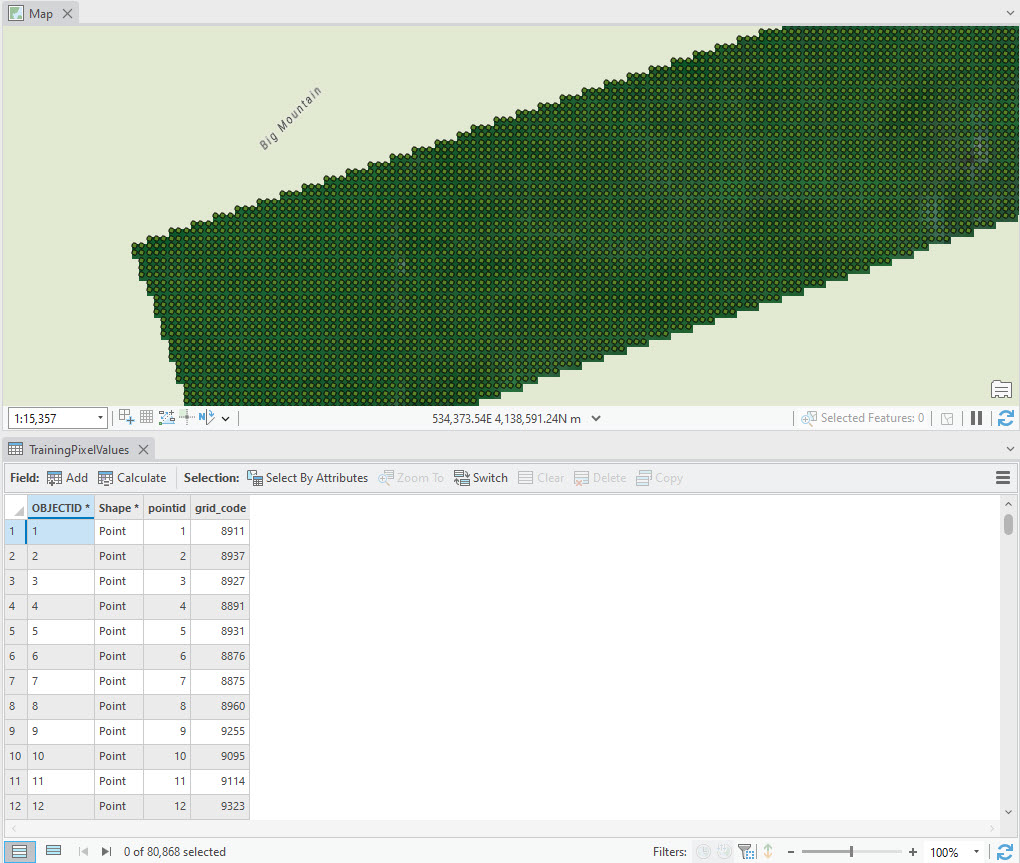
Figure 23.39 Pixel values extracted into a point shapefile
For each point, we need to identify if the point represents water, urban, agriculture, or forest—our informational classes and each training sample location. We must first add the informational category as a field to the new shapefile. Open the Attribute Table, and select Fields View (Figure 23.40).
Figure 23.40 Adding a new field to an attribute table
At the bottom of the table, select Click here to add a new field (Figure 23.41).
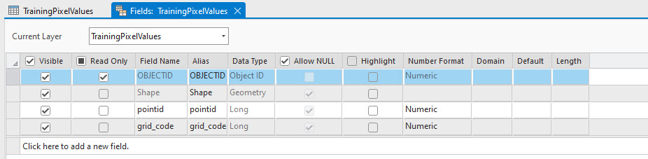
Figure 23.41 Adding a new field
Add a new InfoClass field, as shown in Figure 23.42. The length of the field should be 15.
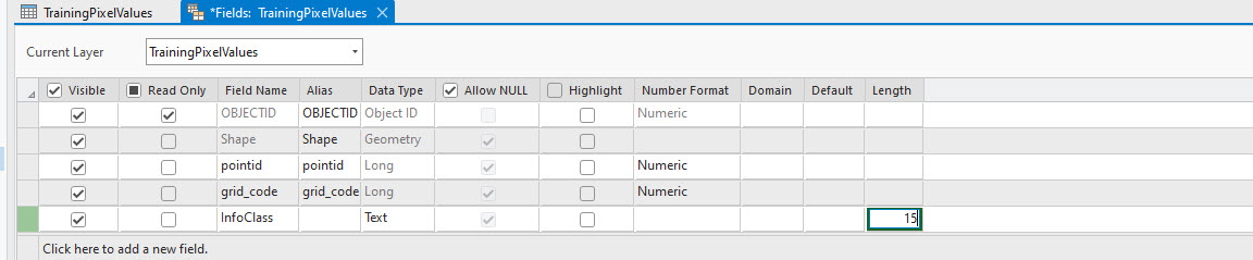
Figure 23.42 Adding the length and data type
Then click Save in the Changes group on the ribbon (Figure 23.43).
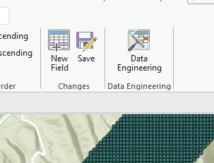
Figure 23.43 Saving changes
Close Fields View. The new field is in the Attribute Table filled with <Null> values (Figure 23.44).
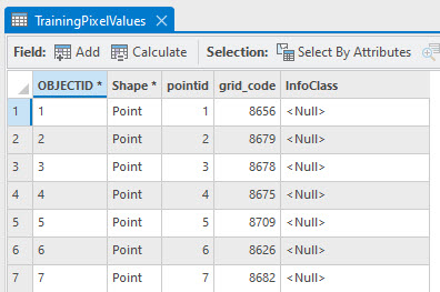
Figure 23.44. Null values in the attribute table
Now, we must populate the new field. Please follow these instructions step by step. We will use Select by Attributes to select all the points for the first informational class. As shown in Figure 23.45, that is Agriculture.
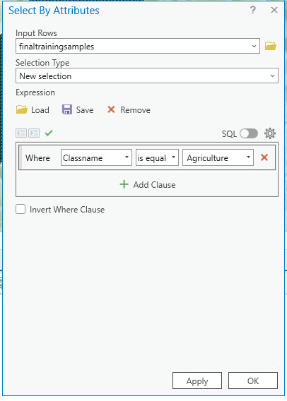
Figure 23.45 Selecting by attribute
Open Select by Location (Figure 23.46). Input Features is the newly created point shapefile. Relationship is Within because you want the points within each of the Agriculture training sample polygons. Then click OK.
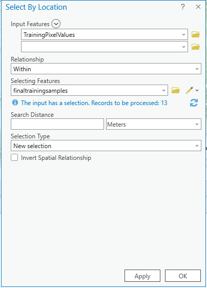
Figure 23.46 Selecting by Location
You have selected all the points within the agriculture training sample polygons (Figure 23.47). In the Attribute Table, right-click the InfoClass field and choose Calculate Field.
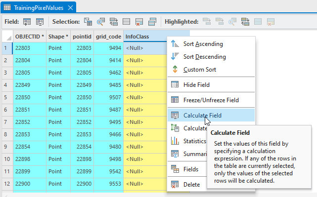
Figure 23.47 Calculating a field
In the Calculate Field dialog box at the bottom, type “Agriculture” (Figure 23.48).
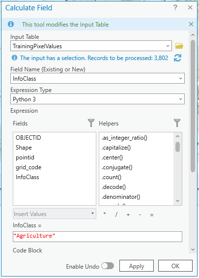
Figure 23.48 Calculating a field
Points located within agriculture training sample polygons are now labeled as such in the InfoClass field of the Attribute Table (Figure 23.49).
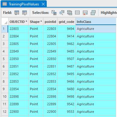
Figure 23.49 Population a field with text
Clear your selection (Figure 23.50).
Figure 23.50 Clearing selected features
Now complete the same process for the other three informational classes—water, urban, and forest. Ensure you type the correct informational class name. Clear your selections each time and after the last one.
Once you have completed all four informational classes, we must ensure you have not missed any pixels. Open Select by Attributes again and populate it as shown in Figure 23.51.
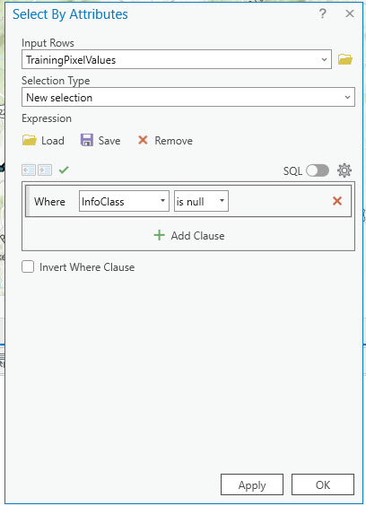
Figure 23.51 Searching for missed values
If this Select by Attributes returns any null values found in the InfoClass field, you must select these points and assign them to an informational class. Depending on the number of pixels found, you can either redo your selection by location using the term within a distance of 30 meters or manually select each point.
Once all informational classes have been filled in and no null values are present, we must assign the brightness values for each pixel in each band. Before proceeding be sure that you have cleared any selections!
Return to the toolbox and search for “Extract Multi Values to Points” (Figure 23.52). Open the tool (Figure 23.53).
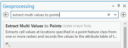
Figure 23.52 The extract multi values to points tool
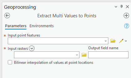
Figure 23.53 The extract multi values to points tool
This tool will extract the brightness values for each band of the composite image and place them into a separate column for each point. Please pay close attention to Figure 23.54 and what goes into the blanks! Input point features is the point feature class, and the Input Raster is the subsetted composite image. Output field name is, as shown, AP_Band. AP stands for ArcGIS®Pro. Remember, the Landsat spectral bands were renumbered when you subsetted the image using only Landsat 9 Bands 2 through 7!
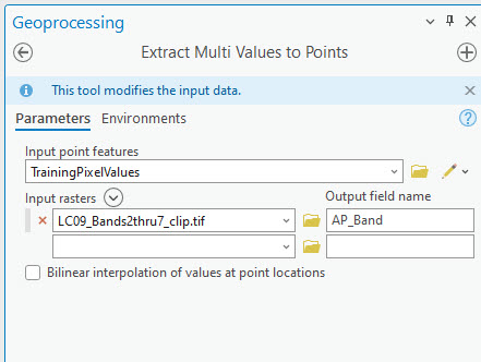
Figure 23.54 The extract multi values to points tool
Review the new columns in the attribute table. Your information class and the brightness values of each pixel for each band in the training sample are present (Figure 23.55). We will use this feature class for the following two sections—Evaluating Separability using Scatterplots and Evaluating Normality using Histograms. Be sure to save your project! You can close the Geoprocessing pane and the attribute table.
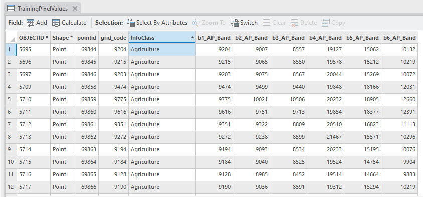
Figure 23.55 Results of extracting multi values to points
Evaluating Separability Using Scatterplots
Scatterplots plot the pixel values of the training data for two bands. One band is chosen for the x-axis and another for the y-axis. When selecting the bands to evaluate, consideration must be given to which bands are best for identifying a specific feature—reference Landsat 9 band sensitivities at the end of this chapter. When viewing pixel values as scatterplots, points should not overlap if the spectral values of each class’s training samples are separate. If any overlapping exists, misclassification could occur.
Change the symbology in the points shapefile to display the informational classes in unique values (Figure 23.56). Adjust the symbology to match our informational class schema.
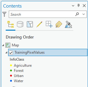
Figure 23.56 Points symbolized by informational class
To create scatterplots, right-click the point shapefile and choose Create Chart >Scatter Plot Matrix (Figure 23.57)
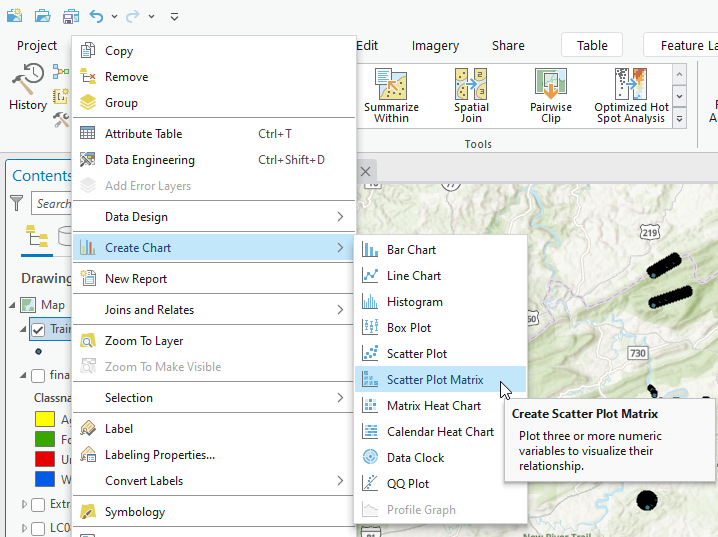
Figure 23.57 Create a scatterplot
The Chart Properties dialog box opens (Figure 23.58).
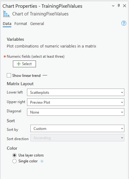
Figure 23.58 Chart properties for scatterplot
Again, please follow and complete the inputs as follows. Click on + Select to get a dropdown list that includes all the band numbers (Figure 23.59). Check the box for each band; as you do, a scatterplot for each band will be drawn in the window below the map document viewer.
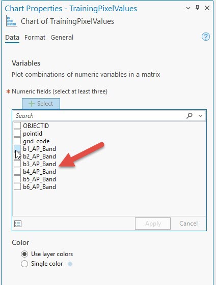
Figure 23.59 Selections in chart properties
Charts for all bands can be compared if all bands are checked (Figure 23.60). The scatter plot with the bold black outline around it also appears as a larger chart in the upper right-hand corner of the window. In Figure 23.60, Band 1 is compared to Band 6.
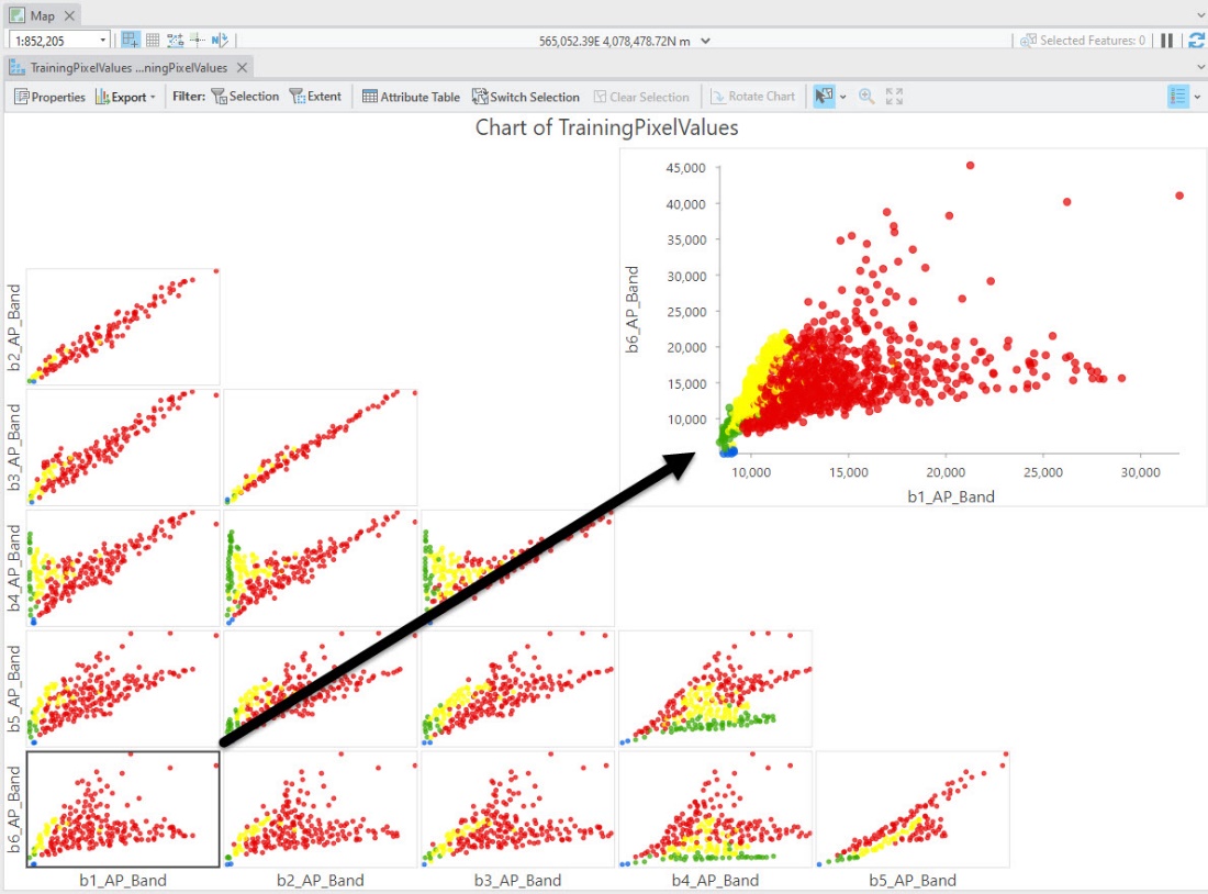
Figure 23.60 Band 6 compared to band 1
In Figure 23.61, the comparison is Band 6 to Band 4.
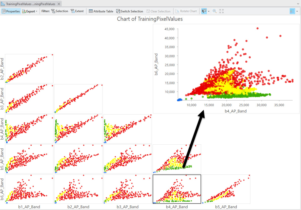
Figure 23.61 Comparison of band 6 to band 4
Review the different informational classes for all band comparisons. Are any points intermingling or overlapping between informational classes?
In the Band 6 to Band 4 comparison of Figure 23.62, the forest class (green) is separate and appears across the bottom of the graph. The water class (blue) is separate and in the lower left corner.
The urban class (yellow) is scattered across the entire vertical and horizontal range in all graphs. Why? Remember, urban areas are very diverse, with many different types of features and spectral reflectances.
But Figure 23.62 shows quite a bit of overlap between urban and agriculture. Does this same issue occur across all band comparisons? If so, the training samples must be re-evaluated, thus the reason for saving your original training samples. You can check each training sample separately to ensure you trained your data appropriately.
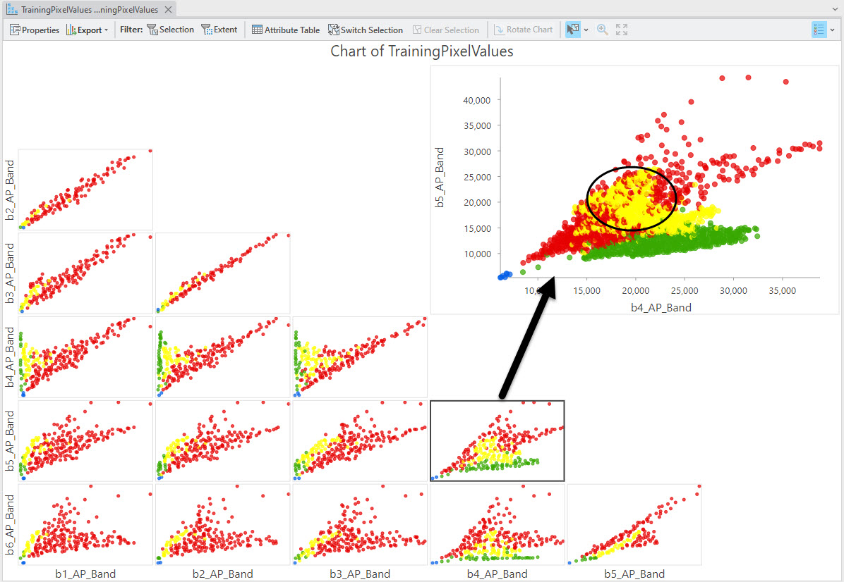
Figure 23.62 Areas of intermingling
If overlapping/intermingling pixels are located, training samples must be reviewed to determine the class where they belong. This means returning to the original training samples in the Training Samples Manager and adding training samples to one class while eliminating them from another. For example, many urban areas have parks with extensive tree canopy or parks that mimic agricultural areas; mountain shadows may have spectral properties similar to water, etc. These variables must be kept in mind when creating and evaluating training samples.
To identify which pixels in your point shapefile belong to the overlapping samples, you can click within the graph to select a point (Figure 23.63), which highlights the row within the attribute table (Figure 23.64) and selects it in the map viewer (Figure 23.65). You can then turn on the original training sample shapefile to determine where those points are and if they are trained appropriately.
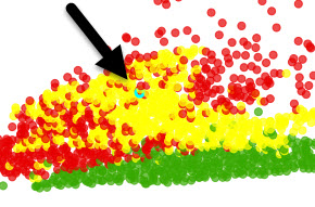
Figure 23.63 Selecting a point within the scatterplot
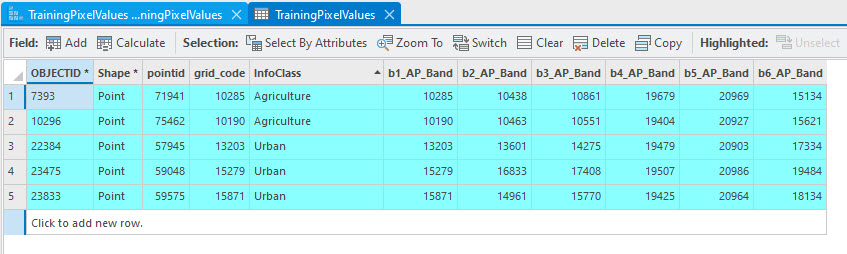
Figure 23.64 The attribute table shows the selection
Figure 23.65 The section is shown in the map viewer
Once you have completed your separability analysis with scatterplots and retrained any data necessary, save your project. Close Chart Properties and the chart itself. The chart is still in Contents and can be opened from there (Figure 23.66).
Figure 23.66 Opening the chart from contents
Evaluating Normality with Histograms
Recall from Chapter 17: Radiometric Enhancement of Landsat 9 Imagery that a histogram depicts the distribution of the numbers of pixels with respect to pixel values. We now need to evaluate training data pixel values to assess their degree of normality. Suppose pixel values within any one of the classes are not normally distributed; for example, they display a bimodal histogram. In that case, it is likely that a specific class has not been sufficiently trained. If this is the case, additional training samples are needed to cover missing spectral values. We can use the same point feature class created to evaluate separability.
We will evaluate each informational class separately, so we must separate the extracted pixel values from the point feature class used for scatterplots. Use Select by Attributes to select the agriculture informational class. If you need assistance, refer to Figure 23.45.
Next, right-click that point feature class, point to Data, and select Export Features (Figure 23.67).
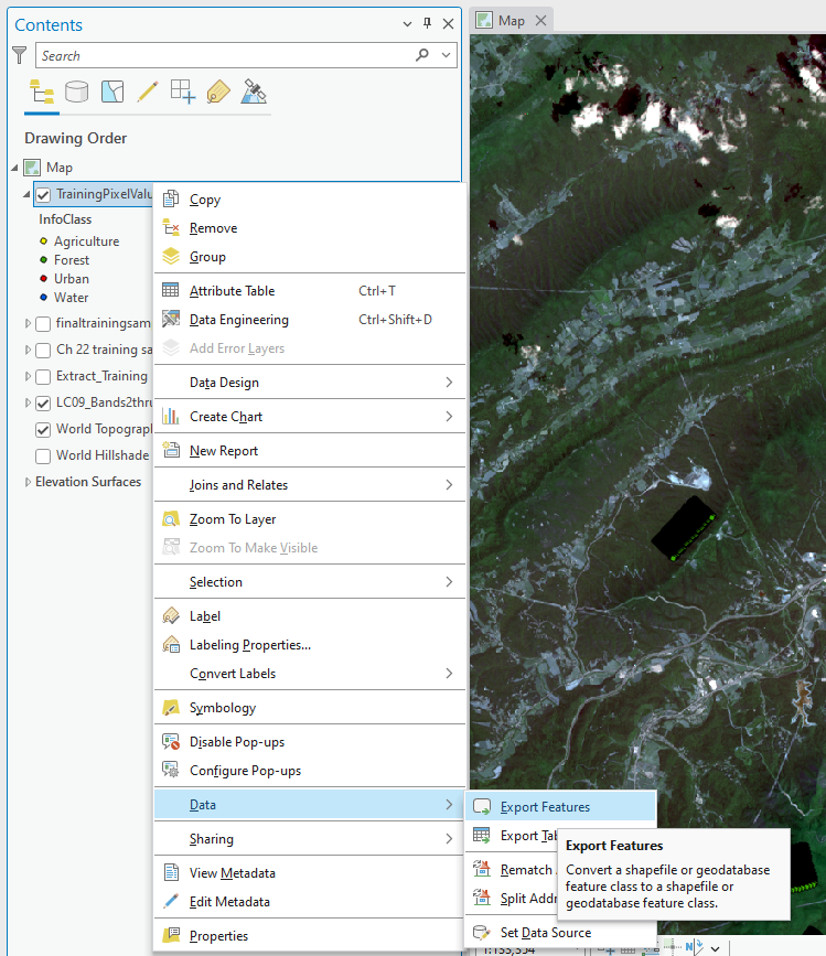
Figure 23.67 Exporting features to a new file
Name the Output Feature Class for water pixels—don’t use the default naming convention shown in Figure 23.68. Click OK.
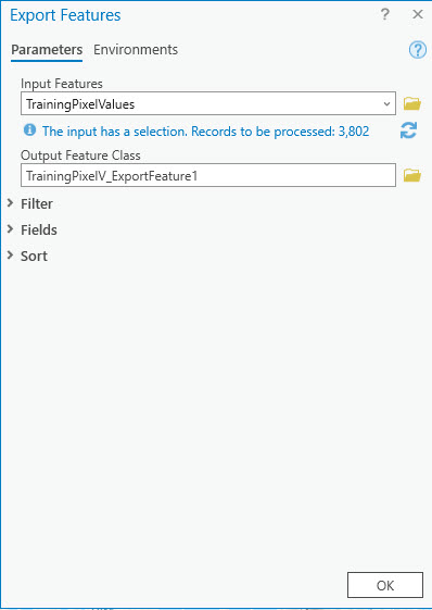
Figure 23.68 Exporting features
A new point feature class containing the points for water, the informational class, and band information will be in the Contents. Please do this for all four informational classes so each has its own feature class (Figure 23.69).
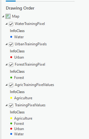
Figure 23.69 Training classes are shown in Contents
Now you are ready to create histograms. Right-click on the water training layer and choose Create Chart > Histogram (Figure 23.70).
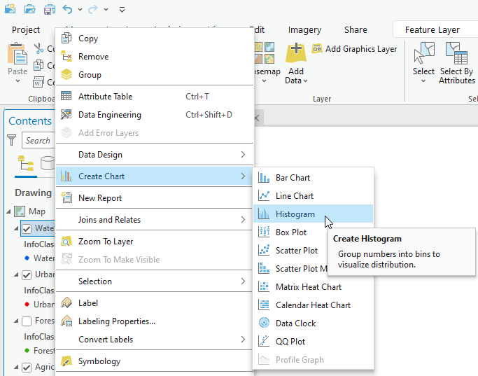
Figure 23.70 Creating a Histogram
In Chart Properties, under Variable, choose a band (Figure 23.71). Then check all the boxes for Mean, Median, Standard Deviation, and Show Normal distribution.
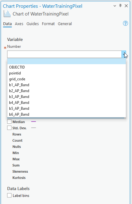
Figure 23.71 Histogram chart properties
Figure 23.72 shows the histogram generated for the water informational class with Band 5 training data. Remember, Band 5 is the first SWIR band for this Landsat 9 composite image. In a full 11-band Landsat image, the SWIR Band is Band 6.
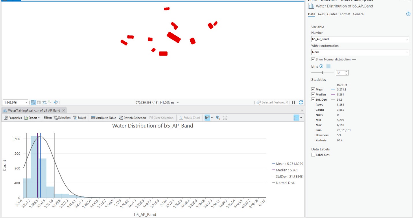
Figure 23.72 Histogram for water: SWIR
This distribution shows that our Water Training Sample pixel values have a normal distribution in Band 5, albeit a long tail. Figure 23.73 shows water for band 1 (blue visible). Why is it multi-modal? Well, remember, water is better depicted in the infrared bands instead of the blue; if water on the surface has any sediment, algae, or other features that would cause many varied reflectances.
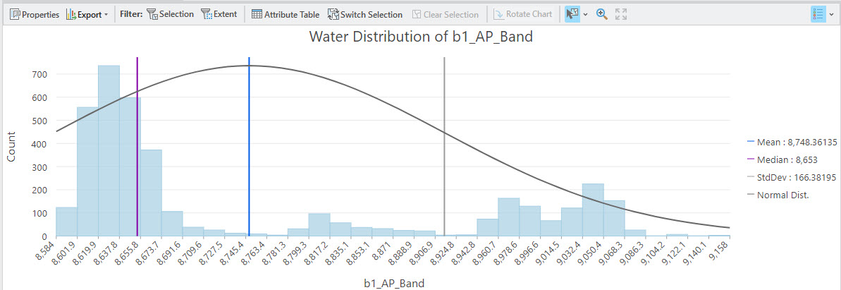
Figure 23.73 Histogram for water: blue visible
Do the same thing for each Band that is significant for the specific feature (forest, agriculture, urban). If you need clarification about the sensitivities, see the table at the end of this chapter.
We will not repeat the process step-by-step but follow it for each class. Here are examples for the other three classes.
For Forest, we checked Band 2 (Green Visible) and Band 4 (NIR)—Figures 23.74 and 23.75. Figures 23.76 through 23.79 show histograms for Urban and Agriculture.
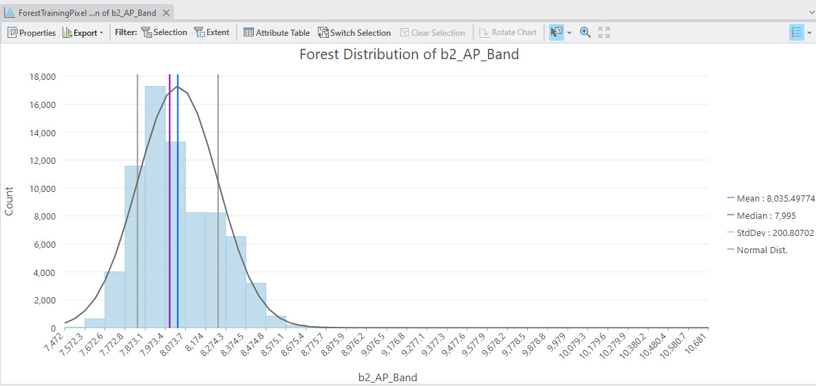
Figure 23.74 Forest histogram: green visible
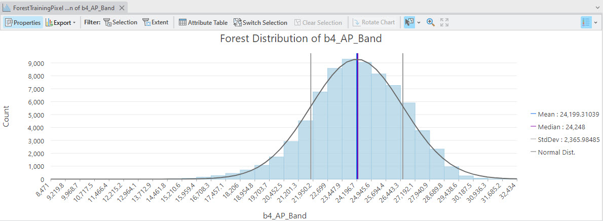
Figure 23.75 Forest histogram: NIR
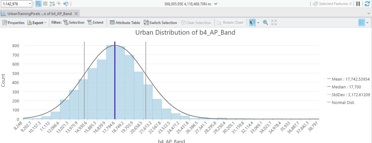
Figure 23.76 Urban histogram: NIR
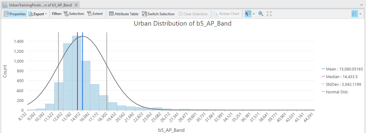 Figure 23.77 Urban histogram: SWIR
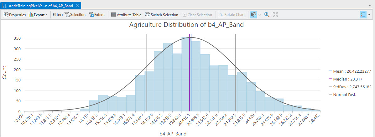
Figure 23.78 Agriculture histogram: NIR
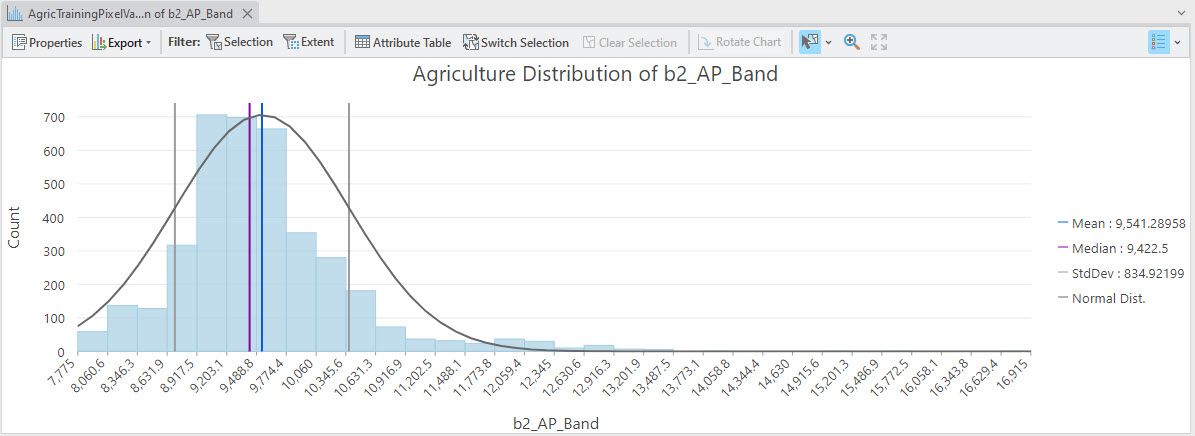
Figure 23.79 Agriculture histogram: green visible
Again, examine each of the classes for normality in each of the significant bands. We state significant because, for our seven-band Landsat 9 image, Band 1 and Bands 10 and 11 are likely insignificant for our analysis. Do you need to add any training data to any of the classes? Training data for each class may not cover the entire range of brightness values, as demonstrated for water.
Now that we have finished evaluating our training samples, eliminated samples, merged samples, and created new samples, we are ready to proceed with classification.
Band Sensitivities for Landsat 8 and 9.
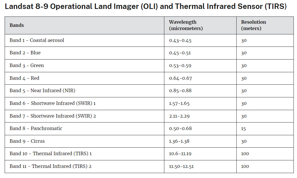
Figure 23.80 Landsat 8/9 spectral and spatial resolutions. Source: USGS https://www.usgs.gov/faqs/what-are-band-designations-landsat-satellites