15 Global Climate Change
Learning Objectives
By the end of this chapter, students should be able to:
- Describe the role of greenhouse gases in climate change.
- Describe the sources of greenhouse gases.
- Explain Earth’s energy budget and global temperature changes.
- Explain how positive and negative feedback mechanisms can influence climate.
- Explain how we know about climates in the geologic past.
- Accurately describe which aspects of the environment are changing due to anthropogenic climate change.
- Describe the causes of recent climate change, particularly the role of humans in the overall climate balance.
This chapter describes the Earth systems involved in climate change, the geologic evidence of past climate changes, and the human role in today’s climate change. In science, a system is a group of interacting objects and processes. Earth System Science is the study of these systems: geosphere—rocks; atmosphere—gasses; hydrosphere—water; cryosphere—ice; and biosphere—living things. Earth science studies these systems and how they interact and change in response to natural cycles and human-driven, or anthropogenic forces. Changes in one Earth system affect other systems.
It is critically important for us to be aware of the geologic context of climate change processes and how these Earth systems interact, first, for us to understand how and why human activities cause present-day climate change and, secondly, to distinguish between natural processes and human processes in the geologic past’s climate record.
A significant part of this chapter introduces and discusses various processes from these Earth systems, how they influence each other, and how they impact global climate. For example, Earth’s temperature and climate largely change based on atmospheric gas composition, ocean circulation, and the land-surface characteristics of rocks, glaciers, and plants.
Also necessary to understanding climate change is to distinguish between climate and weather. Weather is the short-term temperature and precipitation patterns that occur in days and weeks. Climate is the variable range of temperature and precipitation patterns averaged over the long-term for a particular region (see section 13.1). Thus, a single cold winter does not mean that the entire globe is cooling—indeed, the United States’ cold winters of 2013 and 2014 occurred while the rest of the Earth was experiencing record warm-winter temperatures. To avoid these generalizations, many scientists use a 30-year average as a good baseline. Therefore, climate change refers to slow temperature and precipitation changes and trends over the long term for a particular area or the Earth as a whole.
15.1 Earth’s Temperature
Without an atmosphere, Earth would have huge temperature fluctuations between day and night, like the moon. Daytime temperatures would be hundreds of degrees Celsius above normal, and nighttime temperatures would be hundreds of degrees below normal. Because the Moon doesn’t have much of an atmosphere, its daytime temperatures are around 106 °C (224℉) and nighttime temperatures are around -183°C (-298℉). That is an astonishing 272°C (522°F) degree range between the Moon’s light side and dark side. This section describes how Earth’s atmosphere is involved in regulating the Earth’s temperature.
15.1.1 Composition of Atmosphere
The atmosphere’s composition is a key component in regulating the planet’s temperature. The atmosphere is 78 percent nitrogen (N2), 21 percent oxygen (O2), one percent argon (Ar), and less than one percent trace components, which are all other gases. Trace components include carbon dioxide (CO2), water vapor (H2O), neon, helium, and methane. Water vapor is highly variable, mostly based on region, and composes about one percent of the atmosphere. Trace component gasses include several important greenhouse gases, which are the gases responsible for warming and cooling the plant. On a geologic scale, volcanoes and the weathering process, which bury CO2 in sediments, are the atmosphere’s CO2 sources. Biological processes both add and subtract CO2 from the atmosphere.
Greenhouse gases trap heat in the atmosphere and warm the planet by absorbing some of the longer-wave outgoing infrared radiation that is emitted from Earth, thus keeping heat from being lost to space. More greenhouse gases in the atmosphere absorb more longwave heat and make the planet warmer. Greenhouse gasses have little effect on shorter-wave incoming solar radiation.
The most common greenhouse gases are water vapor (H2O), carbon dioxide (CO2), methane (CH4), and nitrous oxide (N2O). Water vapor is the most abundant greenhouse gas, but its atmospheric abundance does not change much over time. Carbon dioxide is much less abundant than water vapor, but carbon dioxide is being added to the atmosphere by human activities such as burning fossil fuels, land-use changes, and deforestation. Further, natural processes such as volcanic eruptions add carbon dioxide, but at an insignificant rate compared to human-caused contributions.
There are two important reasons why carbon dioxide is the most important greenhouse gas. First, carbon dioxide stays in the atmosphere and does not go away for hundreds of years. Second, most of the additional carbon dioxide is “fossil” in origin, which means that it is released by burning fossil fuels. For example, coal and petroleum are fossil fuels. Coal and oil are made from long-dead plant material, which was originally created by photosynthesis millions of years ago and stored in the ground. Photosynthesis takes sunlight plus carbon dioxide and creates the substances of plants. This transformation occurs over millions of years as a slow process, accumulating fossil carbon in rocks and sediments. So, when we burn coal and oil, we instantaneously release the stored solar energy and fossil carbon dioxide that took millions of years to accumulate in the first place. The rate of release is critical to comprehend current climate change.
15.1.2 Carbon Cycle
Critical to understanding global climate change is to understand the carbon cycle and how Earth’s own carbon-balancing system is being rapidly thrown off balance by human-driven activities. Earth has two important carbon cycles: the biological and the geological. In the biological cycle, living organisms—mostly plants—consume carbon dioxide from the atmosphere to make their tissues and substances through photosynthesis. Then, after the organisms die, and when they decay over years or decades, that carbon is released back into the atmosphere. The following is the general equation for photosynthesis.
CO2 + H2O + sunlight → sugars + O2
In the geological carbon cycle, a portion of the biological-cycle carbon becomes part of the geological carbon cycle: plant materials into coal and petroleum, tiny fragments and molecules into organic-rich shale, and the carbonate bearing calcareous shells and other parts of marine organisms into limestone. Such materials become buried and become part of the slow geologic formation of coal and other sedimentary materials. This cycle actually involves most of Earth’s carbon and operates very slowly.
The following are geological carbon-cycle storage reservoirs:
- Organic matter from plants is stored in peat, coal, and permafrost for thousands to millions of years.
- Silicate–mineral weathering converts atmospheric carbon dioxide to dissolved bicarbonate, which is stored in the oceans for thousands to tens of thousands of years.
- Marine organisms convert dissolved bicarbonate to forms of calcite, which is stored in carbonate rocks for tens to hundreds of millions of years.
- Carbon compounds are directly stored in sediments for tens to hundreds of millions of years; some end up in petroleum deposits.
- Carbon-bearing sediments are transferred by subduction to the mantle, where the carbon may be stored for tens of millions to billions of years.
- Carbon dioxide from within the Earth is released back to the atmosphere during volcanic eruptions, where it is stored for years to decades.
During much of Earth’s history, the geological carbon cycle has been balanced by volcanos releasing carbon at approximately the same rate that carbon is stored by the other processes. Under these conditions, Earth’s climate has remained relatively stable. However, in Earth’s history, there have been times when that balance has been upset. This can happen during prolonged stretches of above-average volcanic activity. One example is the Siberian Traps eruption around 250 million years ago, which contributed to strong climate warming over a few million years.
A carbon imbalance is also associated with significant mountain-building events. For example, the Himalayan Range has been forming for about 40 million years, and over that time—and still today—the rate of weathering on Earth has been enhanced because those mountains are so huge and the range is so extensive that they present a greater surface area on which weathering takes place. The weathering of these rocks—most importantly the hydrolysis of feldspar—has resulted in consumption of atmospheric carbon dioxide and transfer of the carbon to the oceans and to ocean-floor carbonate-rich sediments. The steady drop in carbon dioxide levels over the past 40 million years, which contributed to the Pliocene-Pleistocene glaciations, is partly attributable to the formation of the Himalayan Range.
Another, nongeological form of carbon-cycle imbalance is happening today on a very rapid time scale. In just a few decades, humans have extracted volumes of fossil fuels, such as coal, oil, and gas, which were stored in rocks over the past several hundred million years, and converted these fuels to energy and carbon dioxide. By doing so, we are changing the climate faster than has ever happened in the past. Remember, carbon dioxide stays in the atmosphere and does not go away for hundreds of years. The more greenhouse gases in the atmosphere, the more heat is trapped and the warmer the planet becomes.
15.1.3 Greenhouse Effect
The greenhouse effect is the reason our global temperature is rising, but it’s important to understand what this effect is and how it occurs. The greenhouse effect occurs because greenhouse gases are present in the atmosphere. The greenhouse effect is named after a similar process that warms a greenhouse or a car on a hot summer day. Sunlight passes through the glass of the greenhouse or car, reaches the interior, and changes into heat. The heat radiates upward and gets trapped by the glass windows. The greenhouse effect for the Earth can be explained in three steps.
Step 1: Solar radiation from the sun is composed of mostly ultraviolet (UV), visible light, and infrared (IR) radiation. Components of solar radiation include parts with a shorter wavelength than visible light, like ultraviolet light, and parts of the spectrum with longer wavelengths, like IR and others. Some of the radiation gets absorbed, scattered, or reflected by the atmospheric gases but about half of the solar radiation eventually reaches the Earth’s surface.
Step 2: The visible, UV, and IR radiation, that reaches the surface converts to heat energy. Most students have experienced sunlight warming a surface such as pavement, a patio, or deck. When this occurs, the warmer surface then emits thermal radiation, which is a type of IR radiation. So, there is a conversion from visible, UV, and IR to just thermal IR. This thermal IR is what we experience as heat. If you have ever felt heat radiating from a fire or a hot stove top, then you have experienced thermal IR.
Step 3: Thermal IR radiates from the earth’s surface back into the atmosphere. But since it is thermal IR instead of UV, visible, or regular IR, this thermal IR gets trapped by greenhouse gases. In other words, the sun’s energy leaves the Earth at a different wavelength than it enters, so the sun’s energy is not absorbed in the lower atmosphere when energy is coming in, but rather when the energy is going out. The gases that are mostly responsible for this energy blocking on Earth include carbon dioxide, water vapor, methane, and nitrous oxide. More greenhouse gases in the atmosphere results in more thermal IR being trapped. Explore this external link to an interactive animation on the greenhouse effect from the National Academy of Sciences.
15.1.4 Earth’s Energy Budget
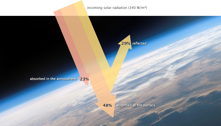
The solar radiation that reaches Earth is relatively uniform over time. Earth is warmed, and energy or heat radiates from the Earth’s surface and lower atmosphere back to space. This flow of incoming and outgoing energy is Earth’s energy budget. For Earth’s temperature to be stable over long stretches of time, incoming energy and outgoing energy have to be equal on average so that the energy budget at the top of the atmosphere balances. About 29 percent of the incoming solar energy arriving at the top of the atmosphere is reflected back to space by clouds, atmospheric particles, or reflective ground surfaces like sea ice and snow. About 23 percent of incoming solar energy is absorbed in the atmosphere by water vapor, dust, and ozone. The remaining 48 percent passes through the atmosphere and is absorbed at the surface. Thus, about 71 percent of the total incoming solar energy is absorbed by the Earth system.
When this energy reaches Earth, the atoms and molecules that makeup the atmosphere and surface absorb the energy, and Earth’s temperature increases. If this material only absorbed energy, then the temperature of the Earth would continue to increase and eventually overheat. For example, if you continuously run a faucet in a stopped-up sink, the water level rises and eventually overflows. However, temperature does not infinitely rise because the Earth is not just absorbing sunlight; it is also radiating thermal energy or heat back into the atmosphere. If the temperature of the Earth rises, the planet emits an increasing amount of heat to space, and this is the primary mechanism that prevents Earth from continually heating.
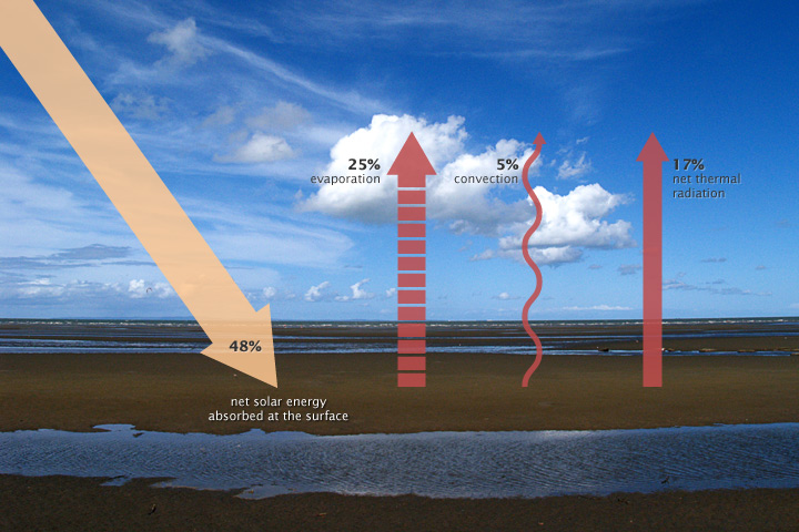
Some of the thermal infrared heat radiating from the surface is absorbed and trapped by greenhouse gasses in the atmosphere, which act like a giant canopy over Earth. The more greenhouse gases in the atmosphere, the more outgoing heat Earth retains, and the less thermal infrared heat dissipates to space.
Factors that can affect the Earth’s energy budget are not limited to greenhouse gases. Increasing solar energy can increase the energy Earth receives. However, these increases are very small over time. In addition, land and water will absorb more sunlight when there is less ice and snow to reflect the sunlight back to the atmosphere. For example, the ice covering the Arctic Sea reflects sunlight back to the atmosphere; this reflectivity is called albedo. Furthermore, aerosols (dust particles) produced from burning coal, diesel engines, and volcanic eruptions can reflect incoming solar radiation and actually cool the planet. While the effect of anthropogenic aerosols on the climate’s system is weak, the effect of human-produced greenhouse gases is not weak. Thus, the net effect of human activity is warming due to more anthropogenic greenhouse gases associated with fossil fuel combustion.
An effect that changes the planet can trigger feedback mechanisms that amplify or suppress the original effect. A positive feedback mechanism occurs when the output or effect of a process enhances the original stimulus or cause. Thus, it increases the ongoing effect. For example, the loss of sea ice at the North Pole makes that area less reflective, reducing albedo. This allows the surface air and ocean to absorb more energy in an area that was once covered by sea ice. Another example is melting permafrost. Permafrost is permanently frozen soil located in the high latitudes, mostly in the Northern Hemisphere. As the climate warms, more permafrost thaws, and the thick deposits of organic matter are exposed to oxygen and begin to decay. This oxidation process releases carbon dioxide and methane, which in turn causes more warming, which melts more permafrost, and so on and on.
A negative feedback mechanism occurs when the output or effect reduces the original stimulus or cause. For example, in the short term, more carbon dioxide (CO2) is expected to cause forest canopies to grow, which absorb more CO2. Another example for the long term is that increased carbon dioxide in the atmosphere will cause more carbonic acid and chemical weathering, which results in transporting dissolved bicarbonate and other ions to the oceans, which are then stored in sediment.
Global warming is evidence that Earth’s energy budget is not balanced. Positive effects on Earth’s temperature are now greater than negative effects.

Take this quiz to check your comprehension of this section.
If you are using an offline version of this text, access the quiz for section 15.1 via the QR code.
15.2 Evidence of Recent Climate Change
While climate has changed often in the past due to natural causes (see section 14.5.1 and section 15.3), the scientific consensus is that human activity is causing current very rapid climate change. While this seems like a new idea, it was suggested more than 75 years ago. This section describes the evidence of what most scientists agree is anthropogenic or human-caused climate change. For more information, watch the video below on climate change by two professors at the North Carolina State University.

Video 15.1: Evidence for climate change.
If you are using an offline version of this text, access this YouTube video via the QR code.
15.2.1 Global Temperature Rise
The land-ocean temperature index, 1880 to present, compared to a base reference time of 1951-1980, shows ocean temperatures steadily rising. The solid black line is the global annual mean, and the solid red line is the five-year Lowess smoothing. The blue uncertainty bars (95 percent confidence limit) account only for incomplete spatial sampling.
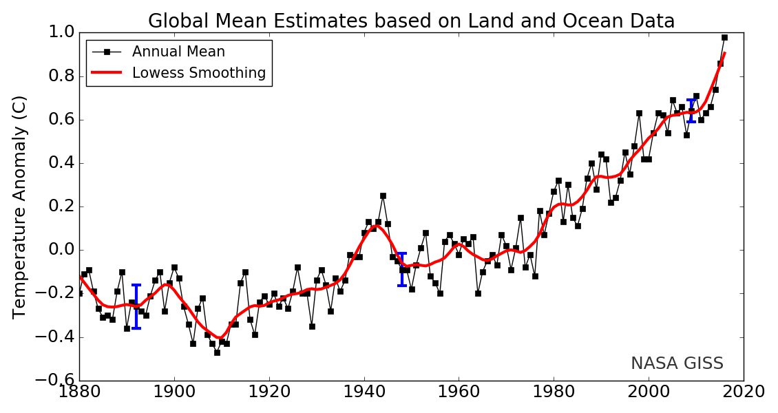
Since 1880, Earth’s surface-temperature average has trended upward with most of that warming occurring since 1970 (see this NASA animation). Surface temperatures include both land and ocean because water absorbs much additional trapped heat. Changes in land-surface or ocean-surface temperatures compared to a reference period from 1951 to 1980, where the long-term average remained relatively constant, are called temperature anomalies. A temperature anomaly thus represents the difference between the measured temperature and the average value during the reference period. Climate scientists calculate long-term average temperatures over thirty years or more which identified the reference period from 1951 to 1980. Another common range is a century, for example, 1900-2000. Therefore, an anomaly of 1.25 ℃ (34.3°F) for 2015 means that the average temperature for 2015 was 1.25 ℃ (34.3°F) greater than the 1900-2000 average. In 1950, the temperature anomaly was -0.28 ℃ (31.5°F), so this is -0.28 ℃ (31.5°F) lower than the 1900-2000 average. These temperatures are annual average measured surface temperatures.
This video figure of temperature anomalies shows worldwide temperature changes since 1880. The more blue, the cooler; the more yellow and red, the warmer.

Video 15.2: Earth’s long-term warming trend can be seen in this visualization of NASA’s global temperature record, which shows how the planet’s temperatures are changing over time, compared to a baseline average from 1951 to 1980. The record is shown as a running five-year average.
If you are using an offline version of this text, access this YouTube video via the QR code.
In addition to average land-surface temperatures rising, the ocean has absorbed much heat. Because oceans cover about 70 percent of the Earth’s surface and have such a high specific heat value, they provide a large opportunity to absorb energy. The ocean has been absorbing about 80 to 90 percent of human activities’ additional heat. As a result, temperature in the ocean’s top 701.4 m (2,300 ft) has increased by -17.6°C (0.3℉) since 1969 (watch this 3 minute video by NASA JPL on the ocean’s heat capacity). The reason the ocean has warmed less than the atmosphere, while still taking on most of the heat, is due to water’s very high specific heat, which means that water can absorb a lot of heat energy with a small temperature increase. In contrast, the lower specific heat of the atmosphere means it has a higher temperature increase as it absorbs less heat energy.
Some scientists suggest that anthropogenic greenhouse gases do not cause global warming because between 1998 and 2013, Earth’s surface temperatures did not increase much, despite greenhouse gas concentrations continuing to increase. However, since the oceans are absorbing most of the heat, decade-scale circulation changes in the ocean, similar to La Niña, push warmer water deeper under the surface. Once the ocean’s absorption and circulation is accounted for, and this heat is added back into surface temperatures, then temperature increases become apparent, as shown in the figure. Also, the ocean’s heat storage is temporary, as reflected in the record-breaking warm years of 2014-2016. Indeed, with this temporary ocean-storage effect, the twenty-first century’s first 15 of its 16 years were the hottest in recorded history.
15.2.2 Carbon Dioxide
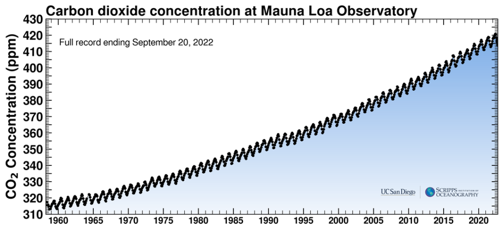
Anthropogenic greenhouse gases, mostly carbon dioxide (CO2), have increased since the industrial revolution when humans dramatically increased burning fossil fuels. These levels are unprecedented in the last 800,000-year Earth history as recorded in geologic sources such as ice cores. Carbon dioxide has increased by 40 percent since 1750, and the rate of increase has been the fastest during the last decade. For example, since 1750, 20409 tonnes (2040 gigatons) of CO2 have been added to the atmosphere; about 40 percent has remained in the atmosphere while the remaining 60 percent has been absorbed into the land by plants and soil or into the oceans. Indeed, during the lifetime of most young adults, the total atmospheric CO2 has increased by 50 ppm, or 15 percent.
Charles Keeling, an oceanographer with Scripps Institution of Oceanography in San Diego, California, was the first person to regularly measure atmospheric CO2. Using his methods, scientists at the Mauna Loa Observatory, Hawaii, have constantly measured atmospheric CO2 since 1957. NASA regularly publishes these measurements at https://keelingcurve.ucsd.edu. Go there now to see the very latest measurement. Keeling’s measured values have been posted in a curve of increasing values, called the Keeling Curve. This curve varies up and down in a regular annual cycle, from summer when the plants in the Northern Hemisphere are using CO2 to winter when the plants are dormant. But the curve shows a steady CO2 increase over the past several decades. This curve increases exponentially, not linearly, showing that the rate of CO2 increase is itself increasing!

The following Atmospheric CO2 video shows how atmospheric CO2 has varied recently and over the last 800,000 years, as determined by an increasing number of CO2 monitoring stations as shown on the insert map. It is also instructive to watch the video’s Keeling portion of how CO2 varies by latitude. This shows that most human CO2 sources are in the Northern Hemisphere where most of the land is and where most of the developed nations are.

Video 15.3: History of atmospheric CO2 from 800,000 years ago until January 2016. Visit https://gml.noaa.gov/ccgg/trends/ for more information.
If you are using an offline version of this text, access this YouTube video via the QR code.
15.2.3 Melting Glaciers and Shrinking Sea Ice
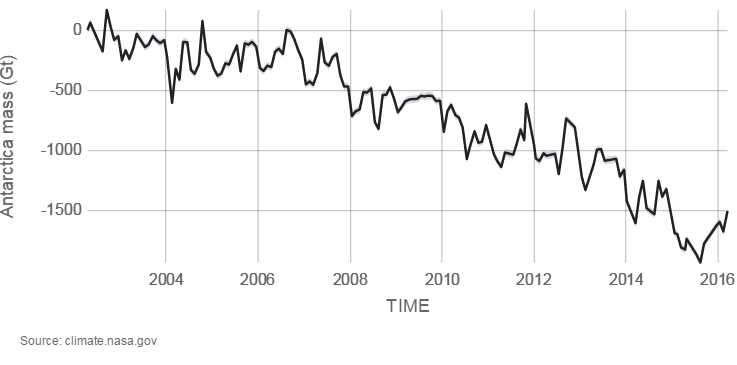
Glaciers are large ice accumulations that exist year round on the land’s surface. In contrast, icebergs are masses of floating sea ice, although they may have had their origin in glaciers (see chapter 14). Alpine glaciers, ice sheets, and sea ice are all melting. Explore melting glaciers at NASA’s interactive Global Ice Viewer). Satellites have recorded that Antarctica is melting at 1189 tonnes (118 gigatons) per year, and Greenland is melting at 2819 tonnes (281 gigatons) per year; 1 metric tonne is 1000 kilograms (1 gigaton is over 2 trillion pounds). Almost all major alpine glaciers are shrinking, deflating, and retreating. The ice-mass loss rate is unprecedented—never observed before—since the 1940’s when quality records for glaciers began.
Before anthropogenic warming, glacial activity was variable with some retreating and some advancing. Now, spring snow cover is decreasing, and sea ice is shrinking. Most sea ice is at the North Pole, which is only occupied by the Arctic Ocean and sea ice. The NOAA animation shows how perennial sea ice has declined from 1987 to 2015. The oldest ice is white, and the youngest, seasonal ice is dark blue. The amount of old ice has declined from 20 percent in 1985 to 3 percent in 2015.

Video 15.4: This animation tracks the relative amount of ice of different ages from 1987 through early November 2015. The oldest ice is white; the youngest (seasonal) ice is dark blue. Key patterns are the export of ice from the Arctic through Fram Strait and the melting of old ice as it passes through the warm waters of the Beaufort Sea. Sea ice age is estimated by tracking of ice parcels using satellite imagery and drifting ocean buoys.
If you are using an offline version of this text, access this YouTube video via the QR code.
15.2.4 Rising Sea-Level
Sea level is rising 3.4 millimeters (0.13 inches) per year and has risen 0.19 meters (7.4 inches) from 1901 to 2010. This is thought largely to be from both glaciers melting and thermal expansion of sea water. Thermal expansion means that as objects such as solids, liquids, and gases heat up, they expand in volume.
Classic video demonstration (30 second) on thermal expansion with brass ball and ring (North Carolina School of Science and Mathematics).

Video 15.5: Thermal expansion.
If you are using an offline version of this text, access this YouTube video via the QR code.
15.2.5 Ocean Acidification
Since 1750, about 40 percent of new anthropogenic carbon dioxide has remained in the atmosphere. The remaining 60 percent gets absorbed by the ocean and vegetation. The ocean has absorbed about 30 percent of that carbon dioxide. When carbon dioxide gets absorbed in the ocean, it creates carbonic acid. This makes the ocean more acidic, which then has an impact on marine organisms that secrete calcium carbonate shells. Recall that hydrochloric acid reacts by effervescing with limestone rock made of calcite, which is calcium carbonate. A more acidic ocean is associated with climate change and is linked to some sea snails (pteropods) and small protozoan zooplanktons’ (foraminifera) thinning carbonate shells and to ocean coral reefs’ declining growth rates. Small animals like protozoan zooplankton are an important component at the base of the marine ecosystem. Acidification combined with warmer temperature and lower oxygen levels is expected to have severe impacts on marine ecosystems and human-harvested fisheries, possibly affecting our ocean-derived food sources.

Video 15.6: Ocean acidification: The other carbon dioxide problem.
If you are using an offline version of this text, access this YouTube video via the QR code.
15.2.6 Extreme Weather Events
Extreme weather events such as hurricanes, precipitation, and heatwaves are increasing and becoming more intense. Since the 1980’s, hurricanes, which are generated from warm ocean water, have increased in frequency, intensity, and duration and are likely connected to a warmer climate. Since 1910, average precipitation has increased by 10 percent in the contiguous United States, and much of this increase is associated with heavy precipitation events. However, the distribution is not even, and more precipitation is projected for the northern United States while less precipitation is projected for the already dry southwest. Also, heatwaves have increased, and rising temperatures are already affecting crop yields in northern latitudes. Increased heat allows for greater moisture capacity in the atmosphere, increasing the potential for more extreme events.

Take this quiz to check your comprehension of this section.
If you are using an offline version of this text, access the quiz for section 15.2 via the QR code.
15.3 Prehistoric Climate Change
Over Earth’s history, the climate has changed a lot. For example, during the Mesozoic Era, the Age of Dinosaurs, the climate was much warmer, and carbon dioxide was abundant in the atmosphere. However, throughout the Cenozoic Era, 65 million years ago to today, the climate has been gradually cooling. This section summarizes some of these major past climate changes.
15.3.1 Past Glaciations
Through geologic history, climate has changed slowly over millions of years. Before the most recent Pliocene-Quaternary glaciation, there were other major glaciations. The oldest, known as the Huronian, occurred toward the end of the Archean Eon-early Proterozoic Eon, about 2.5 billion years ago. The event of that time, the Great Oxygenation Event, was a major happening (see chapter 8) most commonly associated with causing that glaciation. The increased oxygen is thought to have reacted with the potent greenhouse gas methane, causing cooling.
The end of the Proterozoic Eon, about 700 million years ago, had other glaciations. These ancient Precambrian glaciations are included in the Snowball Earth hypothesis. Widespread global rock sequences from these ancient times contain evidence that glaciers existed even in low-latitudes. Two examples are limestone rock—usually formed in tropical marine environments—and glacial deposits—usually formed in cold climates—have been found together from this time in many regions around the world. One example is in Utah. Evidence of continental glaciation is seen in interbedded limestone and glacial deposits (diamictites) on Antelope Island in the Great Salt Lake.
The controversial Snowball Earth hypothesis suggests that a runaway albedo effect—where ice and snow reflect solar radiation and increasingly spread from polar regions toward the equator—caused land and ocean surfaces to completely freeze and biological activity to collapse. Thinking is that because carbon dioxide could not enter the then-frozen ocean, the ice covering Earth could only melt when volcanoes emitted high enough carbon dioxide into the atmosphere to cause greenhouse heating. Some studies estimate that because of the frozen ocean surface, carbon dioxide 350 times higher than today’s concentration was required. Because biological activity did survive, the complete freezing and its extent in the snowball earth hypothesis are controversial. A competing hypothesis is the Slushball Earth hypothesis in which some regions of the equatorial ocean remained open. Differing scientific conclusions about the stability of Earth’s magnetic poles, impacts on ancient rock evidence from subsequent metamorphism, and alternate interpretations of existing evidence keep the idea of Snowball Earth controversial.
Glaciations also occurred in the Paleozoic Era, notably the Andean-Saharan glaciation in the late Ordovician, about 440–460 million years ago, which coincided with a major extinction event, and the Karoo Ice Age during the Pennsylvanian Period, 323 to 300 million years ago. This glaciation was one of the evidences cited by Wegener for his Continental Drift hypothesis as his proposed Pangea drifted into south polar latitudes. The Karoo glaciation was associated with an increase of oxygen and a subsequent drop in carbon dioxide, most likely produced by the evolution and rise of land plants.
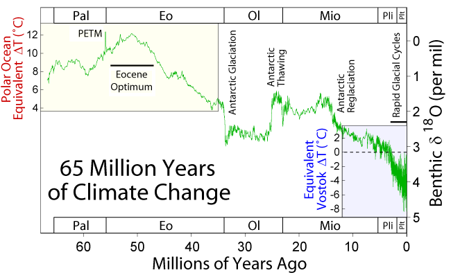
During the Cenozoic Era—the last 65 million years, climate started out warm and gradually cooled to today. This warm time is called the Paleocene-Eocene Thermal Maximum, and Antarctica and Greenland were ice free during this time. Since the Eocene, tectonic events during the Cenozoic Era caused the planet to persistently and significantly cool. For example, the Indian Plate and Asian Plate collided, creating the Himalaya Mountains, which increased the rate of weathering and erosion of silicate minerals, especially feldspar. Increased weathering consumes carbon dioxide from the atmosphere, which reduces the greenhouse effect, resulting in long-term cooling.
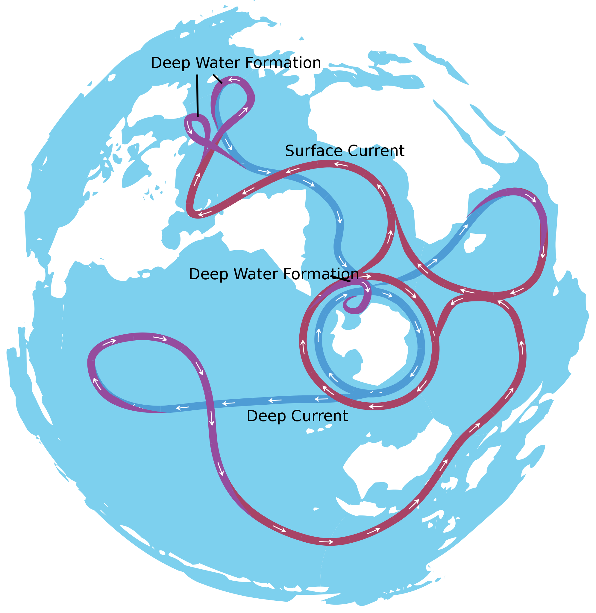
About 40 million years ago, the narrow gap between the South American Plate and the Antarctica Plate widened, which opened the Drake Passage. This opening allowed the water around Antarctica—the Antarctic Circumpolar Current—to flow unrestrictedly west-to-east, which effectively isolated the southern ocean from the warmer waters of the Pacific, Atlantic, and Indian Oceans. The region cooled significantly, and by 35 million years ago, during the Oligocene Epoch, glaciers had started to form on Antarctica.
Around 15 million years ago, subduction-related volcanos between Central and South America created the Isthmus of Panama, which connected North and South America. This prevented water from flowing between the Pacific and Atlantic Oceans and reduced heat transfer from the tropics to the poles. This reduced heat transfer created a cooler Antarctica and larger Antarctic glaciers. As a result, the ice sheet expanded on land and water, increased Earth’s reflectivity and enhanced the albedo effect, which created a positive feedback loop: more reflective glacial ice, more cooling, more ice, more cooling, and so on.
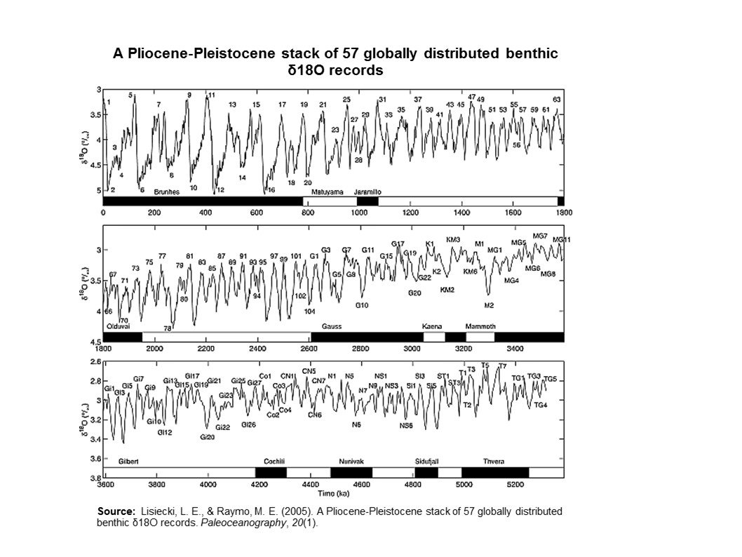
By 5 million years ago, during the Pliocene Epoch, ice sheets had started to grow in North America and northern Europe. The most intense part of the current glaciation is the Pleistocene Epoch’s last 1 million years. The Pleistocene’s temperature varies significantly through a range of almost 10°C (18°F) on time scales of 40,000 to 100,000 years, and ice sheets expand and contract correspondingly. These variations are attributed to subtle changes in Earth’s orbital parameters, called Milankovitch cycles (see chapter 14). Over the past million years, the glaciation cycles occurred approximately every 100,000 years, with many glacial advances occurring in the last 2 million years (Lisiecki and Raymo, 2005).
During an ice age, periods of warming climate are called interglacials; during interglacials, very brief periods of even warmer climate are called interstadials. These warming upticks are related to Earth’s climate variations, like Milankovitch cycles, which are changes to the Earth’s orbit that can fluctuate climate (see chapter 14). In the last 500,000 years, there have been five or six interglacials, with the most recent belonging to our current time, the Holocene Epoch.
The two more recent climate swings, the Younger Dryas and the Holocene Climatic Optimum, demonstrate complex changes. These events are more recent, yet have conflicting information. The Younger Dryas’ cooling is widely recognized in the Northern Hemisphere, though the event’s timing, about 12,000 years ago, does not appear to be equal everywhere. Also, it is difficult to find in the Southern Hemisphere. The Holocene Climatic Optimum is a warming around 6,000 years ago; it was not universally warmer, nor as warm as current warming, and not warm at the same time everywhere.
15.3.2 Proxy Indicators of Past Climates
How do we know about past climates? Geologists use proxy indicators to understand past climate. A proxy indicator is a biological, chemical, or physical signature preserved in the rock, sediment, or ice record that acts like a fingerprint of something in the past. Thus, they are an indirect indicator of climate. An indirect indicator of ancient glaciations from the Proterozoic Eon and Paleozoic Era is the Mineral Fork Formation in Utah, which contains rock formations of glacial sediments such as diamictite (tillite). This dark rock has many fine-grained components plus some large out-sized clasts like a modern glacial till.
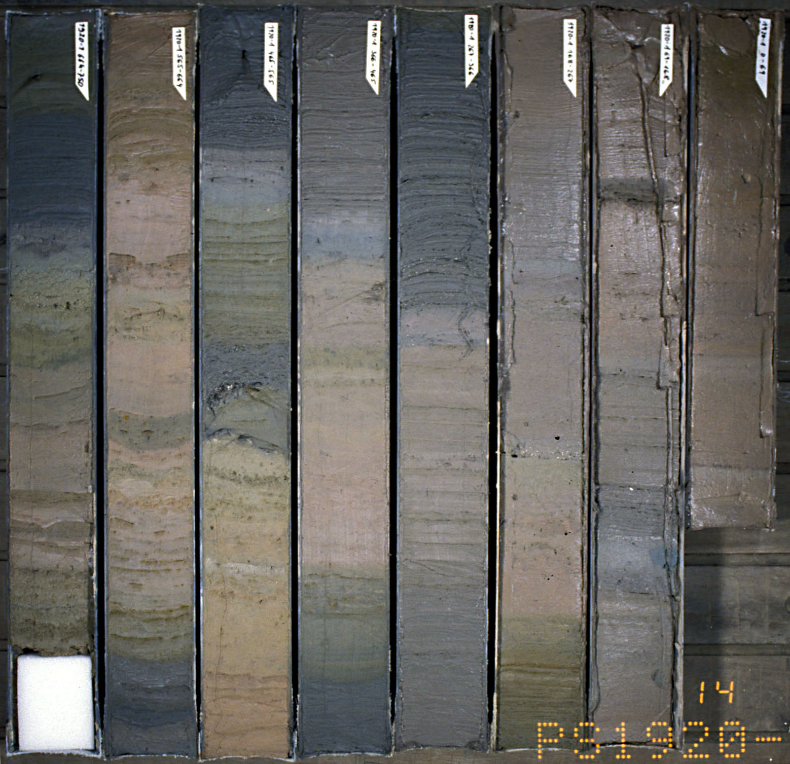
Deep-sea sediment is an indirect indicator of climate change during the Cenozoic Era, about the last 65 million years. Researchers from the Ocean Drilling Program, an international research collaboration, collect deep-sea sediment cores that record continuous sediment accumulation. The sediment provides detailed chemical records of stable carbon and oxygen isotopes obtained from deep-sea benthic foraminifera shells that accumulated on the ocean floor over millions of years. The oxygen isotopes are a proxy indicator of deep-sea temperatures and continental ice volume.
Sediment Cores—Stable Oxygen Isotopes
How do oxygen isotopes indicate past climate? The two main stable oxygen isotopes are 16O and 18O. They both occur in water (H2O) and in the calcium carbonate (CaCO3) shells of foraminifera as both of those substances’ oxygen component. The most abundant and lighter isotope is 16O. Since it is lighter, it evaporates more readily from the ocean’s surface as water vapor, which later turns to clouds and precipitation on the ocean and land. This evaporation is enhanced in warmer sea water and slightly increases the concentration of 18O in the surface seawater from which the plankton derives the carbonate for its shells. Thus the ratio of 16O and 18O in the fossilized shells in seafloor sediment is a proxy indicator of the temperature and evaporation of seawater.
Keep in mind, it is harder to evaporate the heavier water and easier to condense it. As evaporated water vapor drifts toward the poles and tiny droplets form clouds and precipitation, droplets of water with 18O tend to form more readily than droplets of the lighter form and precipitate out, leaving the drifting vapor depleted in 18O. During geologic times when the climate is cooler, more of this lighter precipitation that falls on land is locked in the form of glacial ice. Consider that the giant ice sheets were more than a mile thick and covered a large part of North America during the last ice age only 14,000 years ago. During glaciation, the glaciers thus effectively lock away more 16O, thus the ocean water and foraminifera shells become enriched in 18O. Therefore, the ratio of 18O to 16O (𝛿18O) in calcium carbonate shells of foraminifera is a proxy indicator of past climate. The sediment cores from the Ocean Drilling Program record a continuous accumulation of these fossils in the sediment and provide a record of glacials, interglacials and interstadials.
Sediment Cores—Boron–Isotopes and Acidity
Ocean acidity is affected by carbonic acid and is a proxy for past atmospheric CO2 concentrations. To estimate the ocean’s pH (acidity) over the past 60 million years, researchers collected deep-sea sediment cores and examined the ancient planktonic foraminifera shells’ boron-isotope ratios. Boron has two isotopes: 11B and 10B. In aqueous compounds of boron, the relative abundance of these two isotopes is sensitive to pH (acidity), hence CO2 concentrations. In the early Cenozoic, around 60 million years ago, CO2 concentrations were over 2,000 ppm, higher pH, and started falling around 55 to 40 million years ago, with noticeable drop in pH, indicated by boron isotope ratios. The drop was possibly due to reduced CO2 outgassing from ocean ridges, volcanoes and metamorphic belts, and increased carbon burial due to subduction and the Himalaya Mountains uplift. By the Miocene Epoch, about 24 million years ago, CO2 levels were below 500 ppm, and by 800,000 years ago, CO2 levels didn’t exceed 300 ppm.
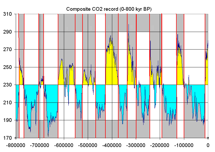
Carbon Dioxide Concentrations in Ice Cores
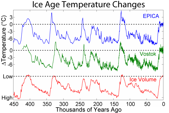
For the recent Pleistocene Epoch’s climate, researchers get a more detailed and direct chemical record of the last 800,000 years by extracting and analyzing ice cores from the Antarctic and Greenland ice sheets. Snow accumulates on these ice sheets and creates yearly layers. Oxygen isotopes are collected from these annual layers, and the ratio of 18O to 16O (𝛿18O) is used to determine temperature as discussed above. In addition, the ice contains small bubbles of atmospheric gas as the snow turns to ice. Analysis of these bubbles reveals the composition of the atmosphere at these previous times.
Small pieces of this ice are crushed, and the ancient air is extracted into a mass spectrometer that can detect the ancient atmosphere’s chemistry. Carbon dioxide levels are recreated from these measurements. Over the last 800,000 years, the maximum carbon dioxide concentration during warm times was about 300 parts per million (ppm), and the minimum was about 170 ppm during cold stretches. Currently, the earth’s atmospheric carbon dioxide content is over 410 ppm.
Oceanic Microfossils
Microfossils, like foraminifera, diatoms, and radiolarians can be used as a proxy to interpret past climate record. Different species of microfossils are found in the sediment core’s different layers. Microfossil groups are called assemblages and their composition differs depending on the climatic conditions when they lived. One assemblage consists of species that lived in cooler ocean water, such as in glacial times, and at a different level in the same sediment core, another assemblage consists of species that lived in warmer waters.

Video 15.7: What sediment cores from the world’s oceans reveal about climate patterns.
If you are using an offline version of this text, access this YouTube video via the QR code.
Tree Rings
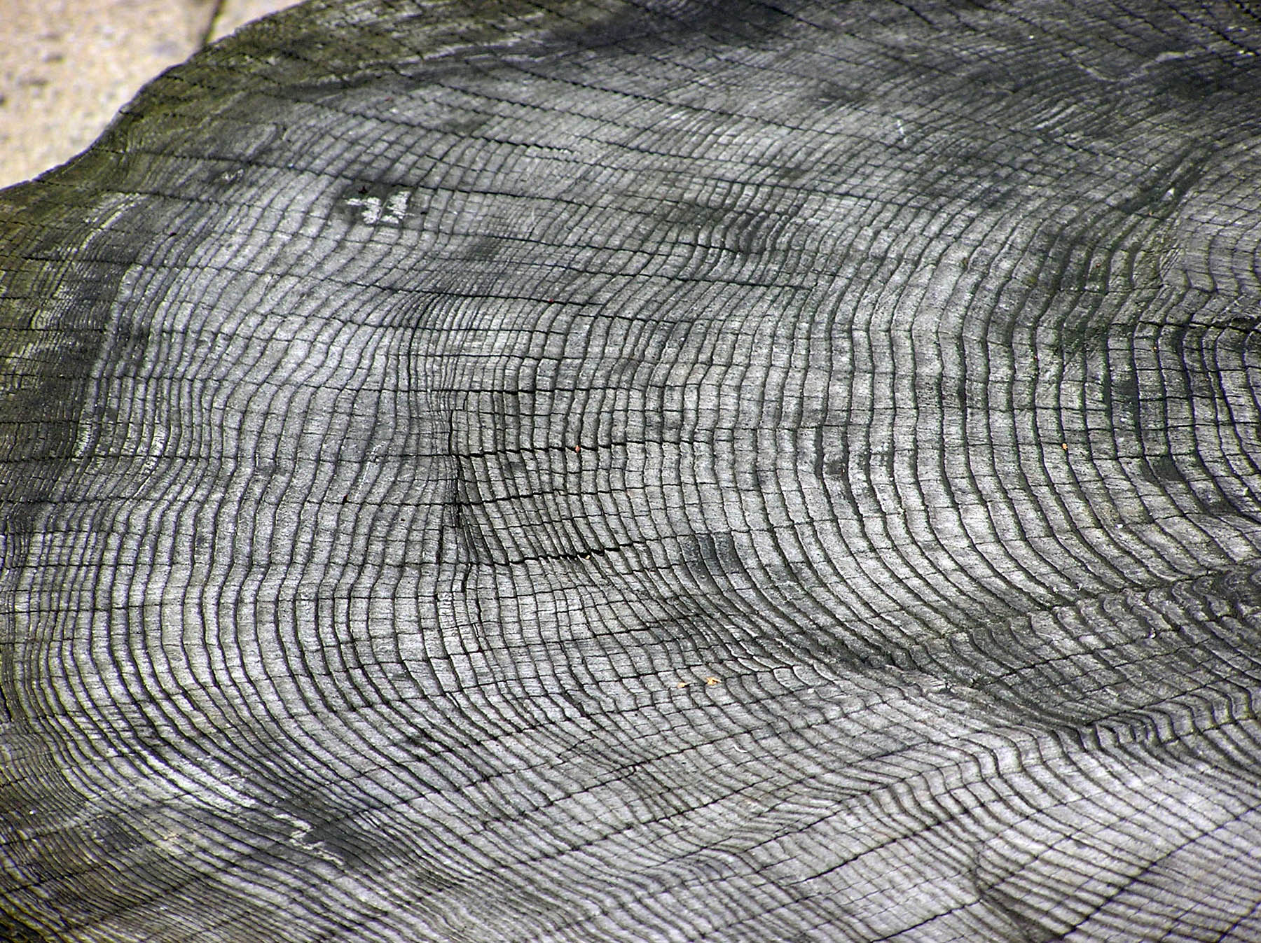
Tree rings, which form every year as a tree grows, are another past climate indicator. Rings that are thicker indicate wetter years, and rings that are thinner and closer together indicate dryer years. Every year, a tree will grow one ring with a light section and a dark section. The rings vary in width. Since trees need much water to survive, narrower rings indicate colder and drier climates. Since some trees are several thousand years old, scientists can use their rings for regional paleoclimatic reconstructions, for example, to reconstruct past temperature, precipitation, vegetation, streamflow, sea-surface temperature, and other climate-dependent conditions. Paleoclimatic study means relating to a distinct past geologic climate. Also, dead trees, such as those found in Puebloan ruins, can be used to extend this proxy indicator by showing long-term droughts in the region and possibly explain why villages were abandoned.
Pollen

Pollen is also a proxy climate indicator. Flowering plants produce pollen grains. Pollen grains are distinctive when viewed under a microscope. Sometimes, pollen is preserved in lake sediments that accumulate in layers every year. Lake-sediment cores can reveal ancient pollen. Fossil-pollen assemblages are pollen groups from multiple species, such as spruce, pine, and oak. Through time, via the sediment cores and radiometric age-dating techniques, the pollen assemblages change, revealing the plants that lived in the area at the time. Thus, the pollen assemblages are a past climate indicator, since different plants will prefer different climates. For example, in the Pacific Northwest, east of the Cascades in a region close to grassland and forest borders, scientists tracked pollen over the last 125,000 years, covering the last two glaciations. As shown in the figure (Fig. 2 from reference Whitlock and Bartlein 1997), pollen assemblages with more pine tree pollen are found during glaciations and pollen assemblages with less pine tree pollen are found during interglacial times.
Other Proxy Indicators
Paleoclimatologists study many other phenomena to understand past climates, such as human historical accounts, human instrument records from the recent past, lake sediments, cave deposits, and corals.

Take this quiz to check your comprehension of this section.
If you are using an offline version of this text, access the quiz for section 15.3 via the QR code.
15.4 Anthropogenic Causes of Climate Change
As shown in the previous section, prehistoric climate changes occur slowly over many millions of years. The climate changes observed today are rapid and largely human caused. Evidence shows that climate is changing, but what is causing that change? Since the late 1800s, scientists have suspected that human-produced, i.e. anthropogenic changes in atmospheric greenhouse gases would likely cause climate change because changes in these gases have been the case every time in the geologic past. By the middle 1900s, scientists began conducting systematic measurements, which confirmed that human-produced carbon dioxide was accumulating in the atmosphere and other earth systems, such as forests and oceans. By the end of the 1900s and into the early 2000s, scientists solidified the Theory of Anthropogenic Climate Change when evidence from thousands of ground-based studies and continuous land and ocean satellite measurements mounted, revealing the expected temperature increase. The Theory of Anthropogenic Climate Change is that humans are causing most of the current climate changes by burning fossil fuels such as coal, oil, and natural gas. Theories evolve and transform as new data and new techniques become available, and they represent a particular field’s state of thinking. This section summarizes the scientific consensus of anthropogenic climate change.
15.4.1 Scientific Consensus
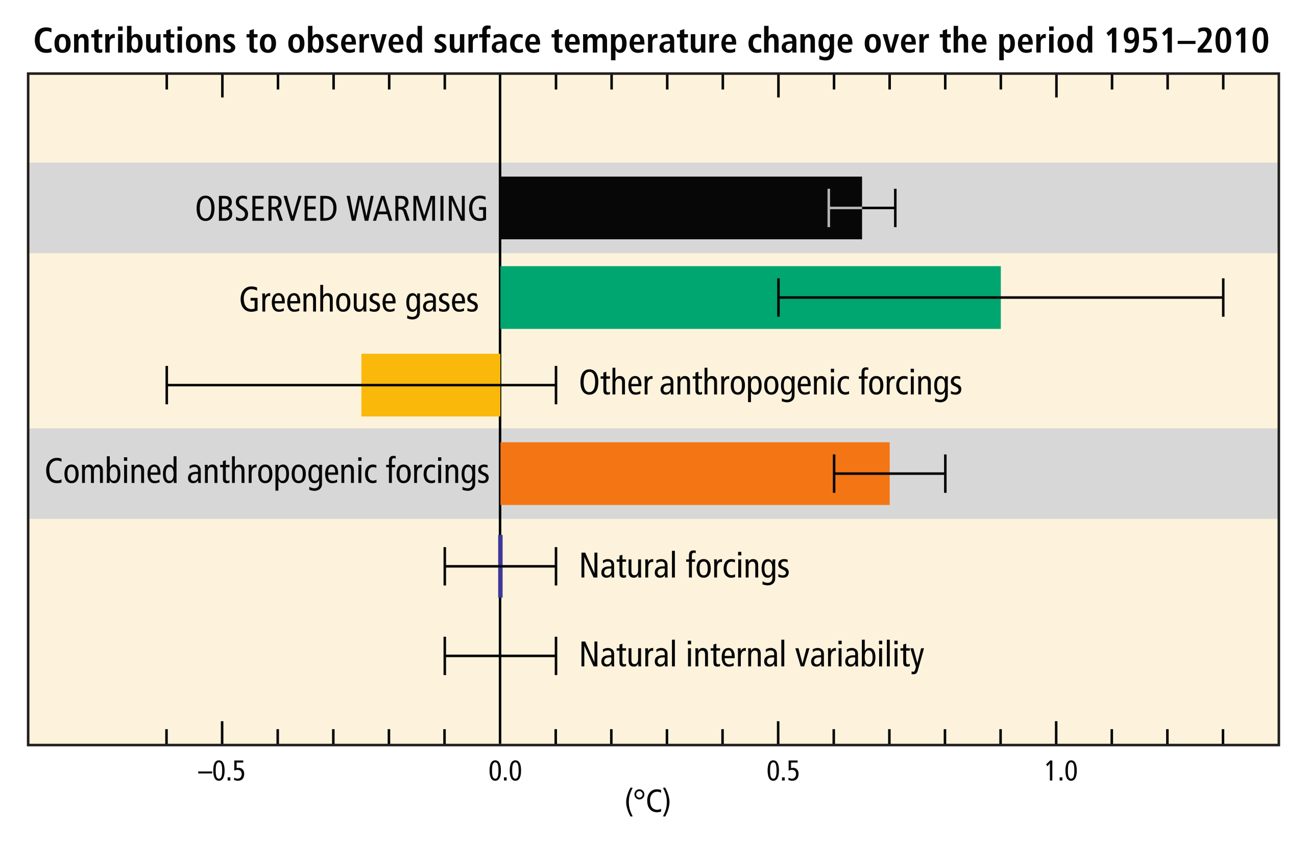
The overwhelming majority of climate studies indicate that human activity is causing rapid changes to the climate, which will cause severe environmental damage. There is strong scientific consensus on the issue. Studies published in peer-reviewed scientific journals show that 97 percent of climate scientists agree that climate warming is caused from human activities. There is no alternative explanation for the observed link between human-produced greenhouse gas emissions and changing modern climate. Most leading scientific organizations endorse this position, including the U.S. National Academy of Science, which was established in 1863 by an act of Congress under President Lincoln. Congress charged the National Academy of Science “with providing independent, objective advice to the nation on matters related to science and technology.” Therefore, the National Academy of Science is the leading authority when it comes to policy advice related to scientific issues.
One way we know that the increased greenhouse gas emissions are from human activities is with isotopic fingerprints. For example, fossil fuels, representing plants that lived millions of years ago, have a stable carbon-13 to carbon-12 (13C/12C) ratio that is different from today’s atmospheric stable-carbon ratio (radioactive 14C is unstable). Isotopic carbon signatures have been used to identify anthropogenic carbon in the atmosphere since the 1980s. Isotopic records from the Antarctic Ice Sheet show stable isotopic signatures from ~1000 AD to ~1800 AD and a steady isotopic signature gradually changing since 1800, followed by a more rapid change after 1950 as burning of fossil fuels dilutes the CO2 in the atmosphere. These changes show the atmosphere as having a carbon isotopic signature increasingly more similar to that of fossil fuels.
15.4.2 Anthropogenic Sources of Greenhouse Gases
Anthropogenic emissions of greenhouse gases have increased since pre-industrial times due to global economic growth and population growth. Atmospheric concentrations of the leading greenhouse gas, carbon dioxide, are at unprecedented levels that haven’t been observed in at least the last 800,000 years. Pre-industrial level of carbon dioxide was at about 278 parts per million (ppm). As of 2016, carbon dioxide was, for the first time, above 400 ppm for the entirety of the year. Measurements of atmospheric carbon at the Mauna Loa Carbon Dioxide Observatory show a continuous increase since 1957 when the observatory was established from 315 ppm to over 417 ppm in 2022. The daily reading today can be seen at Daily CO2. Based on the ice core record over the past 800,000 years, carbon dioxide ranged from about 185 ppm during ice ages to 300 ppm during warm times. View the data-accurate NOAA animation below of carbon dioxide trends over the last 800,000 years.
What is the source of these anthropogenic greenhouse gas emissions? Fossil fuel combustion and industrial processes contributed 78 percent of all emissions since 1970. The economic sectors responsible for most of this include electricity and heat production (25 percent); agriculture, forestry, and land use (24 percent); industry (21 percent); transportation, including automobiles (14 percent); other energy production (9.6 percent); and buildings (6.4 percent). More than half of greenhouse gas emissions have occurred in the last 40 years, and 40 percent of these emissions have stayed in the atmosphere. Unfortunately, despite scientific consensus, efforts to mitigate climate change require political action. Despite growing climate change concern, mitigation efforts, legislation, and international agreements have reduced emissions in some places, yet the less developed world’s continual economic growth has increased global greenhouse gas emissions. In fact, the years 2000 to 2010 saw the largest increases since 1970.

Take this quiz to check your comprehension of this section.
If you are using an offline version of this text, access the quiz for section 15.4 via the QR code.
Summary
Included in Earth Science is the study of the system of processes that affect surface environments and atmosphere of the Earth. Recent changes in atmospheric temperature and climate over intervals of decades have been observed. For Earth’s climate to be stable, incoming radiation from the sun and outgoing radiation from the sun-warmed Earth must be in balance. Gases in the atmosphere called greenhouse gases absorb the infrared thermal radiation from the Earth’s surface, trapping that heat and warming the atmosphere, a process called the Greenhouse Effect. Thus the energy budget is not now in balance and the Earth is warming. Human activity produces many greenhouse gases that have accelerated climate change. CO2 from fossil fuel burning is one of the major ones. While atmospheric composition is mostly nitrogen and oxygen, trace components including the greenhouse gases (CO2 and methane are the major ones and there are others) have the greatest effect on global warming.
A number of Positive Feedback Mechanisms, processes whose results reinforce the original process, take place in the Earth system. An example of a PFM of great concern is permafrost melting which causes decay of melting organic material that produces CO2 and methane (both powerful greenhouse gases) that warm the atmosphere and promote more permafrost melting. Two carbon cycles affect Earth’s atmospheric CO2 composition, the biologic carbon cycle and the geologic carbon cycle. In the biologic cycle, organisms (mostly plants and also animals that eat them) remove CO2 from the atmosphere for energy and to build their body tissues and return it to the atmosphere when they die and decay. The biologic cycle is a rapid cycle. In the geologic cycle, some organic matter is preserved in the form of petroleum and coal while more is dissolved in seawater and captured in carbonate sediments, some of which is subducted into the mantle and returned by volcanic activity. The geologic carbon cycle is slow over geologic time.
Measurements of increasing atmospheric temperature have been made since the nineteenth century but the upward temperature trend itself increased in the mid twentieth century showing the current trend is exponential. Because of the high specific heat of water, the oceans have absorbed most of the added heat. That this is temporary storage is revealed by the record-breaking warm years of the recent decade and the increase in intense storms and hurricanes. In 1957 the Mauna Loa CO2 Observatory was established in Hawaii providing constant measurements of atmospheric CO2 since 1958. The initial value was 315 ppm. The Keeling curve, named for the observatory founder, shows that value has steadily increased, exponentially, to over 417 ppm now. Compared to proxy data from atmospheric gases trapped in ice cores that show a maximum value for CO2 of about 300 ppm over the last 800,000 years, the Keeling increase of over 100 ppm in 50 years is dramatic evidence of human caused CO2 increase and climate change! As Earth’s temperature rises, glaciers and ice sheets are shrinking resulting in sea level rise. Atmospheric CO2 is also absorbed in sea water producing increased concentrations of carbonic acid which is raising the pH of the oceans making it harder for marine life to extract carbonate for their skeletal materials.
Earth’s climate has changed over geologic time with periods of major glaciations. There was a high temperature period in the Mesozoic shown by fossils in high latitudes and the Western Interior Seaway covering what is now the Midwest. However, climate has been cooling during the Cenozoic culminating in the Ice Age. Since the Ice Age, several proxy indicators of ancient climate show that the rate and amount of current climate change is unique in geologic history and can only be attributed to human activity. Those who ignore the consequences of increasing global warming for our planet’s future do so at the peril of our posterity!

Take this quiz to check your comprehension of this chapter.
If you are using an offline version of this text, access the quiz for chapter 15 via the QR code.
URLs Linked Within This Chapter
Interactive animation on the greenhouse effect: https://climate.nasa.gov/climate_resources/188/graphic-the-greenhouse-effect/
NASA animation: NASA Scientific Visualization Studio (2022), Global Temperature Anomalies from 1880 to 2021 https://svs.gsfc.nasa.gov/4964
3 minute NASA video: NASA JPL, Oceans of Climate Change, https://climate.nasa.gov/climate_resources/40/video-oceans-of-climate-change
Daily CO2: https://www.co2.earth/daily-co2
Text References
- Allen, P.A., and Etienne, J.L., 2008, Sedimentary challenge to Snowball Earth: Nat. Geosci., v. 1, no. 12, p. 817–825.
- Berner, R.A., 1998, The carbon cycle and carbon dioxide over Phanerozoic time: the role of land plants: Philos. Trans. R. Soc. Lond. B Biol. Sci., v. 353, no. 1365, p. 75–82.
- Cunningham, W.L., Leventer, A., Andrews, J.T., Jennings, A.E., and Licht, K.J., 1999, Late Pleistocene–Holocene marine conditions in the Ross Sea, Antarctica: evidence from the diatom record: The Holocene, v. 9, no. 2, p. 129–139.
- Deynoux, M., Miller, J.M.G., and Domack, E.W., 2004, Earth’s Glacial Record: World and Regional Geology, Cambridge University Press, World and Regional Geology.
- Earle, S., 2015, Physical geology OER textbook: BC Campus OpenEd.
- Eyles, N., and Januszczak, N., 2004, “Zipper-rift”: a tectonic model for Neoproterozoic glaciations during the breakup of Rodinia after 750 Ma: Earth-Sci. Rev.
- Francey, R.J., Allison, C.E., Etheridge, D.M., Trudinger, C.M., and others, 1999, A 1000‐year high precision record of δ13C in atmospheric CO2: Tellus B Chem. Phys. Meteorol.
- Gutro, R., 2005, NASA – What’s the Difference Between Weather and Climate? Online, http://www.nasa.gov/mission_pages/noaa-n/climate/climate_weather.html, accessed September 2016.
- Hoffman, P.F., Kaufman, A.J., Halverson, G.P., and Schrag, D.P., 1998, A neoproterozoic snowball earth: Science, v. 281, no. 5381, p. 1342–1346.
- Kopp, R.E., Kirschvink, J.L., Hilburn, I.A., and Nash, C.Z., 2005, The Paleoproterozoic snowball Earth: a climate disaster triggered by the evolution of oxygenic photosynthesis: Proc. Natl. Acad. Sci. U. S. A., v. 102, no. 32, p. 11131–11136.
- Lean, J., Beer, J., and Bradley, R., 1995, Reconstruction of solar irradiance since 1610: Implications for climate change: Geophys. Res. Lett., v. 22, no. 23, p. 3195–3198.
- Levitus, S., Antonov, J.I., Wang, J., Delworth, T.L., Dixon, K.W., and Broccoli, A.J., 2001, Anthropogenic warming of Earth’s climate system: Science, v. 292, no. 5515, p. 267–270.
- Lindsey, R., 2009, Climate and Earth’s Energy Budget : Feature Articles: Online, http://earthobservatory.nasa.gov, accessed September 2016.
- North Carolina State University, 2013a, Composition of the Atmosphere.
- North Carolina State University, 2013b, Composition of the Atmosphere: Online, http://climate.ncsu.edu/edu/k12/.AtmComposition, accessed September 2016.
- Oreskes, N., 2004, The scientific consensus on climate change: Science, v. 306, no. 5702, p. 1686–1686.
- Pachauri, R.K., Allen, M.R., Barros, V.R., Broome, J., Cramer, W., Christ, R., Church, J.A., Clarke, L., Dahe, Q., Dasgupta, P., Dubash, N.K., Edenhofer, O., Elgizouli, I., Field, C.B., and others, 2014, Climate Change 2014: Synthesis Report. Contribution of Working Groups I, II and III to the Fifth Assessment Report of the Intergovernmental Panel on Climate Change (R. K. Pachauri & L. Meyer, Eds.): Geneva, Switzerland, IPCC, 151 p.
- Santer, B.D., Mears, C., Wentz, F.J., Taylor, K.E., Gleckler, P.J., Wigley, T.M.L., Barnett, T.P., Boyle, J.S., Brüggemann, W., Gillett, N.P., Klein, S.A., Meehl, G.A., Nozawa, T., Pierce, D.W., and others, 2007, Identification of human-induced changes in atmospheric moisture content: Proc. Natl. Acad. Sci. U. S. A., v. 104, no. 39, p. 15248–15253.
- Schopf, J.W., and Klein, C., 1992, Late Proterozoic Low-Latitude Global Glaciation: the Snowball Earth, in Schopf, J.W., and Klein, C., editors, The Proterozoic biosphere: a multidisciplinary study: New York, Cambridge University Press, p. 51–52.
- Webb, T., and Thompson, W., 1986, Is vegetation in equilibrium with climate? How to interpret late-Quaternary pollen data: Vegetatio, v. 67, no. 2, p. 75–91.
- Weissert, H., 2000, Deciphering methane’s fingerprint: Nature, v. 406, no. 6794, p. 356–357.
- Whitlock, C., and Bartlein, P.J., 1997, Vegetation and climate change in northwest America during the past 125 kyr: Nature, v. 388, no. 6637, p. 57–61.
- Wolpert, S., 2009, New NASA temperature maps provide a ‘whole new way of seeing the moon’: Online, http://newsroom.ucla.edu/releases/new-nasa-temperature-maps-provide-102070, accessed February 2017.
- Zachos, J., Pagani, M., Sloan, L., Thomas, E., and Billups, K., 2001, Trends, rhythms, and aberrations in global climate 65 Ma to present: Science, v. 292, no. 5517, p. 686–693.
Figure References
Figure 15.1: Composition of the atmosphere. NASA. 2019. Public domain. https://climate.nasa.gov/news/2915/the-atmosphere-getting-a-handle-on-carbon-dioxide/#:~:text=By%20volume%2C%20the%20dry%20air,methane%2C%20nitrous%20oxide%20and%20ozone.
Figure 15.2: Common greenhouse gases. Kindred Grey. 2022. CC BY 4.0. Water molecule 3D by Dbc334, 2006 (Public domain, https://commons.wikimedia.org/wiki/File:Water_molecule_3D.svg). Nitrous-oxide-dimensions-3D-balls by Ben Mills, 2007 (Public domain, https://commons.wikimedia.org/wiki/File:Nitrous-oxide-dimensions-3D-balls.png). Methane-CRC-MW-3D-balls by Ben Mills, 2009 (Public domain, https://en.m.wikipedia.org/wiki/File:Methane-CRC-MW-3D-balls.png). Carbon dioxide 3D ball by Jynto, 2011 (Public domain, https://commons.wikimedia.org/wiki/File:Carbon_dioxide_3D_ball.png).
Figure 15.3: Carbon cycle. USGS. 2022. Public domain. https://www.usgs.gov/media/images/usgs-carbon-cycle
Figure 15.4: Incoming radiation absorbed, scattered, and reflected by atmospheric gases. Robert A. Rohde. 2013. CC BY-SA 3.0. https://commons.wikimedia.org/wiki/File:Solar_spectrum_en.svg
Figure 15.5: Incoming solar radiation filtered by the atmosphere. NASA illustration by Robert Simmon. Astronaut photograph ISS013-E-8948. 2009. Public domain. https://earthobservatory.nasa.gov/features/EnergyBalance/page4.php
Figure 15.6: Some of the thermal infrared energy (heat) radiated from the surface into the atmosphere is trapped by gasses in the atmosphere. NASA illustration by Robert Simmon. Photograph by Cyron, 2006 (CC BY-NC 2.0). https://earthobservatory.nasa.gov/features/EnergyBalance/page5.php
Figure 15.7: Net effect of factors influencing warming. IPCC. 2014. Public domain. https://commons.wikimedia.org/wiki/File:Contributions_to_observed_surface_temperature_change_over_the_period_1951%E2%80%932010.svg
Figure 15.8: Land-ocean temperature index, 1880 to present, with a base time 1951-1980. NASA. 2010. Public domain. https://commons.wikimedia.org/wiki/File:Global_Temperature_Trends.png
Figure 15.9: Latest CO2 reading as of September 20, 2022. Scripps Institution of Oceanography at UC San Diego. 2022. Permissions statement. https://keelingcurve.ucsd.edu/
Figure 15.10: Keeling curve graph of the carbon dioxide concentration at Mauna Loa Observatory as of September 20, 2022. Scripps Institution of Oceanography at UC San Diego. 2022. Permissions statement. https://keelingcurve.ucsd.edu/
Figure 15.11: Decline of Antarctic ice mass from 2002 to 2016. NASA. 2017. Public domain. https://commons.wikimedia.org/wiki/File:ANTARCTICA_MASS_VARIATION_SINCE_2002.png
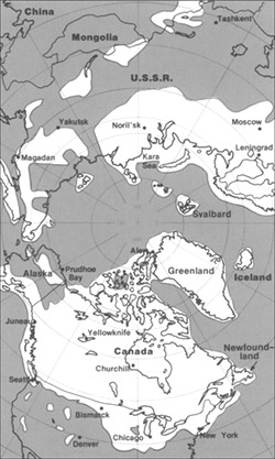
Figure 15.12: Maximum extent of Laurentide Ice Sheet. USGS. 2005. Public domain. https://commons.wikimedia.org/wiki/File:Pleistocene_north_ice_map.jpg
Figure 15.13: Global average surface temperature over the past 65 million years. Robert A. Rohde. 2005. CC BY-SA 3.0. https://commons.wikimedia.org/wiki/File:65_Myr_Climate_Change.png
Figure 15.14: The Antarctic Circumpolar Current. Avsa. 2009. CC BY-SA 3.0. https://commons.wikimedia.org/wiki/File:Conveyor_belt.svg
Figure 15.15: A Pliocene–Pleistocene stack of 57 globally distributed benthic δ18O records. Used under fair use from A Pliocene-Pleistocene stack of 57 globally distributed benthic δ18O records by Lorraine E. Lisiecki, Maureen E. Raymo (https://doi.org/10.1029/2004PA001071).
Figure 15.16: Sediment core from the Greenland continental slope. Hannes Grobe. 2008. CC BY 3.0. https://en.m.wikipedia.org/wiki/File:PS1920-1_0-750_sediment-core_hg.jpg
Figure 15.17: Antarctic temperature changes during the last few glaciations compared to global ice volume. This figure was produced by Robert A. Rohde from publicly available data and is incorporated into the Global Warming Art project. 2012. CC BY-SA 3.0. https://commons.wikimedia.org/wiki/File:Ice_Age_Temperature.png
Figure 15.18: 19 cm long section of ice core showing 11 annual layers with summer layers (arrowed) sandwiched between darker winter layers. NOAA. 2005. Public domain. https://commons.wikimedia.org/wiki/File:GISP2_1855m_ice_core_layers.png?uselang=en-gb
Figure 15.19: Antarctic ice showing hundreds of tiny trapped air bubbles from the atmosphere thousands of years ago. Atmospheric Research, CSIRO. 2000. CC BY 3.0. https://commons.wikimedia.org/wiki/File:CSIRO_ScienceImage_518_Air_Bubbles_Trapped_in_Ice.jpg
Figure 15.20: Composite carbon dioxide record from last 800,000 years based on ice core data from EPICA Dome C Ice Core. Tomruen. 2011. CC BY-SA 3.0. https://commons.wikimedia.org/w/index.php?curid=16147504
Figure 15.21: Tree rings form every year. Arpingstone. 2005. Public domain. https://commons.wikimedia.org/wiki/File:Tree.ring.arp.jpg
Figure 15.22: Summer temperature anomalies for the past 7,000 years. R.M.Hantemirov. 2010. CC BY 3.0. https://commons.wikimedia.org/wiki/File:Yamal50.gif
Figure 15.23: Scanning electron microscope image of modern pollen with false color added to distinguish plant species. Dartmouth Electron Microscope Facility, Dartmouth College. 2011. Public domain. https://en.wikipedia.org/wiki/File:Misc_pollen_colorized.jpg
Figure 15.24: Total anthropogenic greenhouse gas emissions (gigatonne of CO2-equivalent per year, GtCO2-eq/yr) from economic sectors in 2010. Kindred Grey. 2022. CC BY 4.0. Data from IPCC, 2014: Climate Change 2014: Synthesis Report. Contribution of Working Groups I, II and III to the Fifth Assessment Report of the Intergovernmental Panel on Climate Change [Core Writing Team, R.K. Pachauri and L.A. Meyer (eds.)]. IPCC, Geneva, Switzerland, 151 pp. https://www.ipcc.ch/site/assets/uploads/2018/05/SYR_AR5_FINAL_full_wcover.pdf
Figure 15.25: Annual global anthropogenic carbon dioxide (CO2) emissions in gigatonne of CO2-equivalent per year (GtCO2/yr) from fossil fuel combustion, cement production and flaring, and forestry and other land use (FOLU), 1750–2011. Kindred Grey. 2022. CC BY 4.0. Data from IPCC, 2014: Climate Change 2014: Synthesis Report. Contribution of Working Groups I, II and III to the Fifth Assessment Report of the Intergovernmental Panel on Climate Change [Core Writing Team, R.K. Pachauri and L.A. Meyer (eds.)]. IPCC, Geneva, Switzerland, 151 pp. https://www.ipcc.ch/site/assets/uploads/2018/05/SYR_AR5_FINAL_full_wcover.pdf
Long term averages and variations within the conditions of the atmosphere.
The measure of the vibrational (kinetic) energy of a substance.
A system which reverts back to a baseline when it deviates.
Made or influenced by humans.
An interconnected set of parts that combine and make up a whole.
The study of the interaction of the spheres within the system that is the Earth, mainly the study of the hydrosphere, atmosphere, geosphere (lithosphere), and biosphere.
The solid, rocky parts of the Earth, including the crust, mantle, and core. Also referred to as the lithosphere.
The gases that are part of the Earth, which are mainly nitrogen and oxygen.
The water part of the Earth, as a solid, liquid, or gas.
The part of the hydrosphere (water) that is frozen, found mainly at the poles.
The living things that inhabit the Earth.
The mineral makeup of a rock, i.e. which minerals are found within a rock.
A body of ice that moves downhill under its own mass.
Current conditions within the atmosphere.
The act of a solid coming out of solution, typically resulting from a drop in temperature or a decrease of the dissolving material.
Place where lava is erupted at the surface.
Breaking down rocks into small pieces by chemical or mechanical means.
Pieces of rock that have been weathered and possibly eroded.
A geologic circumstance (such as a fold, fault, change in lithology, etc.) which allows petroleum resources to collect.
Minerals in which ions are bonded to oxygen, such as hematite (Fe2O3).
Energy resources (typically hydrocarbons) derived from ancient chemical energy preserved in the geologic record. Includes coal, oil, and natural gas.
Any evidence of ancient life.
Former swamp-derived (plant) material that is part of the rock record.
A liquid fossil fuel derived from shallow marine rocks (also known as crude oil).
A dark liquid fossil fuel derived from petroleum.
A very fine-grained rock with very thin layering (fissile).
Mineral group in which the carbonate ion, CO3-2, is the building block. This can also refer to the rocks that are made from these minerals, namely limestone and dolomite (dolostone).
Places that are under ocean water at all times.
A chemical or biochemical rock made of mainly calcite.
An extensive, distinct, and mapped set of geologic layers.
Rocks which allow petroleum resources to collect or move.
Soil and rock which is below freezing for long periods of time.
Mineral group in which the silica tetrahedra, SiO4-4, is the building block.
A natural substance that is typically solid, has a crystalline structure, and is typically formed by inorganic processes. Minerals are the building blocks of most rocks.
The process in which solids (like minerals) are disassociated and the ionic components are dispersed in a liquid (usually water).
CaCO3. Pure form is clear, but can take on many different colors with impurities. It is soft, fizzes in acid, and has three cleavages that are not at 90°.
A process where an oceanic plate descends bellow a less dense plate, causing the removal of the plate from the surface. Subduction causes the largest earthquakes possible, as the subducting plate can lock as it goes down. Volcanism is also caused as the plate releases volatiles into the mantle, causing melting.
Middle chemical layer of the Earth, made of mainly iron and magnesium silicates. It is generally denser than the crust (except for older oceanic crust) and less dense than the core.
Water breaking into ions and replacing ions in minerals; a major type of chemical weathering in silicates.
Consisting of three end members: potassium feldspar (K-spar, KAlSi3O8), plagioclase with calcium (CaAl2Si2O8, called anorthite), and plagioclase with sodium (NaAlSi3O8, called albite). Commonly blocky, with two cleavages at ~90°. Plagioclase is typically more dull white and gray, and K-spar is more vibrant white, orange, or red.
A period of cooler temperatures on Earth in which ice sheets can grow on continents.
The ability for the atmosphere to absorb heat that is emitted by a planet's surface.
The distance between any two repeating portions of a wave (e.g., two successive wave crests).
The amount of light that is reflected off of an object. It is measured on a scale of 0 (absorbs all light) to 1 (reflects all light).
An event that causes a landslide event. Water is a common trigger.
A process that exacerbates the effects of an input, amplifying the output. That is, a one-directional loop that self-reinforces change.
A type of non-eroded sediment mixed with organic matter, used by plants. Many essential elements for life, like nitrogen, are delivered to organisms via the soil.
Certain metallic elements (like iron) take in oxygen, causing reactions like rust.
An acid that forms from carbon dioxide and water. It is a large contributor to chemical weathering.
Breaking down of mineral material via chemical methods, like dissolution and oxidation.
Climate change caused by human activity, namely, the burning of fossil fuels.
A unit of the geologic time scale; smaller than an era, larger than an epoch. We are currently in the Quaternary period.
Data which is out of the ordinary and does not fit previous trends.
The measure of degrees north or south from the equator, which has a latitude of 0 degrees. The Earth's north and south poles have latitudes of 90 degrees north and south, respectively.
A glacier that forms on a mountain.
Thick glaciers that cover continents during ice ages.
Deposition and erosion tied to glacier movement.
A place where pressurized groundwater flows onto the surface.
A topographic high found away from the beach in deeper water, but still on the continental shelf. Typically, these are formed in tropical areas by organisms such as corals.
Meaning "middle life," it is the middle era of the Phanerozoic, starting at 252 million years ago and ending 66 million years ago. Known as the Age of Reptiles.
The second largest span of time recognized by geologists; smaller than an eon, larger than a period. We are currently in the Cenozoic era.
The last (and current) era of the Phanerozoic eon, starting 66 million years ago and spanning through the present.
The most recent, and current, period within the Cenozoic era, starting 2.58 million years ago.
Eon defined as the time between 4 billion years ago to 2.5 billion years ago. Most of the oldest rocks on Earth, including large portions of the continents, formed at this time.
The largest span of time recognized by geologists, larger than an era. We are currently in the Phanerozoic eon. Rocks of a specific eon are called eonotherms.
Meaning "earlier life," the third eon of Earth's history, starting at 2.5 billion years ago and ending at 541 million years ago. Marked by increasing atmospheric oxygen and the supercontinent Rodinia.
A period of the early Proterozoic (around 2.5-2 billion years ago) where atmospheric oxygen levels dramatically increased, killing many non-oxygen-breathing organisms and allowing oxygen-breathing organisms to thrive.
A term for the collective time before the Phanerozoic (pre-541 million years ago), including the Hadean, Archean, and Proterozoic. Known for a lack of easy-to-find fossils.
A hypothesis which states the entire ocean froze and continental glaciation covered the planet about 700 million years ago.
The layers of igneous, sedimentary, and metamorphic rocks that form the continents. Continental crust is much thicker than oceanic crust. Continental crust is defined as having higher concentrations of very light elements like K, Na, and Ca, and is the lowest density rocky layer of Earth. Its average composition is similar to granite.
A sedimentary rock containing two distinct grain sizes, typically cobbles (or larger) mixed with mud.
A proposed explanation for an observation that can be tested.
Rocks and minerals that change within the Earth are called metamorphic, changed by heat and pressure. Metamorphism is the name of the process.
Meaning "ancient life," the era that started 541 million years ago and ending 252 million years ago. Vertebrates (including fish, amphibians, and reptiles) and arthropods (including insects) evolved and diversified throughout the Paleozoic. Pangea formed toward the end of the Paleozoic.
The second period of the Paleozoic era, 485-444 million years ago.
When a species no longer exists.
The most recent supercontinent, which formed over 300 million years ago and started breaking apart less than 200 million years ago. Africa and South America, as well as Europe and North America, bordered each other.
A warm climate spike, the warmest in the recent geologic past, occurring about 55.5 million years ago. Commonly abbreviated as the PETM.
The theory that the outer layer of the Earth (the lithosphere) is broken in several plates, and these plates move relative to one another, causing the major topographic features of Earth (e.g. mountains, oceans) and most earthquakes and volcanoes.
The transport and movement of weathered sediments.
A unit of geological time recognized by geologists; smaller than a period. We are currently in the Holocene epoch.
A series of changes in the Earth's orbit/position in relation to the Sun which can fluctuate climate over varying periodicities.
Period of warming within a glacial or ice age cycle.
A very brief period of warming, even warmer than a interglacial, within a glacial or ice age cycle.
The most recent epoch of geologic time, from 11,700 years ago to present.
A measurement which can specify a change in another system. For example, changes in climate can change the amount of certain isotopes of oxygen and carbon in sea creatures.
Term for a rock made definitively of glacial till.
General term for very poorly sorted sediment that is of glacial origin.
An atom that has different number of neutrons but the same number of protons. While most properties are based on the number of protons in an element, isotopes can have subtle changes between them, including temperature fractionation and radioactivity.
Relatively flat ocean floor, which accumulates very fine grained detrital and chemical sediments.
Detached, free-falling rocks from very steep slopes.
A device that can determine the amounts of different isotopes in a substance.
Pieces of rock that have been weathered and possibly eroded.
The innermost chemical layer of the Earth, made chiefly of iron and nickel. It has both liquid and solid components.
An accepted scientific idea that explains a process using the best available information.
Gaseous fossil fuel derived from petroleum, mostly made of methane.
Place where two plates slide past each other, creating strike slip faults.
An observation that is completely free of bias, i.e. anyone and everyone would make the same observation.
The process of atoms breaking down randomly and spontaneously.
