6.3 The Sampling Distribution of the Sample Proportion
We have now talked at length about the basics of inference on the mean of quantitative data. What if the variable of interest is categorical? We cannot calculate means, variances, and the like for categorical data. However, we can count the number of individuals that have a certain characteristic and divide by the total number in our population to get the population proportion (p).
Understanding the Variability of a Proportion
Suppose we know that the proportion of American adults who support the expansion of solar energy is p = 0.88, which is our parameter of interest. If we were to take a poll of 1,000 American adults on this topic, the estimate would not be perfect, but how close to 88% might we expect the sample proportion to be? We want to understand how the sample proportion,  , behaves when the true population proportion is 0.88. We can simulate responses we would get from a simple random sample of 1,000 American adults, which is only possible because we know the actual support for expanding solar energy is 0.88. Here’s how we might go about constructing such a simulation:
- There were about 250 million American adults in 2018. On 250 million pieces of paper, write “support” on 88% of them and “not” on the other 12%.
- Mix up the pieces of paper and pull out 1,000 pieces to represent our sample of 1,000 American adults.
- Compute the fraction of the sample that say “support.”
Any volunteers to conduct this simulation? Probably not. Running this simulation with 250 million pieces of paper would be time-consuming and very costly, but we can simulate it using technology. In this simulation, one sample gave a point estimate of 1 = 0.894. We know the population proportion for the simulation was p = 0.88, so we know the estimate had an error of 0.894 − 0.88 = +0.014. One simulation isn’t enough to get a great sense of the distribution of estimates we might expect in the simulation, so we should run more simulations. In a second simulation, we get 2 = 0.885, which has an error of +0.005. In another, 3 = 0.878 gives an error of -0.002. And in another, an estimate of 4 = 0.859 means an error of -0.021. With the help of a computer, we’ve run the simulation 10,000 times and created a histogram of the results from all 10,000 simulations in the figure 6.6.
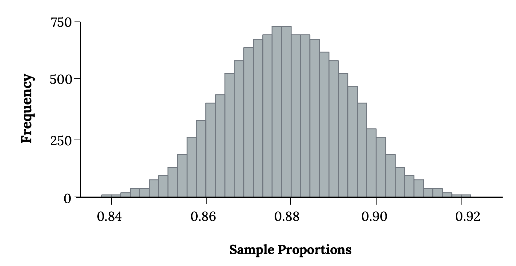
This simulates the sampling distribution of the sample proportion. We can characterize this sampling distribution as follows:
- Center: The center of the distribution is
 = 0.880, which is the same as the parameter. Notice that the simulation mimicked a simple random sample of the population, which is a straightforward sampling strategy that helps avoid sampling bias.
 - Spread: The standard deviation of the distribution is
 = 0.010. When we’re talking about a sampling distribution or the variability of a point estimate, we typically use the term “standard error” rather than “standard deviation,” and the notation
  is used for the standard error associated with the sample proportion.
 - Shape: The distribution is symmetric and bell-shaped, and it resembles a normal distribution.
When the population proportion is p = 0.88 and the sample size is n = 1,000, the sample proportion looks to give an unbiased estimate of the population proportion and resembles a normal distribution. It looks as if we can apply the central limit theorem here too under the conditions discussed in the following section of this chapter.
Conditions for the CLT for p
When observations are independent and the sample size is sufficiently large, the sample proportion will tend to follow a normal distribution with parameters:
 = p
= p

In order for the central limit theorem to hold, the sample size is typically considered sufficiently large when np ≥ 10 and n(1 − p) ≥ 10. Note that some resources may use 5, but 10 is safer. Hopefully, you see some similarity to the normal approximation to the binomial, which is the underlying idea. It is also typically recommended that the number of successes (x) and failures (n-x) both exceed 10 as well, resulting in a minimum sample size of 20 because the normal approximation just doesn’t work well with smaller sample sizes.
What if we do not meet these conditions? Consider the following distributions, and see if any patterns emerge.
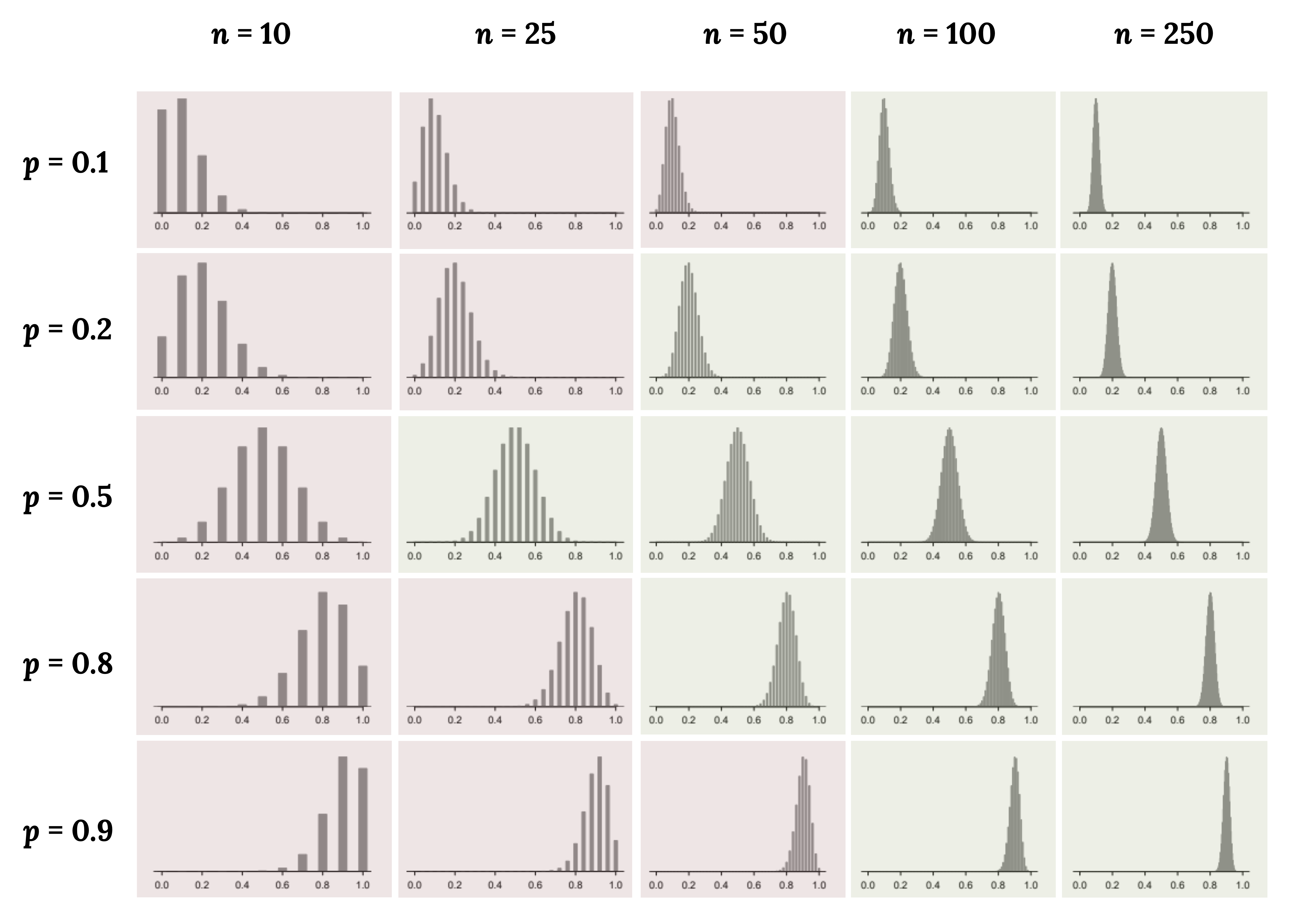
The figures above shaded in red do not meet conditions, while the ones in green do. From these distributions, we can see some patterns:
- When either n is small resulting in np n(1 − p) also being small, the distribution looks more discrete (i.e., not continuous).
- When np or n(1 − p) is smaller than 10, the skew in the distribution is more noteworthy.
- The larger both np and n(1 − p), the more normal the distribution. This may be a little harder to see for the larger sample size in these plots as the variability also becomes much smaller.
- When np and n(1 − p) are both very large, the distribution’s discreteness is hardly evident, and the distribution looks much more like a normal distribution.
In regards to how the mean and standard error of the distributions change:
- The centers of the distribution are always at the population proportion, p, that was used to generate the simulation. Because the sampling distribution of is always centered at the population parameter, p, it means the sample proportion () is accurate (unbiased) when the data are independent and drawn from such a population.
- For a particular population proportion, the variability in the sampling distribution decreases as the sample size becomes larger. This will likely align with your intuition that an estimate based on a larger sample size will tend to be more accurate.
- For a particular sample size, the variability will be largest when p = 0.5. The differences may be a little subtle, so take a close look. This reflects the role of the proportion p in the standard error formula. The standard error is largest when p = 0.5.
At no point will the distribution of look perfectly normal, since will always be take discrete values (x/n). It is always a matter of degree, and we will use the standard success-failure condition with minimums of 10 for np and n(1 − p) as our guideline within this book.
Additional Resources
Figure References
Figure 6.6: Kindred Grey (2020). Histogram from simulation. CC BY-SA 4.0.
Figure 6.7: Kindred Grey (2024). Sample size conditions. CC BY-SA 4.0. Adaptation of Figures 5.4 and 5.5 from OpenIntro Introductory Statistics (2019) (CC BY-SA 3.0). Retrieved from https://www.openintro.org/book/os
Figure Descriptions
Figure 6.6: Bar chart with narrow bars that follow the normal distribution. The x axis is labeled ‘sample proportions’ and ranges from 0.84 to 0.92 by .02. The y axis is labeled ‘frequency’ and ranges from zero to 750 by 250.
Figure 6.7: 20 different bar charts showing that as sample size increases, the bell curve shape and narrowness of the curve increases. These graphs also show that as p increases, the graph shifts from right skewed (p = 0.1) to normal (p = 0.5) to left skewed (p = 0.9).
The number of individuals that have a characteristic of interest divided by the total number in the population
If there is a population with mean μ and standard deviation σ, and you take sufficiently large random samples from the population, then the distribution of the sample means will be approximately normally distributed.
