3.1 Introduction to Bivariate Data
Learning Objectives

Professionals often want to know how two (or more) variables are related. For example, is there a relationship between a student’s grade on their second math exam and their grade on the final? If there is a relationship, what is the relationship and how strong is it?
In another example related to Figure 3.1, your income may be determined by your education, your profession, your years of experience, and your ability. The amount you pay a repair person for labor is often determined by an initial amount plus an hourly fee.
The type of data described in these examples is bivariate data (“bi” for two variables). We could have:
- A categorical variable vs. another categorical variable
- A categorical variable vs. a quantitative variable
- A quantitative vs. a quantitative variable
This section will briefly discuss displaying a quantitative variable with a categorical grouping variable and then focus on displaying two categorical variables. The rest of this chapter will then focus on relationships between two quantitative variables.
Picturing Bivariate Variables
When it comes to displaying a quantitative variable as a response vs. a categorical variable as a predictor, the methods we will discuss mainly apply to situations where we have a quantitative response variable being measured and want to further break it down by another categorical grouping variable. Some methods are simply an overlaid line graph or histogram.

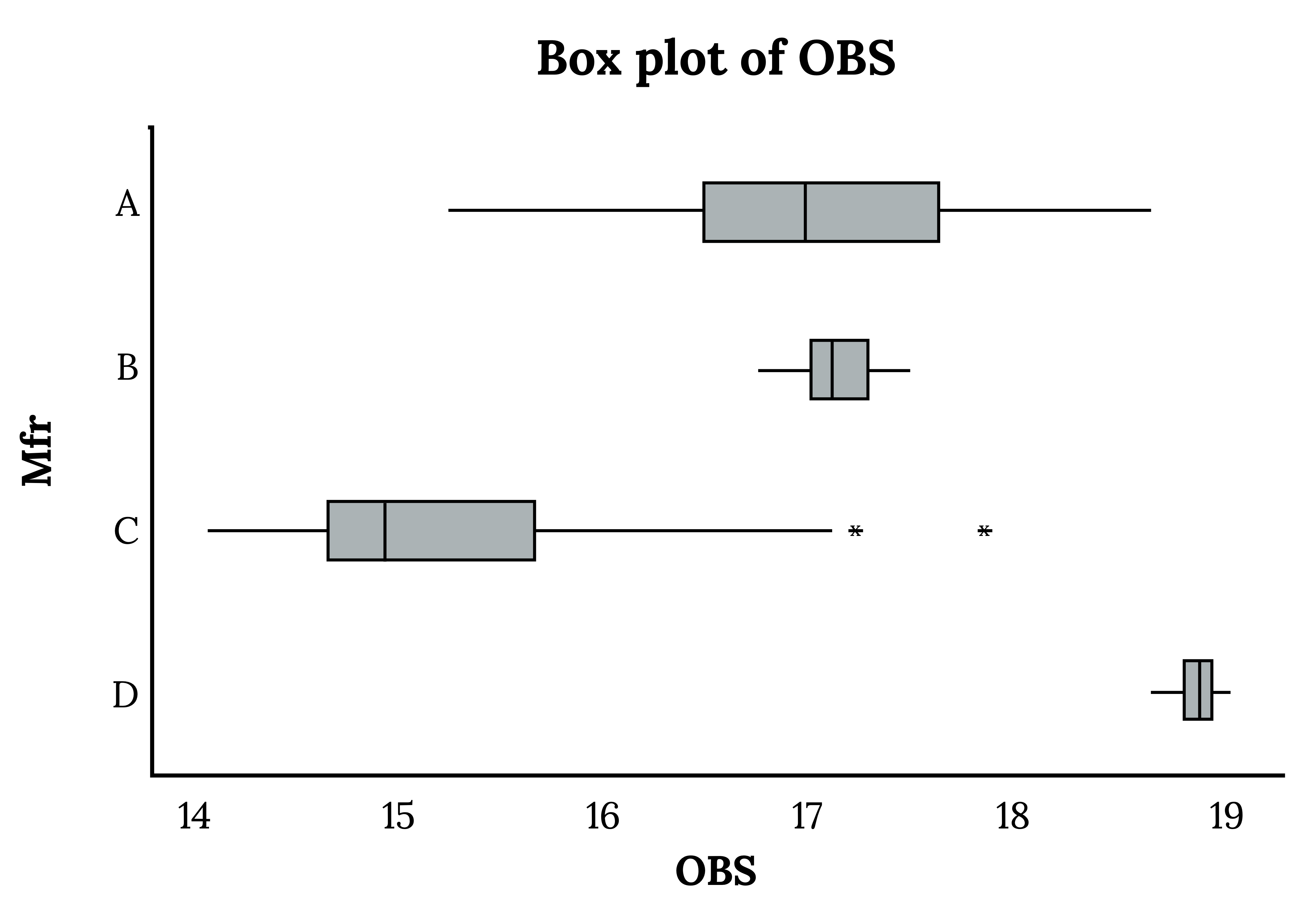
The above options may work well in some cases, like when the bins for each group line up well. For most cases, however, a better option can often be a comparative box plot:

Heat maps are particularly well suited to handle situations where there is a geographical or spatial element.

There are numerical methods to further analyze categorical response and quantitative predictor variables, but they get pretty complicated mathematically and are beyond the scope of this course.
Picturing Bivariate Categorical Variables
We will begin by examining the relationship between two categorical variables visually. The options below build off some ideas we have discussed in relation to univariate categorical data.
- Univariate frequency tables → Contingency tables
- Univariate bar chart → Stacked or grouped bar chart
Contingency Tables
A contingency table portrays data in a way that can facilitate calculating probabilities. The table helps in determining conditional probabilities quite easily. The table displays sample values in relation to two different variables that may be dependent or contingent on one another. Later on, will revisit contingency tables and use them in another manner.
Example
Suppose a study of speeding violations and drivers who use cell phones produced the following data:
| Speeding violation in the last year | No speeding violation in the last year | Total | |
|---|---|---|---|
| Uses cell phone while driving | 25 | 280 | 305 |
| Does not use cell phone while driving | 45 | 405 | 450 |
| Total | 70 | 685 | 755 |
Figure 3.5: Driving violations
The total number of people in the sample is 755. The marginal row totals are 305 and 450, and the marginal column totals are 70 and 685. Notice that 305 + 450 = 755 and 70 + 685 = 755.
Your Turn!
The figure below contains the number of crimes per 100,000 inhabitants from 2008 to 2011 in the US.
| Year | Robbery | Burglary | Rape | Vehicle | Total |
|---|---|---|---|---|---|
| 2008 | 145.7 | 732.1 | 29.7 | 314.7 | |
| 2009 | 133.1 | 717.7 | 29.1 | 259.2 | |
| 2010 | 119.3 | 701 | 27.7 | 239.1 | |
| 2011 | 113.7 | 702.2 | 26.8 | 229.6 | |
| Total |
Figure 3.6: US crime index rates
Find the following:
- Marginal frequencies
- Overall total
- Marginal relative frequencies
- Conditional percentages of type of crime in each given year
Variations on Bar Charts
The following variations on bar charts can also help us see relationships between two categorical variables, providing us with a little more visual information than a contingency table:

Additional Resources
Figure References
Figure 3.1: Aaron Huber (2018). Man holding engines. Unsplash license. https://unsplash.com/photos/man-holding-engines-KxeFuXta4SE
Figure 3.2: Kindred Grey (2024). Line graph and histogram. CC BY 4.0.
Figure 3.3: Kindred Grey (2024). Comparative box plot. CC BY 4.0.
Figure 3.4: Clay Banks (2020). Red and Black Heart Illustration. Unsplash license. https://unsplash.com/photos/red-and-black-heart-illustration-U0-r0JMypE0
Figure 3.7: Kindred Grey (2024). Stacked bar chart and grouped bar chart. CC BY 4.0.
Figure Descriptions
Figure 3.1: Man inspecting an engine in an auto shop.
Figure 3.2: Left: Two lines (one for test scores and one for final grades) connected by points. Both peak around 84.5 grade with a frequency of 45. Right: boxes on a graph next to each other. Three of the five have extra boxes stacked on top of one another, indicating that the values for test scores and final grades are different from one another for these three frequencies.
Figure 3.3: Four box plots of varying widths, medians, and outliers.
Figure 3.4: Map of the world with orange circles varying in size placed on the map and overlap
Figure 3.7: Left: stacked bar chart with neither, one, and both represented in different colors stacked in the same bar labeled “smokes”. There is another bar labeled “does not smoke” with the same three categories stacked on top of one another. Right: Smokes category is on the left, but this time with neither, one, and both columns placed side by side. Same for “does not smoke”.
A table in a matrix format that displays the frequency distribution of different variables

