2.2 Displaying and Describing Categorical Distributions
Descriptive Statistics for Categorical Data
Working with categorical data is typically more straightforward. Recall that descriptive statistics consists of visual and numerical methods. We usually start with visual methods and then move on to numerical.
Graphical Methods for Categorical Data
Below are tables comparing the number of part-time and full-time students at De Anza College and Foothill College enrolled for the spring 2010 quarter. The tables display counts (frequencies) and percentages or proportions (relative frequencies). The percent columns make it easier to compare the same categories across colleges. Displaying percentages along with the numbers is often helpful, but it is particularly important when comparing sets of data that do not have the same totals, such as the total enrollments for both colleges in this example. Notice how much larger the percentage for part-time students at Foothill College is compared to De Anza College.
| De Anza College | Foothill College | |||||
|---|---|---|---|---|---|---|
| Number | Percent | Number | Percent | |||
| Full-time | 9,200 | 40.9% | Full-time | 4,059 | 28.6% | |
| Part-time | 13,296 | 59.1% | Part-time | 10,124 | 71.4% | |
| Total | 22,496 | 100% | Total | 14,183 | 100% | |
Figure 2.4: Full- and part-time students
Tables are a good way of organizing and displaying data, but graphs can be even more helpful in understanding the data. There are no strict rules concerning which graphs to use. Two graphs that are used to display categorical data are pie charts and bar graphs.
Pie Charts
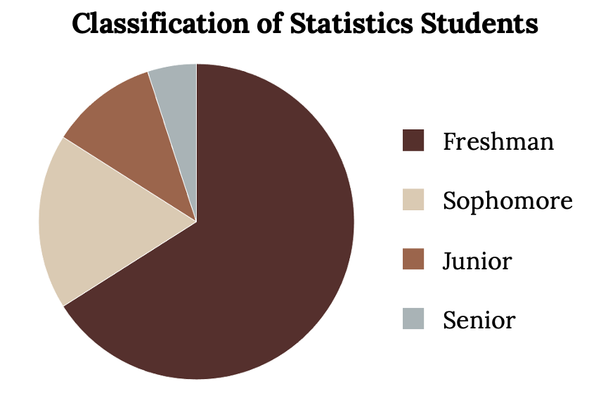
In a pie chart, categories of data are represented by wedges in a circle and are proportional in size to the percent of individuals in each category. Suppose a statistics professor collects information about the classification of her students about which of her students are freshmen, sophomores, juniors, or seniors. The data she collects is summarized in the pie chart below.
Bar Graphs
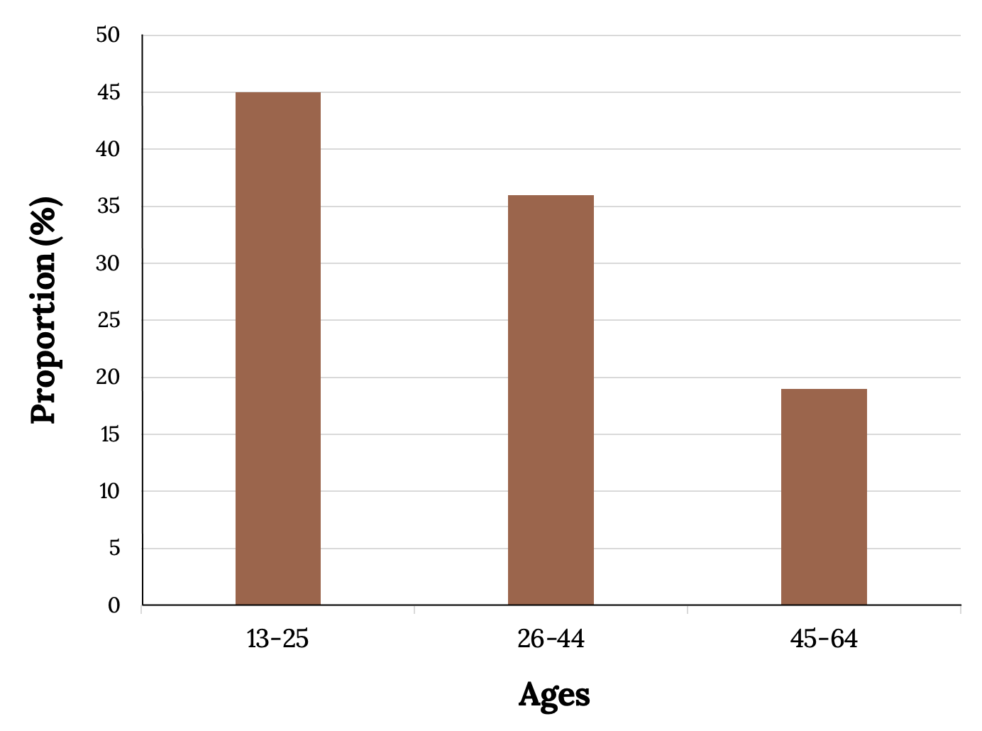
Bar graphs are made up of separate bars representing categories, where the length of the bar for each category is proportional to the number or percent of individuals in that category. The bars can be rectangles, or they can be rectangular boxes (used in three-dimensional plots), and they can be vertical or horizontal. In the bar graph shown in Figure 2.7 below, age groups are represented on the x-axis and proportions on the y-axis
By the end of 2011, Facebook had over 146 million users in the United States. The figure below shows three age groups, the number of users in each age group, and the proportion (%) of users in each age group.
| Age groups | Number of Facebook users | Proportion (%) of Facebook users |
|---|---|---|
| 13–25 | 65,082,280 | 45% |
| 26–44 | 53,300,200 | 36% |
| 45–64 | 27,885,100 | 19% |
Figure 2.6: Facebook users
Pie vs. Bar Charts
It is a good idea to consider a variety of graphs to determine which will be the most helpful in displaying our data. Our choice of the “best” graph will change depending on the data and the context. Our choice also depends on our purpose behind using the data. Look at the following plots (pie or bar), and think about which displays the comparisons better:
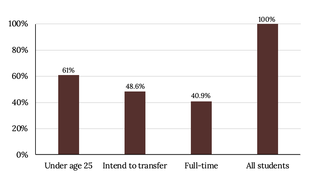
Percentages That Add up to More (or Less) than 100%
Sometimes percentages add up to be more than 100% (or less than 100%). In the graph shown in Figure 2.11, the percentages add to more than 100% because students can be in more than one category. Therefore, a bar graph is appropriate to compare the relative size of the categories, and a pie chart cannot be used. It also cannot be used if the percentages add up to less than 100%.
| Characteristic/Category | Percent |
|---|---|
| Full-time students | 40.9% |
| Students who intend to transfer to a four-year educational institution | 48.6% |
| Students under age 25 | 61.0% |
| Total | 150.5% |
Figure 2.10: De Anza College data
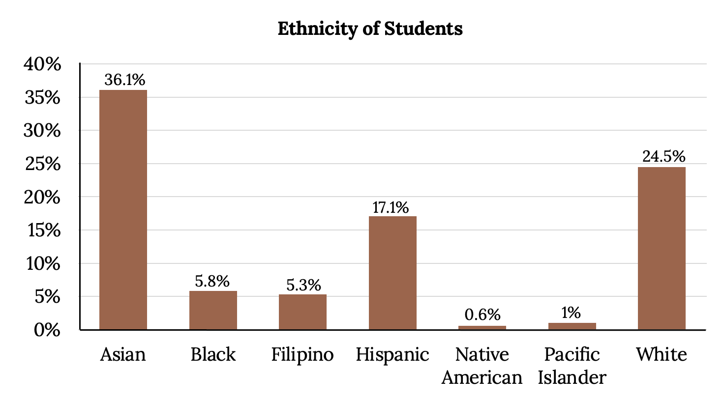
Omitting Categories/Missing Data
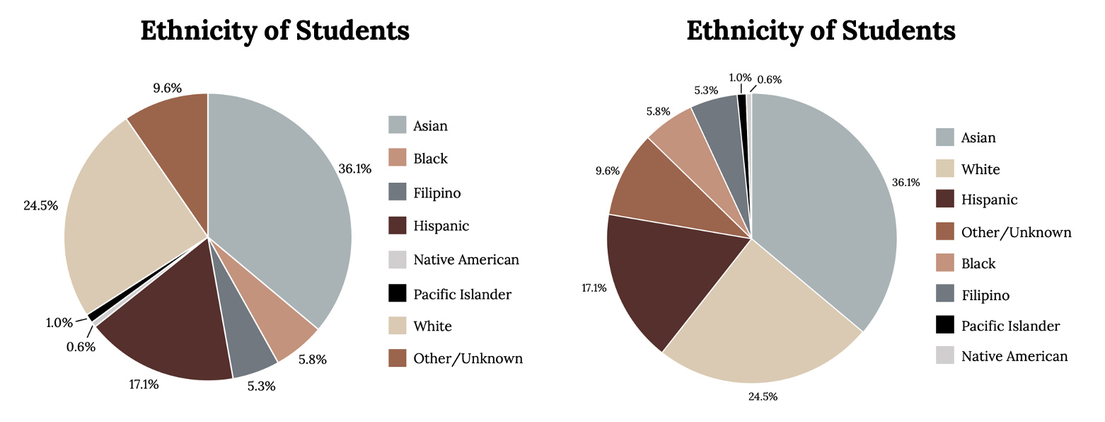
The table displays ethnicity of students but is missing the “Other/Unknown” category for people who did not feel they fit into any of the ethnicity categories or who declined to respond. Notice that the frequencies do not add up to the total number of students. In this situation, create a bar graph and not a pie chart.
| Frequency | Percent | |
|---|---|---|
| Asian | 8,794 | 36.1% |
| Black | 1,412 | 5.8% |
| Filipino | 1,298 | 5.3% |
| Hispanic | 4,180 | 17.1% |
| Native American | 146 | 0.6% |
| Pacific Islander | 236 | 1.0% |
| White | 5,978 | 24.5% |
| Total | 22,044 out of 24,382 | 90.4% out of 100% |
Figure 2.12: Ethnicity of students at De Anza College
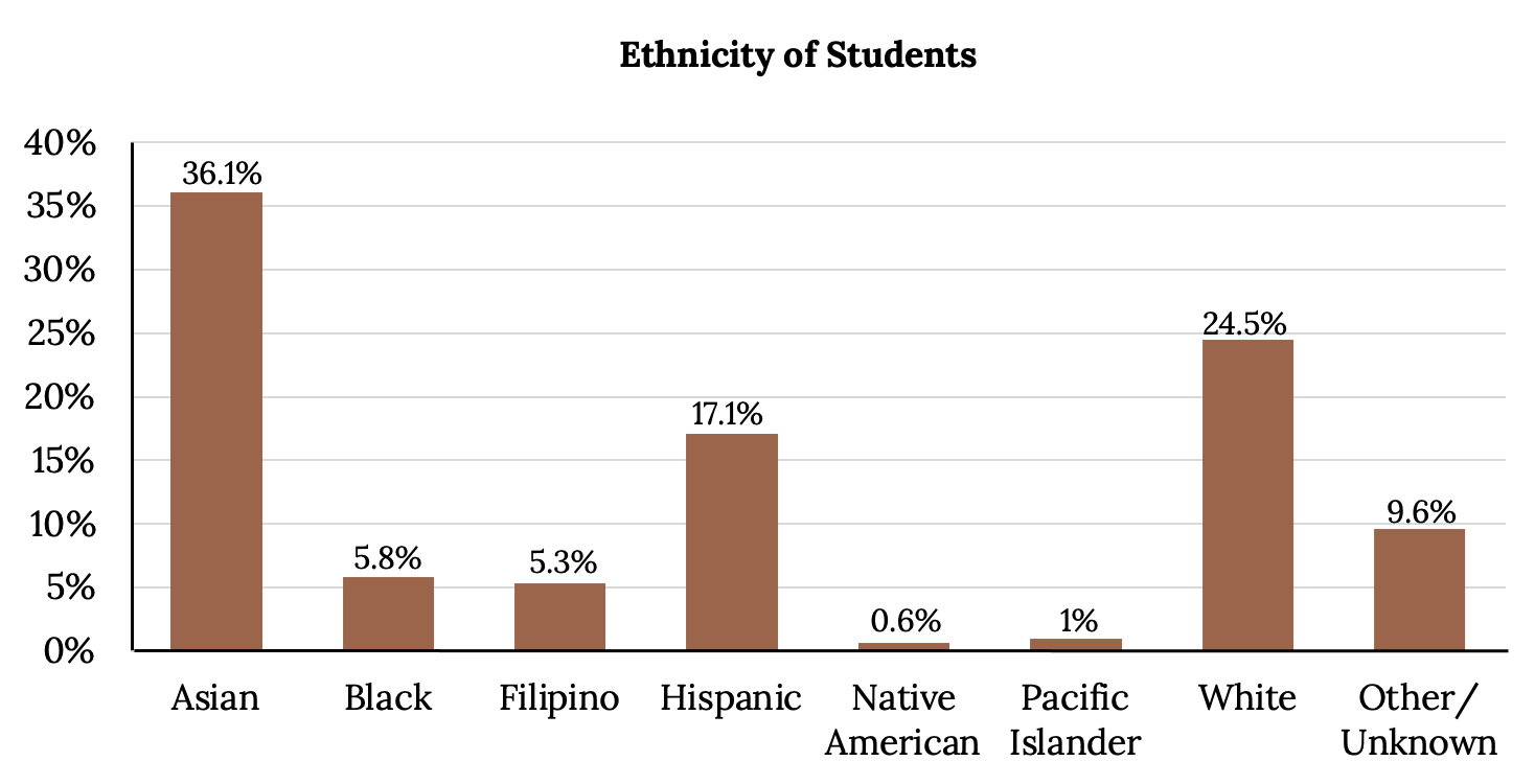
The graph shown in Figure 2.14 is the same as the previous graph, but the “Other/Unknown” percent (9.6%) has been included. The “Other/Unknown” category is large compared to some of the other categories, like Native American (0.6%) or Pacific Islander (1.0%). This is important to know when we think about what the data is telling us.
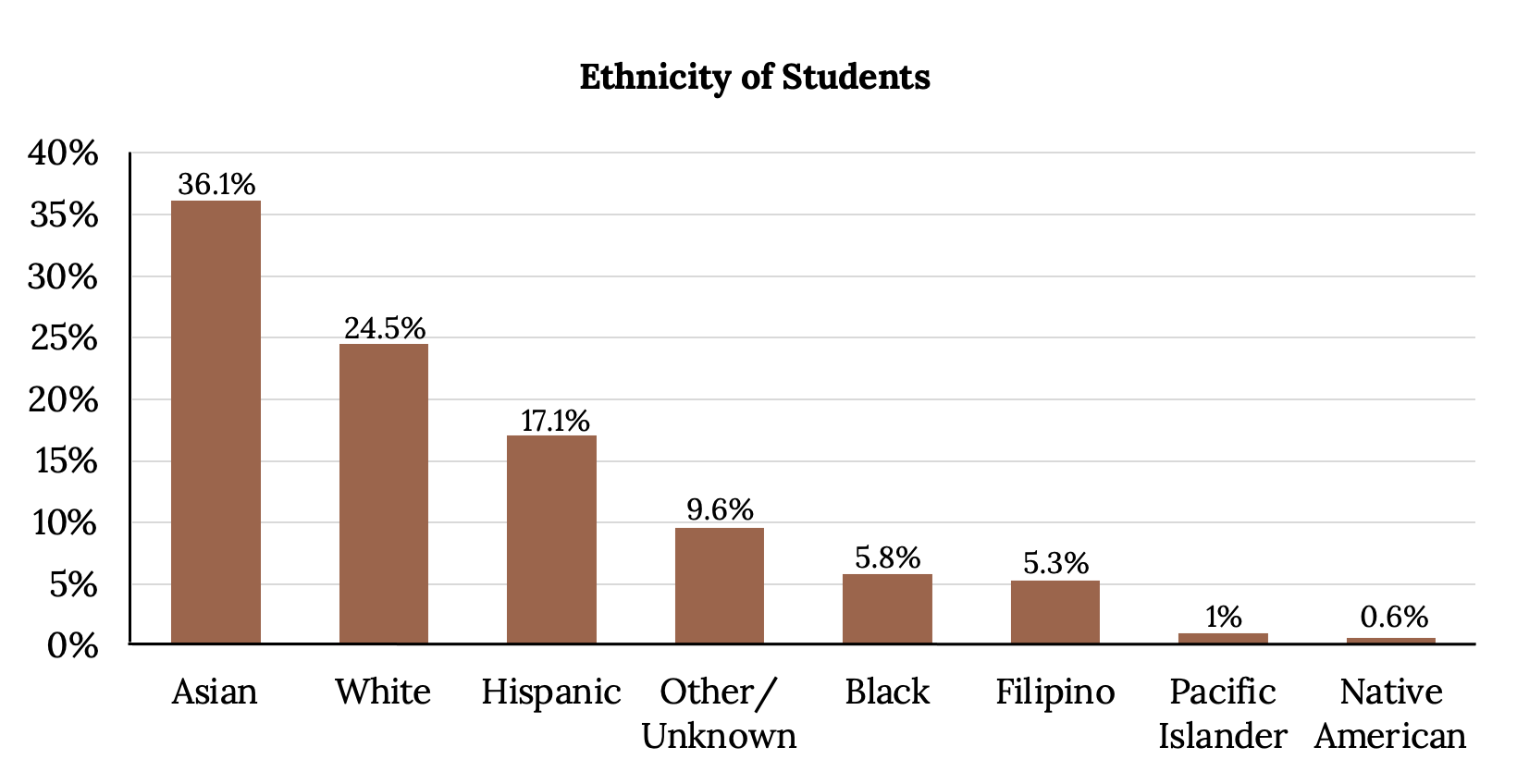
Bar Graph with “Other/Unknown” Category
This particular bar graph could be difficult to understand visually at first glance. A Pareto chart consists of bars that are sorted into order by category size (largest to smallest). This Pareto chart arranges the bars from largest to smallest and is easier to read and interpret.
Pie Charts: No Missing Data
The following pie charts include the “Other/Unknown” category (since the percentages must add to 100%). The chart on the right is organized by the size of each wedge, which makes it a more visually informative graph than the unsorted, alphabetical graph in the chart on the left.
Example
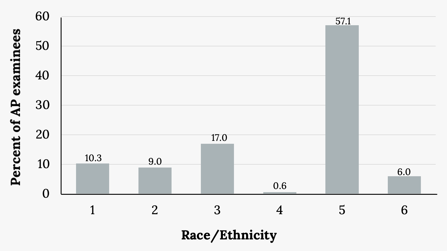
The columns in the table below contain the race or ethnicity of students in U.S. public schools for the class of 2011, percentages of that class taking the Advanced Placement exam, and percentages for the overall student population. Create a bar graph with the student race or ethnicity (qualitative data) on the x-axis and the Advanced Placement examinee population percentages on the y-axis.
| Race/Ethnicity | AP examinee population | Overall student population |
|---|---|---|
| 1 = Asian, Asian American, or Pacific Islander | 10.3% | 5.7% |
| 2 = Black or African American | 9.0% | 14.7% |
| 3 = Hispanic or Latino | 17.0% | 17.6% |
| 4 = American Indian or Alaska Native | 0.6% | 1.1% |
| 5 = White | 57.1% | 59.2% |
| 6 = Not reported/other | 6.0% | 1.7% |
Figure 2.17: AP student population
Your Turn!
Park City is broken down into six voting districts. The table shows the percent of the total registered voter population that lives in each district as well as the percent total of the entire population that lives in each district.
| District | Registered voter population | Overall city population |
|---|---|---|
| 1 | 15.5% | 19.4% |
| 2 | 12.2% | 15.6% |
| 3 | 9.8% | 9.0% |
| 4 | 17.4% | 18.5% |
| 5 | 22.8% | 20.7% |
| 6 | 22.3% | 16.8% |
Figure 2.19: Registered voter population by district
Construct a bar graph that shows the registered voter population by district.
Describing Categorical Data
After we have displayed the data visually, we then want to follow up by describing it numerically. Since categorical data does not lend itself to mathematical calculations by nature, there are not many numerical descriptors we can use to describe it. However, we can describe a categorical distribution’s “typical value” with the mode, as well as noting its level of variability.
Mode
The mode of a dataset is the most frequently occurring value. There can be more than one mode in a dataset as long as those values have the same frequency and that frequency is the highest. A dataset with two modes is called bimodal, and one with three modes is called trimodal. Sets with multiple modes are called multimodal. In most cases, the mode can easily be found as the largest piece of a pie chart or largest bar in a bar chart. Modes can be observed in several previous examples from this chapter:
The mode of the class of statistics students shown in Figure 2.20 is obviously Freshman. If any doubt remains, a Pareto chart makes identifying the mode trivial, which is Asian in Figure 2.21.
Variability
The best way to gauge variability in categorical data is by thinking about it as diversity. Although we will not calculate a numerical measure here, we can note it visually. A variable that has observations spread out fairly evenly over all categories shows high variability, while a variable with observations mostly falling into one or a small number of categories displays low variability.
Example
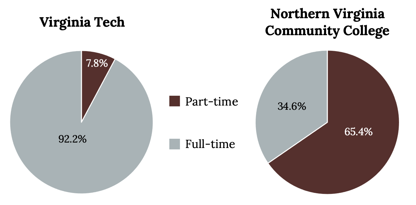
Consider the level of variability in the two pie charts below. Which college has more variability?
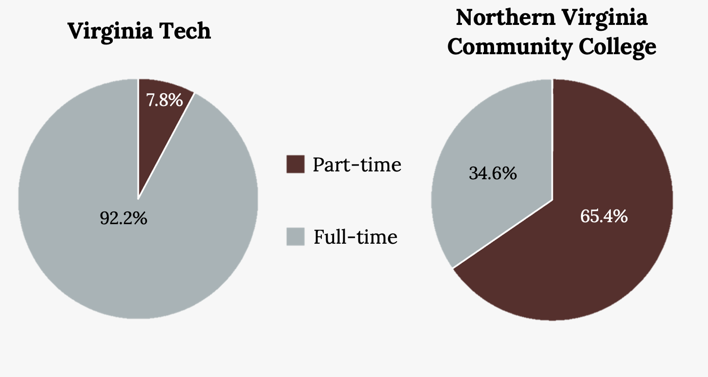
Solution
Although this variable only has two levels, Northern Virginia Community College shows more variability than Virginia Tech with regard to types of students.
Your Turn!
Let’s consider the variability in the following bar charts. Which bar chart shows greater variability?
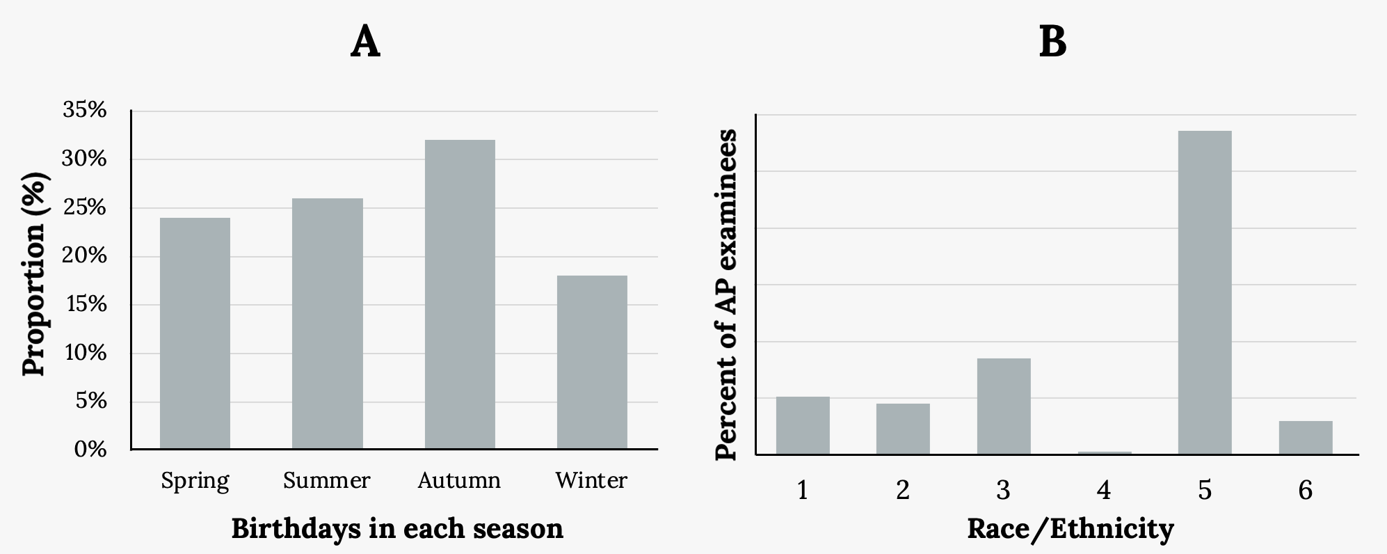
Solution
We see much greater variability in the birthday data on the left than the ethnicity data on the right.
Additional Resources
Figure References
Figure 2.5: Kindred Grey (2020). Classification of statistics students. CC BY-SA 4.0.
Figure 2.7: Kindred Grey (2020). Facebook users (bar graph). CC BY-SA 4.0.
Figure 2.8: Kindred Grey (2020). Full-time and part-time students at Virginia Tech and NVCC (pie chart). CC BY-SA 4.0.
Figure 2.9: Kindred Grey (2020). Full-time and part-time students at Virginia Tech and NVCC (bar graph). CC BY-SA 4.0.
Figure 2.11: Kindred Grey (2020). De Anza College bar graph. CC BY-SA 4.0.
Figure 2.13: Kindred Grey (2020). Ethnicity of students at De Anza College (bar graph). CC BY-SA 4.0.
Figure 2.14: Kindred Grey (2020). Ethnicity of students at De Anza College (bar graph with “Other/Unknown”category). CC BY-SA 4.0.
Figure 2.15: Kindred Grey (2020). Ethnicity of students at De Anza College (bar graph with “Other/Unknown” category). CC BY-SA 4.0.
Figure 2.16: Kindred Grey (2020). Pie charts with no missing data. CC BY-SA 4.0.
Figure 2.18: Kindred Grey (2020). AP student population (bar graph). CC BY-SA 4.0.
Figure 2.20: Kindred Grey (2020). Classification of statistics students. CC BY-SA 4.0.
Figure 2.21: Kindred Grey (2020). Ethnicity of students at De Anza College (bar graph with “Other/Unknown” category). CC BY-SA 4.0.
Figure 2.22: Kindred Grey (2020). Full-time and part-time students at Virginia Tech and NVCC. CC BY-SA 4.0.
Figure 2.23: Kindred Grey (2020). Variability comparisons. CC BY-SA 4.0.
Figure Descriptions
Figure 2.5: Pie chart showing the class classification of statistics students. The chart has four sections labeled Freshman, Sophomore, Junior, Senior with associated descending pie slice sizes.
Figure 2.7: Bar graph that matches the supplied data. The x-axis shows age groups (13-25, 26-44, 45-64), and the y-axis shows the proportion (%) of Facebook users ranging from zero to 50.
Figure 2.8: Two pie charts. Left pie chart labeled Virginia Tech separated into two pie slices: Part time (7.8%) and Full time (92.2%). Right pie chart labeled Northern Virginia Community College separated into two pie slices: Part time (65.4%) and Full time (34.6%).
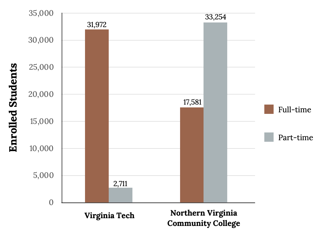
Figure 2.9: Y axis range from zero to 35,000, X axis shows: Virginia Tech full time (31972), Virginia Tech part time (2711), Northern Virginia Community College full time (17581), Northern Virginia Community College part time (33254).
Figure 2.11: Bar graph with Y axis ranging from 0% to 100% by 20%. X axis values: Under age 25 (61%), Intend to transfer (48.6%), full time (40.9%), all students (100%).
Figure 2.13: Bar graph with Y axis ranging from 0% to 40% by 5%. X axis values: Asian (36.1%), Black (5.8%), Filipino (5.3%), Hispanic (17.1%), Native American (0.6%), Pacific Islander (1%), White (24.5%).
Figure 2.14: Bar graph with Y axis ranging from 0% to 40% by 5%. X axis values: Asian (36.1%), Black (5.8%), Filipino (5.3%), Hispanic (17.1%), Native American (0.6%), Pacific Islander (1%), White (24.5%), Other/Unknown (9.6%).
Figure 2.15: Bar chart including the same values as Figure 2.17, however this figure is sorted from highest to lowest, left to right, beginning with Asian (36.1%) and ending with Native American (0.6%).
Figure 2.16: Two pie charts side by side both titled ‘Ethnicity of Students’. Left: Asian (36.1%), Black (5.8%), Filipino (5.3%), Hispanic (17.1%), Native American (0.6%), Pacific Islander (1%), White (24.5%), Other (9.6%). Right pie chart includes the same values but arranged in descending order starting with Asian (36.1%) and ending with Native American (0.6%).
Figure 2.18: Bar graph that matches the supplied data. The x-axis shows race and ethnicity with groups one through six, and the y-axis shows the percentages of AP examinees ranging from 0.6 to 57.1.
Figure 2.20: Pie chart showing the class classification of statistics students. The chart has four sections labeled Freshman, Sophomore, Junior, Senior with associated descending pie slice sizes.
Figure 2.21: Bar chart including the same values as Figure 2.17, however this figure is sorted from highest to lowest, left to right, beginning with Asian (36.1%) and ending with Native American (0.6%).
Figure 2.22: Two pie charts. Left pie chart labeled Virginia Tech separated into two pie slices: Part time (7.8%) and Full time (92.2%). Right pie chart labeled Northern Virginia Community College separated into 2 pie slices: Part time (65.4%) and Full time (34.6%).
Figure 2.23: Two bar graphs side by side. Left: titled ‘A’ with ‘Proportion (%) on the y axis and ‘Birthdays in each season’ on the x axis. X axis includes: Spring (24%), Summer (26%), Autumn (31%), Winter (18%). Right: titled ‘B’ with ‘Percent of AP examinees’ on the y axis and ‘Race/Ethnicity’ on the x axis. X axis values: 1 (10.3), 2 (9.0), 3 (17.0), 4 (0.6), 5 (57.1), 6 (6.0).
Data that describes qualities or puts individuals into categories; also known as categorical data
The most frequently occurring value
The level of variability or dispersion of a dataset; also commonly known as variation/variability
