2.4 Describing Quantitative Distributions
Consider the following exercise.
Your classmates write down the average time (in hours, to the nearest half-hour) they sleep per night and then create a simple dot plot of the data:
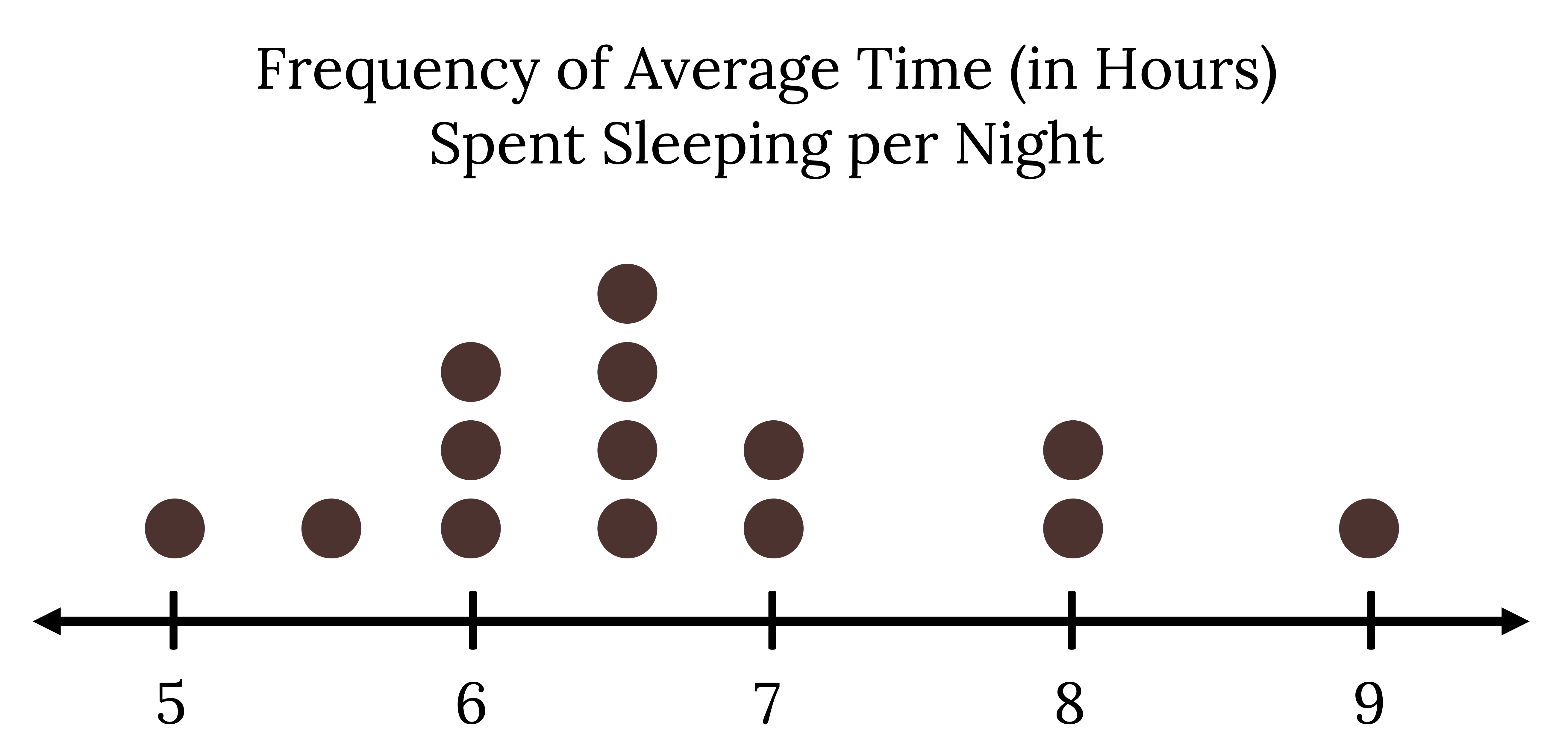
How would you interpret or explain this distribution? Where do your data appear to cluster? How might you interpret the clustering? If you did the same example in an English class with the same number of students, do you think the results would be the same? Why or why not?
The questions above ask you to analyze and interpret your data. It isn’t enough to just make graphs, we must be able to interpret the information with a critical eye.
Key Aspects of Quantitative Data
When describing a quantitative distribution we want to note at least four: the shape of the distribution, the presence of outliers, the center, and the spread. A helpful acronym for remembering this is SOCS:
Shape is the main characteristic we can determine by looking at a graph. We are often able to identify potential outliers visually as well. Center and spread can be roughly gauged visually, but there are also numerical calculations for them, which will be discussed in the following sections.
Shape
Shape is the first thing we should note since it will often dictate how to proceed with the rest of our analysis. We have already seen that most of our graphical methods can give us an idea of the shape of a distribution, but the best choice in most situations is a properly formatted histogram.
Symmetry vs. Skewness
Most of us are familiar with datasets that show roughly equal tails trailing off equally in both directions, which would be described as symmetric.
Consider the following alternative:
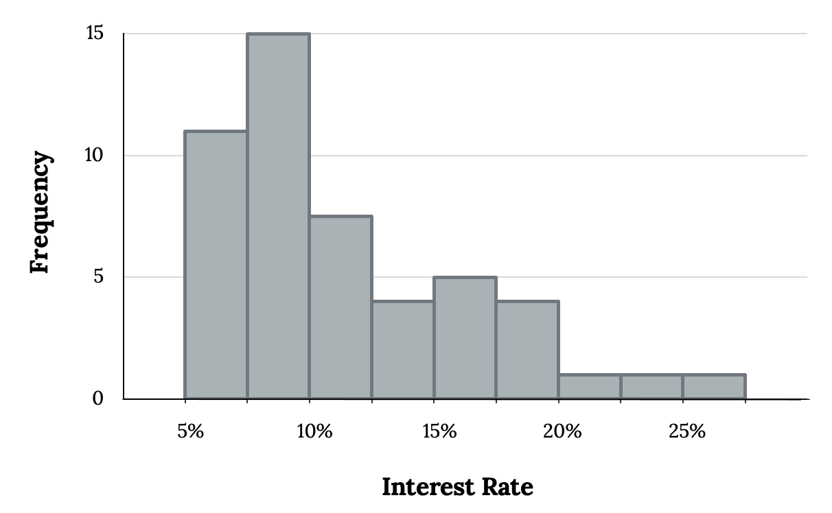
The figure above suggests that most loans have rates under 15%, while only a handful of loans have rates above 20%. When data trails off to the right in this way and has a longer right tail, the shape is said to be right-skewed. Datasets with the reverse characteristic—a long, thinner tail to the left—are said to be left-skewed. We also say that such a distribution has a long left tail.
Modality
In addition to looking at whether a distribution is skewed or symmetric, histograms can be used to identify the modality of a distribution. A mode is represented by a prominent peak in the distribution. There is only one prominent peak in the histogram of loan amounts. The definition of mode sometimes taught in math classes is the value with the most occurrences in the dataset. However, for many real-world datasets, it is common to have no observations with the same value in a dataset, making this definition impractical in data analysis. The figure below shows histograms that have one, two, or three prominent peaks.
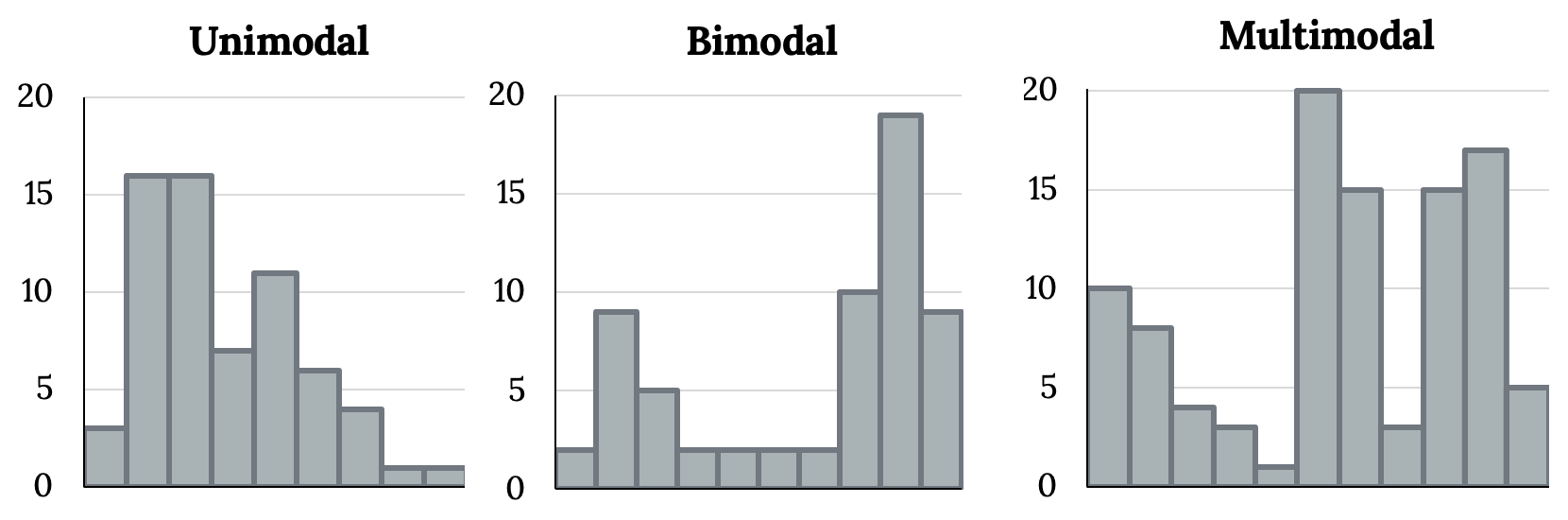
Such distributions are called unimodal, bimodal, and multimodal, respectively. Any distribution with more than two prominent peaks is called multimodal. Notice that there was one prominent peak in the unimodal distribution, with a second less prominent peak that was not counted since it only differs from its neighboring bins by a few observations.
Looking for modes isn’t about finding a clear and correct answer about the number of modes in a distribution, which is why “prominent” is not rigorously defined in this book. The most important part of this examination is to better understand your data.
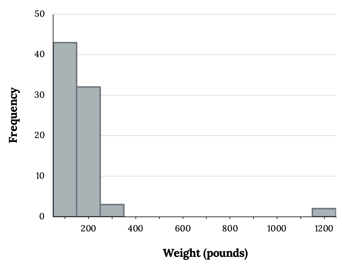
Outliers
Sometimes one or more data points stick out visually. These extreme values could potentially be outliers. Sometimes they may be obvious to us, as in the following histogram:
On the other hand, outliers may not be as obvious and might only show up upon careful examination of a dot plot or through other methods. Examining data for outliers serves many useful purposes, including:
- Identifying skewness in the distribution
- Identifying possible data collection or data entry errors
- Providing insight into interesting properties of the data
Subsequent sections will discuss numerical methods to “officially” identify outliers and how to deal with them.
Center
We also want to make sure to describe a quantitative distribution’s most typical value, known as its central tendency. We can simply estimate this visually, but future sections will focus on more robust and appropriate measures we can calculate.
Spread
A rough measure of spread we can usually determine visually is the range (range = maximum – minimum). Again, we will encounter more robust and appropriate measures we can calculate in future sections.
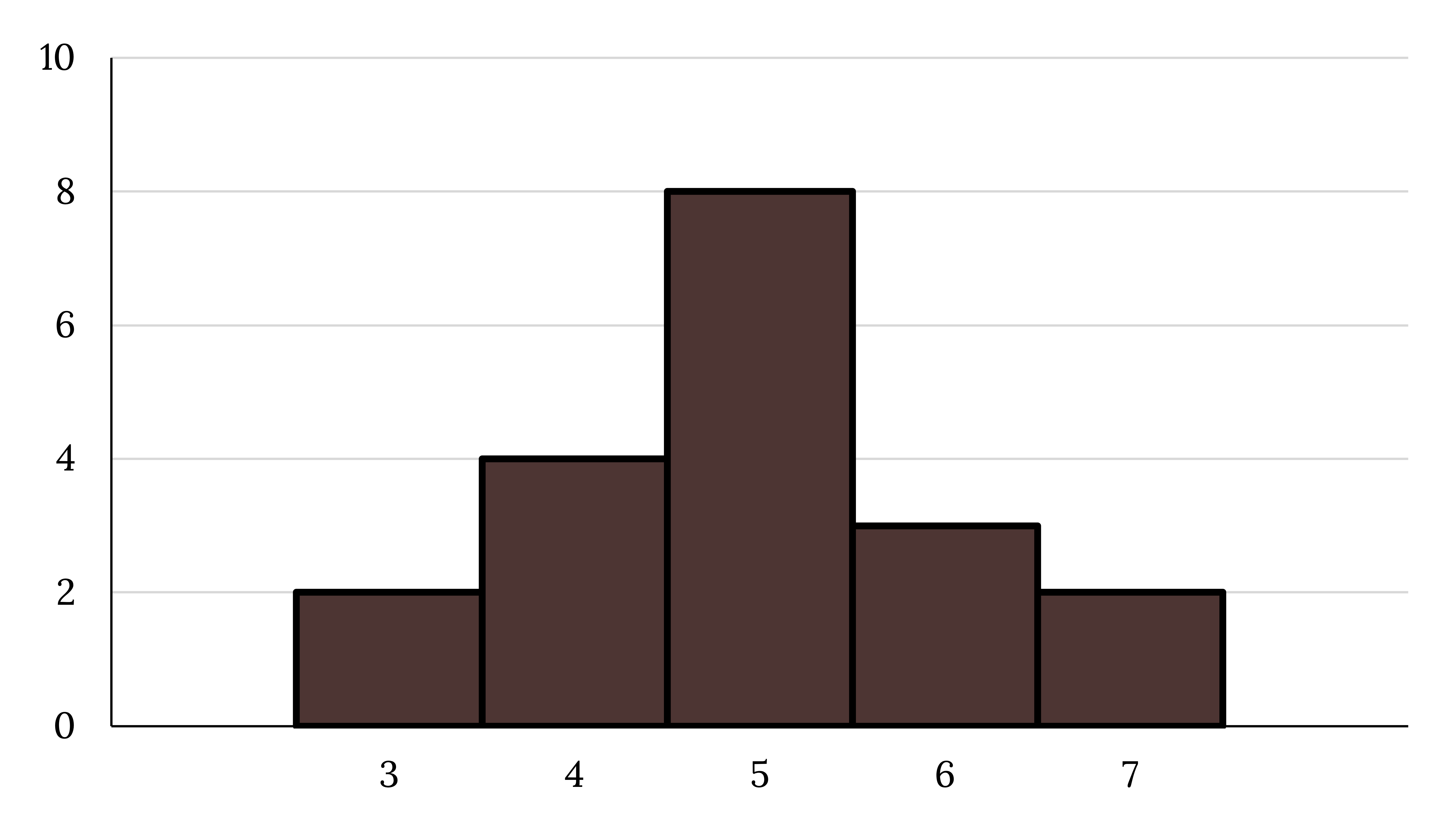
Example
Use the following graph to answer the questions below.
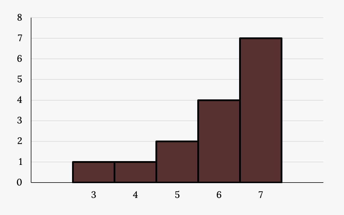
Describe the shape of this distribution.
Solution
The distribution is left-skewed.
Describe the modality of the distribution.
Solution
The distribution appears to be unimodal with a mode of 7.
Do you see any apparent outliers?
Solution
3 may be a potential outlier.
What does the center appear to be?
Solution
The center appears to be roughly 6.
Provide a rough estimate of the spread.
Solution
We see a range of 7 – 3 = 4 for a rough measure of spread.
Your Turn!
Describe the shape of this distribution visually:
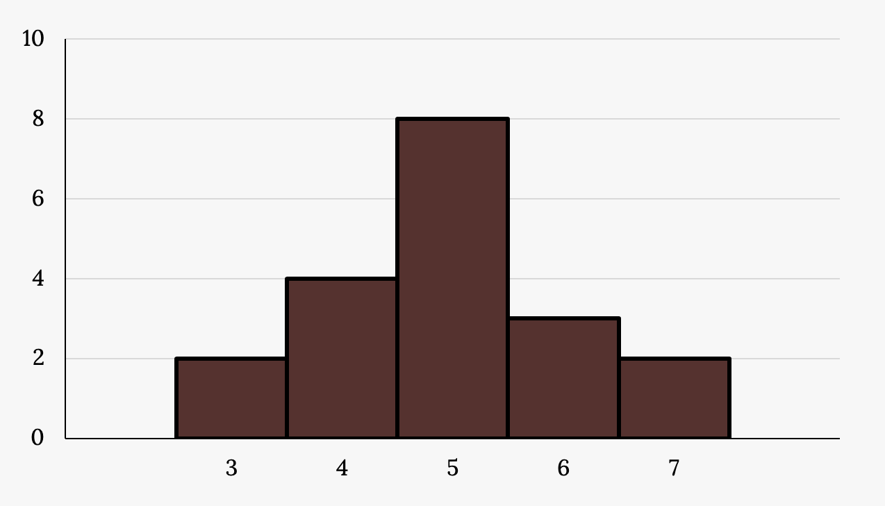
- Is the data symmetric or skewed? If you see skewness, what is its direction?
- Describe the modality of the distribution.
- Do you see any apparent outliers?
- What does the center appear to be?
- Provide a rough estimate of the spread.
Additional Resources
Figure References
Figure 2.35: Kindred Grey (2020). Student sleep hours. CC BY-SA 4.0.
Figure 2.36: Kindred Grey (2020). Symmetric data. CC BY-SA 4.0.
Figure 2.37: Kindred Grey (2020). Skewed data. CC BY-SA 4.0.
Figure 2.38: Kindred Grey (2020). Unimodal, bimodal, and multimodal distributions. CC BY-SA 4.0.
Figure 2.39: Kindred Grey (2020). Outlier. CC BY-SA 4.0.
Figure 2.40: Kindred Grey (2020). Distribution 1. CC BY-SA 4.0.
Figure 2.41: Kindred Grey (2020). Distribution 2. CC BY-SA 4.0.
Figure Descriptions
Figure 2.35: Dot plot showing ‘frequency of average time (in hours) spent sleeping per night’. The number line is marked in intervals of one from five to nine. Dots above the line show one person reporting 5 hours, one with 5.5, three with 6, four with 6.5, two with 7, two with 8, and one with 9 hours.
Figure 2.36: Bell curve shaped histogram. Tallest bar is in the middle and tapers off on both sides.
Figure 2.37: Bar graph with frequency on the y axis ranging from zero to 15 by five, and Interest rate on the x axis ranging from 5% to 25% by five. Bars include: 5-7.5% (11), 7.5-10% (15), 10-12.5% (7), 12.5-15% (4), 15-17.5% (5), 17.5-20% (5), 20-22.5% (1), 22.5-25% (1), 25-27.5% (1).
Figure 2.38: Three side-by-side bar graphs with y axis ranging from zero to 20 by five. The first graph has a peak around four, the second graph has a peak at three and 17, the third graph has a peak at one, 12, and 18.
Figure 2.39: Bar graph with x axis measuring weight (in pounds) ranging from zero to 1200 by 200. The y axis measures frequency ranging from zero to 40 by 10. There is a peak when weight = 200, frequency = 40. the only other data is when weight = 1200, frequency = 2.
Figure 2.40: Histogram which consists of five adjacent bars over an x-axis split into intervals of one from three to seven. The bar heights from left to right are: 1, 1, 2, 4, 7.
Figure 2.41: Histogram which consists of five adjacent bars with the x-axis split into intervals of one from three to seven. The bar heights peak in the middle and taper down to the right and left.
The visual appearance of a dataset
An observation that stands out from the rest of the data significantly
The central tendency or most typical value of a dataset
The level of variability or dispersion of a dataset; also commonly known as variation/variability
How many peaks or clusters there appear to be in a quantitative distribution
