2 Measuring Things in Epidemiology
2.1 Types of Counting
Epidemiologists are interested in the numbers behind health issues, including:
- How many people/animals are affected?
- How long are people/animals affected?
- Do the numbers differ by other factors?
- How many deaths are there?
Being able to do the work of an epidemiologist all comes down to appropriately counting what happens. There are two general categories of counting that we use in epidemiology: counts and ratios. Counts are the simplest and most frequently performed quantitative measures in epidemiology. Counts refer to the number of cases of a disease or other health phenomenon being studied. Most of the numbers you frequently see in epidemiology are types of ratios (rates, proportions, and percentages). Ratios are the values obtained by dividing one quantity (count) by another (numerator over a denominator).
Example: Interpreting ratios
Between 1981 and 2007, 2,920,260 men died of injury (any type) and 1,119,669 women died of injury (any type) in the United States (figure 2.1).[1]
| Count | |
| Injury Deaths in Men | 2,920,260 |
| Injury Deaths in Women | 1,119,669 |
| Ratio | |
| 2,920,260 / 1,119,669 = 2.6:1 men to women | |
Figure 2.1: Injury deaths in men and women in the United States.
We would interpret this sex ratio by saying “Between 1981 and 2007, for every 2.6 injury deaths among men, there was one injury death among women in the United States.”
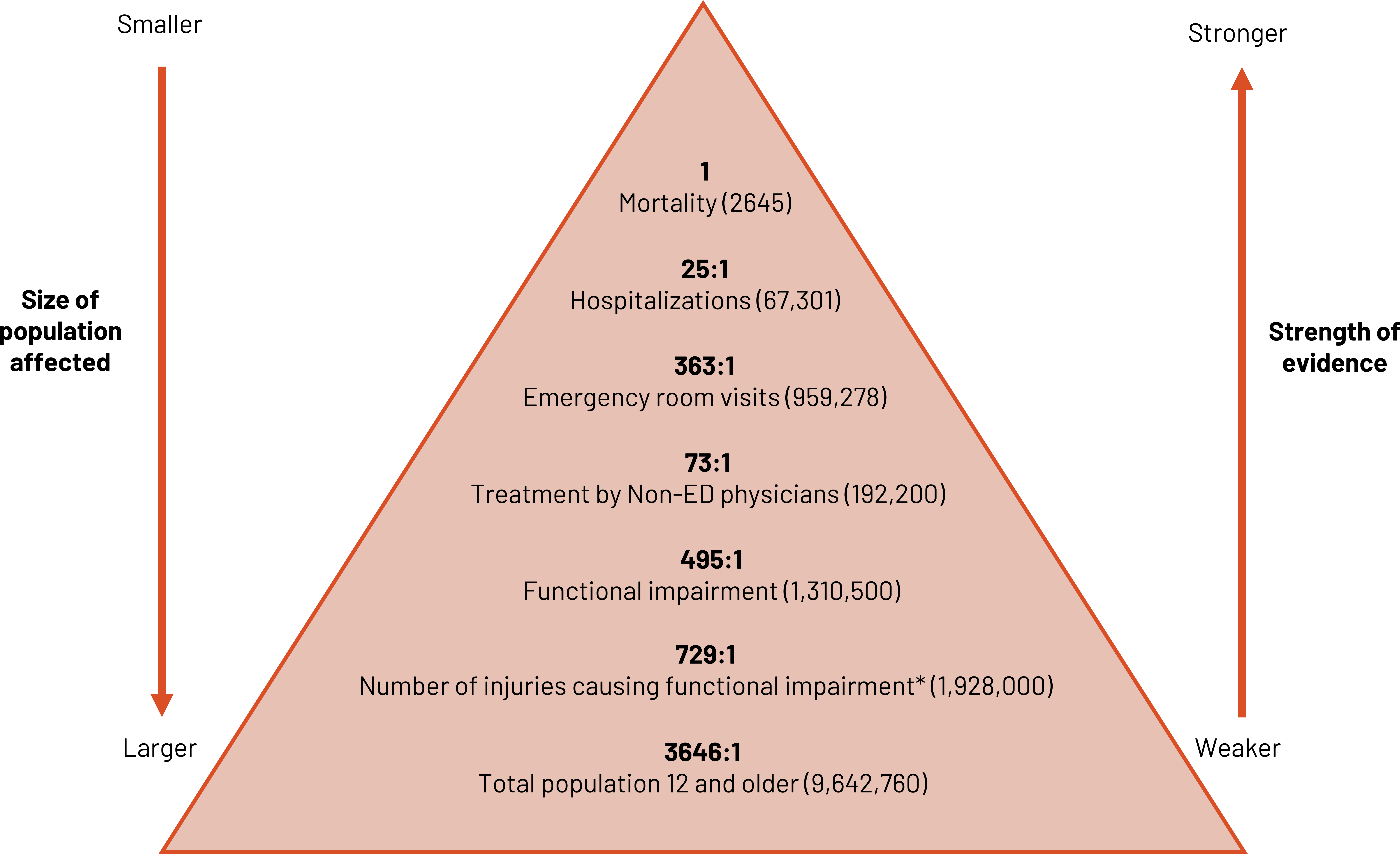
We can use ratios to contrast different levels of injury severity from the most severe (e.g., death) to least severe (e.g., injured but not needing treatment) (figure 2.2). As the size and breadth of the population affected grows, the strength of definitive evidence for the marker decreases. We must strike a balance between the two when optimizing the use of the ratio.
2.1.1 Proportions
Proportions are a measure that states a count relative to the size of the group. It is a ratio in which the denominator contains the numerator. It can be expressed (written, said, etc.) as a percentage. A proportion can be used to demonstrate the magnitude of a health problem.
Example: Magnitude
If 10 dormitory students develop strep throat, we want to know how important the problem is.
- If only 20 students live in the dorm, 50 percent are ill. Magnitude: This is a major problem! We need action immediately.
- If 500 students live in the dorm, 2 percent are ill. Magnitude: This is a problem but not as concerning. We will likely keep a cautious eye on the situation but not act immediately.
Prevalence is the number of existing cases of a disease or health condition in a population at some designated time. Prevalence is a proportion. It can be expressed (written, said, etc.,) as follows:
- A number
- A percentage
- The number of cases per unit size of the population
If no time is specified, we usually are discussing point prevalence or prevalence at a specific point in time. Period prevalence is the prevalence over a specified period of time. How do we use prevalence? As previously stated, we use it to find the magnitude or burden of a health problem in a population. We also use it to estimate the frequency of an exposure or to determine the allocation of health resources such as facilities and personnel.

The numerator for period prevalence is the sum of the prevalence at the beginning of the time period in question plus the cases that occur during the time interval.

The denominator for period prevalence is the average population over the time period in question. Sometimes we know the exact size of the population and we can use that number. But when we’re considering things that are dynamic, like the exact number of patients in and out of a hospital, an average is our best method. We could calculate this average a number of different ways, but often we use the following method:

The period prevalence includes everyone (alive, dead, cured) who had the condition during the period in question.
Example: Period prevalence
Wörner et al. thought that the modern style of goalkeeping in ice hockey predisposed goalie athletes to hip and groin problems.[2]. Sweden has 128 elite ice hockey goalkeepers. Of these, 101 participated in Wörner’s study designed to find out the magnitude (prevalence) of hip and groin problems among them. According to the study, 28.1 percent of goalkeepers reported a hip or groin injury in any given week, and a total of 69 percent of all goalkeepers reported a hip or groin injury at any point in the season.[3] This shows a fairly large burden of injury on goalkeepers and that we should work to reduce the number of injuries.
In this example, both the 28.1 percent of goalkeepers reporting a hip or groin injury in any given week and the 69 percent of goalkeepers reporting a hip or groin injury at any point in the season would be referred to as period prevalence, but the time points differ.
Example: Period prevalence and proportion
Now, let’s imagine we are examining the burden of shoulder injuries in field hockey players in Metro A in 2020. On January 1, 2020, there are 1000 field hockey players, and 25 of these players come into the year with existing shoulder injuries.
Exactly 248 shoulder injuries occur to individual athletes between January 1, 2020 and December 31, 2020. On December 31, 2020, there are 1200 field hockey players in Metro A. To calculate the period prevalence, we need to add together all the shoulder injuries to create the numerator (25 + 248). We then need to create an average number of field hockey players over the year ([1000+1200]/2) as one way to account for the change over the year.
![\text { Period prevalence }=\frac{25+248}{\left[\frac{1000+1200}{2}\right]}=\frac{273}{1100}=0.2481](https://pressbooks.lib.vt.edu/app/uploads/quicklatex/quicklatex.com-a9dcd94bb84412737bb5b7a7224ce730_l3.png "Rendered by QuickLaTeX.com")
We could report the prevalence of shoulder injuries as 0.2481. It is an absolute number (a value that shows the distance from zero), so there is no context for interpreting this number. More useful to us is this number as a relative number (an absolute value relative to another number) such as a percentage:

Thus, 24.81 percent of field hockey players in Metro A had a shoulder injury in 2020. This number, 24.81 percent, is the proportion of players with a shoulder injury. Because it is a relatively large proportion, we should work with players and teams on preventing these injuries.
2.1.2 Rates
A rate is a ratio that consists of a numerator and a denominator and in which time forms part of the denominator. It must contain:
- Disease frequency
- Unit size of the population
- Time period during which an event occurs
When we report rates, we often use multipliers. You may recognize from news stories or journal articles rates being reported per 100,000 population. When we look at issues related to children or maternity, we often use 1000 as the multiplier (e.g., per 1000 live births). But 100,000 is the most used standard and assists us when we want to compare rates across populations.
In epidemiology we use three different forms of the rate. First is the crude rate. This rate is the rawest version of a rate. We have not considered any other reasons why that relationship could happen or any other related factors for the situation. It is just a simple numerator and a simple denominator.
Examples:
- Crude birth rate
- Fertility rate
- Infant mortality rate
- Fetal death rate
- Postneonatal mortality rate
- Maternal mortality rate
An example formula:

Example: Crude rate
In a study of student-athlete deaths in the National Collegiate Athletic Association (NCAA), Harmon et al. found that from the 2003–2004 school year though the 2012–2013 school year, there were 514 student-athlete deaths from all causes.[4] There are approximately 450,000 student-athletes in the NCAA.

Use crude rates with caution when comparing disease frequencies between populations. Observed differences in crude rates may be the result of systematic factors (e.g., sex or age distributions) within the populations rather than true variation in rates. If this is the case, we are comparing apples to oranges. We need to make the populations as similar as possible to compare apples to apples.
If we want to compare rates across populations or even get a more accurate rate for our single population, we should do our best to use an adjusted rate. An adjusted rate is a measure in which statistical procedures have been applied to remove the effect of differences in composition of various populations. We can adjust using tools such as the direct method, indirect method, or regression.
The third type of rate we use is called a specific rate. This type of rate refers to a particular subgroup of the population defined in terms of factors such as race, age, sex, or single cause of death or illness (e.g., an age-specific death rate).
Incidence is the number of new cases of a disease that occur in a group during a certain time period. We can use incidence to help us research the etiology of disease and to provide estimates of the risk of developing disease. One way to calculate incidence is as a rate. The incidence rate describes the rate of development of a disease in a group over a certain time period. It has to include a numerator (number of new cases), denominator (population at risk), and time (period during which cases occur).
Example: Incidence rate
In one of our earlier examples for prevalence (see section 2.1.1), we examined shoulder injuries in field hockey players in Metro A. Remember that 248 new shoulder injuries occurred to individual athletes between January 1, 2020 and December 31, 2020. There were 1000 field hockey players in January and 25 of these players came into the year with existing shoulder injuries. If we assume that none of the players with existing injuries could be injured in January from sport, we can calculate our “at-risk” or susceptible population (1000 – 25). When calculating incidence we want to do our best to include only those who are capable of having the outcome in the denominator. If 20 of the 248 new injuries happened in January, 20 is our numerator.

We would report this as an incidence of 20.51 shoulder injuries per 1000 field hockey players in Metro A in January 2020.
2.2 Incidence Versus Prevalence
For both incidence and prevalence, we must have:
- A clear, discrete definition of the event (either the event happened or it did not)
- The time frame for the event
An event (outcome) could be the start or end of a biological process (e.g., menopause), death, remission, disease (diagnosis, start of symptoms, or relapse), or the start or end a behavior (e.g., smoking cessation).
Time, as discussed in section 1.2, can vary widely. It is query dependent and could be calendar time, age, time from study recruitment, time from an exposure (e.g., time from employment), or time from diagnosis.
Figure 2.3 displays a comparison between incidence and prevalence and examples of both. The bathtub of prevention[5] is a common graphical representation of the relationship between the two. Incidence is displayed as the water as it enters the tub. If the drain of the tub is closed, no water exits and it fills. This is similar to the relationship between incidence and prevalence. In reality, often some cases of disease do not survive or are cured; this part of the water escapes the tub. Sometimes those who are cured or are in remission have recurrences of disease and those cases are re-added to the mix. We can use them in the calculation of new cases (they are new) but also separately calculate the incidence of recurrence.
| Definition | Formula | Units | Example | Graphic representation | |
|---|---|---|---|---|---|
| Incidence | All new cases in a given time (example: last year) in a population | # of new cases / # of people at risk | per unit of time | Of the 100 children at the sports camp yesterday, 20 got a sunburn. Incidence = 20/100 | 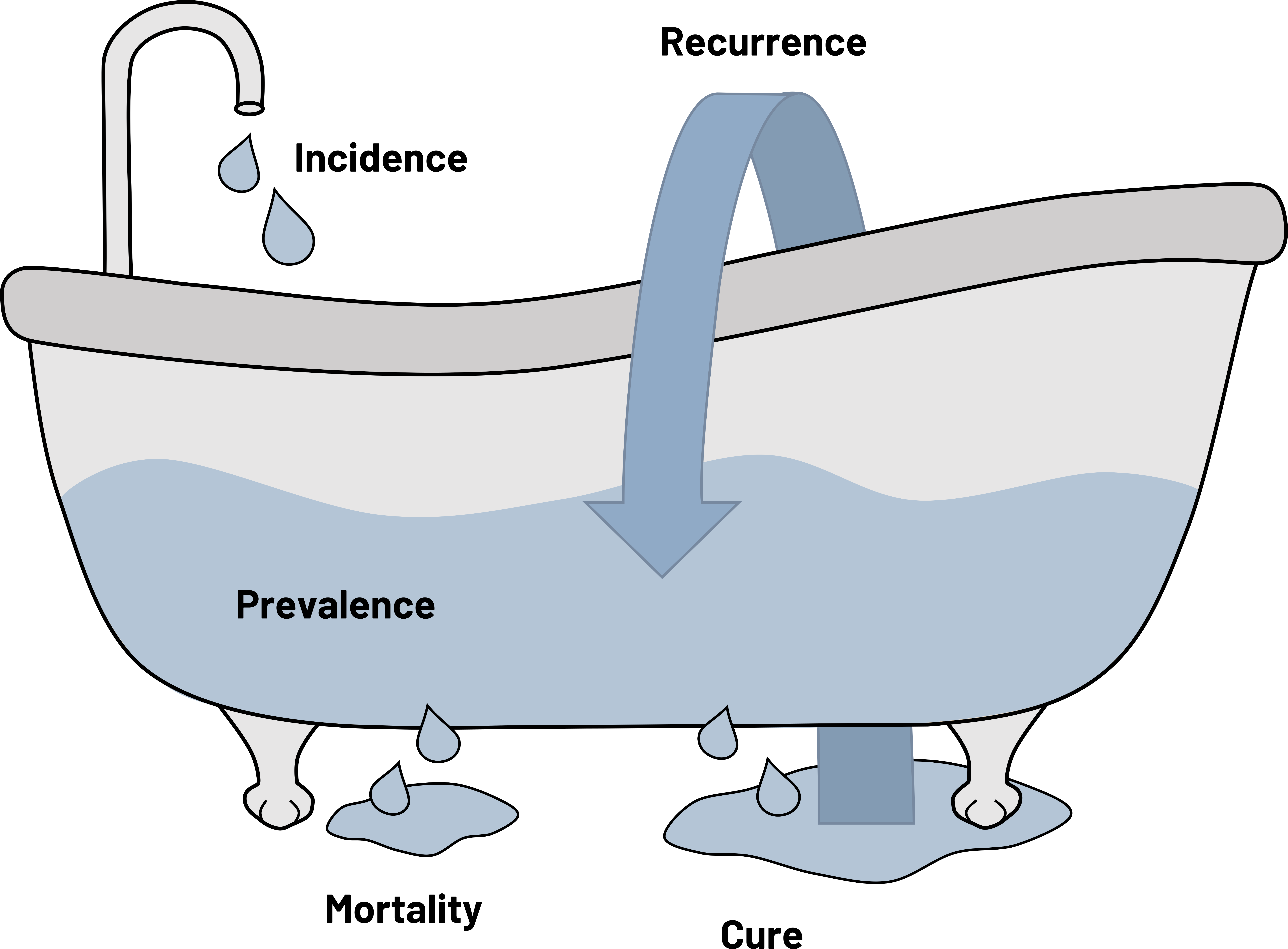 |
| Prevalence | All cases (new + old) in a population in a given time | # of all cases / total # of people | at a point in time or during a period in time | Of the 1000 children in Town A during the summer of 2015, 50 children got a sunburn. Prevalence = 50/1000 |
Figure 2.3: The bathtub of prevention.
Prevalence includes all cases in a given time. If you are studying a patient’s survival time, mortality, or recovery time, you are interested in prevalence. Prevalence is approximately equal to the incidence of the disease times the duration (length) of the illness. What does this mean? If the duration of disease is short and incidence is high, prevalence becomes similar to incidence. Conditions that have short duration mean that cases recover rapidly or are fatal, so prevalence does not have time to build up. This is typical of certain infectious diseases such as the common cold. Conditions that have a long duration and a low incidence result in a prevalence that increases at a pace faster than incidence. This is very typical of chronic diseases. We have also come to recognize this with some infectious diseases such as HIV due to the wide availability of drug therapies and prevention strategies. If immunization programs work as intended for vaccine preventable diseases such as measles, the incidence should be low, as should prevalence. Figure 2.4 provides three scenarios in which we might calculate prevalence and what the expected outcome would be.
| Possible scenarios | Corresponding outcomes for prevalence |
|---|---|
| Physical therapy shortens the time of acute hip pain for patients with bursitis. | The faster recovery time for the acute hip pain means that the prevalence of people with hip pain goes down. Duration of acute hip pain is short, so the number of old cases that exist at a given point is low. |
| Most people with untreated Rabies lyssavirus die within 10 days of symptom onset. | The fewer people that exist with the condition, the lower the numerator, so the prevalence of disease goes down. Duration of the infection is short, so the number of old cases that exist at a given point is low. |
| People who take antiretroviral drugs for HIV live a longer life. | The infection responds well to the medications, meaning that if people continue to be infected with HIV the prevalence of the disease goes up. The duration is long, so the numerator continues to increase. |
Figure 2.4: Scenarios and outcomes for prevalence.
Incidence includes new cases only in a given time. This, as well as prevalence, are impacted by prevention strategies and their acceptance in the population. When we see incidence and prevalence change, we need to understand why they are changing and appropriately adjust our numbers so we can best evaluate what our next steps should be (figure 2.5).
| Possible scenarios | Corresponding outcomes for incidence | Corresponding outcomes for prevalence |
|---|---|---|
| Nearly universal acceptance of the polio vaccination has made the disease nearly disappear from the world. | Vaccination prevents new cases, so the incidence goes down. | The number of cases of polio continue to drop and the number of people globally with the condition is extremely low. The prevalence also goes down. |
| A risk factor for homelessness is the lack of available and affordable housing. The hospital partners with the city to make homes available to all people in need that come into the ER. | Fewer people will be unhoused, meaning that the incidence of homelessness goes down. | If fewer people are unhoused, over time the prevalence of being unhoused goes down. |
| We improve the accuracy of a COVID-19 rapid test that is affordable and available to the public. | Because our test is more accurate, we will pick up more cases of the disease, so the incidence goes up. | If the incidence increases, the prevalence of ever having had the condition also goes up. |
Figure 2.5: Scenarios and outcomes for incidence and prevalence.
Figure 2.6 summarizes various common types of prevalence and incidence and how we should interpret them. As you can see, there are at least four types of incidence that we can calculate. The difference is in how we capture the denominator and the population used. More details on when to use the different types of incidence can be found in section 2.3.
| Numerator | Denominator | Time | Interpretation | |
|---|---|---|---|---|
| Point prevalence | All cases at that point in time (new + old) | The whole population | A single point in time (e.g., June 3, 2012 or the year 2012) | Probability (chance) of having disease at a given point in time |
| Period prevalence | All cases during that period (new + old) | The whole population | A particular follow-up period (e.g., after vaccine administration started) | Probability (chance) of having disease during a given period in time |
| Incidence rate (when you are studying a dynamic* geographic area) | New cases | People who are at risk (i.e., those susceptible to the condition) in the area or the average population of the entire geographic area | A single point or period of time | How fast disease spreads in a specific study population at a specific point in time |
| Incidence rate (when you are studying a dynamic* cohort of patients) | New cases | People who are at risk (i.e., those susceptible to the condition and are still in the cohort [have not dropped out]) | A single point or period of time | How fast disease spreads in a specific study population at a specific point in time |
| Cumulative incidence (when you are studying a fixed** cohort of patients and have complete records for them all) | New cases | The initial study population | The study period | Probability (chance) of developing disease during a designated study period |
| Cumulative incidence (when you are studying a fixed** cohort of patients and do not have complete records for them all) | New cases | Changes depending on the time period; use of the Kaplan-Meier or Classic Life Table approach required | Points during a specific study period | Probability (chance) of developing disease at a specific point in time |
| *”The term “dynamic” here means that the population is steadily changing. People can continue to come in and out of the population being studied. | ||||
| **The term “fixed” here means that the population is set and specific for this study. People can only leave. | ||||
Figure 2.6: Prevalence and incidence summary table.
2.3 More Details on Calculating Incidence
There are two general types of incidence: cumulative incidence and the incidence rate. The difference is how the denominator is calculated.
2.3.1 Cumulative Incidence
If we have a constrained population (we know everyone involved and we have been tracking them; e.g., a clinical trial or prospective cohort study [covered in chapter 3]), we usually calculate cumulative incidence because we can focus on person-time at risk. Cumulative incidence is a proportion and can only range from 0 to 1. It is an extremely precise version of incidence and requires that we have a well-defined and closed population (i.e., a fixed population).
If we have completed follow-up (meaning we have details on every subject):

Example: Cumulative incidence
For example, if we follow a cohort of 1000 patients after their first visit to our emergency department and see that 121 return within a week for the same issue:

The cumulative incidence of our cohort returning to the emergency department for the same issue within a week after their first visit is 0.121 or 12.1 percent.
However, the number of times you will have complete follow-up information is rare. Study subjects are often censored, meaning they did not complete follow-up (e.g., disappeared, moved out of the study area, left because of other health problems, died, or were recruited late in the study), meaning you will need to use either the Kaplan-Meier method or the classic life table method to calculate cumulative incidence. Cumulative incidence is also known as the hazard of having an outcome. It is the complement of cumulative survival. If we can calculate the chance of having the event, we can also calculate the chance of surviving without it. This is one place where the Kaplan-Meier method (K-M) and the classic life table (CLT) shine. They allow us to have different follow-up time for study participants, including those who started later and those who are censored.
2.3.1.1 Classic Life Table
Example: Classic life table
For example, we follow 10 postoperative orthopedic patients for one year. We are interested in finding out how long it took before the patients were cleared from rehabilitation to resume normal activities. We found that five patients completed rehabilitation before the year was over, four were censored, and one was still in rehabilitation at the end of the year.
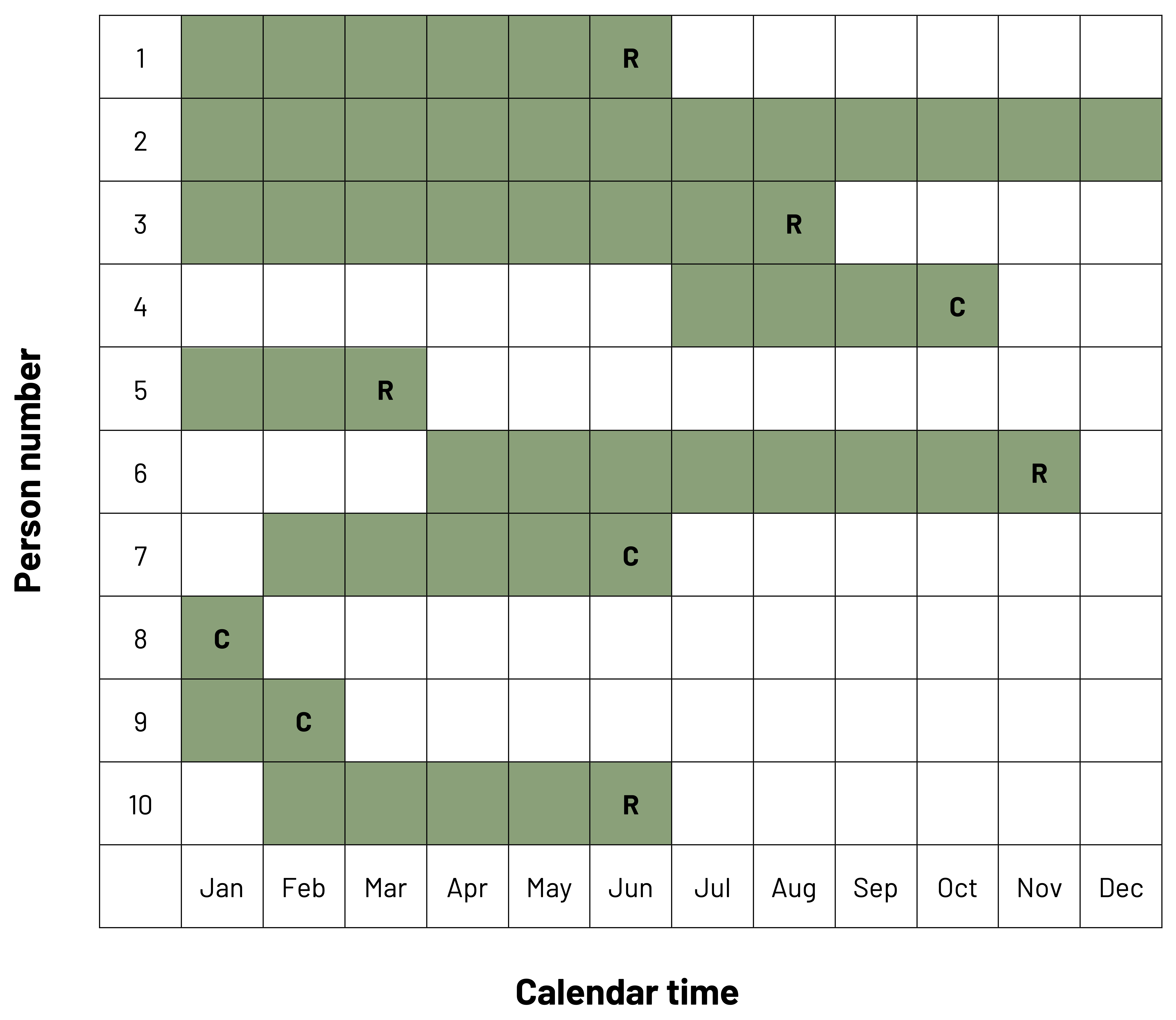
In figure 2.7, we can see a row for each of our 10 patients across the 12-month study period. We can see that some patients were enrolled in January, while others were enrolled later. Boxes that are shaded are the months the subject was in rehabilitation. The letter R denotes that the patient was released to normal activity. The letter C denotes that the patient was censored. In this example, we would calculate cumulative incidence for the patients that were released (the outcome of interest) and the cumulative survival (chance of remaining in the study without the outcome) for patients that were not released. Five patients were released and five patients were not released, so the cumulative survival is:

If we change the time scale to be months contributed to the study, we get figure 2.8.
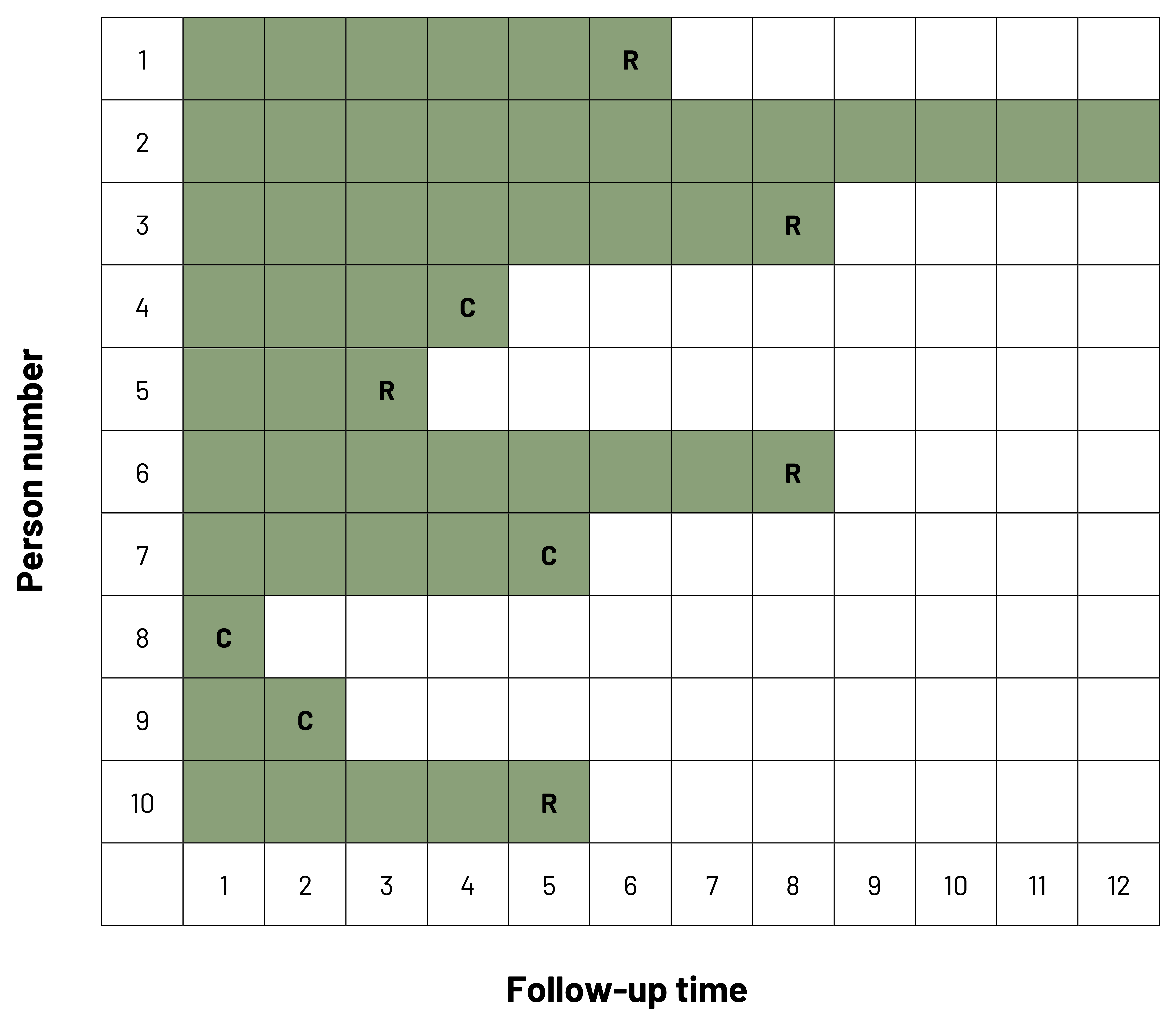
Note that the x-axis has changed from calendar time to follow-up time. Cumulative incidence can now be calculated for each individual time point in the study. For example, if we wanted to know the incidence of being released by the end of six months (time point 6), we see that, including that time point, three patients have been released and four have been censored.
Cumulative incidence:
Cumulative incidencetime point t 
Cumulative incidencetime point 6 
Cumulative survival:
Cumulative survivaltime point t 
Cumulative survivaltime point 6
There is a problem: we lost all of the data for the people that censored at or before time point 6! Our rules tell us that we must always take into account those that have censored. If we use the CLT approach, we choose to assume that everyone that censors during the time period contributes one-half the risk in the denominator. This method assumes that censoring happens uniformly throughout the period under study.
In action, this looks like:
Cumulative incidencetime point t 
Cumulative incidencetime point 6 
By the end of time point 6, 37.5 percent of patients had been released from rehabilitation to normal activity.
Cumulative survivaltime point t = 1-cumulative incidencetime point t
Cumulative survivaltime point 6 = 1-0.375 = 0.625 or 62.5 percent
Patients remaining in the study at the end of time point 6 had a 62.5 percent chance to remain in rehabilitation past this time point.
As we can see from these results and figures 2.7 and 2.8, the probability that a patient stays in rehabilitation changes over the study. Because the chance of finishing rehabilitation or staying in rehabilitation changes over the study period (e.g., because of weather changes, changes in rehabilitation site, or changes in other medical conditions), we may need to examine this problem over multiple intervals of time. With an infectious disease such as the flu or a cold, we expect to need to calculate the cumulative incidence based on seasons of the year.
2.3.1.2 Kaplan-Meier Method
The primary difference between the classic life table and K-M methods is that in the latter we calculate the incidence and survival every time there is an event (outcome). This allows us to give all participants full credit for their time in the study.
Looking at figure 2.8, we see that patients were released from rehabilitation in month 3, month 5, month 6, and month 7. We will use this information to calculate the conditional probability of the event/survival during the study observation period. In figure 2.9, we have six columns: the time points when events happen (A); the number of patients under observation in the study at that time point (B); the number of patients with an event at that time point (C); the probability of the event occurring (conditional on it being at that time point) (D); the probability of surviving (conditional on it being at that time point) (E); and the cumulative probability of surviving to that time point (F). Note that participants are included in the denominator until after the time point when the event occurred. As an example, at time point 3, patient 5 is included in the numerator and in the denominator because that person was in the study until that point; at time point 4, the patient is no longer included in the denominator.
| A | B | C | D = C/B | E = 1 - D | F |
|---|---|---|---|---|---|
| Time point | Number at risk | Number of events | Conditional probability of the event | Conditional probability of survival | Cumulative probability of survival |
| 0 | 10 | 0 | 0/10 = 0.000 | 1 - 0.000 = 1.000 | 1 |
| 3 | 8 | 1 | 1/8 = 0.125 | 1 - 0.125 = 0.875 | 1.000 x 0.875 = 0.875 |
| 5 | 6 | 1 | 1/6 = 0.167 | 1 - 0.167 = 0.833 | 0.875 x 0.833 = 0.729 |
| 6 | 4 | 1 | 1/4 = 0.250 | 1 - 0.250 = 0.750 | 0.729 x 0.750 = 0.547 |
| 7 | 3 | 2 | 2/3 = 0.670 | 1 - .670 = 0.330 | 0.547 x 0.330 = 0.181 |
Figure 2.9: Kaplan-Meier table.
The K-M Curve (figure 2.10) is used often in clinical studies to show the cumulative survival or the cumulative incidence in graphic form. Known for its “stair step,” the graph shows how the probability (y-axis) changes as time passes (x-axis). As we know from our previous figure/table as the study starts, the probability of being in rehabilitation is 100 percent. Every time a patient completes rehabilitation, the probability of being in rehabilitation (“step down” in red [top left to bottom right]) and the probability of finishing rehabilitation (“step up” in blue [bottom left to top right]) change. These two probabilities mirror each other, so display the graph that best depicts what you are trying to convey.
When using this method, it is important to recognize that if your study period is long, you do not see what are called secular trends, meaning changes in risk over time of your study that could be attributed to something else. You also need to make sure that censoring is independent of survival (i.e., those who censor have the same prognosis as those who remain in the study). If those who censor are for some reason different from those who remain (e.g., older or sicker), the results of your study will be biased. If censored observations have a worse prognosis than those in the study, the observed survival will be greater than the real answer. If censored observations have a better prognosis than those in the study, the observed survival will be lower than the real answer. See chapter 5 for more on bias.
2.3.2 Incidence Rate
In our previous examples discussing cumulative incidence, our population was fixed. More often, however, we have an open or dynamic population, such as the patients in a hospital, the population of a state, or the population of students at a university. Dynamic means that people can come in and out of the population (e.g., births, deaths, migration). In this case we typically use incidence rate (also known as incidence density). The incidence rate is a ratio, but it is not a proportion. The value can be from zero to infinity.
If you have a better-defined population, like a cohort of patients from a hospital where all have a specific diagnosis coming through the emergency department and each one of them participates a different amount of time, calculating incidence using person-time as the denominator is the best option. If you are looking at geographical-type areas, use the average population as the denominator. In this instance, the formula is:

The average population can be calculated one of two ways.
- Method 1
Using our previous example (figure 2.9), we started with 10 people in rehabilitation and finished with 1 in rehabilitation.
Average population = (10+1) / 2 = 11 / 2 = 5.5
In a different example, if our town had a ski resort and the population changed several times over the year to include seasonal workers or seasonal residents, we might have more population numbers to consider. If the population during ski season was 10,000, immediately after the season was 6,000, and during the summer was 8,000, we would calculate the denominator as follows:
Average population = (10,000 + 6,000 + 8,000) / 3 = 24,000 / 3 = 8,000
- Method 2
Average population = population at the beginning of the period –  events- censored
Using our original example (figure 2.9), we started with 10 people in rehabilitation, 5 people had the event of interest (getting out of rehabilitation), and 4 people censored.
Average population = 10 – (5) – (4) = 10 – 2.5 – 2 = 10 – 4.5 = 5.5
In our ski example, if 1,500 people were injured and 2,200 censored, we would calculate the denominator as follows:
Average population = 10,000 – (1,500) – (2,200) = 10,000 – 750 – 1,100 = 10,000 – 1,850 = 8,150
2.3.2.1 Person Time
Using person-time, or incidence based on how much time was contributed by participants, requires precise data from a very defined population. The denominator is calculated as how much time each person contributed to the study. For example, if we studied 5 people for 5 years, the 5 people would have contributed a total of 25 person-years to our study. If we studied 25 people for 1 year, the 25 people would have contributed a total of 25 person-years to our study. We then take this information to calculate our incidence rate (density):

We use person-time when we cannot determine the incidence of the event for individuals like we would with cumulative incidence but need a similar answer. We use the time unit (e.g., years, months, days) that is most relevant to the situation. For the time at risk, we assume the participant with the event provided half of the relevant time period before their outcome (e.g., if the time period is one year, the participant is assumed to have had the event at six months).
If we look at figure 2.11, we see a graphical representation of a study cohort over a four-month study period. At the beginning of the study, there are eight volleyball players on a team. We want to observe the incidence of shoulder injuries during the four-month period but only have team-level information. In the first month, one player gets a shoulder injury. In the second month, no player is injured. In the third month, four players get a shoulder injury. In the fourth month, no player is injured.
At the end of month 1 (example January 1 to January 31), the person-time contributed by the eight volleyball players is 7.5 months.
7 players uninjured → person-time = 7 x 1 = 7
1 player injured → person time = 1 x 0.5 = 0.5
The total person-time after 1 month = 7+0.5 = 7.5
The amount of person time contributed in month 2 (example February 1 to February 28) by the seven remaining uninjured players is seven months.
7 players uninjured → person-time = 7 x 1 = 7
The total person-time to this point is 14.5 months (7.5 + 7).
The amount of person time contributed in month 3 (example March 1 to March 31) by the seven remaining uninjured players is five months.
3 players uninjured → person-time = 3 x 1 = 3
4 players injured → person-time = 4 x 0.5 = 2
Total person-time added in month 3 = 3+2 = 5
The total person-time to this point is 19.5 months (14.5 + 5).
The amount of person-time contributed in month 4 (example April 1 to April 30) by the three remaining uninjured players is three months.
3 players uninjured → person-time = 3 x 1 = 3
The total person-time at the end of the study period (example January 1 to April 30) is 22.5 months (19.5 + 3).
There were a total of five injuries during the study period.
Incidence of shoulder injuries = 5 / 22.5 person-months = 0.22 injuries per person-month
or 2.67 injuries per person-year or 0.88 injuries per season
| Total no. of game athlete-exposures | Injuries, no. | Game injury rate per 1000 athlete-exposures | 95 percent confidence interval | Total no. of practice athlete-exposures | Injuries, no. | Practice injury rate per 1000 athlete-exposures | 95 percent confidence interval | |
|---|---|---|---|---|---|---|---|---|
| Division I | ||||||||
| Preseason | 114528 | 803 | 7.01 | 6.53, 7.50 | 4903695 | 35710 | 7.28 | 7.21, 7.36 |
| In season | 1963708 | 31883 | 16.24 | 16.06, 16.41 | 7305903 | 17502 | 2.4 | 2.36, 2.43 |
| Postseason | 89610 | 849 | 9.47 | 8.84, 10.11 | 390538 | 622 | 1.59 | 1.47, 1.72 |
| Total division I | 2167846 | 33535 | 15.47 | 15.30, 15.63 | 12600136 | 53834 | 4.27 | 4.24, 4.31 |
| Division II | ||||||||
| Preseason | 56590 | 356 | 6.29 | 5.64, 6.94 | 2290173 | 14696 | 6.42 | 6.31, 6.52 |
| In season | 1017991 | 13855 | 13.61 | 13.38, 13.84 | 3138541 | 7013 | 2.23 | 2.18, 2.29 |
| Postseason | 45747 | 388 | 8.48 | 7.64, 9.33 | 146101 | 179 | 1.23 | 1.05, 1.40 |
| Total division II | 1120328 | 14599 | 13.03 | 12.82, 13.24 | 5574815 | 21888 | 3.93 | 3.87, 3.98 |
| Division III | ||||||||
| Preseason | 115725 | 562 | 4.86 | 4.45, 5.26 | 3502829 | 20545 | 5.87 | 5.79, 5.95 |
| In season | 1754358 | 22940 | 13.08 | 12.91, 13.25 | 5472374 | 12625 | 2.31 | 2.27, 2.35 |
| Postseason | 85831 | 680 | 7.92 | 7.33, 8.52 | 252727 | 268 | 1.06 | 0.93, 1.19 |
| Total division III | 1955914 | 24182 | 12.36 | 12.21, 12.52 | 9227930 | 33438 | 3.62 | 3.58, 3.66 |
| All divisions | ||||||||
| Preseason | 286843 | 1721 | 6 | 5.72, 6.28 | 10696697 | 70951 | 6.63 | 6.58, 6.68 |
| In season | 4736057 | 68678 | 14.5 | 14.39, 14.61 | 15916818 | 37140 | 2.33 | 2.31, 2.36 |
| Postseason | 221188 | 1917 | 8.67 | 8.28, 9.05 | 789366 | 1069 | 1.35 | 1.27, 1.44 |
| Total | 5244088 | 72316 | 13.79 | 13.69, 13.89 | 27402881 | 109160 | 3.98 | 3.96, 4.04 |
| Wald X2 statistics from negative binomial model: game injury rates differed among divisions (p < .01) and within season (p < .01). Practice injury rates differed among divisions (p < .01) and within season (p < .01). Postseason sample sizes are much smaller (and have a higher variability) than preseason and in season sample sizes because only a small percentage of schools participated in the postseason tournaments in any sport and not all of those were a part of the injury Surveillance System sample. Numbers do not always sum to totals because of missing division or season information. Spring football data are not included here. | ||||||||
Figure 2.12: Game and practice injury rates, 15 Sports, National Collegiate Athletic Association (1988–1989 through 2003–2004).
In SRI research, person-time is often referred to as an athlete-exposure. Figure 2.12 is an example of the use of person-time in the NCAA Injury Surveillance Study to calculate the rates of game and practice injuries from the 1988–1989 academic year through the 2003–2004 academic year.[6] Because of the number of players and the lack of the ability to count precisely how much time each individual athlete is present for a game or a practice and how much time each spends at said event actually playing instead of not being active, being present at the event and on the roster that day counts as an exposure. Athletic-training and clinician records are often used to count the number of injuries that occurred and when they occurred for the numerator. In figure 2.12, for example, we see that for Division III sports, there were 115,725 athlete-exposures and 562 injuries during games in the preseason. Using our formula for calculating person-time and 1000 as a multiplier, we find the following:
Game injury rate =  x 1000 = 0.00486 x 1000 = 4.86 game injuries per 1000 athlete-exposures in Division III sports
2.4 Dynamics of Disease
2.4.1 Demographic Transition
The demographic transition refers to the change in population makeup due to births, deaths, and migration. Populations move from high births and high death rates from a time before the Industrial Revolution to low birth rates and low death rates due to factors such as improved economic conditions, sanitation, and better health care. This change occurs as a population (e.g., a country) moves from being agrarian to postindustrial. The demographic transition is important in clinical medicine because as we become more dependent on industry and richer as a population, our birth rate decreases, people live longer so the death rate decreases, and the population as a whole starts to decrease in size. Figure 2.13 displays the transition using population pyramids.[7]
Figure 2.14 shows how this transition has occurred in five countries. As we can see, from 1820 where the x axis starts through 2010 where it ends, the population size has increased for all countries, but each has a slightly different pattern of how births and deaths occurred. However, in all cases, the births and deaths eventually fell, and yet the overall population size remained high because people lived longer.
Despite overall population growth, the demographic transition also means that populations will stop growing and eventually start falling. This can be seen in figure 2.15. There are lines for the least developed countries, less developed regions, and more developed regions. We can see that from 1950 to the present day, the population growth rate for all three countries has dropped and then slightly leveled out. It is predicted that the rates will continue to drop through the end of the century.
2.4.2 Epidemiologic Transition
The epidemiologic transition is an extension of the demographic transition and refers to how as countries transition from being more agrarian to more industrial, the causes of their deaths tend to change as well. In more agricultural societies and when populations have high rates of births and deaths, the causes of death tend to be infectious diseases and complications from reproduction. As populations become more industrial and even postindustrial, the advent of better sanitation, health care, transportation, and so on allows for improvements in care to reduce the burden of infectious diseases and reproductive outcomes. As people live longer, they become more susceptible to noncommunicable diseases and injury such as heart disease and falls. The originator of the epidemiologic transition theory,[8] Dr. Abdel Omran, has published in length about this idea (see figures 2.16 and 2.17).
In figure 2.16, we can see all of the dynamics that feed into the epidemiologic transition and how it is built on top of the demographic transition.
In figure 2.17, we can see the movement of the preventable disease burden over time and how this impacts what we see in the clinical space.
2.4.3 Epidemic Curve
One mechanism used to examine disease in populations, particularly infectious diseases, is the epidemic curve (epi curve). An epi curve is a visual display of the onset of illness among cases associated with an outbreak.
You can learn a lot about an outbreak from an epi curve,[9] such as:
- The outbreak’s time trend; that is, the distribution of cases over time
- Outliers; that is, cases that stand apart from the overall pattern
- General sense of the outbreak’s magnitude
- Inferences about the outbreak’s pattern of spread
- The most likely time period of exposure
In an epi curve, the x-axis represents the time frame of interest. Depending on the condition, this time frame might need to be minutes, hours, days, weeks, months, or even years. The y-axis is the incidence of cases of disease. This scale depends on how many cases exist. In figure 2.18, example B shows what we might see if we plot a disease that occurs sporadically, like Creutzfeldt-Jakob Disease. Example C shows what we might see with an endemic disease. In the United States, an example of an endemic disease is influenza. Example D shows us what an epidemic disease that is spread from a single source looks like if we were to plot the cases like foodborne illness from a potluck. This is different from epidemic disease with a propagating source (Example E). In these types of epidemics, the initial wave of disease propagates (i.e., is the source of) the following cases of disease. An example would be a measles outbreak in the United States.
Figure Descriptions
Figure 2.2: Triangle representing ratios with consideration of population size and strength of evidence. Size of population affected is larger as triangle widens at bottom. Strength of evidence is weaker as triangle widens at bottom. From top to bottom. 1:1 (mortality=2645), 25:1 (hospitalizations=67301), 363:1 (emergency room visits=959278), 73:1 (treatment by non-ED physicians=192200), 295:1 (functional impairment=1310500), 729:1 (number of injuries causing functional impairment*=1928000), 3646:1 (total population 12 and older=9642760). Return to figure 2.2.
Figure 2.7: Boxed table with calendar time on x-axis and person number on y-axis. Each row is shaded and labeled with respect to when the person was enrolled, censored, or released from (completed) rehabilitation. Across twelve months, shading of each person’s participation is staggered based on different enrollment and release times. Return to figure 2.7.
Figure 2.8: Boxed table with follow up time on x-axis and person number on y-axis. Each row is shaded and labeled with respect to when the person was censored or released from (completed) rehabilitation. Exact enrollment time in this table is negligible. Follow-up time simply tracks the total length (in months) of participation in rehabilitation. Return to figure 2.8.
Figure 2.10: Graph with duration (0-12) on the x-axis and probability on the y-axis. A red line shows originates at 100% at duration 0 and decreases over duration, ending at the bottom right. A blue line starts at 0% at duration 0 and increases over duration, ending at the top right. The lines intersect at duration 8. Return to figure 2.10.
Figure 2.11: At start (Ex: Jan 1), 8 people in figure are all shaded black. Between the first and last day of the first month, one player had a shoulder injury. At end of month 1 (Ex: Jan 31), 1 of these people is shaded green, indicating a new case. Between the first and last day of the second month, no players were injured. At end of month 2 (Ex: Feb 28), 7 people are shaded black. Between the first and last day of the third month, four players had shoulder injuries. At end of month 3 (Ex: Mar 31), 3 people are shaded black and 4 people are shaded green. Between the first and last day of the fourth month, no players were injured. At end of month 4 (Ex: Apr 30), the 3 remaining people are shaded black, and are uninjured (no new cases). Return to figure 2.11.
Figure 2.13: Stages 1 through 5, from left to right, depicting birth and death rates for each stage. In Stage 1, birth and death rates are high and equivalent. In Stage 2, birth rates are higher than death rates, which are rapidly decreasing. In Stage 3, birth rates are rapidly falling and death rates are more steadily declining. In Stage 4, birth rates are falling but death rates have stabilized. In Stage 5, there is little change. Across Stages 1-4, the total population increases, until Stage 5, in which total population may rise or fall. Natural increase is shaded gray and depicts the gap between birth and death rates. Below demographic transition model, five population pyramids with men on the left half and women on the right half, depicting the spread of the population across sexes in each stage. Stage 1-3 population pyramids are triangular, and round out at Stage 4 and 5. Return to figure 2.13.
Figure 2.14: Graph with years from 1820 to 2010 on x-axis, birth and death rates (per 1,000 per year) on left y-axis, and total population (in millions) on right y-axis. From top to bottom, countries included are Germany, Sweden, Chile, Mauritius, and China. For each country, total population is represented by a yellow line, birth rate by a green line, and death rate by a red line. Total population increases over time in all 5 countries, but the transitions are represented by the interaction between birth and death rates which varies from country-to-country. In Germany, Birth and death rates were above the total population from 1820 to around the 1900s, after which the death rate line falls below the total population, as does birth rates around 1912. Both the birth and death rates remain below the total population line for the remainder of the time. Return to figure 2.14.
Figure 2.15: Years on x-axis from 1950 to 2099. Growth rate expressed as percentage on y-axis from 0% to 2.5%. Least developed countries and less developed regions have a consistently higher population growth rate than more developed regions. All 3 population growth rates are predicted to decline drastically by 2099. Return to figure 2.15.
Figure 2.16: Flow chart with epidemiological stages and transitions. Stage 1 is indicated by Pestilence and famine, 2 is Overlap of stages with receding pandemics, 3 is Overlap of stages with degenerative, stress and man-made diseases, 4 is Merging with declining CVD mortality, ageing, and emerging diseases, and 5 is Future stages with aspired quality of life with persistent inequalities. On the left, the flow chart begins with socio-economic development and/or industrialization followed by two key epidemiological transition models. On the top, Health transition is preceded by determinants of disease and morality changes, which is part of the lifestyle and education transition. Health transition is defined as changing patterns of health, survival, disease, and mortality. Then, as part of technological transitions and environmental factors, Health transition moves towards continued dynamic change with chronicity plus emerging diseases, and decline in CVDs in West (actual) or non-western models (potentially). On the bottom, Demographic transition is preceded by determinants of fertility decline, which is part of the lifestyle and education transition. Demographic transition is characterized by high fertility followed by decline, as well as changes in age structure from young to old. In technological transition and influence from environmental factors, this shifts towards ageing. Both Health transition and Demographic transitions affect the quality of life for all, the final arrow in the flow chart. Flow of the Transition can be disrupted or reversed under crises or the Transition may accelerate under strikingly favorable conditions. Return to figure 2.16.
Figure 2.17: Timeline with three time periods. First period: Before 20th and early 20th century when life expectancy was about 30. A time of preventable disease burden. Old set of morbidity: communicable disease (epidemics and endemics), reproductive morbidity and mortality, nutritional deficiency, poor sanitation and housing, poor personal hygiene, high child mortality, high Disability Adjusted Life Years Lost (DALYS) due to early death, and poverty. Second time period: 1940-1960/70 when life expectancy was 30-45. A transitional period with rapid change since the mid 20th century and a recession of epidemics. Third time period: 1960/70-2050+ when life expectancy is 45-70+. A time of triple health burden. 1: Unfinished old set (communicable disease, reproductive morbidity, nutritional deficiency, rapid population growth). 2: Rising new set (cardiovascular disease, malignancy and diabetes, stress/depression, ageing and diseases of the elderly, accidents from traffic, work, etc., emerging and resurgent diseases). 3: Lagging health care (health systems and medical training ill-suited for the rising chronic and continuing acute diseases plus long-term care for the ages, the disabled, and the mentally ill). Return to figure 2.17.
Figure 2.18: 5 graphs with time on the x-axis and incidence on the y-axis. A: general example with days on x-axis and morbidity on y-axis (incidence is low until mid-way, incidence spikes very high and then slowly over time decreases). B: sporadic disease spread (four random incidences over time, all with a low incidence value). C: endemic (over time incidence rises and falls slightly but is never at zero and is never very high). D: epidemic point source (standard bell curve; incidence rises in the middle and tapers off left and right). E: epidemic propagating (over time incidence rises and falls slightly and then at a certain time continues to rise and never fall). Return to figure 2.18.
Figure References
Figure 2.2: Deaths to injury severity ratio example. Kindred Grey. 2022. Adapted under fair use from Sahai VS, Ward MS, Zmijowskyj T, Rowe BH. Quantifying the iceberg effect for injury: Using comprehensive community health data [published correction appears in Can J Public Health. 2006 Jan-Feb;97(1):34]. Can J Public Health. 2005;96(5):328–332. DOI:10.1007/BF03404025
Figure 2.3: The bathtub of prevention. Graphic by Kindred Grey. 2022. CC BY 4.0. Table data adapted under fair use from USMLE First Aid, Step 1.
Figure 2.6: Prevalence and incidence summary table. Adapted under fair use from table 2 of An Introduction to Veterinary Epidemiology by Mark Stevenson (2008).
Figure 2.7: Classic life table (calendar time). Kindred Grey. 2022. CC BY 4.0.
Figure 2.8: Classic life table (follow-up time). Kindred Grey. 2022. CC BY 4.0.
Figure 2.10: Kaplan-Meier curve. Kindred Grey. 2022. CC BY 4.0.
Figure 2.11: How to calculate incidence using person-time. Kindred Grey. 2022. CC BY 4.0.
Figure 2.12: Game and practice injury rates, 15 sports, National Collegiate Athletic Association (1988–1989 through 2003–2004). Data from Hootman JM, Dick R, Agel J. Epidemiology of collegiate injuries for 15 sports: Summary and recommendations for injury prevention initiatives. J Athl Train. 2007;42(2):311–319.
Figure 2.13: The five stages of the demographic transition. Kindred Grey. 2022. CC BY-SA 4.0. Adapted from Roser M. Demographic-TransitionOWID, from WikimediaCommons (CC BY-SA 4.0).
Figure 2.14: The demographic transition in five countries. Roser M. CC BY 4.0. From OurWorldinData.
Figure 2.15: Population growth rate by level of development. Roser M, Ritchie H, Ortiz-Ospina E, Rodés-Guirao L. World Population Growth. 2013. CC BY 4.0. Published online at OurWorldInData.org.
Figure 2.16: The epidemiologic transition dynamics. Kindred Grey. 2022. CC BY-NC-SA 3.0 IGO. Adapted from Omran AR. The epidemiologic transition theory revisited thirty years later. World Health Stat Q. 1998;53 (2, 3, 4), 99–119. World Health Organization. (CC BY-NC-SA 3.0 IGO)
Figure 2.17: Transition stages in the developing countries. Kindred Grey. 2022. CC BY-NC-SA 3.0 IGO. Adapted from Omran AR. The epidemiologic transition theory revisited thirty years later. World Health Stat Q. 1998;53 (2, 3, 4), 99 –119. World Health Organization. (CC BY-NC-SA 3.0 IGO)
Figure 2.18: Examples of epidemic curves. Kindred Grey. 2022. CC BY 4.0.
- Sorenson SB. Gender disparities in injury mortality: Consistent, persistent, and larger than you'd think. Am J Public Health. 2011;101 (Suppl 1):S353–358. ↵
- Wörner T, Clarsen B, Thorborg K, Eek F. Elite ice hockey goalkeepers have a high prevalence of hip and groin problems associated with decreased sporting function: A single-season prospective cohort study. Orthop J Sports Med. 2019;7(12) https://doi.org/10.1177/2325967119892586 ↵
- Wörner T, Clarsen B, Thorborg K, Eek F. Elite ice hockey goalkeepers have a high prevalence of hip and groin problems associated with decreased sporting function: A single-season prospective cohort study. Orthop J Sports Med. 2019;7(12) https://doi.org/10.1177/2325967119892586 ↵
- Harmon KG, Asif IM, Maleszewski JJ, et al. Incidence, cause, and comparative frequency of sudden cardiac death in National Collegiate Athletic Association athletes: A decade in review. Circulation. 2015;132(1):10–19. ↵
- Bhopal RS. Concepts of Epidemiology: Integrating the Ideas, Theories, Principles, and Methods of Epidemiology. 2nd ed. Oxford University Press; 2008. https://doi.org/10.1093/acprof:oso/9780199543144.001.0001 ↵
- Hootman JM, Dick R, Agel J. Epidemiology of collegiate injuries for 15 sports: Summary and recommendations for injury prevention initiatives. J Athl Train. 2007;42(2):311–319. ↵
- Roser M, Ritchie H, Ortiz-Ospina E. World population growth. https://ourworldindata.org/population-growth. Published 2013. Accessed 2022. ↵
- Omran AR. The epidemiologic transition: A theory of the epidemiology of population change. Milbank Mem Fund Q. 1971;49(4):509–538. ↵
- Centers for Disease Control and Prevention. Quick-Learn Lesson: Create an Epi Curve. https://www.cdc.gov/training/quicklearns/createepi/index.html. Published 2021. Accessed September 12, 2023. ↵
