4 Diagnostics and Screening
Diagnostic and screening tests are primary and secondary prevention tools (see section 1.1).
What do we use them for?
- Determine whether a patient is likely to have a disease or condition
- Diseased vs nondiseased
- Positive vs negative
- High vs low risk
- Exposed vs unexposed
- Describe the burden of the disease or condition in the population (prevalence)
In clinical medicine, diagnostic and screening tests help us answer three questions:
- How do we treat individual patients?
- How does the test we use in our study affect the results of the study?
- In the study we’re reviewing, did false positives and false negatives bias the results?
One possible problem with diagnostic and screening tests is that they could be incorrect or give false results. Errors can result in patients being treated when they do not need it or not getting treatment when they do. It also can result in decisions that are not reversible (e.g., selective abortion for a birth defect, suicide for a positive HIV test) and may not be acceptable to the population being served.
4.1 Screening Tests
Screening for disease is the presumptive identification of unrecognized disease or defects by the application of tests, examinations, or other procedures that can be applied rapidly. Positive screening results are followed by diagnostic tests to confirm actual disease. For example, if a newborn tests positive during phenylketonuria (PKU) screening at birth, the phenylalanine loading test is used next to confirm the presence of PKU. Common screening tests include the pap smear, mammogram, blood pressure screening, cholesterol testing, vision tests, and urinalysis. When we conduct screening for disease, there are three very important considerations we should make: the social, scientific, and ethical impacts.
Social
- The health problem should be important for the individual and the community.
- Diagnostic follow-up and intervention should be available to all who require them.
- There should be a favorable cost-benefit ratio.
- Public acceptance must be high.
Scientific
- The natural history of the condition should be adequately understood. This knowledge permits identification of early stages of disease and appropriate biologic markers of progression.
- A knowledge base exists for the efficacy of prevention and the occurrence of side effects.
- Prevalence of the disease or condition is high.
Ethical
- The program can alter the natural history of the condition in a significant proportion of those screened.
- Always ask yourself if you can do anything about changing the course of disease. If not, there is a potential that the screening does more harm than good.
- There should be suitable and acceptable tests for screening and diagnosis of the condition as well as acceptable, effective methods of prevention.
Example: Screening
An example screening program: ECG for athletes to detect heart issues prior to participation[1] during a preparticipation screening.
4.2 Characteristics of a Good Screening Test
A screening test should be
- Simple—easy to learn and perform.
- Rapid—quick to administer; results available rapidly.
- Inexpensive—good cost-benefit ratio.
- Safe—no harm to participants.
- Acceptable—to target group.
A test may not meet all five criteria, but this should be a goal.
Example: ECG screening
- Simple[2]: Programs exist to teach someone how to be an ECG technician, and skills are also included in clinical training for doctors and nurses. All cardiologists can perform this test.
- Rapid[3]: Takes less than 10 minutes, including the time to attach and detach electrodes from the body. Results are often available within 24 hours.
- Inexpensive: Good cost-benefit ratio for people with greater than low risk for heart issues. Poor cost-benefit ratio for people with low risk for heart issues. More data is needed[4] because the costs depend on insurance but are often less than $300.
- Safe: Risks[5] are minimal and rare.
- Acceptable: Noninvasiveness helps to make the screening acceptable.
4.3 Validity and Reliability
When it comes to screening tests or measurements, we are concerned with validity and reliability. Internal validity is accuracy. It describes the ability of a measuring instrument to give a true measure. Internal validity can be evaluated only if an accepted and independent method for confirming the test measurement exists. This accepted and independent method is known as a gold standard. Reliability is precision. It describes the ability of a measuring instrument to give consistent results on repeated trials. When we are measuring the reliability over these repeated measures, we are looking for the degree of consistency among repeated measurements of the same individual on more than one occasion.
In figure 4.1, we see information about precision (reliability) and accuracy (validity). Under the column visual representation, we see four dartboard targets. Our first row, Precision, contains two targets. In each of these, the darts have been thrown in such a way that they are clustered together. These were hit in the same place over and over—they were thrown precisely. In the second row, Accuracy, you see two additional targets. In the first, the darts were not only thrown precisely but they were also thrown accurately at the bull’s-eye. This is a visual representation of what we would like our research to be: precise and accurate. The last target shows us an example of throwing darts that neither land in the sample place (not precise) nor land at the bull’s-eye (not accurate). This is a visual representation of exactly what we do not want to happen in research.
| Mnemonic device | What it is | Things to remember | Visual representation | |
|---|---|---|---|---|
| Precision | Precision = Reliability, Reproducibility | • The consistency and reproducibility of a test • The absence of random variation in a test |
• Random error ↓ precision in a test • ↑ precision →↓ standard deviation • ↑ precision →↑ statistical power (1-β) |
 |
| Accuracy | Accuracy = Validity | • The closeness of test results to the true values • The absence of systematic error in a test |
Systematic error ↓ accuracy in a test |  |
Figure 4.1: Precision and accuracy.
What are some of the things that cause a measure to not be reliable or not be valid?
Measurement bias is when we have constant errors that are introduced by a faulty measuring device. This tends to reduce the reliability of measurements. An example of this is a miscalibrated blood pressure manometer.
The halo effect is the influence upon an observation of the observer’s perception of the characteristics of the individual observed. This includes the influence of the observer’s recollection or knowledge of findings on a previous occasion. An example of this is when a health provider tends to rate a patient’s sexual behavior use in a particular manner based on the provider’s opinion about the patient’s characteristics without obtaining specific information concerning current or past sexual behavior.
Social desirability is when a respondent answers questions in a manner that agrees with socially desirable norms. An example would be when teenage boys respond to a screening interview about sexual behavior by exaggerating their frequency of sexual activities because that might be perceived as socially desirable or cool among their peer groups.
4.4 Measuring Validity and Reliability
When we want to measure the validity of a measuring tool (including screening tests), we use four different measures: sensitivity, specificity, positive predictive value, and negative predictive value. It is helpful to use a table when calculating these measures. This table looks similar to the 2×2 table in chapter 3. In figures 4.2 and 4.3, the columns represent the results that the gold standard provides, and the rows represent the results that the new (or comparison) test provides. The table itself helps us calculate how well the test works. If a person is diseased (figure 4.4), our goal is for the test to correctly tell us this. The better the test does, the higher our sensitivity (defined below). The better the test is, the more certain we are that if someone tests negative they do not have the disease, so we say that high sensitivity helps us rule out disease. We simultaneously hope for the test to correctly tell us someone does not have the disease. The better the test does at this, we say the higher the specificity. The higher the specificity, the more we feel we can rule in disease if someone tests positive. We must balance the two items to make the best test possible, but as noted below, sometimes we sacrifice one to improve the other.
| Definition | Calculation | |
|---|---|---|
| Sensitivity (true-positive rate) | The percent of positives identified by the screening tests that are truly positive. The higher this number, the more people we have correctly identified as having the outcome. It is calculated as the number of true positives (TP) over all tests that are positive according to the gold standard (TP+FN). |  |
| Specificity (true-negative rate) | The percent of negatives identified by the screening test that are truly negative. The higher this number, the more people we have correctly identified as not having the outcome. It is calculated as the number of true negatives (TN) over all tests that are negative according to the gold standard (FP+TN). |  |
| Positive predictive value (PPV) | The percent of positive results from the screening test that are true positives (TP). It is calculated as the number of TP over all tests that are positive according to the screening test (TP+FP). |  |
| Negative predictive value (NPV) | The percent of negative results from the screening test that are true negatives (TN). It is calculated as the number of TN over all tests that are negative according to the screening test (FN+TN). |  |
Figure 4.5: Properties of validity tests.
Sensitivity and specificity are fixed properties of a test. They let us know how good a test is. No matter when the test is run, the sensitivity and the specificity will always be the same.
Looking at figure 4.6, there are two bell curves: one for patients without the disease (negatives) and those with the disease (positives). The black dotted line indicates the perfect balance of sensitivity and specificity—neither is 100 percent, but we have minimized both the number of false positives and the number of false negatives. If we move that dotted line to the left, we are increasing the number of positive cases that we identify (increase of sensitivity) at the expense of specificity. We have more false positives, but we are also doing a good job at ruling out disease. If we have a disease of high consequence like HIV or cancer, we want our test to have a really high sensitivity because we do not want to miss any possible cases. This does mean that some people will get false positives, so it is helpful to have a secondary test for verification. In the case of HIV, often people undergo rapid tests, and, if positive, then we will run confirmatory blood tests.
SnNOUT: When a highly Sensitive test is NEGATIVE, it rules OUT disease.
If we move the dotted line to the right, we increase specificity at the expense of sensitivity. Specificity should be high for a screening test, but this can vary depending on whether you can afford a lot of misdiagnoses. If there is low stigma about a condition or the treatment is fairly benign, misdiagnoses are more acceptable to the population. For example, if you tell a patient who has a broken leg that it is not broken, harm can happen, and that is not acceptable. But if you tell a patient who does not have a broken finger that it needs to be splinted, the harm may be minimal: you can verify that it is not actually broken, and the splint can be removed. Highly specific tests are good at ruling in disease.
SpPIN: When a highly Specific test is POSITIVE, it rules IN disease.
Whereas sensitivity and specificity are fixed, PPV and NPV vary depending on disease prevalence in the population being tested. PPV and NPV let us know how to interpret our patient’s test results.
- If prevalence of the disease is high, PPV is high and NPV is low.
- If prevalence of the disease is low (rare disease), PPV is low and NPV is high.
Beyond just sensitivity and specificity, it is important to know how much more likely a particular test result is going to be for people with the disease compared to those without the disease. This is called the likelihood ratio (figure 4.7). We can calculate the likelihood that a person with the disease tests positive compared to someone without the disease (LR+) and the likelihood that a person with the disease tests negative compared to someone without the disease (LR-). A LR+ that is greater than 10 indicates that the test is highly specific (very good at picking up negatives), whereas a LR- value of less than 0.1 indicates a highly sensitive test (very good at picking up positives). This is very important in clinical decision making.[6]

Further reading
SpPIN and SnNOUT are great mnemonic devices for remembering how to rule disease in or out, however there are caveats about using them in reality. This article by Pewsner et al. demonstrates how careful you should be when applying these principles.[7]
How do you improve sensitivity and specificity?
- Retrain the people doing the measurements. This reduces the amount of misclassification in tests that require human assessment.
- Recalibrate the screening instrument. This reduces the amount of imprecision in tools like scales.
- Use a different test.
- Use more than one test.
- Use visuals to help participants choose the answer that is valid for them.
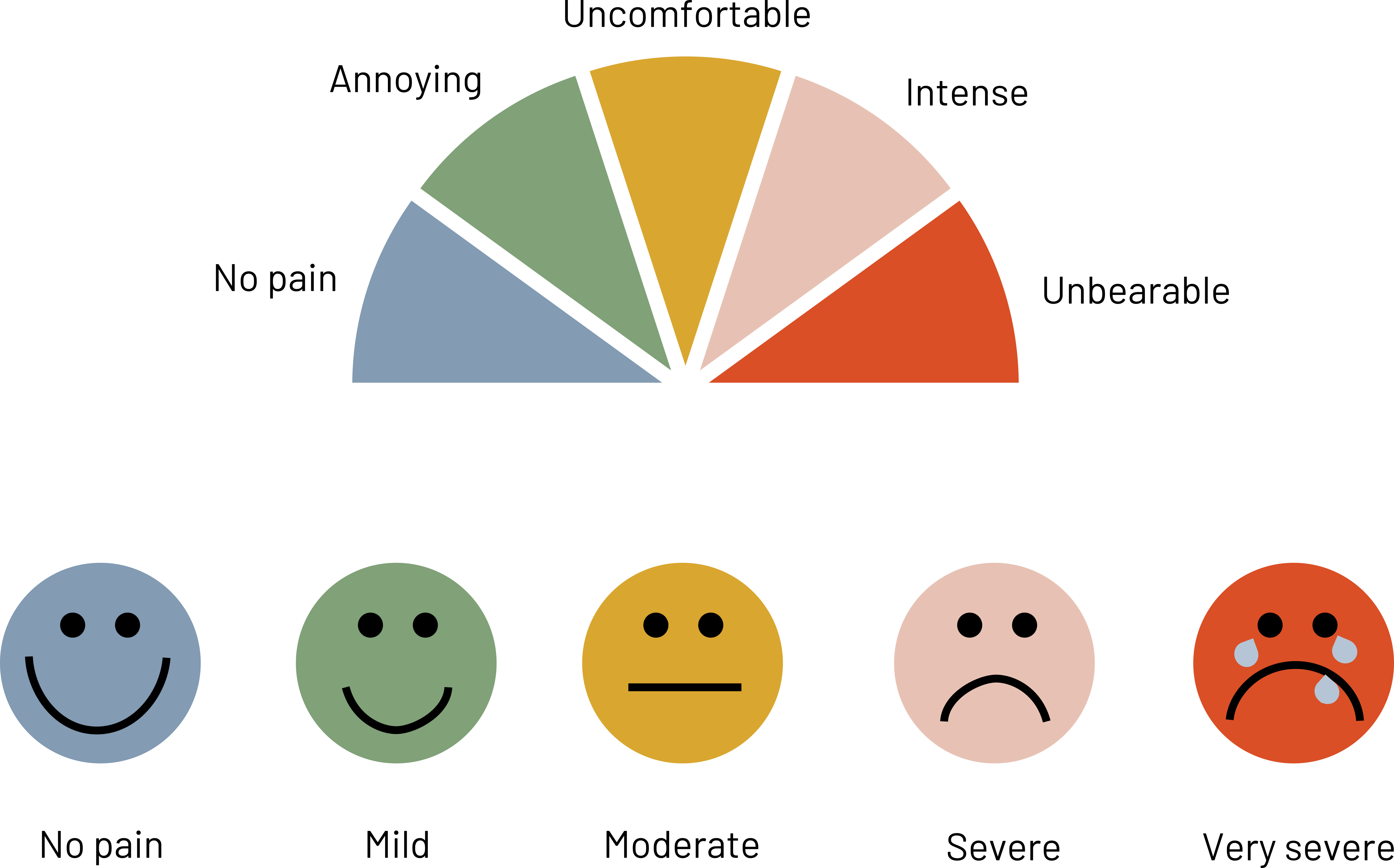
Figure 4.8 shows examples of visuals that are more useful when trying to measure responses from patients because they remove some of the variability caused by subjective topics like pain.
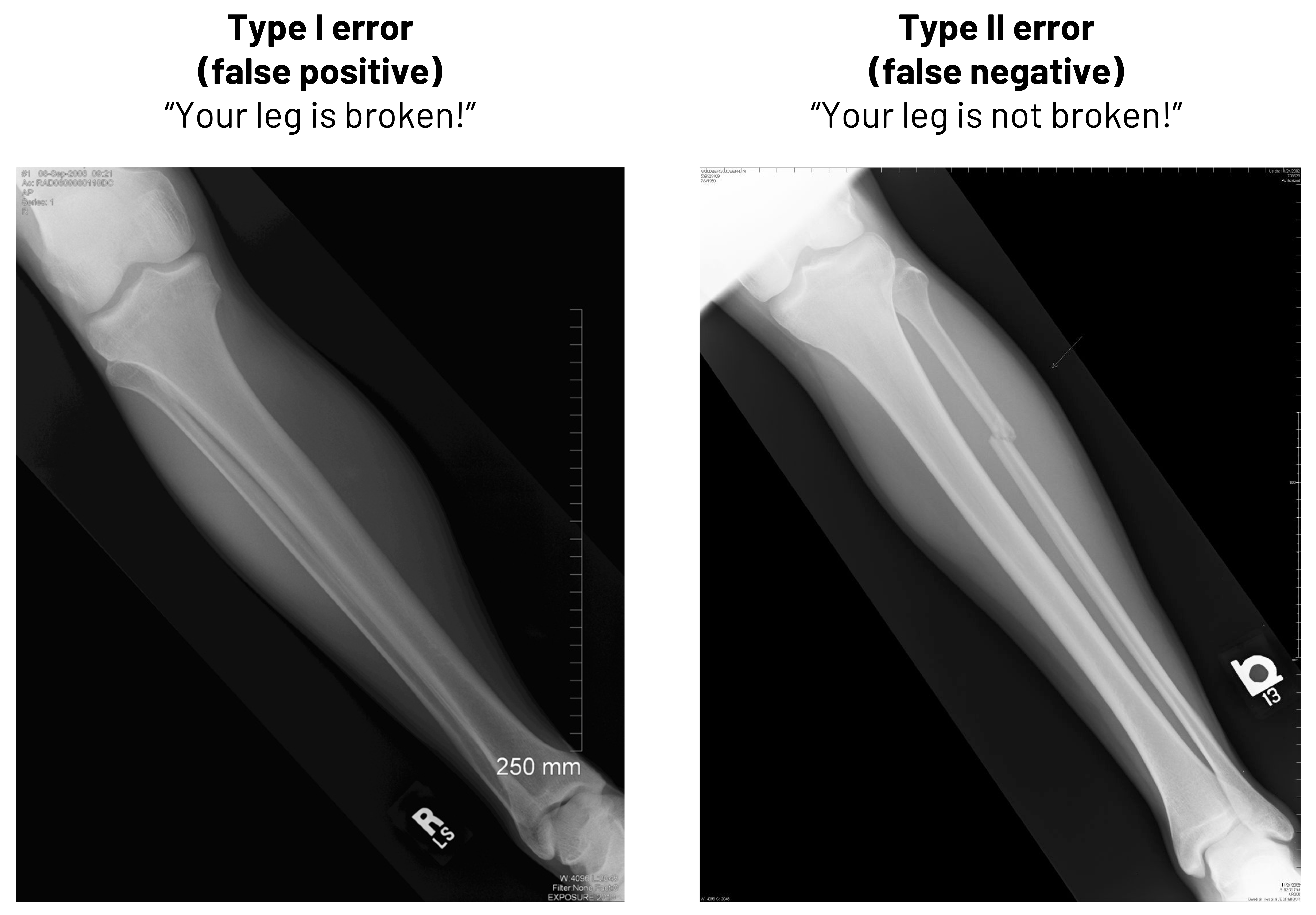
Besides thinking in terms of calculations, it is important to know why false positives and false negatives are important in clinical medicine. In figure 4.9, we see two radiographs. In one, there is no deformity of the bone. If we told that patient they had a broken leg, we would be committing what is known as a Type I error (false positive). We need to either improve how we read the radiographs to stop making this type of mistake or we need to change who is reading them to avoid this mistake. In the second image, there is deformity of the bone. If we told that patient that they did not have a broken leg, we would be committing what is known as a Type II error (false negative). While the method we use to improve the chance we do not make a Type I error is the same as we might use in this case to not make a Type II error, the result of our error here would be more egregious: the patient clearly has a broken leg, and we would be delaying treatment. The patient may lose trust in the practitioner or, worse, suffer further damage.
Example: PPV and NPV of the ImPACT Assessment[8]
If we want to see a real example of how the PPV and the NPV are used in clinical medicine, we can take a look at the ImPACT (Immediate Post-concussion Assessment and Cognitive Testing) tool. This tool is used to help identify whether athletes have post-concussive abnormalities after injury or not. Is this tool important in the arsenal against returning athletes to play too soon?
In a study of 122 athletes diagnosed with concussion and 70 athletes without recent concussion:
- 93 percent of athletes with a reliable increase in symptoms actually had concussion (PPV)
- 1 percent of athletes without a reliable increase in symptoms had a concussion (59 percent NPV)
How would you interpret these numbers?
Further reading
What kind of performance did RT-PCR have to detect SARS-CoV-2 in a hospital setting in 2020?[9]
How does the King-Devick test perform to identify concussion in collegiate athletes?[10]
4.5 Sources of Bias in Screening
There are several sources of bias in screening. Lead time bias is the perception that the screen-detected case has longer survival because the disease was identified early. Length bias is particularly relevant to cancer screening because tumors identified by screening are slower growing and have a better prognosis. Selection bias is when we make errors in how we select who is in our study. Because motivated participants (e.g., those with prior injury history) have a different probability of disease than do those who refuse to participate (e.g., those that have never been injured), we get biased study results.
| Type | Definition | Examples | Strategies to reduce bias |
|---|---|---|---|
| Selection bias | Incorrectly picked the population to study. Results in a nonrepresentative study group. | Women and men with a family history are more likely to volunteer for a breast cancer study than people without a family history. These two groups have differing levels of risk. | • Randomize • Be strategic in where and how you recruit participants • Make sure your study population is representative of the group you want to make an inference about even if it means that you turn volunteers down • Example: Select patients with family history and some without and include family history as a part of the study to see the impact it makes on your answer |
| Lead-time bias | When earlier detection of the disease looks like it leads to increased survival over those that were not diagnosed earlier. | Two patients die at 68 years old of lung cancer. One was diagnosed at 50 with screening and the other started being symptomatic at 65. | • Adjust the survival time based on how severe disease is at the time of diagnosis. • Example: Patient A was Stage 1 at the time of diagnosis and Patient B was Stage 4 at the time of diagnosis. Find out whether each patient’s length of survival was appropriate for the stage at diagnosis. |
| Length-time bias | Screening is more effective if the disease is latent longer compared to if the disease has a short latency period. | Patients with slow-growing tumors are in the majority of patients treated at your clinic, so you overestimate the length of survival for the rare patient with a fast-growing tumor. | • Randomize patients to determine the length of survival after screening compared to those that were not screened. • Example: Half of the patients in your clinic are randomized to being screened for tumors and half are not. You calculate the survival time for the two groups in your study to find differences to adjust your predictions. |
Figure 4.10: Sources of bias in screening.
4.6 Natural History of Disease
A main reason to use a screening test is to identify disease earlier than we would without the test. However, a screening test is really useful only if there is something we can do to change the natural history of the disease. This means if we could increase survival, change the quality of life, eliminate disease better, or something similar.
In figure 4.11, we see a comparison between the expected trajectory of survival for a patient who is screened for disease compared to a patient who is not screened for disease. The disease begins at the same point for both patients (e.g., at 50 years of age). Both patients are asymptomatic at age 55, but one patient is screened at that time and is given a positive diagnosis. Treatment begins immediately. The other patient becomes symptomatic at age 60 and is diagnosed at that time. The first patient had 5 years of lead time, meaning more time to minimize the effect of the disease or slow its progression. Both patients die at 70 years of age. The patient who was not screened had 5 years of survival time, or time between diagnosis and death, whereas the patient who was screened had 10 years of survival time. In this particular example, screening did not lead to a longer survival, but it could have led to improved quality of life for the duration of the illness because we were able to potentially impact the natural history of the disease (e.g., slow the disease down, reverse the course of disease). Because both patients actually had disease at the same point and survived the same amount of time, their survival length after adjustment is the same. To assume otherwise would be to commit lead time bias. If instead the patient who was screened died at 75 instead of 70, that patient’s survival actually would be different than the patient who was not screened. We would have a different impact on the natural history of disease: this patient had a longer survival and hopefully a better quality of life than the patient who was not screened. Both are indicators that screening is a good idea.
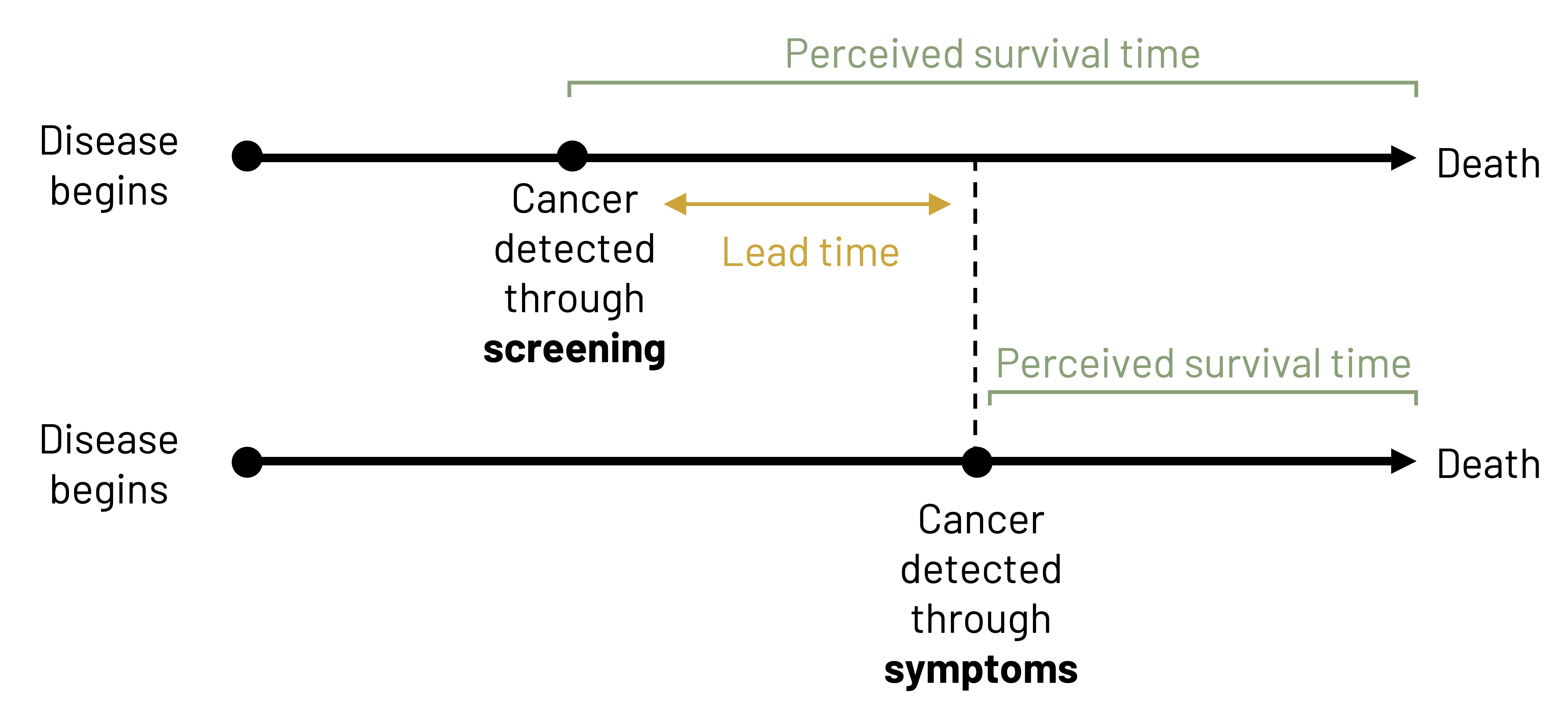
Figure Descriptions
Figure 4.2: Above the table is condition according to gold standard (present or absent). Left of the table is test result (positive or negative). If present and positive, A. If absent and positive, B. If present and negative, C. If absent and negative, D. Reading left to right in the table: A, B, line break, C, D. Outside of the table are calculations for finding totals. Below the table left to right: total, A+C, B+D, line break, Sensitivity=A/(A+C). Specificity=D/(B+D). Right of the table top to bottom: total, A+B, C+D. Additional rightmost column: predictive value (+)=A/(A+B), predictive value (-)=C/(C+D). Grand total: A+B+C+D. Return to figure 4.2.
Figure 4.3: Above the table is disease (+) and disease (-). Left of the table is test (+) and test (-). If disease (+) and test (+), true positive. If disease (-) and test (+), false positive. If disease (+) and test (-), false negative. If disease (-) and test (-), true negative. Outside of the table are calculations for finding other values. Below the table left to right: sensitivity=TP/(TP+FN) and specificity=TN/(TN+FP). Right of the table top to bottom: predictive value (+)=TP/(TP+FP), predictive value (-)=TN/(TN+FN). Prevalence=(TP+FN)/(TP+FN+FP+TN). Return to figure 4.3.
Figure 4.4: True positives and false negatives make up every individual who have the condition. True negatives and false positives make up every individual who does not have the condition. Sensitivity=true positives/(true positives+false negatives). Specificity=true negatives/(true negatives+false positives). Return to figure 4.4.
Figure 4.6: Two overlapping bell curves representing specificity and sensitivity. X-axis and y-axis range from 0 to 40. Specificity bell curve (individuals who do not have the condition) is left of sensitivity (individuals who have the condition). The curves overlap slightly. Where they overlap is the optimal balance between specificity and sensitivity. To increase sensitivity, shift to the left. To decrease sensitivity, shift to the right. Return to figure 4.6.
Figure 4.7: Likelihood ratio (+)=probability of positive result in patient with disorder/probability of positive result in patient without disorder=sensitivity/(1-specificity)=TP rate/FP rate. If LR (+) > 10, indicates a highly specific test. Likelihood ratio (-)=probability of negative result in patient with disorder/probability of negative result in patient without disorder=(1-sensitivity)/specificity=FN rate/TN rate. If LR (-) < 0.1, indicates a highly sensitive test. Return to figure 4.7.
Figure 4.8: Rainbow of colors in a half circle with each color representing a point on the pain scale. Left to right: no pain (blue), annoying (green), uncomfortable (yellow), intense (pink), unbearable (red). A different pain scale is below, represented by 5 simple faces. Left to right: no pain (happy face), mild (slightly smiling face), moderate (neutral face), severe (sad face), very severe (crying). Return to figure 4.8.
Figure 4.9: Left: Example of Type I error (false positive). “Your leg is broken!” when the leg in the image is not broken. Right: Example of Type II error (false negative) “Your leg is not broken!” when the leg in the image is broken. Return to figure 4.9.
Figure 4.11: Two timelines. First: disease begins and cancer is detected through screening shortly after. Patient has a longer perceived survival time since cancer was detected early through screening (more lead time). Second: disease begins, more time passes, cancer is detected through symptoms. Patient has a shorter perceived survival time since cancer was detected later through symptoms. Lead time: The difference in time between the cancer being detected through screening versus symptoms. Return to figure 4.11.
Figure References
Figure 4.1: Precision and accuracy. Graphic by Kindred Grey. 2022. CC BY 4.0. Table data adapted under fair use from USMLE First Aid, Step 1.
Figure 4.2: The fourfold (2×2) table. Kindred Grey. 2022. CC BY 4.0.
Figure 4.3: A simplified table. Kindred Grey. 2022. CC BY 4.0.
Figure 4.4: Sensitivity and specificity. Kindred Grey. 2022. CC BY-SA 4.0. Adapted from Sensitivity and Specificity 1.01 by FeanDoe, from WikimediaCommons (CC BY-SA 4.0).
Figure 4.5: Properties of validity tests. Adapted under fair use from USMLE First Aid, Step 1.
Figure 4.6: The optimization of sensitivity and specificity. Kindred Grey. 2022. CC BY 4.0.
Figure 4.7: Likelihood ratio. Kindred Grey. 2022. CC BY 4.0.
Figure 4.8: Examples of improved visuals. Kindred Grey. 2022. CC BY 4.0.
Figure 4.9: The importance of false positives and false negatives. Kindred Grey. 2022. CC BY-SA 2.0. Includes leg1 by Joe Goldberg, from Flickr (CC BY-SA 2.0) and Lower Leg Tib Fib Right x-ray 0000 no info, by Eric Schmuttenmaer, from WikimediaCommons (CC BY-SA 2.0).
Figure 4.10: Sources of bias in screening. Adapted under fair use from USMLE First Aid, Step 1.
Figure 4.11: Natural history of disease. Kindred Grey. 2022. CC BY 4.0. Adapted from Lead time bias by Mcstrother, from WikimediaCommons (CC BY 3.0).
- Myerburg RJ, Vetter VL. Electrocardiograms should be included in preparticipation screening of athletes. Circulation. 2007;116(22):2616–2626. ↵
- Kligfield P, Gettes LS, Bailey JJ, et al. Recommendations for the standardization and interpretation of the electrocardiogram. Circulation. 2007;115(10):1306–1324. ↵
- Cleveland Clinic. Electrocardiogram (EKG). https://my.clevelandclinic.org/health/diagnostics/16953-electrocardiogram-ekg. Published 2022. Accessed 17 September 2023. ↵
- U.S. Preventive Services Task Force. Final Recommendation Statement. Cardiovascular disease risk: Screening With electrocardiography. https://www.uspreventiveservicestaskforce.org/uspstf/recommendation/cardiovascular-disease-risk-screening-with-electrocardiography. Published 2018. Accessed 17 September 2023. ↵
- Johns Hopkins Medicine. Electrocardiogram. https://www.hopkinsmedicine.org/health/treatment-tests-and-therapies/electrocardiogram. Published 2023. Accessed 17 September 2023. ↵
- Hayden SR, Brown MD. Likelihood ratio: A powerful tool for incorporating the results of a diagnostic test into clinical decisionmaking. Ann Emerg Med. 1999;33(5):575–580. ↵
- Pewsner D, Battaglia M, Minder C, Marx A, Bucher HC, Egger M. Ruling a diagnosis in or out with “SpPIn” and “SnNOut”: A note of caution. BMJ (Clinical research ed). 2004;329(7459):209–213. ↵
- Van Kampen DA, Lovell MR, Pardini JE, Collins MW, Fu FH. The “value added” of neurocognitive testing after sports-related concussion. Am J Sports Med. 2006;34(10):1630–1635. ↵
- Brihn A, Chang J, K OY, et al. Diagnostic performance of an antigen test with RT-PCR for the detection of SARS-CoV-2 in a hospital setting—Los Angeles County, California, June-August 2020. MMWR Morbidity and Mortality Weekly Report. 2021;70(19):702–706. ↵
- Le RK, Ortega JD, Chrisman SPD, et al. King-Devick sensitivity and specificity to concussion in collegiate athletes. J Athl Train. 2023;58(2):97–105. ↵
