6 Interpreting Different Types of Images
Interpreting a True Color (RGB) Image
When considering a true color image, keep in mind that the imagery will visually appear the same as if you are looking out of the window of an airplane and observing the terrain below since the colors associated with the image are the same as what we would see with our naked eyes. Go back to Figure 31 (the orthophoto for the Waterbury dataset) and identify the forested areas, the roads, and other features. Think about how you visually interpreted them- color, hue, size, shape, pattern, texture, context, etc.. We can also apply many of these same visualization strategies and analysis techniques to other types of images, such as near infrared (NIR) and images created from index calculations (including the normalized difference vegetation index (NDVI) and other vegetation indices). Using drone sensors that capture data from outside the human visible spectrum, we can often observe additional information and characteristics about the Earth’s surface.
Displaying and Interpreting Plant Health Vegetation Indices for an RGB Image
Click on the Plant Health button in the upper right corner of the Map View for the Waterbury dataset. The orthophoto will now calculate NDVI values according to the formula below and display them, as shown in Figure 34.
NDVI = (NIR-Red) / (NIR+Red)
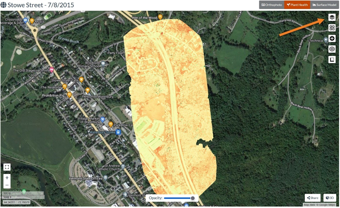
See if you can still identify the same features as you identified in the true color orthophoto. If you need a reminder of what the landscape looks like, click the ‘layers’ button in the top right and toggle the Plant Health (NDVI) layer on and off (i.e., uncheck or check the box in front of it). Figure 35 shows the layers manager with the Waterbury (Plant Health) layer checked. Uncheck it so it is no longer displayed on the screen. After doing this to see what it looks like, turn the Waterbury (Plant Health) layer on again.
Remember that plants absorb red and blue wavelengths and reflect wavelengths in the near IR and green bands. Our eyes can see the reflected green light in the visible range, so this is why healthy plants look green. Vegetation indices like NDVI (Normalized Difference Vegetation Index) use two (or more) bands of wavelengths to perform calculations that highlight a desired property of the sample. NDVI is the most common of these indices for vegetation analysis, but there are many more.
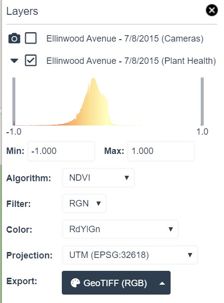
The first thing to notice in this box is the Algorithm chosen by default, which is NDVI. The NDVI index is based on both the Near IR and Red bands. In this example (based on the color scale selected), more vigorous vegetation should show up as green in the image.
The Filter chosen by default in this example (Figure 35) is RGN (Red, Green, Near IR). However, this image was collected with an RGB (Red, Green, Blue) sensor that did not have a Near IR sensor. This is a true color image and does not contain Near IR data. This is a word of caution. Do not rely on the software to select appropriate algorithms or parameters to support your needs. In this example, NDVI is a poor image processing algorithm option for this particular image because it requires near infrared data (and no NIR data is associated with this image). So, let’s try a more suitable option.
Go to the Algorithm drop-down box and choose VARI. Figure 36 shows the results of the VARI image with the manager box opened.
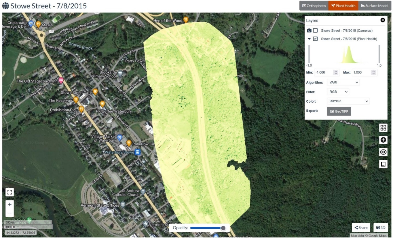
VARI stands for Visible Atmospherically Resistant Index. Note that the VARI algorithm uses the RGB (Red, Green, Blue) bands. Our Waterbury image contains these three bands. The formula for the VARI index is:
VARI=Green-Red(Green+Red-Blue)
The trees and vegetation in the image appear green (higher VARI index value), and the roads and other non-vegetative surfaces appear yellow (i.e., have a low value for VARI). One additional feature to explore is the Color drop-down box, which allows one to change how the range of values in the image is displayed by the computer. Feel free to try out the different visualization options and see what happens.
Working with Multispectral Imagery and NDVI
For this example, we will use the piachoo_nir_1 dataset downloaded from the ODM sample dataset archive (https://www.opendronemap.org/odm/datasets/). The images were taken with the Micasense NIR sensor, which includes the NIR band. Create a new project, select all the images, choose the Default option from the drop-down list, and process the images. The processing time was about 14 minutes for 196 images. Click on the + to expand the task (Figure 37).

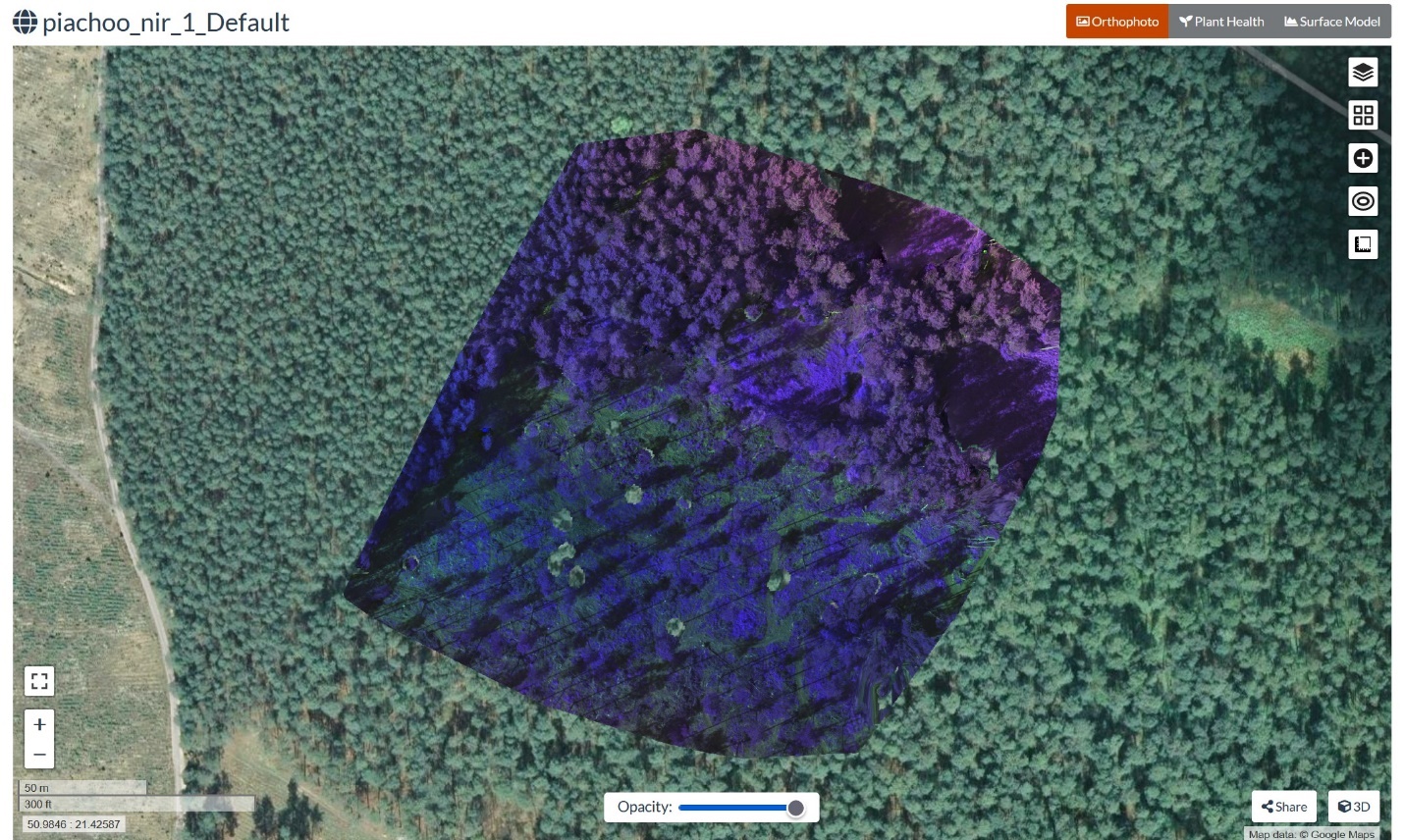
Select the View Map button, and the following Orthophoto will appear (Figure 38). This is a forested landscape acquired from a multispectral sensor. The colors shown are chosen automatically by WebODM.
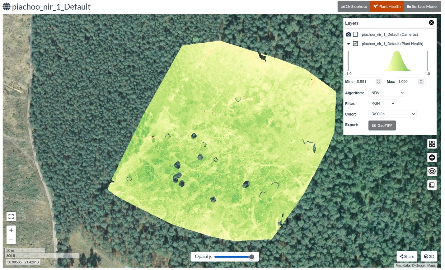
Select Plant Health, and the NDVI for the image will appear, as shown in Figure 39. Recall that the multispectral sensor used to collect data for this image includes the near IR band, so the green vegetation in the imagery appears green in the NDVI image.
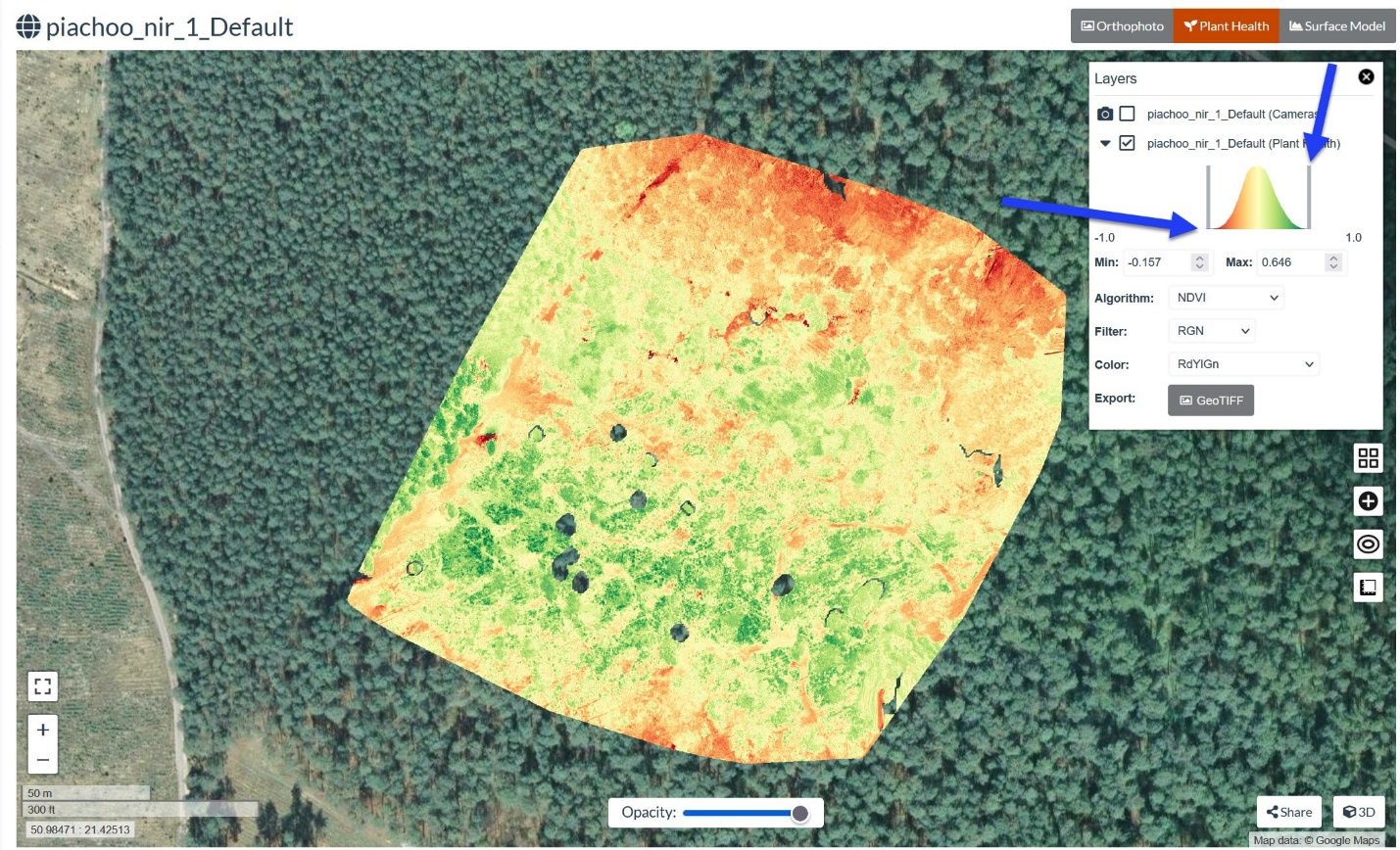
To increase the contrast in this image, the histogram can be ‘stretched’ by dragging the vertical bar on each side of the histogram (i.e., at the end of each tail). This will narrow the interval for the NDVI values displayed or change the Min/Max values. Note that in Figure 40, the gray bar has been moved on each side, and the histogram now fills the whole range of values. The arrows point to the gray bars. Histogram stretching is a prevalent approach to facilitate the interpretation of an image by increasing contrast and revealing salient features.
Interpretation of NIR (Near IR) Imagery
For this example, we will use the mf_obriens dataset, downloaded from the ODM sample dataset archive (https://www.opendronemap.org/odm/datasets/). This imagery was captured with a full spectrum blue/NIR sensor, which also includes the NIR band. Unzip the archive and locate the OBriens_2017-07-22 folder. Create a project, select all the images, choose the Default option from the drop-down list, and process the images. The processing time was about 27 minutes for 87 images. Click on the + to expand the task. The result is shown in Figure 41.

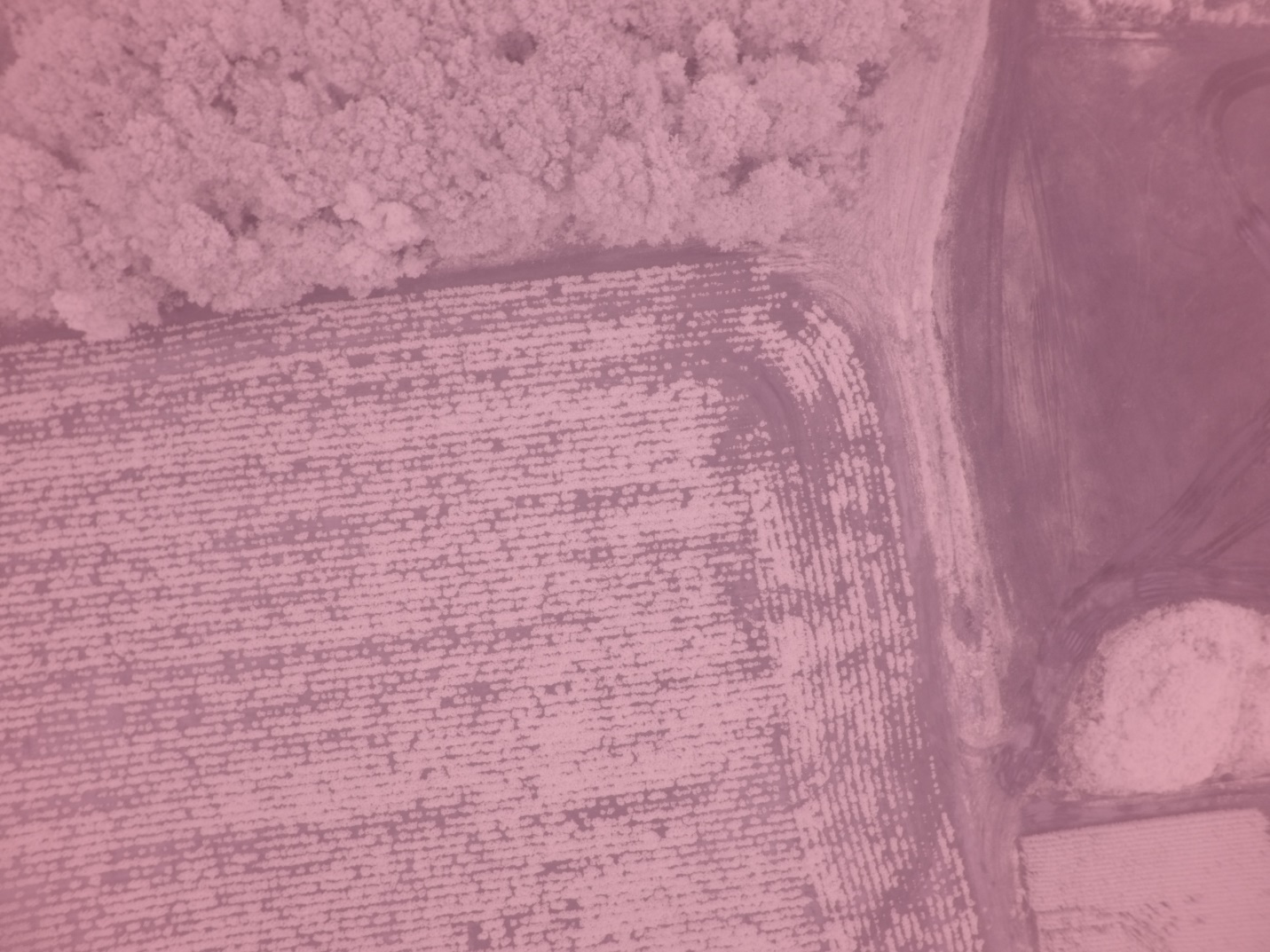
Before we move on to the orthophoto and NDVI for this image, let’s open one of the raw drone images (such as GOPRO321.jpg shown in Figure 42) and display it. See if you can identify the features in this NIR image without the benefit of true color. Use textures, hues, shading, patterns, and shapes to identify what this image shows.
Now, let’s return to the processed imagery shown in Figure 41 by clicking on the dashboard. Navigate to the specific project, select View Map, and the view in Figure 43 will appear.
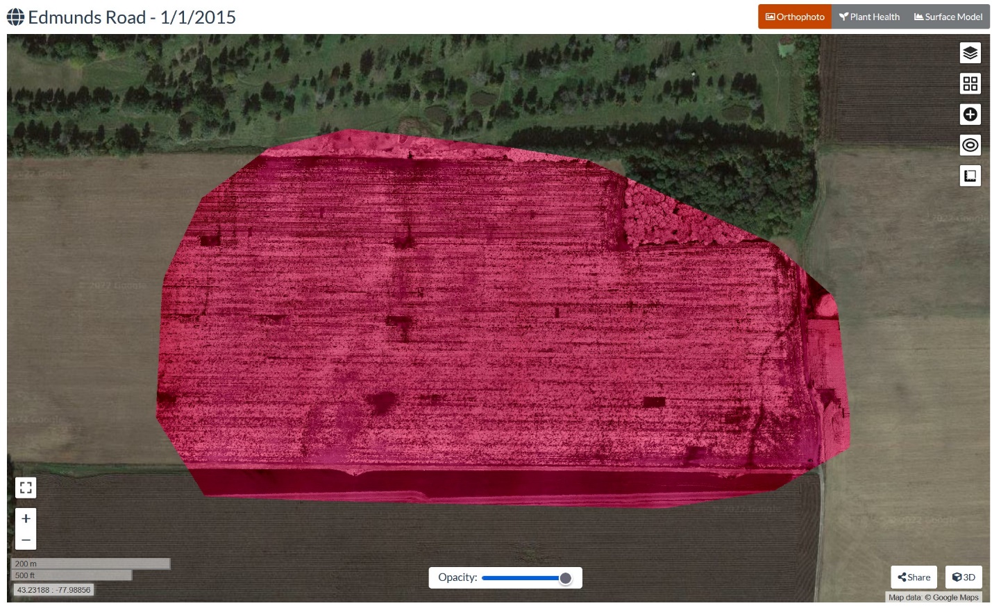
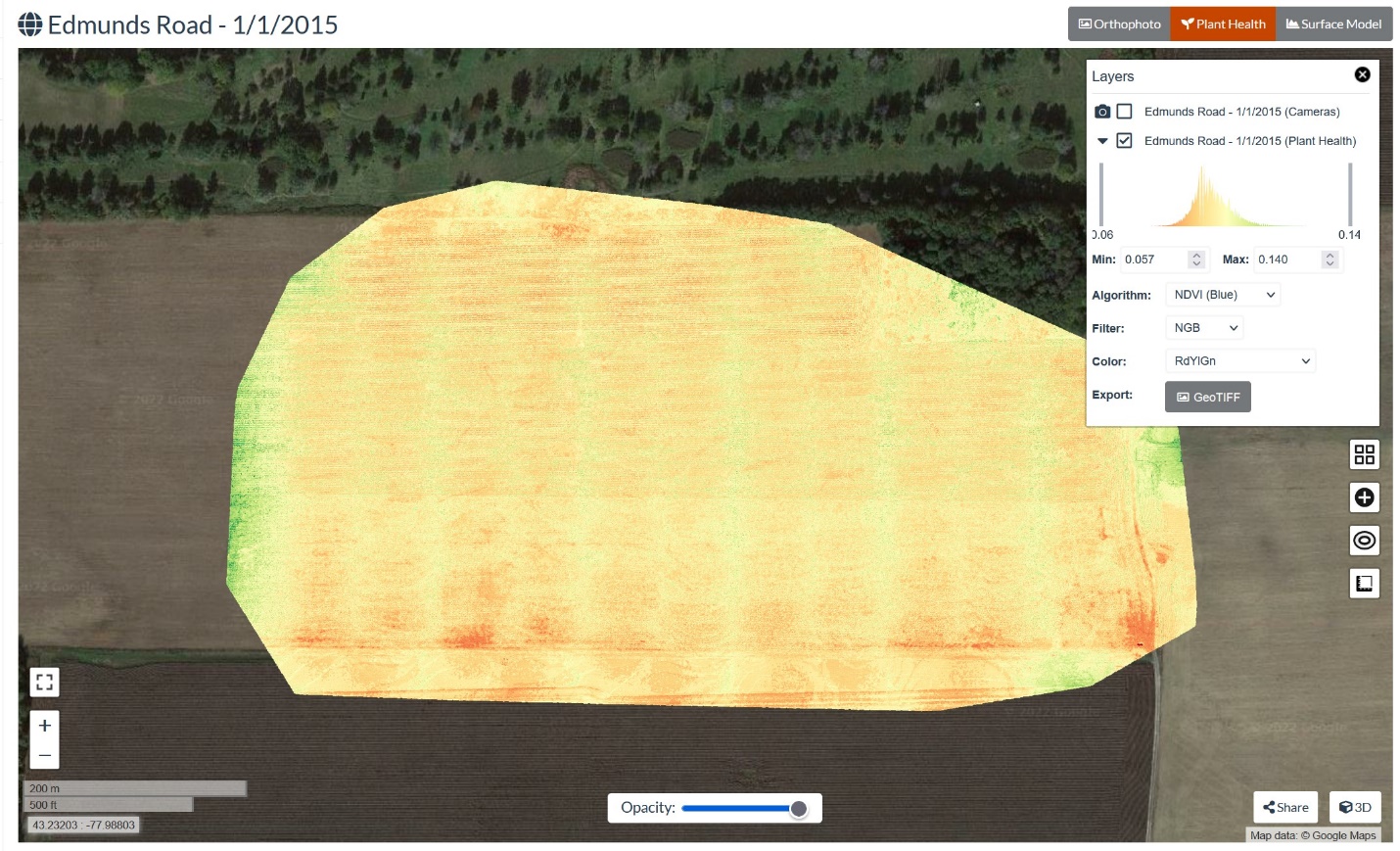
Identify the features in this image using textures, hues, shading, patterns, and shape. Before you select Plant Health, try to predict what you think this layer will look like in terms of color and the presence of healthy plants. As soon as you have made your predictions, select Plant Health and see if your predictions were correct (Figure 44).
Making Measurements in Your 3D Image Mosaic
We will now explore some tools associated with the 3D Model in WebODM. For this activity, we will use the Helenenschacht data set, which is downloadable from the ODM sample dataset archive (https://www.opendronemap.org/odm/datasets/). Ensure that you download the data and store it locally, as previously mentioned. Next, create a project and select all the images. For this project, choose the ‘High Resolution’ option from the processing drop-down list. Click on the + symbol (as was done previously) to expand the task. The result is shown in Figure 45.

Click the View 3D Model button to see the 3D map, as shown in Figure 46.
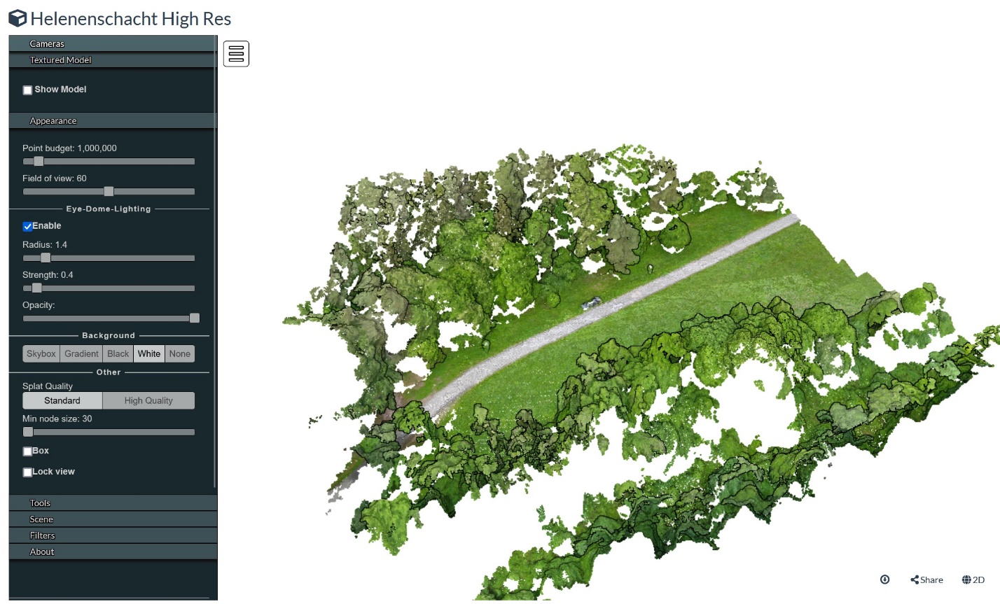
In the panel menu of options on the left, click on the Textured Model option header to expand it. Check the box beside Show Model to load the Textured Model onto the 3D map view. This view will help us discern the edges of features more easily in the map we want to measure. Your project should look similar to Figure 47.
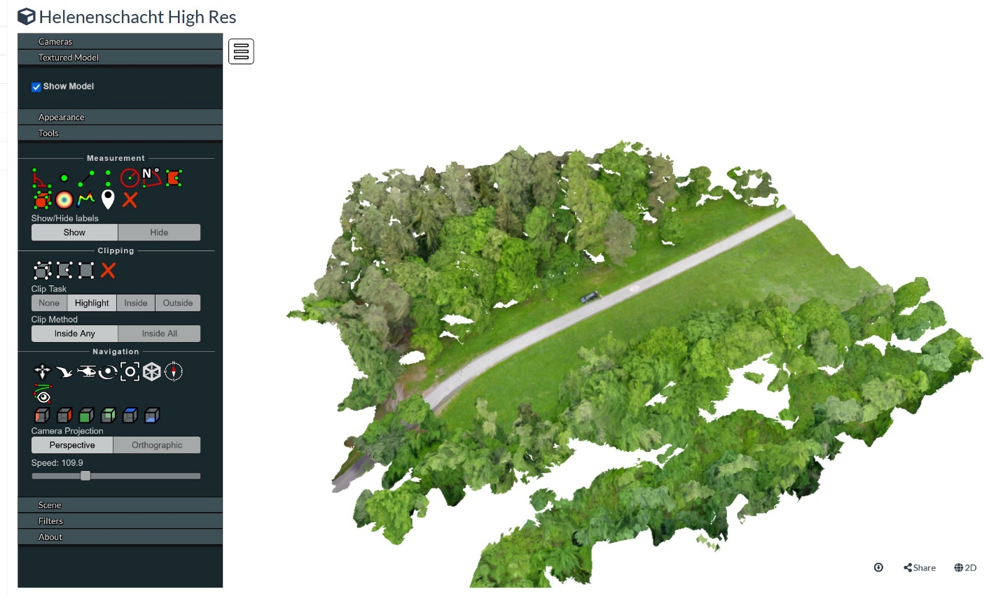
Notice the car shown in the image. Let’s zoom in on the car and measure it. Click on the Tools header and expand it to show the selection of measurement tools. To determine what each tool measures, hover the mouse over each tool icon to display the text that identifies the function. The distance measurement tool is circled in yellow in Figure 48. To measure the car, right-click on the distance measurement tool, then right-click on the front of the car to place the first end of the line segment. Next, drag the resulting line toward the back of the car with your mouse. Right-click where you would like the measurement to end, and then left-click to stop measuring. If you don’t left-click to stop measuring, then everywhere you click will continue the measurement.
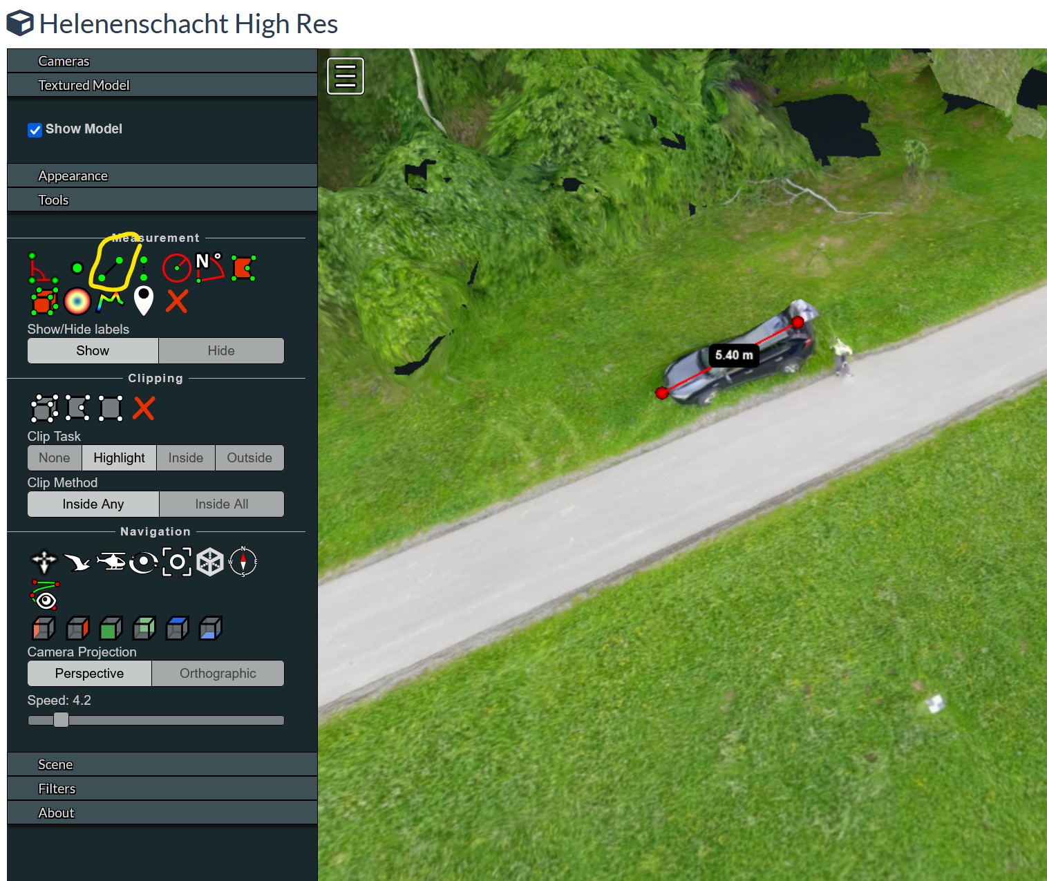
Once you are satisfied with your measurement, record the length and click the red Xto delete it. If you make a mistake while measuring, you can always click the red X in the tool menu to delete it from your map and start over.
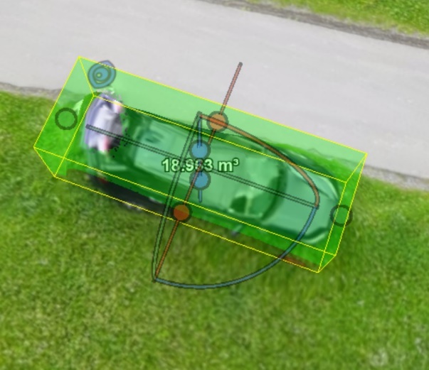
Now, let’s go back to the car shown in the image. Click on the volume measurement tool, then center your mouse cursor over the car. The result is shown in Figure 49. The rectangular prism shown can be adjusted in size using the three axes (x, y, and z) inside. Note that a preliminary measurement (m3) is displayed. Your measurement values will likely differ.
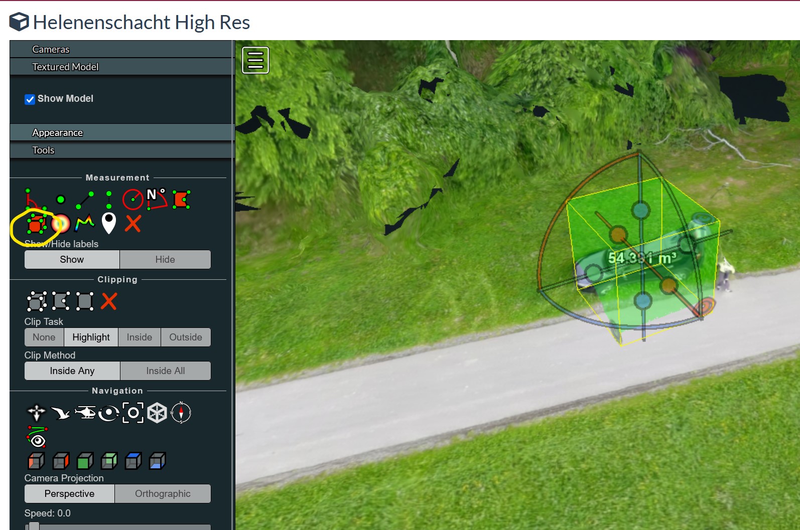
To get a reasonably accurate estimation of the volume of the car, adjust each of the axes (x, y, and z) to reflect the length of each dimension. Each of the three dimensions is color-coded in red, blue, and green. The length of each dimension can be adjusted by moving the balls at the end of the segments. In Figure 50, we can see that the car’s width is represented in red. Hover your mouse over one of the red balls to highlight it, and then move it to align with the side of the car. Do the same for the other side. Next, we will set the length measurement represented in green. Again, highlight and move the green balls to each end of the car. Finally, do the same with the blue balls representing the car’s height. Your image should look something like Figure 51, and the measurement shown should be significantly smaller than the original measurement.
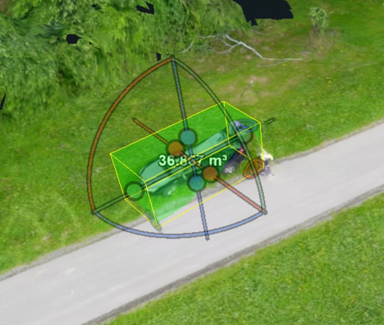
Using your mouse, rotate the image to see the side view, as shown below in Figure 51. Again, move the endpoints (balls) for each axis to better delineate the car’s profile and dimensions.
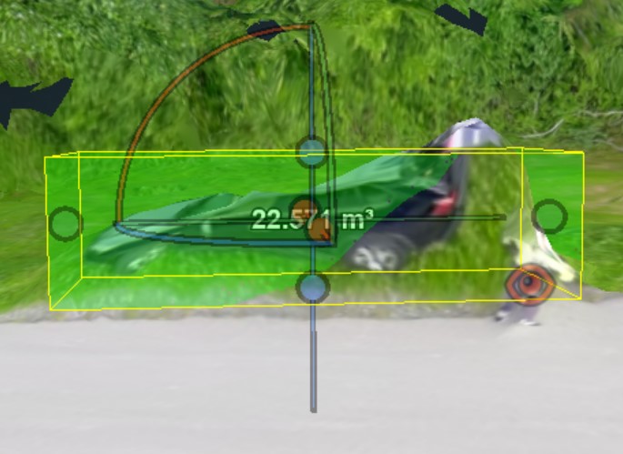
Finally, rotate the image to the top view and look from above. In this example, the cube is not lined up well with the car in the image. (See Figure 52).
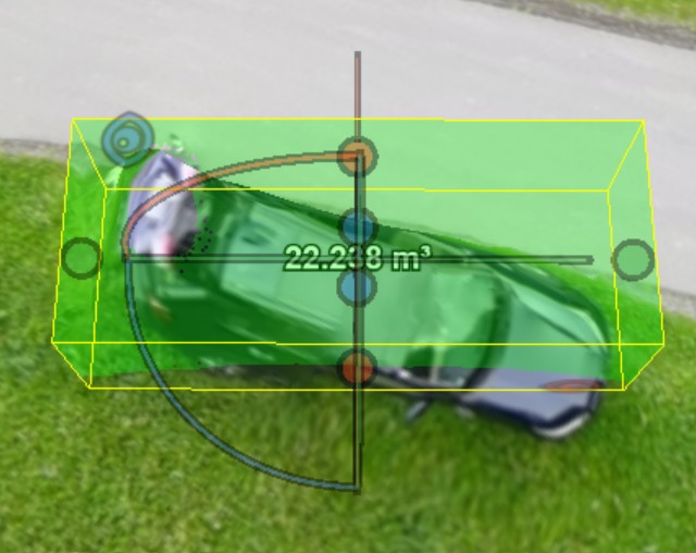
To adjust this, hover over one of the arcs until it lights up, and then click on it and drag it to rotate the rectangular prism. The blue arc was highlighted, clicked, and rotated in this instance. If you need to adjust the balls again (as required here), hover over the ball you want to move and then click and drag as necessary. The final top-view result is shown in Figure 53.
When determining volume measurements, these adjustments can be approached in any sequence. It will likely be necessary to revisit each view to ensure the best fit of the prism over the feature being measured.
