3.2 Visualizing Bivariate Quantitative Data
Bivariate Quantitative Data
When we are looking at bivariate data, we first need to decide if changing one variable seems to lead to a change in the other. A response variable (also called y, dependent variable, and predicted variable) measures or records an outcome of a study. An explanatory variable (also called x, independent variable, and predictor variable) explains changes in the response variable.
In the rest of this chapter, we will be studying “simple linear regression.” Note that this does not imply that these ideas are “simple” but just that we are working with one independent variable (x) and a linear relationship. This involves data that fits a line in two dimensions.
When considering the relationship between two quantitative variables:
- Start with a graph (scatter plot).
- Look for an overall pattern and deviations from the pattern.
- Use numerical descriptions of the data and overall pattern (correlation, coefficient of determination).
- Consider a mathematical model (regression).
Scatter Plots
Before we discuss linear regression and correlation, we need to examine a way to display the relation between the variables x and y. The most common and easiest way is a scatter plot. A scatter plot shows a lot about the relationship between the variables. When you look at a scatter plot, you want to notice the overall pattern and any potential deviations from the pattern. You can determine the strength of the relationship by looking at the scatter plot and seeing how close the points are together. When looking at a scatter plot you always want to note:
- Shape
- Trend
- Strength
The following scatter plot examples illustrate these concepts.
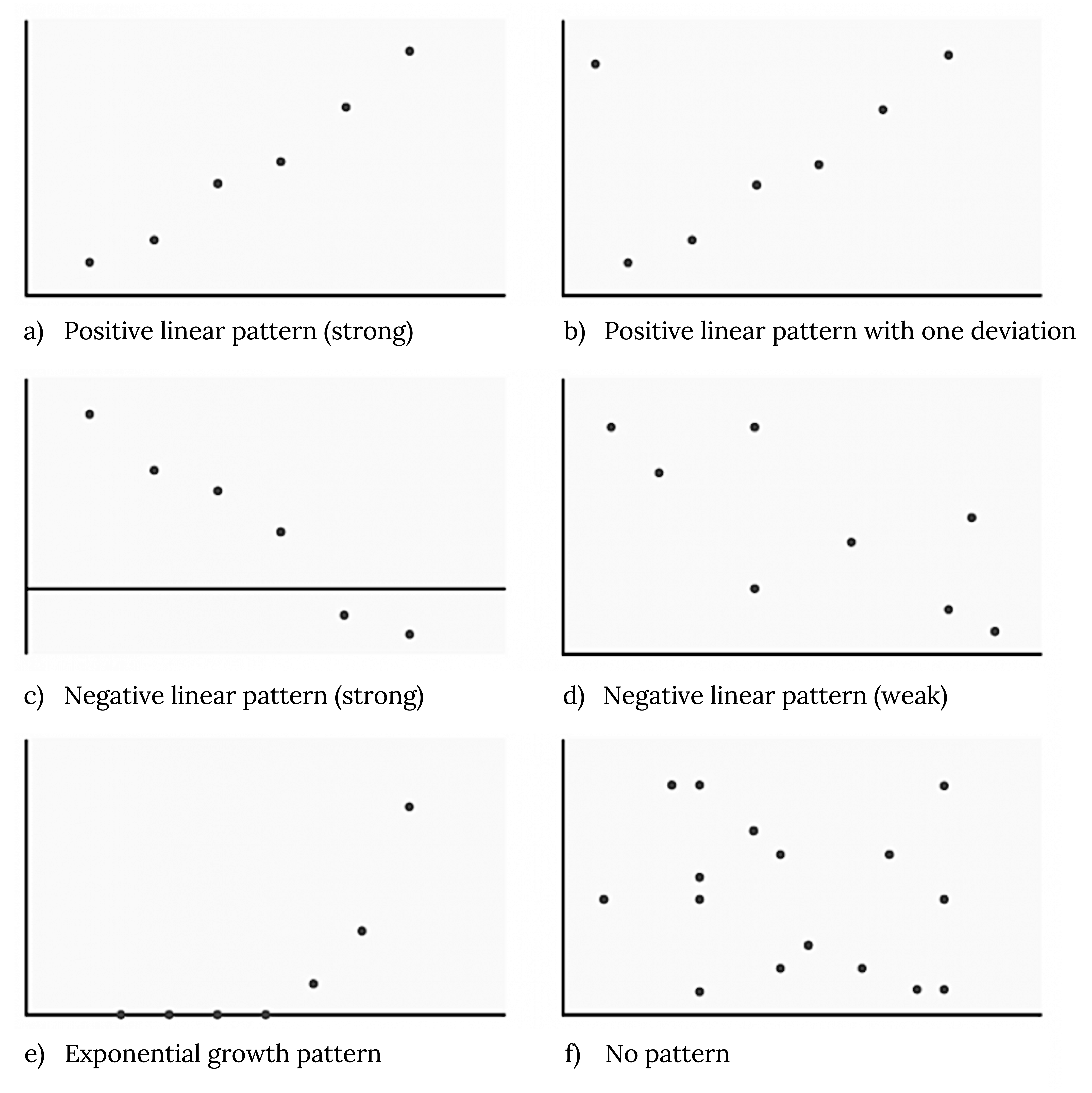
Shape
Although we may see other shapes in a scatter plot, we are currently only interested in applying these ideas when we see a linear pattern. Linear patterns are quite common. The linear relationship is strong if the points are close to a straight line, except in the case of a horizontal line, which indicates no relationship. If we think that the points show a linear relationship, we draw a line on the scatter plot. Later, we will learn to calculate this line through a process called linear regression. However, we only calculate a regression line if one of the variables helps to explain or predict the other variable.
Trend
If we do see a linear pattern, what sort of relationship is there? A positive trend is seen when increasing x also increases y. On the other hand, a negative (inverse) trend is seen when increasing x appears to cause y to decrease. In other words:
- High values of one variable occurring with high values of the other variable or low values of one variable occurring with low values of the other variable
- High values of one variable occurring with low values of the other variable
Strength
At this point, we can think about the strength of a relationship by asking how tightly the points on a scatter plot fit the linear pattern. A stronger relationship has points clustered together closely, while in a weaker one, points are more spread out. The strength of a relationship is not always apparent in a scatter plot, but we will see them measured numerically in the future.
Example
Does the scatter plot appear linear? Strong or weak? Positive or negative?
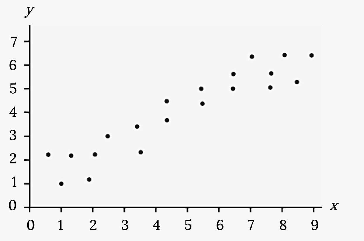
Solution
The data appear to be linear with a strong, positive correlation.
Does the scatter plot appear linear? Strong or weak? Positive or negative?
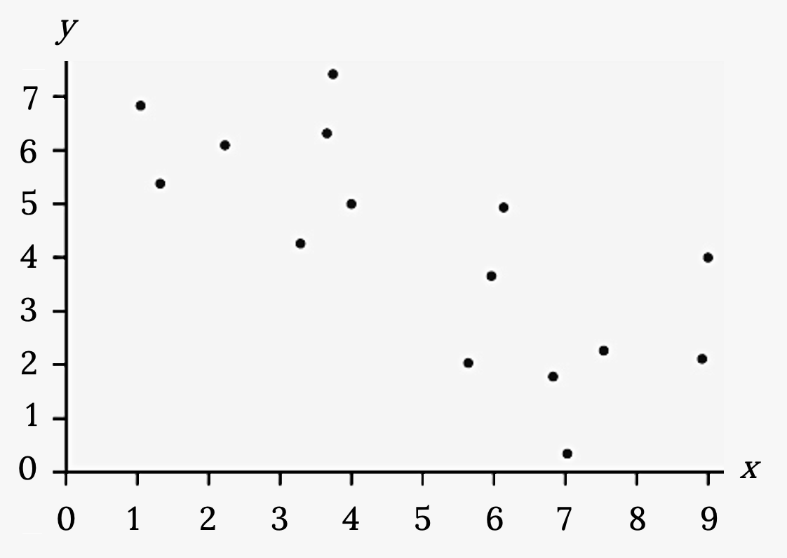
Solution
The data appear to be linear with a weak, negative correlation.
Does the scatter plot appear linear? Strong or weak? Positive or negative?

Solution
The data appear to have no correlation.
Your Turn!
Amelia plays basketball for her high school. She wants to improve to play at the college level. She notices that the number of points she scores in a game seems to go up in response to the number of hours she practices her jump shot each week. She records the following data:
Hours practicing jump shot  |
Points scored in a game 
|
|---|---|
| 5 | 15 |
| 7 | 22 |
| 9 | 28 |
| 10 | 31 |
| 11 | 33 |
| 12 | 36 |
Figure 3.12: Amelia’s points
Construct a scatter plot, and state whether Amelia’s hypothesis appears to be true.
Figure References
Figure 3.8: Kindred Grey (2020). Scatter plot configurations. CC BY-SA 4.0. Adaptation of Figures 12.6, 12.7, and 12.8 from OpenStax Introductory Statistics (2013) (CC BY 4.0). Retrieved from https://openstax.org/books/introductory-statistics/pages/12-2-scatter-plots
Figure 3.9: Kindred Grey (2020). Scatter plot 1. CC BY-SA 4.0. Adaptation of Figure 12.26 from OpenStax Introductory Statistics (2013) (CC BY 4.0). Retrieved from https://openstax.org/books/introductory-statistics/pages/12-practice
Figure 3.10: Kindred Grey (2020). Scatter plot 2. CC BY-SA 4.0. Adaptation of Figure 12.27 from OpenStax Introductory Statistics (2013) (CC BY 4.0). Retrieved from https://openstax.org/books/introductory-statistics/pages/12-practice
Figure 3.11: Kindred Grey (2020). Scatter plot 3. CC BY-SA 4.0. Adaptation of Figure 12.28 from OpenStax Introductory Statistics (2013) (CC BY 4.0). Retrieved from https://openstax.org/books/introductory-statistics/pages/12-practice
Data consisting of two variables, often in search of an association
The dependent variable in an experiment; the value that is measured for change at the end of an experiment
The independent variable in an experiment; the value controlled by researchers
